

Recommended
More Related Content
What's hot
What's hot (20)
Viewers also liked
Viewers also liked (8)
Similar to Similar Products DigiPaks
Similar to Similar Products DigiPaks (20)
More from Angharad Wilkins
More from Angharad Wilkins (20)
Recently uploaded
Recently uploaded (20)
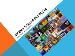
Similar Products DigiPaks
- 2. SIMILAR PRODUCT 1: FRONT COVER Album Name – handwriting style font – bold colour – unusually larger font than the artist name. White background – makes the photograph of the artist stand out and a focal point for the viewer. Photograph of artist taking up the majority of the album front cover – main focus Artist name – same handwriting style font as album name – bright gold writing – small size font
- 3. SIMILAR PRODUCT 1: BACK COVER Song tracks listed in similar font used on front cover – continuity – placed in an interesting way Photograph of artist – takes up half the album back – focal point Copyright – bottom left corner – small font Illustrations which link with the bright colours used on the front cover - continuity Record Company logo – small – bottom of the CD Barcode – bottom right hand corner Use of white background – same as front cover – makes the images stand out – focal point.
- 4. SIMILAR PRODUCT 1: INSIDE COVER Similar Illustrations to the back cover of the album - continuity Photograp h of artist – branding – takes up majority of left inside cover – focal point White background again Artist Name – branding – repetition of artist name for viewer to remember Image – hands joined together – letters spell the album title repetition Same image as on the CD but in colour to blend with the colour image on the left hand side - continuity
- 5. SIMILAR PRODUCT 1: ALBUM BOOKLET Title – ‘Prologue’ Album booklet also includes: Repetition of colourful illustrations from the back and inside cover – continuity – album theme – bright colours represents pop culture – genre of music - Lyrics to songs - Credits The artist explaining the making of her album – personal – exclusive extra for those who have bought the album White Background - continuity Signed by artists name – same handwriting font used in rest of DigiPak – personal touch for her fans
- 6. SIMILAR PRODUCT 2: FRONT COVER Artist name – male – blue font colour – large font size – top of the album cover White background – colour and images stand out Image of the artist – easily recognisable – branding – association with the album and songs – centre of the album cover – focal point Name of the album in the centre of the album cover – in between the image of the artist – less bold than the artist name. Exclusive promotion – ‘Includes the No.1 single…+ lyrics’ Background image – simple – doesn’t draw attention away from the artist
- 7. SIMILAR PRODUCT 2: BACK COVER White Background continuity Song tracks – placed in an interesting way, like bricks on a wall – continues colourful theme of front cover Copyright – small font – bottom of album cover Same backgroun d image as front cover – continuity - theme Record Company logos – small in size – at the bottom of the album cover Barcode in the bottom middle of the back cover
- 8. SIMILAR PRODUCT 2: INSIDE COVER Artist name and album name – bold white font – stands out Same theme as on front and back of album. Same theme as on front and back of album Same blue colour as the font of the artist name on front cover – continuity – theme
- 9. SIMILAR PRODUCT 2: ALBUM BOOKLET Song name in same style as album name on front cover – links them together in audience’ s mind continuity Song lyrics – exclusive extra with album Credits to everyone who helped with the album Number of images of the artist – branding Album booklet also includes: - Message from artist – ‘thank you’ The word ‘credits’ in same style as the album name – repetition continuity
- 10. SIMILAR PRODUCT 3: FRONT COVER Artist Name – bold font – block letters stands out – large size – top of the album – clear to the viewer. Background image – landscape with mountains – links to album title Name of the album – block font – link to the album title – smaller size font than artist name – white against orange background – stands out. M, kml jnkl
- 11. SIMILAR PRODUCT 3: BACK COVER jnkl nm. Ml, M, kml n,m, bjkk
- 12. SIMILAR PRODUCT 3: INSIDE COVER jnkl nm. Ml, M, kml n,m, bjkk
- 13. SIMILAR PRODUCT 3: ALBUM BOOKLET bjkk jnkl nm. Ml, M, kml n,m,
- 14. SIMILAR PRODUCT 4: FRONT COVER jnkl nm. Ml, M, kml n,m, bjkk
- 15. SIMILAR PRODUCT 4: BACK COVER jnkl nm. Ml, M, kml n,m, bjkk
- 16. SIMILAR PRODUCT 4: INSIDE COVER jnkl nm. Ml, M, kml n,m, bjkk
- 17. SIMILAR PRODUCT 4: ALBUM BOOKLET bjkk jnkl nm. Ml, M, kml n,m,