SlideShare a Scribd company logo
1 of 74
11 tips to turn your visitors into customers Karl Gilis - AGConsult Web usability & Information architecture
These slides were created to support an oral story. In an attempt to make them interesting without hearing the story, I've added these bubbles.  I hope they will give enough context to tell the story.
1 tip to start with  (I owe credit to Gerry McGovern for this one)
The view of the universe by a smart guy: Aristotle. He was so wrong.
My view of the world and the universe until I was 30.  I was so wrong. Karl Gilis
The view of many marketing, communication and web managers.  They are so wrong. My company / My website
The bitter truth about the internet.  The visitor is at the centre.  He's the king. The dictator even. He's always right! The visitor
This is what I mean by 'centre of the universe approach'. This is the product page on green energy on the website of Electrabel, "the largest power company in Belgium". Do you notice how they don't talk about the product, but only about how great they are? "The biggest producer of green energy".  "Green energy for the future of our planet." "A real engagement." Good for them. A big round of applause.  But the visitor doesn't care. He wants to see product information. Not bragging about how great Electrabel is. Most visitors will leave upon seeing this.
[object Object],[object Object],1. Your daily mantra You should start every working day with this mantra.
2 tips for visitors coming from Google
2. Make sure the right pages are on top in Google ,[object Object],[object Object],[object Object],[object Object],[object Object],[object Object]
I'm still looking for green energy. The first result in Google for Essent was this page. Good thing they rank high. Bad thing they do so with a pdf file with the rules of a contest.  Bummer.  The visitor will leave and not become a customer.
So yeah, I'm still looking for green energy. The first result in Google for SPE-Luminus was this page. Good thing they rank high. Bad thing they do so with a page about where they get their green energy from. Frankly, at this stage the visitor doesn't care. He wants to see the product specs. Prices.  So he will leave.
In the case of Luminus it really is a pity that previous slide is their highest ranking page. Because on their main website they have a pretty good page on green energy.  But it doesn't rank the highest for their company when searching for 'green energy'.
3. Each page must stand on its own ,[object Object],[object Object],[object Object],[object Object],[object Object]
So here I am, still looking for green energy. The first result in Google for Carrefour is this page. They have a European label for their product. Yep, that's really what the visitor wants to know.  Now he's convinced. Not. He already left the page. Because the only thing he sees is 'European label' and he was looking for green energy.
The solution: make 1 page for your product.  And start with the product info. And maybe, if you really feel the need to tell people about your label, do it at the end.  Because most people are not interested in those things.
Because I didn't find a good solution to buy green energy, I was looking for solutions on how to reduce my energy consumption. After doing some research, I decided that a heat pump was a good solution for me. My next question: can I get a grant for a heat pump?
When Googling I found this page. It tells me a lot about what a heat pump is. And at the bottom (invisible on this screenshot) a link to a pdf-file to apply for the grant.  Is this what the visitor was looking for?
No. This is not what the average visitor expects. At this stage, he knows what a heat pump is.  Remember, this company is not selling heat pumps.  They give grants to people that reduce their energy consumption. What do visitors expect from this page? How much the grant is. Result: the visitor will leave.
Why are the amounts of the grants not on the detail page? Because this company made a classic mistake.  People follow logical paths in a website, don't they? That's why they only show the amounts on the page that shows all the grants.  That's good, but not good enough.
So remember: put all the info that's necessary to have the full story on the destination or detail page.
2 tips for spontaneous visitors
4. Homepage & website focus ,[object Object],[object Object],[object Object],[object Object],[object Object]
[object Object],[object Object],[object Object],[object Object],[object Object]
[object Object],[object Object],[object Object],[object Object]
Question ,[object Object]
I don't know what your answer was.  I'm always surprised to see how many people think Google is a simple company. That's probably because they see Google as the search company.  Or maybe because they think of Google as the company with the very easy to use homepage.
And yes, Google has a very simple homepage.
But their technology is very complex.  Their indexing mechanism, the ranking, the speed, … That is very complex.
As we all know, Google has much more to offer than search. Google docs, Picase, orkut, AdWords, Chrome, API's, Google News, Translate, Analytics, … and much much more.
[object Object],[object Object],[object Object],[object Object],[object Object],[object Object]
All that stuff is not there because it's not the top task of the visitor of Google. Believe me, the people at Google are not stupid.  They know what they're doing. They measure everything. They don't follow their gut feeling. That's why the homepage has a clear focus on search and easy to see links to 'Advertising programs' and 'Business solutions'.
[object Object],[object Object],[object Object],[object Object],[object Object],[object Object],[object Object]
Question ,[object Object],Think for one minute. Write down the 2 or 3 top tasks that cross your mind. Ready? Let's find out what they do…
Yes, this is the homepage of Esso. I know you think it's the homepage of ExxonMobil, but no, it really is Esso.  At least, this is what you see when you go to  www.esso.be . For your information: the red line is what you see on your screen without scrolling. So what's the focus here? A huge article on their internal study "Outlook for Energy: Expectations for the year 2030". You didn't see that one coming, did you? Or was it really on your list of top tasks?
[object Object],[object Object],[object Object],[object Object],[object Object],[object Object],[object Object]
I'm sure you agree that in this comparison Lukoil is the winner. Lukoil knows what their visitors want. Now look at the website of your company. Is it in line with Google and Lukoil? Or does it reflect the Esso approach?
5. Provide clear choices on overview pages ,[object Object],[object Object],[object Object],[object Object],[object Object],[object Object],[object Object],[object Object],[object Object],[object Object]
This is the homepage of the Belgian Government. Visitors really like the 9 'blocks' with links. Why? Because those blocks and links guide the user to the section he needs. Is it fancy? No. Does it work? Yes.
This is the homepage of Vlerick. Students and managers all over the world like the blocks in the centre. Why? They give direct access to the sections they need and are easy to scan.
This is the homepage of a water company. And even without understanding Dutch, you see there are 3 easy choices (drinking water, water for industrial use and waste water).
If you choose drinking water, they give you a page that resembles a site map. Maybe you think it looks boring. Newsflash: the user doesn't care. They all love this page because it helps them to find what they're looking for.
5 tips for all visitors
6. Optimize the 'scannability' of every page ,[object Object],[object Object],[object Object],[object Object],[object Object],[object Object],[object Object],[object Object],[object Object],[object Object],[object Object],[object Object]
Let's do the test on some pages. I was looking for car insurance. The first result in Google was a page from ING. Look at it for 4 seconds… Don't go to the next screen manually. Push the play button.
 
What did you see? Anything important? Or have you just seen a big load of text? And maybe the very interesting 'More information' links. Because that's really what you want now, isn't it?  More information. Or do you agree that in real life you would return to Google and try the next result?
Let's see what the second company has to offer. Ready for the car insurance page of Ethias? Click on the play button to make sure you'll see it for 4 seconds only.
 
What did you see? Anything important? Was this better than ING? I think so. But not that much better, was it?
Let's see what the biggest web shop on earth does. Image you're looking for a digital camera. And the search results lead you to the next page. Again, click the Play button to see it for 4 seconds.
 
Do you recall the brand? The model? The price? Was it in stock? Would you stay on this page? Do your web pages have this magic build-up?
7. Use useful pictures ,[object Object],[object Object],[object Object],[object Object],[object Object],[object Object],[object Object],[object Object]
On the next slide you'll see some heat maps.  A heat map is the result of eye tracking research.  A red area means that > 80% of the users looked at it. Yellow: 60 to 80% of the users Green: 40 tot 60% Pay special attention to the 'heat' of the images.
Damn, it seems that visitors largely ignore images. Does this mean you should stop using images? No, but only use them when they have an added value. The smiling lady on the left is okay. She doesn't take up too much space.
This smiling lady is not okay. She's taking up too much space and pushing the content downwards. As a heating company you should show your products. Visitors know that when their home is heated in winter, they will be happier than when they freeze to death.
Last week we had a user test on a comparable website with smiling people.  The user was struggling to find something. Suddenly he said: "I can't find what I'm looking for but I'm glad those people are smiling." He was a big fan of irony.  Those smiling people made him angry. That's what smiling people do when your site is not perfect. They upset the visitor.
The next slide shows the homepage of a transport company. Look at the pictures. What do they tell you?
 
[object Object],[object Object],[object Object],[object Object],[object Object],[object Object],[object Object],[object Object]
You would probably leave the website. That means this company has lost a potential customer. Because 3 levels deep in the structure the item 'transport modes' makes it clear they do transport by truck, train, boat… Showing those transport modes on the homepage (as links) instead of the trucks, would have increased the chance of you becoming a customer.
8. Always give a price indication ,[object Object],[object Object],[object Object],[object Object],[object Object],[object Object],[object Object],[object Object],[object Object],[object Object]
9. Lead generation on every page ,[object Object],[object Object],[object Object],[object Object],[object Object],[object Object],[object Object],[object Object]
This company has a very complex product range. So there's quite a big chance that a lot of visitors want to contact them when seeing this page. Below the page fold there's a 'Contact us' link. That's okay.  Would be better if it was above the page fold. Let's click on it.
What's this? The visitor is forced to choose which Atlas Copco he wants to contact? How should he know that? Why should he know the internal structure of a company?
Want more info?  Not sure what solution suits you? Call: 0800 25 000 Mail:  [email_address] Chat:  Start online chat Contactform   Just for fun, I made this little adjustment to the first page. I filled the empty spot with contact information. This will turn visitors into customers.
10. Always be polite! ,[object Object],[object Object],To check the error messages on your website, push the 'send' button on all the forms on your web site without filling them in.
"We want something that looks like an email address!"
"Misses? / Mister?. Thank you."
"Email problem Push the BACK button to solve the problem" Don't you wish everything in life was this easy? Just push the back button and all your problems ate solved.
That's it. Wait. 11 tips, remember?
11. Find out how AGConsult can help you ,[object Object],[object Object],[object Object],[object Object],[object Object],[object Object],[object Object],[object Object],[object Object],[object Object],[object Object],[object Object],[object Object],[object Object],[object Object],[object Object],[object Object],[object Object],[object Object],[object Object],[object Object],[object Object]

More Related Content

Viewers also liked

20 tips voor bruikbare websites van lokale overheden
20 tips voor bruikbare websites van lokale overheden20 tips voor bruikbare websites van lokale overheden
20 tips voor bruikbare websites van lokale overhedenAGConsult
 
De directheid van online marketing
De directheid van online marketingDe directheid van online marketing
De directheid van online marketingAGConsult
 
Tips voor een betere website van je hotel of b&b
Tips voor een betere website van je hotel of b&bTips voor een betere website van je hotel of b&b
Tips voor een betere website van je hotel of b&bAGConsult
 
From Cultuurweb To UiTinVlaanderen
From Cultuurweb To UiTinVlaanderenFrom Cultuurweb To UiTinVlaanderen
From Cultuurweb To UiTinVlaanderenAGConsult
 
Meer omzet met je hotelwebsite
Meer omzet met je hotelwebsiteMeer omzet met je hotelwebsite
Meer omzet met je hotelwebsiteAGConsult
 
10 grootste usabilityproblemen = 10 tips om je conversie te verhogen
10 grootste usabilityproblemen = 10 tips om je conversie te verhogen10 grootste usabilityproblemen = 10 tips om je conversie te verhogen
10 grootste usabilityproblemen = 10 tips om je conversie te verhogenAGConsult
 
10 keer een pleidooi voor meer usability
10 keer een pleidooi voor meer usability10 keer een pleidooi voor meer usability
10 keer een pleidooi voor meer usabilityAGConsult
 
Content en conversie: cut the crap
Content en conversie: cut the crapContent en conversie: cut the crap
Content en conversie: cut the crapAGConsult
 
Tips voor ecommerce websites
Tips voor ecommerce websitesTips voor ecommerce websites
Tips voor ecommerce websitesAGConsult
 
Optimizing the customer-journey - Website AB-testing cases
Optimizing the customer-journey - Website AB-testing casesOptimizing the customer-journey - Website AB-testing cases
Optimizing the customer-journey - Website AB-testing casesAGConsult
 
7 tips voor een goede website
7 tips voor een goede website7 tips voor een goede website
7 tips voor een goede websiteAGConsult
 
Geld verdienen met je hobby's = zorgeloos ondernemen
Geld verdienen met je hobby's = zorgeloos ondernemenGeld verdienen met je hobby's = zorgeloos ondernemen
Geld verdienen met je hobby's = zorgeloos ondernemenAGConsult
 
20 tips voor bruikbare overheidswebsites
20 tips voor bruikbare overheidswebsites20 tips voor bruikbare overheidswebsites
20 tips voor bruikbare overheidswebsitesAGConsult
 

Viewers also liked (13)

20 tips voor bruikbare websites van lokale overheden
20 tips voor bruikbare websites van lokale overheden20 tips voor bruikbare websites van lokale overheden
20 tips voor bruikbare websites van lokale overheden
 
De directheid van online marketing
De directheid van online marketingDe directheid van online marketing
De directheid van online marketing
 
Tips voor een betere website van je hotel of b&b
Tips voor een betere website van je hotel of b&bTips voor een betere website van je hotel of b&b
Tips voor een betere website van je hotel of b&b
 
From Cultuurweb To UiTinVlaanderen
From Cultuurweb To UiTinVlaanderenFrom Cultuurweb To UiTinVlaanderen
From Cultuurweb To UiTinVlaanderen
 
Meer omzet met je hotelwebsite
Meer omzet met je hotelwebsiteMeer omzet met je hotelwebsite
Meer omzet met je hotelwebsite
 
10 grootste usabilityproblemen = 10 tips om je conversie te verhogen
10 grootste usabilityproblemen = 10 tips om je conversie te verhogen10 grootste usabilityproblemen = 10 tips om je conversie te verhogen
10 grootste usabilityproblemen = 10 tips om je conversie te verhogen
 
10 keer een pleidooi voor meer usability
10 keer een pleidooi voor meer usability10 keer een pleidooi voor meer usability
10 keer een pleidooi voor meer usability
 
Content en conversie: cut the crap
Content en conversie: cut the crapContent en conversie: cut the crap
Content en conversie: cut the crap
 
Tips voor ecommerce websites
Tips voor ecommerce websitesTips voor ecommerce websites
Tips voor ecommerce websites
 
Optimizing the customer-journey - Website AB-testing cases
Optimizing the customer-journey - Website AB-testing casesOptimizing the customer-journey - Website AB-testing cases
Optimizing the customer-journey - Website AB-testing cases
 
7 tips voor een goede website
7 tips voor een goede website7 tips voor een goede website
7 tips voor een goede website
 
Geld verdienen met je hobby's = zorgeloos ondernemen
Geld verdienen met je hobby's = zorgeloos ondernemenGeld verdienen met je hobby's = zorgeloos ondernemen
Geld verdienen met je hobby's = zorgeloos ondernemen
 
20 tips voor bruikbare overheidswebsites
20 tips voor bruikbare overheidswebsites20 tips voor bruikbare overheidswebsites
20 tips voor bruikbare overheidswebsites
 

More from AGConsult

Moderated user testing: do's and don'ts
Moderated user testing: do's and don'tsModerated user testing: do's and don'ts
Moderated user testing: do's and don'tsAGConsult
 
How to make sure your new website won't be a failure? - Digital Elite Camp 2016
How to make sure your new website won't be a failure? - Digital Elite Camp 2016How to make sure your new website won't be a failure? - Digital Elite Camp 2016
How to make sure your new website won't be a failure? - Digital Elite Camp 2016AGConsult
 
Don't do anything on your website you wouldn't do on a first date
Don't do anything on your website you wouldn't do on a first dateDon't do anything on your website you wouldn't do on a first date
Don't do anything on your website you wouldn't do on a first dateAGConsult
 
How to Create Better A/B Tests and Why You Shouldn’t Bank on Best Practices
How to Create Better A/B Tests and Why You Shouldn’t Bank on Best PracticesHow to Create Better A/B Tests and Why You Shouldn’t Bank on Best Practices
How to Create Better A/B Tests and Why You Shouldn’t Bank on Best PracticesAGConsult
 
Don't do anything on your website you wouldn't do on a first date
Don't do anything on your website you wouldn't do on a first dateDon't do anything on your website you wouldn't do on a first date
Don't do anything on your website you wouldn't do on a first dateAGConsult
 
The Truth Is Out There - User Research Based AB-Testing
The Truth Is Out There - User Research Based AB-TestingThe Truth Is Out There - User Research Based AB-Testing
The Truth Is Out There - User Research Based AB-TestingAGConsult
 
Smartphone bezoekers converteren: hoe doe je dat?
Smartphone bezoekers converteren: hoe doe je dat?Smartphone bezoekers converteren: hoe doe je dat?
Smartphone bezoekers converteren: hoe doe je dat?AGConsult
 
Case Enfocus - Partnership met AGConsult
Case Enfocus - Partnership met AGConsultCase Enfocus - Partnership met AGConsult
Case Enfocus - Partnership met AGConsultAGConsult
 
Case Flanders Investment & Trade - AGConsult als architect
Case Flanders Investment & Trade - AGConsult als architectCase Flanders Investment & Trade - AGConsult als architect
Case Flanders Investment & Trade - AGConsult als architectAGConsult
 
Case Suzuki - Voor en na AGConsult
Case Suzuki - Voor en na AGConsultCase Suzuki - Voor en na AGConsult
Case Suzuki - Voor en na AGConsultAGConsult
 
Conversie & usability event 9/05/2015
Conversie & usability event 9/05/2015Conversie & usability event 9/05/2015
Conversie & usability event 9/05/2015AGConsult
 
How to create better A/B tests based on user research
How to create better A/B tests based on user researchHow to create better A/B tests based on user research
How to create better A/B tests based on user researchAGConsult
 
Klanten AGConsult in 2014
Klanten AGConsult in 2014Klanten AGConsult in 2014
Klanten AGConsult in 2014AGConsult
 
Tips voor een goede digitale overheid
Tips voor een goede digitale overheidTips voor een goede digitale overheid
Tips voor een goede digitale overheidAGConsult
 
B2B websites: hoe klanten maken van je bezoekers?
B2B websites: hoe klanten maken van je bezoekers?B2B websites: hoe klanten maken van je bezoekers?
B2B websites: hoe klanten maken van je bezoekers?AGConsult
 
Optimizing the funnel of Suzuki Belgium - and more
Optimizing the funnel of Suzuki Belgium - and moreOptimizing the funnel of Suzuki Belgium - and more
Optimizing the funnel of Suzuki Belgium - and moreAGConsult
 
Fundamenten goede online communicatie
Fundamenten goede online communicatieFundamenten goede online communicatie
Fundamenten goede online communicatieAGConsult
 

More from AGConsult (17)

Moderated user testing: do's and don'ts
Moderated user testing: do's and don'tsModerated user testing: do's and don'ts
Moderated user testing: do's and don'ts
 
How to make sure your new website won't be a failure? - Digital Elite Camp 2016
How to make sure your new website won't be a failure? - Digital Elite Camp 2016How to make sure your new website won't be a failure? - Digital Elite Camp 2016
How to make sure your new website won't be a failure? - Digital Elite Camp 2016
 
Don't do anything on your website you wouldn't do on a first date
Don't do anything on your website you wouldn't do on a first dateDon't do anything on your website you wouldn't do on a first date
Don't do anything on your website you wouldn't do on a first date
 
How to Create Better A/B Tests and Why You Shouldn’t Bank on Best Practices
How to Create Better A/B Tests and Why You Shouldn’t Bank on Best PracticesHow to Create Better A/B Tests and Why You Shouldn’t Bank on Best Practices
How to Create Better A/B Tests and Why You Shouldn’t Bank on Best Practices
 
Don't do anything on your website you wouldn't do on a first date
Don't do anything on your website you wouldn't do on a first dateDon't do anything on your website you wouldn't do on a first date
Don't do anything on your website you wouldn't do on a first date
 
The Truth Is Out There - User Research Based AB-Testing
The Truth Is Out There - User Research Based AB-TestingThe Truth Is Out There - User Research Based AB-Testing
The Truth Is Out There - User Research Based AB-Testing
 
Smartphone bezoekers converteren: hoe doe je dat?
Smartphone bezoekers converteren: hoe doe je dat?Smartphone bezoekers converteren: hoe doe je dat?
Smartphone bezoekers converteren: hoe doe je dat?
 
Case Enfocus - Partnership met AGConsult
Case Enfocus - Partnership met AGConsultCase Enfocus - Partnership met AGConsult
Case Enfocus - Partnership met AGConsult
 
Case Flanders Investment & Trade - AGConsult als architect
Case Flanders Investment & Trade - AGConsult als architectCase Flanders Investment & Trade - AGConsult als architect
Case Flanders Investment & Trade - AGConsult als architect
 
Case Suzuki - Voor en na AGConsult
Case Suzuki - Voor en na AGConsultCase Suzuki - Voor en na AGConsult
Case Suzuki - Voor en na AGConsult
 
Conversie & usability event 9/05/2015
Conversie & usability event 9/05/2015Conversie & usability event 9/05/2015
Conversie & usability event 9/05/2015
 
How to create better A/B tests based on user research
How to create better A/B tests based on user researchHow to create better A/B tests based on user research
How to create better A/B tests based on user research
 
Klanten AGConsult in 2014
Klanten AGConsult in 2014Klanten AGConsult in 2014
Klanten AGConsult in 2014
 
Tips voor een goede digitale overheid
Tips voor een goede digitale overheidTips voor een goede digitale overheid
Tips voor een goede digitale overheid
 
B2B websites: hoe klanten maken van je bezoekers?
B2B websites: hoe klanten maken van je bezoekers?B2B websites: hoe klanten maken van je bezoekers?
B2B websites: hoe klanten maken van je bezoekers?
 
Optimizing the funnel of Suzuki Belgium - and more
Optimizing the funnel of Suzuki Belgium - and moreOptimizing the funnel of Suzuki Belgium - and more
Optimizing the funnel of Suzuki Belgium - and more
 
Fundamenten goede online communicatie
Fundamenten goede online communicatieFundamenten goede online communicatie
Fundamenten goede online communicatie
 

Recently uploaded

Top 10 Modern Web Design Trends for 2025
Top 10 Modern Web Design Trends for 2025Top 10 Modern Web Design Trends for 2025
Top 10 Modern Web Design Trends for 2025Rndexperts
 
Call Girls in Ashok Nagar Delhi ✡️9711147426✡️ Escorts Service
Call Girls in Ashok Nagar Delhi ✡️9711147426✡️ Escorts ServiceCall Girls in Ashok Nagar Delhi ✡️9711147426✡️ Escorts Service
Call Girls in Ashok Nagar Delhi ✡️9711147426✡️ Escorts Servicejennyeacort
 
在线办理ohio毕业证俄亥俄大学毕业证成绩单留信学历认证
在线办理ohio毕业证俄亥俄大学毕业证成绩单留信学历认证在线办理ohio毕业证俄亥俄大学毕业证成绩单留信学历认证
在线办理ohio毕业证俄亥俄大学毕业证成绩单留信学历认证nhjeo1gg
 
MT. Marseille an Archipelago. Strategies for Integrating Residential Communit...
MT. Marseille an Archipelago. Strategies for Integrating Residential Communit...MT. Marseille an Archipelago. Strategies for Integrating Residential Communit...
MT. Marseille an Archipelago. Strategies for Integrating Residential Communit...katerynaivanenko1
 
shot list for my tv series two steps back
shot list for my tv series two steps backshot list for my tv series two steps back
shot list for my tv series two steps back17lcow074
 
Design Portfolio - 2024 - William Vickery
Design Portfolio - 2024 - William VickeryDesign Portfolio - 2024 - William Vickery
Design Portfolio - 2024 - William VickeryWilliamVickery6
 
Mookuthi is an artisanal nose ornament brand based in Madras.
Mookuthi is an artisanal nose ornament brand based in Madras.Mookuthi is an artisanal nose ornament brand based in Madras.
Mookuthi is an artisanal nose ornament brand based in Madras.Mookuthi
 
'CASE STUDY OF INDIRA PARYAVARAN BHAVAN DELHI ,
'CASE STUDY OF INDIRA PARYAVARAN BHAVAN DELHI ,'CASE STUDY OF INDIRA PARYAVARAN BHAVAN DELHI ,
'CASE STUDY OF INDIRA PARYAVARAN BHAVAN DELHI ,Aginakm1
 
Dubai Calls Girl Tapes O525547819 Real Tapes Escort Services Dubai
Dubai Calls Girl Tapes O525547819 Real Tapes Escort Services DubaiDubai Calls Girl Tapes O525547819 Real Tapes Escort Services Dubai
Dubai Calls Girl Tapes O525547819 Real Tapes Escort Services Dubaikojalkojal131
 
办理卡尔顿大学毕业证成绩单|购买加拿大文凭证书
办理卡尔顿大学毕业证成绩单|购买加拿大文凭证书办理卡尔顿大学毕业证成绩单|购买加拿大文凭证书
办理卡尔顿大学毕业证成绩单|购买加拿大文凭证书zdzoqco
 
306MTAMount UCLA University Bachelor's Diploma in Social Media
306MTAMount UCLA University Bachelor's Diploma in Social Media306MTAMount UCLA University Bachelor's Diploma in Social Media
306MTAMount UCLA University Bachelor's Diploma in Social MediaD SSS
 
2024新版美国旧金山州立大学毕业证成绩单pdf电子版制作修改#毕业文凭制作#回国入职#diploma#degree
2024新版美国旧金山州立大学毕业证成绩单pdf电子版制作修改#毕业文凭制作#回国入职#diploma#degree2024新版美国旧金山州立大学毕业证成绩单pdf电子版制作修改#毕业文凭制作#回国入职#diploma#degree
2024新版美国旧金山州立大学毕业证成绩单pdf电子版制作修改#毕业文凭制作#回国入职#diploma#degreeyuu sss
 
Call Girls Aslali 7397865700 Ridhima Hire Me Full Night
Call Girls Aslali 7397865700 Ridhima Hire Me Full NightCall Girls Aslali 7397865700 Ridhima Hire Me Full Night
Call Girls Aslali 7397865700 Ridhima Hire Me Full Nightssuser7cb4ff
 
Architecture case study India Habitat Centre, Delhi.pdf
Architecture case study India Habitat Centre, Delhi.pdfArchitecture case study India Habitat Centre, Delhi.pdf
Architecture case study India Habitat Centre, Delhi.pdfSumit Lathwal
 
Call Us ✡️97111⇛47426⇛Call In girls Vasant Vihar༒(Delhi)
Call Us ✡️97111⇛47426⇛Call In girls Vasant Vihar༒(Delhi)Call Us ✡️97111⇛47426⇛Call In girls Vasant Vihar༒(Delhi)
Call Us ✡️97111⇛47426⇛Call In girls Vasant Vihar༒(Delhi)jennyeacort
 
DAKSHIN BIHAR GRAMIN BANK: REDEFINING THE DIGITAL BANKING EXPERIENCE WITH A U...
DAKSHIN BIHAR GRAMIN BANK: REDEFINING THE DIGITAL BANKING EXPERIENCE WITH A U...DAKSHIN BIHAR GRAMIN BANK: REDEFINING THE DIGITAL BANKING EXPERIENCE WITH A U...
DAKSHIN BIHAR GRAMIN BANK: REDEFINING THE DIGITAL BANKING EXPERIENCE WITH A U...Rishabh Aryan
 
Untitled presedddddddddddddddddntation (1).pptx
Untitled presedddddddddddddddddntation (1).pptxUntitled presedddddddddddddddddntation (1).pptx
Untitled presedddddddddddddddddntation (1).pptxmapanig881
 
1比1办理美国北卡罗莱纳州立大学毕业证成绩单pdf电子版制作修改
1比1办理美国北卡罗莱纳州立大学毕业证成绩单pdf电子版制作修改1比1办理美国北卡罗莱纳州立大学毕业证成绩单pdf电子版制作修改
1比1办理美国北卡罗莱纳州立大学毕业证成绩单pdf电子版制作修改yuu sss
 
原版美国亚利桑那州立大学毕业证成绩单pdf电子版制作修改#毕业文凭制作#回国入职#diploma#degree
原版美国亚利桑那州立大学毕业证成绩单pdf电子版制作修改#毕业文凭制作#回国入职#diploma#degree原版美国亚利桑那州立大学毕业证成绩单pdf电子版制作修改#毕业文凭制作#回国入职#diploma#degree
原版美国亚利桑那州立大学毕业证成绩单pdf电子版制作修改#毕业文凭制作#回国入职#diploma#degreeyuu sss
 

Recently uploaded (20)

Top 10 Modern Web Design Trends for 2025
Top 10 Modern Web Design Trends for 2025Top 10 Modern Web Design Trends for 2025
Top 10 Modern Web Design Trends for 2025
 
Call Girls in Ashok Nagar Delhi ✡️9711147426✡️ Escorts Service
Call Girls in Ashok Nagar Delhi ✡️9711147426✡️ Escorts ServiceCall Girls in Ashok Nagar Delhi ✡️9711147426✡️ Escorts Service
Call Girls in Ashok Nagar Delhi ✡️9711147426✡️ Escorts Service
 
在线办理ohio毕业证俄亥俄大学毕业证成绩单留信学历认证
在线办理ohio毕业证俄亥俄大学毕业证成绩单留信学历认证在线办理ohio毕业证俄亥俄大学毕业证成绩单留信学历认证
在线办理ohio毕业证俄亥俄大学毕业证成绩单留信学历认证
 
MT. Marseille an Archipelago. Strategies for Integrating Residential Communit...
MT. Marseille an Archipelago. Strategies for Integrating Residential Communit...MT. Marseille an Archipelago. Strategies for Integrating Residential Communit...
MT. Marseille an Archipelago. Strategies for Integrating Residential Communit...
 
shot list for my tv series two steps back
shot list for my tv series two steps backshot list for my tv series two steps back
shot list for my tv series two steps back
 
Design Portfolio - 2024 - William Vickery
Design Portfolio - 2024 - William VickeryDesign Portfolio - 2024 - William Vickery
Design Portfolio - 2024 - William Vickery
 
Mookuthi is an artisanal nose ornament brand based in Madras.
Mookuthi is an artisanal nose ornament brand based in Madras.Mookuthi is an artisanal nose ornament brand based in Madras.
Mookuthi is an artisanal nose ornament brand based in Madras.
 
'CASE STUDY OF INDIRA PARYAVARAN BHAVAN DELHI ,
'CASE STUDY OF INDIRA PARYAVARAN BHAVAN DELHI ,'CASE STUDY OF INDIRA PARYAVARAN BHAVAN DELHI ,
'CASE STUDY OF INDIRA PARYAVARAN BHAVAN DELHI ,
 
Dubai Calls Girl Tapes O525547819 Real Tapes Escort Services Dubai
Dubai Calls Girl Tapes O525547819 Real Tapes Escort Services DubaiDubai Calls Girl Tapes O525547819 Real Tapes Escort Services Dubai
Dubai Calls Girl Tapes O525547819 Real Tapes Escort Services Dubai
 
办理卡尔顿大学毕业证成绩单|购买加拿大文凭证书
办理卡尔顿大学毕业证成绩单|购买加拿大文凭证书办理卡尔顿大学毕业证成绩单|购买加拿大文凭证书
办理卡尔顿大学毕业证成绩单|购买加拿大文凭证书
 
306MTAMount UCLA University Bachelor's Diploma in Social Media
306MTAMount UCLA University Bachelor's Diploma in Social Media306MTAMount UCLA University Bachelor's Diploma in Social Media
306MTAMount UCLA University Bachelor's Diploma in Social Media
 
Call Girls in Pratap Nagar, 9953056974 Escort Service
Call Girls in Pratap Nagar,  9953056974 Escort ServiceCall Girls in Pratap Nagar,  9953056974 Escort Service
Call Girls in Pratap Nagar, 9953056974 Escort Service
 
2024新版美国旧金山州立大学毕业证成绩单pdf电子版制作修改#毕业文凭制作#回国入职#diploma#degree
2024新版美国旧金山州立大学毕业证成绩单pdf电子版制作修改#毕业文凭制作#回国入职#diploma#degree2024新版美国旧金山州立大学毕业证成绩单pdf电子版制作修改#毕业文凭制作#回国入职#diploma#degree
2024新版美国旧金山州立大学毕业证成绩单pdf电子版制作修改#毕业文凭制作#回国入职#diploma#degree
 
Call Girls Aslali 7397865700 Ridhima Hire Me Full Night
Call Girls Aslali 7397865700 Ridhima Hire Me Full NightCall Girls Aslali 7397865700 Ridhima Hire Me Full Night
Call Girls Aslali 7397865700 Ridhima Hire Me Full Night
 
Architecture case study India Habitat Centre, Delhi.pdf
Architecture case study India Habitat Centre, Delhi.pdfArchitecture case study India Habitat Centre, Delhi.pdf
Architecture case study India Habitat Centre, Delhi.pdf
 
Call Us ✡️97111⇛47426⇛Call In girls Vasant Vihar༒(Delhi)
Call Us ✡️97111⇛47426⇛Call In girls Vasant Vihar༒(Delhi)Call Us ✡️97111⇛47426⇛Call In girls Vasant Vihar༒(Delhi)
Call Us ✡️97111⇛47426⇛Call In girls Vasant Vihar༒(Delhi)
 
DAKSHIN BIHAR GRAMIN BANK: REDEFINING THE DIGITAL BANKING EXPERIENCE WITH A U...
DAKSHIN BIHAR GRAMIN BANK: REDEFINING THE DIGITAL BANKING EXPERIENCE WITH A U...DAKSHIN BIHAR GRAMIN BANK: REDEFINING THE DIGITAL BANKING EXPERIENCE WITH A U...
DAKSHIN BIHAR GRAMIN BANK: REDEFINING THE DIGITAL BANKING EXPERIENCE WITH A U...
 
Untitled presedddddddddddddddddntation (1).pptx
Untitled presedddddddddddddddddntation (1).pptxUntitled presedddddddddddddddddntation (1).pptx
Untitled presedddddddddddddddddntation (1).pptx
 
1比1办理美国北卡罗莱纳州立大学毕业证成绩单pdf电子版制作修改
1比1办理美国北卡罗莱纳州立大学毕业证成绩单pdf电子版制作修改1比1办理美国北卡罗莱纳州立大学毕业证成绩单pdf电子版制作修改
1比1办理美国北卡罗莱纳州立大学毕业证成绩单pdf电子版制作修改
 
原版美国亚利桑那州立大学毕业证成绩单pdf电子版制作修改#毕业文凭制作#回国入职#diploma#degree
原版美国亚利桑那州立大学毕业证成绩单pdf电子版制作修改#毕业文凭制作#回国入职#diploma#degree原版美国亚利桑那州立大学毕业证成绩单pdf电子版制作修改#毕业文凭制作#回国入职#diploma#degree
原版美国亚利桑那州立大学毕业证成绩单pdf电子版制作修改#毕业文凭制作#回国入职#diploma#degree
 

Usability: Turn Visitors Into Customers - 11 tips

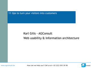
  • 1. 11 tips to turn your visitors into customers Karl Gilis - AGConsult Web usability & Information architecture
  • 2. These slides were created to support an oral story. In an attempt to make them interesting without hearing the story, I've added these bubbles. I hope they will give enough context to tell the story.
  • 3. 1 tip to start with (I owe credit to Gerry McGovern for this one)
  • 4. The view of the universe by a smart guy: Aristotle. He was so wrong.
  • 5. My view of the world and the universe until I was 30. I was so wrong. Karl Gilis
  • 6. The view of many marketing, communication and web managers. They are so wrong. My company / My website
  • 7. The bitter truth about the internet. The visitor is at the centre. He's the king. The dictator even. He's always right! The visitor
  • 8. This is what I mean by 'centre of the universe approach'. This is the product page on green energy on the website of Electrabel, "the largest power company in Belgium". Do you notice how they don't talk about the product, but only about how great they are? "The biggest producer of green energy". "Green energy for the future of our planet." "A real engagement." Good for them. A big round of applause. But the visitor doesn't care. He wants to see product information. Not bragging about how great Electrabel is. Most visitors will leave upon seeing this.
  • 9.
  • 10. 2 tips for visitors coming from Google
  • 11.
  • 12. I'm still looking for green energy. The first result in Google for Essent was this page. Good thing they rank high. Bad thing they do so with a pdf file with the rules of a contest. Bummer. The visitor will leave and not become a customer.
  • 13. So yeah, I'm still looking for green energy. The first result in Google for SPE-Luminus was this page. Good thing they rank high. Bad thing they do so with a page about where they get their green energy from. Frankly, at this stage the visitor doesn't care. He wants to see the product specs. Prices. So he will leave.
  • 14. In the case of Luminus it really is a pity that previous slide is their highest ranking page. Because on their main website they have a pretty good page on green energy. But it doesn't rank the highest for their company when searching for 'green energy'.
  • 15.
  • 16. So here I am, still looking for green energy. The first result in Google for Carrefour is this page. They have a European label for their product. Yep, that's really what the visitor wants to know. Now he's convinced. Not. He already left the page. Because the only thing he sees is 'European label' and he was looking for green energy.
  • 17. The solution: make 1 page for your product. And start with the product info. And maybe, if you really feel the need to tell people about your label, do it at the end. Because most people are not interested in those things.
  • 18. Because I didn't find a good solution to buy green energy, I was looking for solutions on how to reduce my energy consumption. After doing some research, I decided that a heat pump was a good solution for me. My next question: can I get a grant for a heat pump?
  • 19. When Googling I found this page. It tells me a lot about what a heat pump is. And at the bottom (invisible on this screenshot) a link to a pdf-file to apply for the grant. Is this what the visitor was looking for?
  • 20. No. This is not what the average visitor expects. At this stage, he knows what a heat pump is. Remember, this company is not selling heat pumps. They give grants to people that reduce their energy consumption. What do visitors expect from this page? How much the grant is. Result: the visitor will leave.
  • 21. Why are the amounts of the grants not on the detail page? Because this company made a classic mistake. People follow logical paths in a website, don't they? That's why they only show the amounts on the page that shows all the grants. That's good, but not good enough.
  • 22. So remember: put all the info that's necessary to have the full story on the destination or detail page.
  • 23. 2 tips for spontaneous visitors
  • 24.
  • 25.
  • 26.
  • 27.
  • 28. I don't know what your answer was. I'm always surprised to see how many people think Google is a simple company. That's probably because they see Google as the search company. Or maybe because they think of Google as the company with the very easy to use homepage.
  • 29. And yes, Google has a very simple homepage.
  • 30. But their technology is very complex. Their indexing mechanism, the ranking, the speed, … That is very complex.
  • 31. As we all know, Google has much more to offer than search. Google docs, Picase, orkut, AdWords, Chrome, API's, Google News, Translate, Analytics, … and much much more.
  • 32.
  • 33. All that stuff is not there because it's not the top task of the visitor of Google. Believe me, the people at Google are not stupid. They know what they're doing. They measure everything. They don't follow their gut feeling. That's why the homepage has a clear focus on search and easy to see links to 'Advertising programs' and 'Business solutions'.
  • 34.
  • 35.
  • 36. Yes, this is the homepage of Esso. I know you think it's the homepage of ExxonMobil, but no, it really is Esso. At least, this is what you see when you go to www.esso.be . For your information: the red line is what you see on your screen without scrolling. So what's the focus here? A huge article on their internal study "Outlook for Energy: Expectations for the year 2030". You didn't see that one coming, did you? Or was it really on your list of top tasks?
  • 37.
  • 38. I'm sure you agree that in this comparison Lukoil is the winner. Lukoil knows what their visitors want. Now look at the website of your company. Is it in line with Google and Lukoil? Or does it reflect the Esso approach?
  • 39.
  • 40. This is the homepage of the Belgian Government. Visitors really like the 9 'blocks' with links. Why? Because those blocks and links guide the user to the section he needs. Is it fancy? No. Does it work? Yes.
  • 41. This is the homepage of Vlerick. Students and managers all over the world like the blocks in the centre. Why? They give direct access to the sections they need and are easy to scan.
  • 42. This is the homepage of a water company. And even without understanding Dutch, you see there are 3 easy choices (drinking water, water for industrial use and waste water).
  • 43. If you choose drinking water, they give you a page that resembles a site map. Maybe you think it looks boring. Newsflash: the user doesn't care. They all love this page because it helps them to find what they're looking for.
  • 44. 5 tips for all visitors
  • 45.
  • 46. Let's do the test on some pages. I was looking for car insurance. The first result in Google was a page from ING. Look at it for 4 seconds… Don't go to the next screen manually. Push the play button.
  • 47.  
  • 48. What did you see? Anything important? Or have you just seen a big load of text? And maybe the very interesting 'More information' links. Because that's really what you want now, isn't it? More information. Or do you agree that in real life you would return to Google and try the next result?
  • 49. Let's see what the second company has to offer. Ready for the car insurance page of Ethias? Click on the play button to make sure you'll see it for 4 seconds only.
  • 50.  
  • 51. What did you see? Anything important? Was this better than ING? I think so. But not that much better, was it?
  • 52. Let's see what the biggest web shop on earth does. Image you're looking for a digital camera. And the search results lead you to the next page. Again, click the Play button to see it for 4 seconds.
  • 53.  
  • 54. Do you recall the brand? The model? The price? Was it in stock? Would you stay on this page? Do your web pages have this magic build-up?
  • 55.
  • 56. On the next slide you'll see some heat maps. A heat map is the result of eye tracking research. A red area means that > 80% of the users looked at it. Yellow: 60 to 80% of the users Green: 40 tot 60% Pay special attention to the 'heat' of the images.
  • 57. Damn, it seems that visitors largely ignore images. Does this mean you should stop using images? No, but only use them when they have an added value. The smiling lady on the left is okay. She doesn't take up too much space.
  • 58. This smiling lady is not okay. She's taking up too much space and pushing the content downwards. As a heating company you should show your products. Visitors know that when their home is heated in winter, they will be happier than when they freeze to death.
  • 59. Last week we had a user test on a comparable website with smiling people. The user was struggling to find something. Suddenly he said: "I can't find what I'm looking for but I'm glad those people are smiling." He was a big fan of irony. Those smiling people made him angry. That's what smiling people do when your site is not perfect. They upset the visitor.
  • 60. The next slide shows the homepage of a transport company. Look at the pictures. What do they tell you?
  • 61.  
  • 62.
  • 63. You would probably leave the website. That means this company has lost a potential customer. Because 3 levels deep in the structure the item 'transport modes' makes it clear they do transport by truck, train, boat… Showing those transport modes on the homepage (as links) instead of the trucks, would have increased the chance of you becoming a customer.
  • 64.
  • 65.
  • 66. This company has a very complex product range. So there's quite a big chance that a lot of visitors want to contact them when seeing this page. Below the page fold there's a 'Contact us' link. That's okay. Would be better if it was above the page fold. Let's click on it.
  • 67. What's this? The visitor is forced to choose which Atlas Copco he wants to contact? How should he know that? Why should he know the internal structure of a company?
  • 68. Want more info? Not sure what solution suits you? Call: 0800 25 000 Mail: [email_address] Chat: Start online chat Contactform Just for fun, I made this little adjustment to the first page. I filled the empty spot with contact information. This will turn visitors into customers.
  • 69.
  • 70. "We want something that looks like an email address!"
  • 71. "Misses? / Mister?. Thank you."
  • 72. "Email problem Push the BACK button to solve the problem" Don't you wish everything in life was this easy? Just push the back button and all your problems ate solved.
  • 73. That's it. Wait. 11 tips, remember?
  • 74.