How to optimize your tshirt designs for max wearability?
•
0 likes•105 views

Step by step guide on how to design better products.

Recommended
More Related Content
What's hot
What's hot (12)
Viewers also liked
Viewers also liked (6)
Similar to How to optimize your tshirt designs for max wearability?
Similar to How to optimize your tshirt designs for max wearability? (20)
Recently uploaded
Recently uploaded (20)
How to optimize your tshirt designs for max wearability?
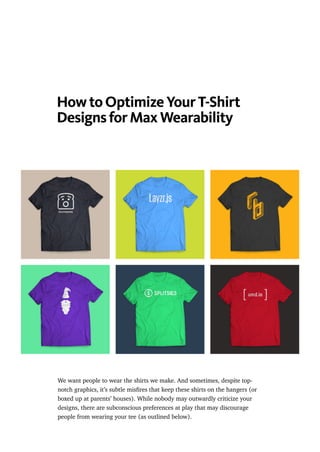
- 1. How to Optimize Your T-Shirt Designs for Max Wearability We want people to wear the shirts we make. And sometimes, despite top- notch graphics, it’s subtle misfires that keep these shirts on the hangers (or boxed up at parents’ houses). While nobody may outwardly criticize your designs, there are subconscious preferences at play that may discourage people from wearing your tee (as outlined below).
- 2. Don’t burn your money on shirts that don’t get worn. Here are a few guidelines to screen your designs before hitting the screenprinters. . . . Design + Composition This is not talking about the content of the design, but rather the formatting, layout, and composition of the elements. . . . No full-torso graphics. Some people can rock large graphics on their torso. But graphics that pass the sternum draw the eye to the stomach and can discourage larger people from wearing them. . . . Don’t go too wide.
- 3. If your graphic is too wide, it’ll get lost in the armpit folds. I use the nipple- to-nipple longitudinal region (about 9 inches wide) as an easy rule of thumb. The human back is flatter than the chest, so this is less of an issue for the reverse side of the shirt. If you must use a back graphic, it can extend up to 12 inches wide. . . . Don’t go too high or too low. This is a precision exercise. Chest graphics that are too high make the body feel empty, while graphics that are too low appear saggy and run the risk of getting hidden underneath the downslope of breasts. To solve this, start by
- 4. vertically centering graphics on the nipples. If that doesn’t look optically correct, raise it an inch or so. . . . Don’t touch the shoulders. Only TapouT is allowed to do this. And only assholes wear TapouT. . . . Don’t forget about boobs.
- 5. You can’t really avoid placing your design on the chest, but do try to avoid elements that emphasize the breasts. It’s a rare occurrence, but you’ll want to be conscious of, say, a graphic of a face with two precariously placed eyeballs. Be considerate. And remember, women aren’t the only people with potentially large breasts. . . . Garment Selection Choosing the right base product to print on is just as important as the design itself, so don’t let it become an afterthought. Here’s are my favorites, sorted by price to help match your budget. All styles shown are unisex short sleeve, the most common shirt for general audiences. That said, each product below is part of a family of styles with women’s fits, youth, long sleeve, v-neck, etc. Check links for alternatives. . . . American Apparel 50/50 ($$$)
- 6. Product ID: BB401 50% Polyester, 50% Cotton aka Poly-Cotton Crew Neck This is the tech world’s favorite skin shield. Pros: Good fit for most people. Lightweight. Wide color selection. Subtle heathered look. Cons: Expensive. Gets pilly after a while. Runs a bit small. Somewhat inconsistent sizing and construction. . . .
- 7. Next Level Poly/Cotton Crew ($$) Product ID: 6200 50% Polyester, 50% Cotton This it the tech world’s favorite knock-off American Apparel.
- 8. Pro: Moderate pricing. Rising in popularity (and availability). Tear-out tag for max brand ownership. Con: Baggier fit. Limited color selection. . . . Gildan Softstyle ($) Product ID: 64000 65% Polyester, 35% Cotton (* heather styles only!)
- 9. Passable as a knock-off American Apparel. I confidently endorse this product for the budget-conscious. Pros: Super inexpensive. Comfortable fit. Thicker weight (longer life). Cons: Annoying tag. Slightly lengthy. (*) Non-heather shirts have a different material composition and are not as soft. . . . Epilogue There is certainly space for experimental design and breaking the norm in t- shirt graphics. Some of my own favorite shirts don’t conform to these standards. But when your goal is to attain mass-wearitude and universal appreciation, these are good measures to follow. . . . I’ve been making shirt designs for almost ten years, but only recently began learning about screenprinting. It introduces a whole world of nuance and craft to apparel — I recommend trying it out! My buddy Jackson and I ran Pantschanger Prints, a small batch shirt co, for fun out of our house.
- 10. . . . (I modified a version of VecFashion’s t-shirt graphic for the demos above.) . . . HH Design is a community for students interested in the intersection between design and technology. contribute Here’s Jackson, all messy in our living room.