Making Data Meaningful
•Download as PPTX, PDF•
4 likes•1,201 views

Presented on May 7, 2015 to the TechChange Technology for M&E course. The aim of the presentation was to highlight key considerations in designing visualizations as part of international development programs, and includes both challenges of visualization in development programs and six things to consider when designing visualizations.

Recommended
More Related Content
What's hot
What's hot (20)
Viewers also liked
Viewers also liked (18)
Similar to Making Data Meaningful
Similar to Making Data Meaningful (20)
More from Amanda Makulec
More from Amanda Makulec (16)
Recently uploaded
Recently uploaded (20)
Making Data Meaningful
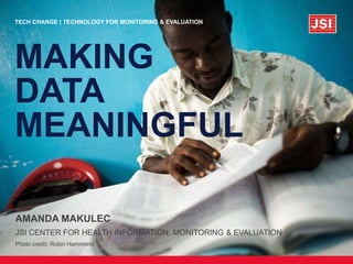
- 1. 6 MAY 2015AMANDA MAKULEC JSI CENTER FOR HEALTH INFORMATION, MONITORING & EVALUATION Photo credit: Robin Hammond TECH CHANGE | TECHNOLOGY FOR MONITORING & EVALUATION MAKING DATA MEANINGFUL
- 2. Amanda Makulec Program Manager & RME Associate John Snow, Inc. Passionate about how visualizing data effectively can empower people to make decisions.
- 3. Monitoring and evaluation is fundamentally about generating information that can inform decisions.
- 4. We want to be purposeful in how we collect and analyze data.
- 5. But we also want to be purposeful in how we visualize our data.
- 6. Advances in data collection technology enable us to collect data more efficiently than ever before.
- 7. Effective visualizations help stakeholders use that information for decisionmaking.
- 8. Some people think design means how it looks. But of course, if you dig deeper, design is how it works. -Steve Jobs, Apple
- 9. meaningful beautiful Well designed visualizations
- 10. An example: PRB World Population Report 2010
- 11. PRB World Population Digital Visualizations 2014
- 12. Developing data visualizations as part of international development programs presents unique challenges.
- 13. Limited resources mean team members often wear multiple hats. © Robin Hammond
- 14. Where connectivity is limited, using snazzy web-based tools can be challenging.
- 15. © Robin Hammond The level of analytical understanding across audiences can vary widely.
- 16. And report formats and templates required by donors have not (historically) been heavily visual.
- 17. Despite these challenges, using visualizations to analyze and use data is huge in the development community.
- 19. There are some simple principles worth considering when designing visualizations in development programs.
- 20. The most useful data visualizations are often designed by a team.
- 21. Consider whose expertise would be useful. M&E Advisor Graphic Designer Technical Expert Communications Expert
- 22. For data analysis tools like dashboards, engage your end user to understand their needs. Image credit: Beth Kanter
- 23. Be purposeful when identifying the audience for your visualization.
- 25. Consider your stakeholders’ literacy, numeric literacy, and what data they need to make decisions.
- 26. An example from the Care Community Hub
- 27. Identify the story you want to tell & consider additional available data.
- 28. Start with the data you’ve collected.
- 29. Then, identify additional data available that would help you tell your story better visually.
- 30. Invest time in choosing the right visualization product.
- 31. STATIC IMAGES: COMMUNICATING A MESSAGE THE USER EXPLORES YOUR DATA AND CAN DRAW THEIR OWN CONCLUSIONS. YOU DECIDE THE STORY AND THE MESSAGE, GUIDING YOUR READER. iNTERACTIVE: PROMOTING EXPLORATION & USE
- 35. MAPS
- 36. An example of data use in action from MEASURE Evaluation
- 37. Consider access to technology and where you need print materials.
- 38. Don’t forget to make sure your beautiful design prints well in black and white though!
- 39. You can build beautiful visualizations with simple tools you already know.
- 40. Jumping straight to design tools can get complicated.
- 41. Instead, sketching is a great place to start.
- 42. *Normal as defined by standard BMI measures and women aged 20-49 years. Data table from: Black RE, Victora CG, Walker SP, Bhutta ZA, Christian P, de Onis M, Ezzati M, Grantham-McGregor S, Katz J, Martorell R, Uauy R. Maternal and child undernutrition and overweight in low-income and middle-income countries” The Lancet 2013; (06 June 2013) DOI: 10.1016/S0140-6736(13)60937-X. underweight normal overweight obese 1980 2008 1980 2008 1980 2008 1980 2008 Africa 18 12 64 58 14 19 4 11 LAC 4 2 66 43 22 31 8 24 Asia 19 17 68 62 11 17 2 4 Europe 4 4 61 55 25 28 10 13 Oceania 6 2 69 45 19 32 6 21 Working from a simple table, using Excel, you can design meaningful, visually appealing graphs and charts.
- 43. Change in BMI status of women 20-49 years from 1980 to 2008 by region 1980 2008
- 44. The proportion of women who are overweight has increased in low and middle income countries.
- 45. Those graphs can be used in infographics, dashboards, or other visualization products.
- 46. Bonus: A few ideas for visualizing qualitative data
- 47. The challenge of visualizing qualitative data requires thoughtful consideration of design and layout.
- 48. Use icons with key themes to draw attention visually to paragraphs of text.
- 49. Use color strategically throughout a report or presentation
- 50. Use quote boxes and text box call outs to highlight key points.
- 51. Create a framework or diagram to explain a complex relationship From Pilot to Practice | SC4CCM
- 52. Nov 2013 Dec Jan 2014 Feb Mar April May June July Aug Sept Oct Nov Dec Jan 2015 Feb Mar April May June July April Sept Oct Nov Baseline data collection Follow-on data collection starts & is continuous to Nov 2015 Budget data validation (July-Aug) Documentation of Yr1 initial findings (Aug-Oct) Yr2 budget data collection; Yr1 information sharing Yr2 budget data validation Global dissemination starts Data collection concludes District baseline data collection District data validation Documentatio n of Yr1 findings District follow up period District information sharing (Jan- Feb) District budget data validation Final round of data collection nationaldistrict Develop simple timelines
- 53. Or more complex ones
- 54. And consider exploring some of the tools available in this space
Editor's Notes
- Image source: http://www.lionspire.com/videos/steve-jobs-commencement-speech-heard-everyone
- By meaningful: Designing a visualization that is tailored to your audience’s needs and provides the necessary information without extra clutter By beautiful: Designing a visualization to create beautiful art that doesn’t communicate a clear message
- Originally, like many reports, the PRB World Population Report was shared as a PDF and downloadable data set that you could use to design your own visualizations. http://www.prb.org/pdf10/10wpds_eng.pdf
- In 2014, with the help of a design firm, PRB released these interactive, engaging visualizations that promote exploration of their data. http://www.prb.org/wpds/2014/
- Instead of having a robust team of graphic designers, coders, and other data visualization experts, M&E officers are often expected to also write and design reports for sharing materials.
- The wide variety of new platforms for designing visualizations provide great opportunities for amateaur designers to use templates and programs with visual best practices embedded. But, at the same time, these platforms are often web-based, require a reasonable bandwidth connection to use with out frustration, and come with lots of fine print about data sharing.
- According to the World Bank (2014), in low and middle income countries only 69% of students age-eligible to be enrolled in secondary education were actually enrolled in school. In sub-Saharan Africa, that number drops to 41%. See more education stats from the World Bank’s World Development Indicators: http://wdi.worldbank.org/table/2.11
- In international development, we’re often working on donor-funded projects which have their own mandatory reporting templates. These templates have required long narratives and not placed heavy emphasis on visualizing information.
- These are my reflections from working data visualization design for global health projects for more than five years, including work on high level policy briefs for USAID and developing program management dashboards for projects in the field.
- Your data viz team can be wide and varied. While involving additional people can mean added consultation and time, you benefit from additional expertise and opinions. Consider bringing in your
- Your data viz team can be wide and varied. While involving additional people can mean added consultation and time, you benefit from additional expertise and opinions. Consider bringing in your
- Donors? Program managers? Ministers of health? Your boss?
- Range between very low number literacy - understanding rates/ratios/percents – understanding regression, odds ratios, etc.
- The Innovations for MNCH (http://www.innovationsformnch.org) Initiative’s Care Community Hub project has developed and deployed a mobile phone-based application for community health nurses in Ghana to be used as a job aid and to increase motivation. As the Global Research Partner on the project, JSI is supporting routine monitoring and evaluation of the program. This includes analyzing usage data, generated when the nurses use the app. When developing the dashboard for monitoring the usage data, the needs for the program managers at our partner’s headquarters (for example, aggregate trends to track overall usage and identify modules with the highest and lowest usage) were different from what the local coordinators wanted to see (for example, which individual nurses weren’t using the application at all so that they could reach out to them to see if they were having technology issues that could be easily resolved). Both had valid reasons for seeking out specific information that they would want to see visualized in different ways, and would use the data to inform the program, but through a consultative process the team has been working through how to identify the key priorities that the dashboard should serve.
- What information are you collecting? How is it actionable? Is it real time? Will you be able to identify trends, interesting findings, etc that will help guide the path of a project? Can you contribute to the broader health movement? An advantage of collecting data using mobile phones or other forms of technology is that the data is often of higher quality and already in a format that facilitates visualization with simple tools.
- Secondary data can be a powerful addition to routine monitoring data or evaluation data, by providing information about the context and framing.
- Whether you want to communicate a message (through a static visualization) or promote data exploration (through something interactive) will drive what kind of visual product you create. Remember, consider your audience when making this choice: what works for meeting their needs, and promoting them to use the data in some meaningful way.
- Basic charts and graphs are the cornerstones of data visualization products. They can stand alone, be embedded in reports or presentations, and are used as building blocks for infographics and larger dashboards. Using simple visual design principles (often scrubbing away the clutter that programs like Excel include in their default formatting settings) and making sure you’ve clearly defined your audience and what the story is you want to tell. Those two things will be the primary drivers behind the choice of chart type. Two great resources from Cole Naussbaumer of Storytellling with Data on designing charts and graphs in Excel include: How to do the decluttering in Excel (a step by step): http://www.storytellingwithdata.com/2011/11/how-to-do-it-in-excel.html Free templates! http://www.storytellingwithdata.com/2012/02/no-more-excuses-for-bad-simple-charts.html For ideas on the various chart types out there and what they’re useful for, check out: The Graphic Continuum - http://blog.visual.ly/graphic-continuum/ Chart Chooser - http://labs.juiceanalytics.com/chartchooser/index.html
- A great way to bring together qualitative and quantitative information to tell a story. Designing a great infographic is more complex than mashing together various data points: starting with a storyboard or other narrative explanation of what you’re trying to tell your user can be extremely helpful. Piktochart is a great online program for infographic design, with a number of free templates as well as a reasonably priced paid “Pro” option. Infogram and Easel.ly have also been providing a similar service for sometime, and newcomer Visage is great for mini-infographics optimized for social media.
- Dashboards are often used for real time data analysis and decision making (as in this example from a DHIS2 routine health information system). Dashboards can be static displays of data, but more often than not have filters and other ways for users to explore the data by demographic group or over time. Programs that work well for designing dashboards include Tableau and Excel, as well as customizations of open source software platforms (e.g. DHIS2). Be cautious with free tools (like Tableau Public) if you’re working with proprietary data (as is the case for most M&E data collected for program monitoring).
- Developing maps with geospatial analysis can assist with the identification of hot spots for disease outbreaks, to understand where services are (or are not) available, and a number of other analytic exercises. They can be a valuable addition to dashboards looking at service delivery statistics or other monitoring indicators, and can be developed using both open source (QGIS) and more sophisticated (ArcGIS) software programs. Remember up front that if you’re interested in developing maps, you need to make sure you have the appropriate geocoordinates, or region/district/facility names depending on how you want to display data and at what level of aggregation. Learn more about using GIS as an analysis tool through this publication from JSI’s Imelda Moise and Marc Cunningham on the MEASURE Evaluation project: http://www.cpc.unc.edu/measure/publications/ms-14-98
- Learn more about this example on JSI’s The Pump: http://thepump.jsi.com/using-geographic-analysis-to-improve-hiv-programs-in-tanzania/
- Data from Demographic and Health Surveys, ICF International.
- This is the original graphs generated by Excel, which resembles what was included in the original publication. Lots of issues: the years being separate don’t facilitate comparison of trends by region, the side-by-side bars make it hard to compare categories within a region, the colors are the basic defaults, and the title doesn’t give any clear take away message.
- Switching to a stacked bar chart (since the values sum to 100%) helps to show how the categories compare, and by clustering the bars so they’re side-by-side for 1980 and 2008 for each region better facilitates seeing the change over time while still showing the overall percent distribution. The key category of “overweight/obese” jumps out in a bright color, and the title provides a clear takeaway for what the graph aims to share.
- Contraceptive Security Index Dashboard from the USAID | DELIVER PROJECT available at http://deliver.jsi.com/dlvr_content/resources/allpubs/factsheets/AfricaCSIndiDash.pdf
- This neat post from Chris Lysy is a nice take on how to visualize interview data (cartoons!) and build a “qualitative dashboard” of sorts. http://freshspectrum.com/qualitative-dashboard/
- Under SPRING, the strategic information team are conducting Pathways to Better Nutrition case studies on nutrition financing and policy prioritization in Nepal and Uganda (more on these activities here: https://www.spring-nutrition.org/publications/series/pathways-better-nutrition-case-study-series). For this slidedoc, we used blue to indicate that a slide was about prioritization and green was about financing, and used that scheme both in a framework graphic and in the subsequent slides.
- From: http://sc4ccm.jsi.com/files/2014/11/Pilot-to-Practice-Brief.pdf
- Timeline from: http://rootsofhealthinequity.org/public-health-timeline.php
- A story about qual visualization in Nvivo: http://blog.qsrinternational.com/a-labryinthine-journey-visualizing-qualitative-data/ Use Nineteen: http://data.pollari.org/ and learn more about their approach on this video: https://vimeo.com/34790687