What is all the hype about responsive web design?
•
1 like•38 views

Why should you have a responsive website? What does it take to have one for your business and what are the benefits of it. This article will acquaint you with all the nuances of a responsive website design.

Recommended
Recommended
More Related Content
More from Biztech Consulting & Solutions
More from Biztech Consulting & Solutions (16)
Recently uploaded
Recently uploaded (20)
What is all the hype about responsive web design?
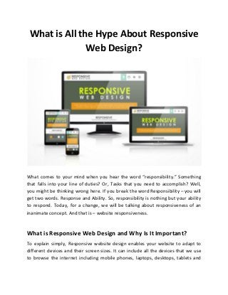
- 1. What is All the Hype About Responsive Web Design? What comes to your mind when you hear the word “responsibility.” Something that falls into your line of duties? Or, Tasks that you need to accomplish? Well, you might be thinking wrong here. If you break the word Responsibility – you will get two words. Response and Ability. So, responsibility is nothing but your ability to respond. Today, for a change, we will be talking about responsiveness of an inanimate concept. And that is – website responsiveness. What is Responsive Web Design and Why Is It Important? To explain simply, Responsive website design enables your website to adapt to different devices and their screen sizes. It can include all the devices that we use to browse the internet including mobile phones, laptops, desktops, tablets and
- 2. more. However, most of the IT firms that provide responsive web design services don’t just go by the responsiveness approach. Rather, they have adapted the “mobile first approach.” The reason being simple. Today, nearly 2.6 billion people use smartphones and by 2020, this figure will reach over 6 billion. If you want people to get an access to your website on their finger tips and want to interact with them on a personal level, you must provide them with a responsive website. So, before you approach a company to provide you with mobile responsive website development services, you must find out certain things. 1. Find out what devices your audiences use to access your website 2. Find out the amount of traffic on desktops vs tablets vs mobiles Also, you should know that every website browser has its own mobile version and displays website differently. And as you need to create website that is responsive on all browsers, you need to get it designed accordingly. Things to Mull Over Before Creating a Responsive Website Design Before you go responsive with your website, you need to think about certain aspects and jot them down. If you are non-technical person, you might not know about it. So, here is some brief on it. a. Website Dimensions It is very important for the responsive website builder to understand that there is nothing like a standard website size. And as there are thousands of devices available in the market, the screen resolutions and sizes change quite often. The purpose of browsing a website depends on the situation. For example, if a user is looking for a tutorial, they might resort to the desktop. And if one is browsing through news, they might prefer to do it on the mobile.
- 3. You can explore Google Analytics to find out which web page size would suit your website and take a decision thereafter. Professionals offering responsive web design services may also be able to help. b. Get At least 3 Layouts Designed It is very important for the responsive website builder to understand that there is nothing like a standard website size. And as there are thousands of devices available in the market, the screen resolutions and sizes change quite often. The purpose of browsing a website depends on the situation. For example, if a user is looking for a tutorial, they might resort to the desktop. And if one is browsing through news, they might prefer to do it on the mobile. For any responsive website design to work properly, it is important for it to have 3 layouts having different browser width. Take a look at some ideal sizes: ● Small: Under 600 px – The way content can be seen on smartphones ● Medium: 600px to 900px – The way content will look on tablets, netbook computers and tablets. ● Large: More than 900px – The way content will look on PCs. These layouts must have similar graphic and text features. However, these should be designed in such a way that the content can be displayed at its best on the devices. It is always advisable to scale down the page to fit small size. Benefits of Responsive Web Design Responsive website design renders advantages to businesses, designers, developers as well as users in the ways given below:
- 4. Fast development as cost-effective rates It takes lesser time to make responsive web designs as compared to making a mobile app. And as we know, time is money. Get in touch with a company that provides mobile responsive website development services at competitive rates. Even if you have to spend more than what you would on creating two websites, it will save your finances spent on configuration, maintenance, and other upgradations. Better Conversion Rates Making your website responsive is not just about lessening the amount of bounce rate. It is about rendering a stable and interactive user experience across all devices. And once you do that, they are sure to keep coming back and bring the other users. If you have a website that looks professional on different platforms, your users will never get frustrated or go to your competitors. Wrapping up We thrive in the world of internet of things and virtual realities. So, the more the variety of devices, the more would be the need to make complex responsive web designs. If you want to meet with the accelerating demands of customers, it’s time you consider hiring a responsive website builder for your website.