Effects of Smartphone Addiction on the Academic Performances of Grades 9 to 1...
Textual analysis
1. Text analysis 1
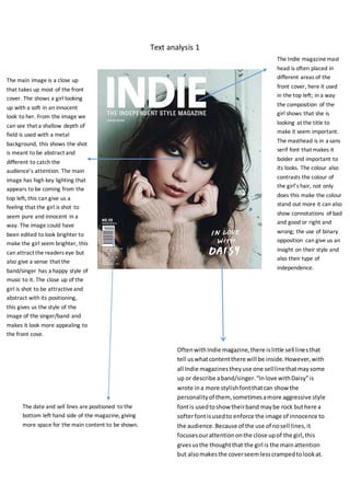
The main image is a close up
that takes up most of the front
cover. The shows a girl looking
up with a soft in an innocent
look to her. From the image we
can see that a shallow depth of
field is used with a metal
background, this shows the shot
is meant to be abstract and
different to catch the
audience’s attention. The main
image has high key lighting that
appears to be coming from the
top left, this can give us a
feeling that the girl is shot to
seem pure and innocent in a
way. The image could have
been edited to look brighter to
make the girl seem brighter, this
can attract the readers eye but
also give a sense that the
band/singer has a happy style of
music to it. The close up of the
girl is shot to be attractiveand
abstract with its positioning,
this gives us the style of the
image of the singer/band and
makes it look more appealing to
the front cove.
The Indie magazinemast
head is often placed in
different areas of the
front cover, here it used
in the top left; in a way
the composition of the
girl shows that she is
looking at the title to
make it seem important.
The masthead is in a sans
serif font that makes it
bolder and important to
its looks. The colour also
contrasts the colour of
the girl’s hair, not only
does this make the colour
stand out more it can also
show connotations of bad
and good or right and
wrong; the use of binary
opposition can give us an
insight on their style and
also their type of
independence.
OftenwithIndie magazine,there islittle sell linesthat
tell uswhatcontentthere will be inside.However,with
all Indie magazinestheyuse one selllinethatmaysome
up or describe aband/singer.“Inlove withDaisy”is
wrote ina more stylishfontthatcan show the
personalityof them, sometimesamore aggressive style
fontis usedtoshow theirband maybe rock buthere a
softerfontisusedto enforce the image of innocence to
the audience.Because of the use of nosell lines,it
focusesourattentiononthe close upof the girl,this
givesusthe thoughtthat the girl is the mainattention
but alsomakesthe coverseemlesscrampedtolookat.
The date and sell lines are positioned to the
bottom left hand side of the magazine, giving
more space for the main content to be shown.
2. Withinthe contentspage there conventionallyisamain
image that focusesonthe maincontent. However, inanIndie
magazine itfocusesonmany contents,eachof themhave
theirownpersonalitybackingupthatconventionof havinga
differentpersonalityinthe indie genre.Eachimage bringsthe
readerseyestothem, thiscan make the readerexamine the
entire page makingthemwanttoread what’s on it.
Advertsare placedinan Indie
magazine topromote newmusicor
festivalsof indiebands.The use of a
coloredbackground witha colored
fontmakesit standout fromthe rest
of the magazine;thisisoftento
showsthe businessesstyle intheir
advertisement.
The title of the contentspage doesnot use the ‘Indie’title of the magazine toputonitscontentpage,theirfontalsois
changedwithdifferentcolorsandspacing. The placementshowsthe styleof the magazine asitsticksout makingthe page
seemmore vivid.
The use of color
withinthe contents
page is simple but
attractive to the eye.
Havingdifferent
colorson the page
makesitseemmore
vividandhave life.
Indie music
producersare very
passionate about
musicexpressingit
throughthis
intriguingstyle,the
colorsenhance their
passionasit givesit
life.
1.
3. The main image takesupthe top of the magazine andvariesfromstudiobackgroundsto
shootsof her singing.There isatwo usesof shots,close upsand mediumshots.Having
variationshowsdifferentexperiencesof the singer,showingof heremotionandstyle that
makesherdifferent.Editingthe imagestobe blackandwhite helpsthe colorscheme andcan
givesusconnotationof mystery,thiscaninvoke the readertobe involvedwiththe textmore
as theywantto knowwhat itis about.Furthermore,the colorscheme isveryformal buthas
style through itsimagesandtext,thiscan give usthe impressionthatthe singerisdynamicor
a powerful female figure.
The layout of the images is in different shapes and at different angles, this is not regular to other magazinelayouts
making this look alternative and have personality; this adds further detail to the conventions of the indie genre. Having
the layout of putting the images at the top indicates to us that she is the main focus of the article. Furthermore, the
placement of her eye level is higher up giving us the indication that she is a strong female character.
The double page spread gives us more text than image. Next to the main image we see pull quotes that are in a large
white font with a black background, this makes the quote stand out from the rest of the magazinegrabbing our
attention to read it. A pull quote can be something important from the main person that will often link in with the
article, this gets us to grasp the main person’s personality that helps us link with the article. The layout of the article
columns them self arevery formal; they have a standard form to them as they arelaid out in a structured way with no
back imageor font change. This can show that the singer is very passionate about her work as it is laid out to be formal
that represents her professionalism in music.
The columns use the
same black text with
out to give the page
some continuity
without. The only
different font is the
title to show the
individuality of the
singer
The title is writing in the
style of the singer “Lykkel
li” which can show her
identity. Having the font
larger draws the reader’s
attention so that they know
what the article is about.
The font has its own style
and the second part is cut
off, editing it like this can
make it seem more edgy or
alternative like the genre.
4. The “Fader” magazine
oftenhasa studiosetting
makingthe mainimage
important,butcan also
add a colourto connote
the singersstyle.Highkey
lightingisused to
symbolise alighterfeel to
the cover whichisfurther
enhancedbythe yellow
givingusconnotationsof
joyor happiness.Editing
may have beenusedto
bringout more colours in
herclotheswhichmay
have beendone tomake
the cover seemeye
catching.Overall,the
coloursshow the happy
feel tosinger“Solange”,
thismay alsohave been
usedas Faderis a hiphop
indie magazine;thistype
of indie genre expresses
theirself through
explosive expression
throughdancingand
singer,the lighterfeel
helpsus understandthis
further.
The Fader mastheadis alwaysplacedatthe top symbolisingit’simportance to
the reader.The firstletterof the mast of a Fadermagazine isalwayswitha
back groundborderwitha colourthat matchesthe mainimage.Here,the
mediumshotof the girl showsthat she iswearingblue asa prime colourthat
linkswiththe Fadertitle;this showsthe involvementof the magazine withthe
singeraddingtopassionthatindie musicdevelopershave andtheirpassion.
The mediumshotof the girl hasbeenpositionedtomake itlook
like she islookingatthe Fadermast head,thismakesitthe centre
of attentionaswe notonlyget a prime colourto grab our
attention,butthe maincontentseyeslookingupatit. To further
add to this,the woman’seyesare positionedhighertomake her
have a strong authorityonthe page addingstrongermeaningto
herlookingupat the Fadermasthead.
The “spring style”Springstyle is used as a sell lineon the front cover or an anchorage. The
anchoragehelps bringmeaning to the image for the audienceto understand.
“Spring style” can symbolizea new beginning or the fashion term for spring
clothes,this can connote that the magazineis fresh and joyful fromits meaning
of Spring.
The issue date
allowsthe reader
to keepwhat
magazine they
are on.
The main coverline isusedtoadvertise
the singer“Solange”.The textisthe
secondlargestfontandis white,the
white colorcontraststhe background
colors therefore makingitstandoutto
the audience.
5. The covers contents are
kepton one page with
the same colour
scheme.Fader’s
contentsare much
smallerbutcontainlots
of detail ontheir
subject;thismakesthe
page lookmore
simplisticwithitsimage.
The contentsare labeled
withnumbersandblend
intothe natural cover of
the page usingthe same
text.
Fader’scontentspages
alwaysuse a simplistic
but dynamicstyle.The
use of the blackand
white colourscheme
give the page a sense of
continuityasitkeptup
throughoutthe page.
To add to this,the
colourshame makesus
intriguedasitlooks
dynamicgivingusthe
sense of
professionalism.The
coloursthemselvesgive
us connotationof
mystery,italsomakes
the dressesfeel
overpoweringtolookat
makingthe twowomen
seemstrong.Overall,
the abstract style of
simplicitygivesus
furtherdetail of the
indie genre,asthey
have theirindividual
image to them.
The main image isa longshotthat showstwo womenposing
throughthe expressionof joy.The image takesthe wholetoppart
of the coverup leavinglittle roomfor text;thisdrawsourattention
to it makingitimportant tothe audience.
The issue number is printed on the contents page with an
edgy font, this can further show the personality of the
magazine/
The contents are broken up using a grid like lines, the
lines divide the contents up making us focus on text that
is wrote in between; editing the contents like this make
them seem important as we drawn to them.
The date and issue are put
on the contents in a different
font to add alternativeness
to the cover.
6.
7. A drop cap is used to bring attention to the article
itself.
The rule of thirds is used so that the attention is drawn to them more
rather than the main image. This is supported by the drop cap which
helps the reader find the start of the article. The text is written in a
white colour to make it stand out from the rest of the back ground, this
makes it more individual from the rest of the page.
The pull quote is in a bigger sans serif font; the
positioning is the centre of the page to symbolise
its importance. The two colours can connote it has
two different meanings to the text, this gives it an
alternative view like the indie genre
The main image is a medium shot showing
us his clothes and props used. From the
image we can see that his eye level is high
giving him the sense of authority or
power, this is backed up from the
connotations of black making him seem
mysterious to the audience; black clothing
can be seen as overpowering making him
look like the centre of attention. The
headphone prop show that he is invested
into his musical career.
The high key lighting is used on the right hand side of his face so that half of it is not
visible. High key lighting is used here to reveal only one side of his face, this gives us a
feeling of mystery whilst looking dynamic. To add to this, the image of the man is placed
on the right hand side of the screen, using the rule of thirds we can see that he may be
perceived to be edgy as he is portraying himself as the antagonist.
The background location looks like a studio;
the studio looks less expensive than other
professional shoots. This gives us the
impression that the producers are indie as it
can show the main person is a rising singer,
this links in with the indie genre as its about
being new.
8. The Mojo mast head is
always aligned center
top; this is showing
that it is the most
important bringing the
audiences eyes to the
product. The font of
Mojo is always the
same sans serif text;
this makes it always
recognisable. Most
magazinemast head
colours are white, the
colour stands out from
most colours making it
get the audience’s
attention, white can
give us imagery of
being modern and
stylish and this is used
to show the style of the
magazine. The slight
drop shadow makes it
seem the mast head is
3D; this makes it
standout more from
the rest of the text
The sell lines arelocated near the title; this not only shows your attention to the titlebut
the sell lines them self. Editing the sell lines to be positioned like this makes it so that the
user knows what they are getting from the magazine straight away. To further advertise
what the sell lines are, the pink colour highlights the key features inside the articles
inside.
The Mojo mast head is
always aligned center
top; this is showing
that it is the most
important bringing the
audiences eyes to the
product. The font of
Mojo is always the
same sans serif text;
this makes it always
recognisable. Most
magazinemast head
colours are white, the
colour stands out from
most colours making it
get the audience’s
attention, white can
give us imagery of
being modern and
stylish and this is used
to show the style of the
magazine. The slight
drop shadow makes it
seem the mast head is
3D; this makes it
standout more from
the rest of the text
The medium shot shows all the band members
together, this links into the main cover line. The
image may have been edited to seem grainier with
the use of the noise of the image, this also links in
with the location used as it seems run down with
graffiti.
The location itself links in with the band. The punk
genre of The Smiths originates from a working
class background; this image is backed up from the
location giving us a sense of the band’s
personality.
The sell lines arelocated near the title; this not only shows your attention to the titlebut
the sell lines them self. Editing the sell lines to be positioned like this makes it so that the
user knows what they are getting from the magazine straight away. To further advertise
what the sell lines are, the pink colour highlights the key features inside the articles
inside.
Throughout the page
different fonts areused to
illustrate the variety in the
magazine’scontents. All of
the fonts but one is sans
serif which makes them
synchronous, that allows for
continuity on the page.
Furthermore, this adds to
the style of the indie genre
as it seems individual.
The main cover line and
the mast head are both
similar in size and colour
which means they are
equally as important. The
sell line that uses the
word ‘plus ‘is in the same
colour and a bigger size
from the rest of the other
sell lines, this makes you
feel you are getting more
from the magazine’s
value.
The barcode shows
the date of the issue
and the price.
9. The main image used is
at a head shot at a high
angle of a man directly
looking up at us giving
the feeling that we are
involved with the
magazineas it creates
intimacy between the
image and the reader.
The vibrant red outfit contrasts to the light background making
him stand out as all of the attention is drawn towards him.
This makes him look abstract and individual from the magazine
focusing on the common convention of the indie genre to
stand out.
The issue number shows
the reader what magazine
they have, it can also show
how successful it is as its
gone on for 193 magazines.
They have used a pull
quote in a larger point
size and serif font,
different to the other
fonts, to make it stand
out from the rest of the
information on the
page. The pull quote is
also black, which is the
same as the other
headings for pages. This
technique makes this
information stand out
so that the reader will
be enticed to see why
it’s so different.
Mojo have made
the cover story
isolated from the
rest of the
information on the
page by creating a
gold border. Also
they have included
a largeamount of
information below
the title to make
the story appear
more important
than anything else
by making it seem
as though there’s a
lot of interesting
information to be
read.
The colours used throughout the page (except from the image) are gold and black. This simple colour palettereflects
a convention of indie of being minimalistic. Both black and gold stand out from each other and the rest of the page,
allowing for the information to be read and organised clearly. The gold colour gives us connotations of treasures and
something valuable, this can show the contents arespecial to give more value on the magazine.
The title is centralized the same way as the front cover, but instead uses black as its colour to fit with
the colour scheme used on this page. Underneath the Mojo main title, it includes three locations, two
of which aren’t as popularly known as the first one; London. This makes the magazineseem as though
it has a very wide and abstract audience which links to the concept of indie being unique.
10. A drop cap has been used at the start of the article to
draw the reader’s attention to where they should
start reading. It’s been placed on a block turquoise
background to stand out from the rest of the article.
Also, there are only two other places where this
colour has been used, meaning that the reader will
pick them out quickly as different so they will be
drawn towards the information that’s presented
near it.
The image of the artist is shown with a typical
‘rock star’ look with the shades, cigaretteand
musical equipment surrounding him. However, his
clothing like his striped trousers show that he
doesn’t fully want to look like he’s rock and roll,
so he’s created his own individual identity.
Also, he’s been positioned on the right hand side
which is typically where the antagonist would be
placed. This portrays his personality as being edgy
and dangerous, which links to the violent title and
hostile pull quote.
The page number
has been used so
that the reader can
orientate
themselves and
find the articles
they want.
The title of the article is also a pull quote that
takes up half of the page. This is done so that
the reader is left in suspense of what the
context of the pull quote is to entice them to
read on.
Credit to the photographer has
been given in the bottom right so
that if anyone is particularly
interested they can find out.
The colour of the imagehas been edited with a slightly
red tint. The connotations of red can be anger and pain,
which related to the article itself so that the entire double
page creates at atmosphere that will link to what it’s
about.
The sub image used
is in a frame and
positioned on an
angle. This gives us a
sense of it being
abstract and stylish,
it also brings our
attention to it as it
the only
monochrome image.