
Recommended
More Related Content
Recently uploaded
Recently uploaded (20)
Featured
Featured (20)
Economist Review
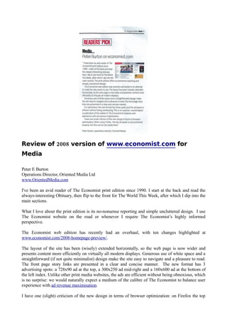
- 1. Review of 2008 version of www.economist.com for Media Peter E Burton Operations Director, Oriented Media Ltd www.OrientedMedia.com I've been an avid reader of The Economist print edition since 1990. I start at the back and read the always-interesting Obituary, then flip to the front for The World This Week, after which I dip into the main sections. What I love about the print edition is its no-nonsense reporting and simple uncluttered design. I use The Economist website on the road or whenever I require The Economist’s highly informed perspective. The Economist web edition has recently had an overhaul, with ten changes highlighted at www.economist.com/2008-homepage-preview/. The layout of the site has been (wisely) extended horizontally, so the web page is now wider and presents content more efficiently on virtually all modern displays. Generous use of white space and a straightforward (if not quite minimalist) design make the site easy to navigate and a pleasure to read. The front page story links are presented in a clear and concise manner. The new format has 3 advertising spots: a 728x90 ad at the top, a 300x250 ad mid-right and a 160x600 ad at the bottom of the left index. Unlike other print media websites, the ads are efficient without being obnoxious, which is no surprise: we would naturally expect a medium of the calibre of The Economist to balance user experience with ad revenue maximisation. I have one (slight) criticism of the new design in terms of browser optimization: on Firefox the top
- 2. 728x90 ad space is not positioned properly (see image), but that is very easily fixed. Old look courtesy of the Wayback Machine New look l 2008 The Economist.com under IE 2008 The Economist.com under Firefox