SlideShare a Scribd company logo
1 of 77
Download to read offline
Red 
Alert 
Communica)ng status through 
great UX, graphics and 
accessibility 
Lisa Ba<le 
Jennifer Chaffee 
Marguerite Bergel
USER 
EXPERIENCE 
& 
USABILITY 
Understand user needs and 
tasks. Design applica)ons 
that work the way people 
expect them to. 
Red 
Alert! 
| 
UXPA 
Conference 
July 
2 
2014 
| 
London 
USER 
EXPERIENCE 
& 
GRAPHIC 
DESIGN 
Unifying graphics and an 
idea, which is placed in 
context to solve a problem. 
Visual and conceptual 
problem solving. 
USER 
EXPERIENCE 
& 
ACCESSIBILITY 
Address accessibility in ways 
that improve the experience 
for all users – no ma<er their 
age, technology or ability. 
Lisa 
Ba?le 
Marguerite 
Bergel 
Jennifer 
Chaffee
Red 
Alert! 
| 
UXPA 
Conference 
July 
3 
2014 
| 
London 
Photo 
bkg 
Text 
in 
a 
paragraph 
format 
goes 
here. 
Smaller 
text 
goes 
below 
if 
necessary. 
This 
is 
more 
detail. 
WAYFINDING 
is 
the 
art 
of 
using 
landmarks, 
signage, 
pathways 
and 
other 
cues 
to 
help 
people 
navigate 
and 
understand 
where 
they 
are.
Red 
Alert! 
| 
UXPA 
Conference 
July 
4 
2014 
| 
London 
Photo 
bkg 
Text 
in 
a 
paragraph 
format 
goes 
here. 
Smaller 
text 
goes 
below 
if 
necessary. 
This 
is 
more 
detail. 
SIGNPOSTING 
helps 
people 
find 
their 
desired 
path 
in 
a 
complex 
and 
unfamiliar 
space. 
.
LANDMARKS 
help 
people 
orient 
themselves 
and 
create 
MENTAL 
MODELS 
Red 
Alert! 
| 
UXPA 
Conference 
July 
5 
2014 
| 
London 
Photo 
bkg 
Text 
in 
a 
paragraph 
format 
goes 
here. 
Smaller 
text 
goes 
below 
if 
necessary. 
This 
is 
more 
detail. 
of 
a 
space.
Red 
Alert! 
| 
UXPA 
Conference 
July 
6 
2014 
| 
London 
Photo 
bkg 
Text 
in 
a 
paragraph 
format 
goes 
here. 
Smaller 
text 
goes 
below 
if 
necessary. 
This 
is 
more 
detail. 
Signage 
provides 
important 
STATUS 
INFORMATION, 
lePng 
people 
know 
when 
there 
is 
a 
problem, 
and 
how 
to 
get 
around 
it.
Red 
Alert! 
| 
UXPA 
Conference 
July 
7 
2014 
| 
London 
Photo 
bkg 
Text 
in 
a 
paragraph 
format 
goes 
here. 
Smaller 
text 
goes 
below 
if 
necessary. 
This 
is 
more 
detail. 
Some 
signs 
provide 
TIMELY, 
dynamically 
changing 
informaQon 
to 
let 
people 
know 
what 
is 
happening 
and 
what 
to 
expect.
SignposSng 
is 
leWng 
the 
user 
know… 
Red 
Alert! 
| 
UXPA 
Conference 
July 
8 
2014 
| 
London 
How 
do 
I 
get 
back? 
What’s 
going 
on 
now? 
What’s 
most 
important? 
What 
do 
I 
need 
to 
do? 
Is 
there 
a 
problem? 
Where 
am 
I?
Red 
Alert! 
| 
UXPA 
Conference 
July 
9 
2014 
| 
London 
GRAPHIC 
ACCESSIBILITY 
DESIGN 
USABILITY 
/ 
HUMAN 
FACTORS 
= 
great 
user 
experience
Red 
Alert! 
| 
UXPA 
Conference 
July 
10 
2014 
| 
London 
USABILITY/ 
HUMAN 
FACTORS 
PRINCIPLES 
Who 
is 
the 
user? 
What 
is 
their 
task 
and 
context? 
• Get the user’s a<en)on. 
• Avoid interrup)ng the task 
(unless it’s truly urgent). 
• Convey priority, urgency, 
next steps. 
• Provide cues that are 
appropriate to the user, 
task and context.
CONTRAST 
The degree of of difference between 
elements in color, value and size, or shape 
ALIGNMENT 
The arrangement of elements in a line 
that visually connects them 
Red 
Alert! 
| 
UXPA 
Conference 
July 
11 
2014 
| 
London 
REPETITION 
The ac)on of repea)ng, forming a 
pa<ern or style crea)ng consistency. 
BALANCE 
The arrangement of elements crea)ng 
symmetry or asymmetry 
PROXIMITY 
The distance between elements, that 
connects or disconnects them 
WHITE SPACE 
The space between elements that gives 
them breathing room 
GRAPHIC 
DESIGN 
PRINCIPLES 
The principles of 
design suggest how 
a designer can best 
arrange the various 
components of a 
page layout in 
connec)on to the 
overall design and 
to each other.
SHAPES 
A form or configura)on. Shapes are 
any type of form or configura)on, 
abstract or literal such as a bullet or an 
icon, a box or a circle, etc. Shapes are 
o[en used to draw a<en)on. 
Red 
Alert! 
| 
UXPA 
Conference 
July 
1122 
22001144 
|| 
LLoonnddoonn 
GRAPHIC 
DESIGN 
ELEMENTS 
The elements of 
design are the 
building blocks for 
design. 
These design 
principles and 
elements play an 
important role in 
communica)ng 
status to users. 
LINE 
A mark between two points. Lines can be 
used to connect or separate elements, 
highlight or isolate elements. 
MASS 
A grouping of elements within a space. 
Mass determines amount large or 
small, can include body copy, or areas 
of color, grouping of items areas or 
regions. 
TEXTURE 
The surface of an object can have various 
types of texture crea)ng visual interest to 
draw a<en)on to an area or create a 
mood. 
COLOR 
Color is used to add appeal and draw 
a<en)on, to symbolize, evoke a feeling or 
create a mood.
Red 
Alert! 
| 
UXPA 
Conference 
July 
13 
2014 
| 
London 
ACCESSIBILITY 
PRINCIPLES 
Add text equivalents 
• For all that isn’t text. 
• Don’t rely on images or styles 
alone. 
Support all input 
methods 
• Keyboard, touch, speech 
• Make content order logical. 
Use proper seman)c 
structure 
• Makes naviga)ng easier 
• Communicates what each item 
is, and its state. 
Give users control Don’t: 
• Override pinch-­‐zoom. 
• Hard code fonts. 
• Require )med responses that 
users can’t extend. 
Red 
Alert! 
| 
UXPA 
Conference 
July 
2014 
| 
London
Pa_erns 
for 
CommunicaSng 
Status 
NoQficaQons 
1 
Red 
Alert! 
| 
UXPA 
Conference 
July 
14 
and 
Alerts 
2014 
| 
London 
Work 
Item 
2 
Lists 
Progress 
3 
Indicators 
Criteria 
4 
Selected 
Error 
5 
Messages 
Dashboards 
6 
Maps 
7
A 
noQficaQon 
or 
alert 
lets 
the 
user 
know 
about 
a 
potenQal 
problem, 
incoming 
request, 
status 
change, 
or 
reminder. 
Red 
Alert! 
| 
UXPA 
Conference 
July 
15 
NoSficaSons 
and 
Alerts 
2014 
| 
London
NoQficaQons 
and 
Alerts 
Red 
Alert! 
| 
UXPA 
Conference 
July 
16 
2014 
| 
London 
EXAMPLE 
1
NoQficaQons 
and 
Alerts 
Red 
Alert! 
| 
UXPA 
Conference 
July 
17 
2014 
| 
London 
EXAMPLE 
2 
Mobile 
example
NoQficaQons 
and 
Alerts 
Red 
Alert! 
| 
UXPA 
Conference 
July 
18 
2014 
| 
London 
DESIGN 
APPROACH 
Make 
it 
easy 
to 
drill 
down 
to 
addiQonal 
informaQon 
and 
relevant 
acQons. 
Get 
back 
to 
alerts 
even 
if 
you’ve 
read 
them 
before. 
Dismiss 
alerts 
when 
done. 
Allow 
alerts 
to 
decay 
gracefully.
NoQficaQons 
and 
Alerts 
Red 
Alert! 
| 
UXPA 
Conference 
July 
19 
2014 
| 
London 
DESIGN 
APPROACH 
Color 
used 
for 
contrast 
to 
draw 
the 
eye 
to 
informaQon 
Simple 
shapes 
and 
icons 
draw 
low 
key 
a?enQon
NoQficaQons 
and 
Alerts 
Red 
Alert! 
| 
UXPA 
Conference 
July 
20 
2014 
| 
London 
DESIGN 
APPROACH 
How 
does 
a 
user 
get 
there? 
• They’re 
already 
at 
top 
of 
page 
• Placing 
a 
(hidden) 
heading 
just 
before 
• ARIA 
landmarks 
• Can 
Ctrl+F 
and 
search 
alt 
text 
(alt=“Alerts”) 
Need 
text 
equivalents? 
Usually, 
the 
number 
is 
actually 
text. 
So 
nothing 
else 
needed.
NoQficaQons 
and 
Alerts 
Red 
Alert! 
| 
UXPA 
Conference 
July 
21 
2014 
| 
London 
DESIGN 
APPROACH 
Ensure 
adequate 
contrast 
via 
colour 
contrast 
analyser 
For 
PC 
& 
Mac 
Scores 
vs 
WCAG 
2.0 
Then 
use 
Webaim.org’s 
contrast 
checker
NoQficaQons 
and 
Alerts 
Red 
Alert! 
| 
UXPA 
Conference 
July 
22 
2014 
| 
London 
DESIGN 
APPROACH 
How 
does 
a 
user 
get 
there? 
• Ensure 
focus 
shihs 
into 
/ 
out 
of 
dialogs 
• When 
dialog 
closes, 
return 
focus 
to 
‘point 
of 
origin' 
If 
a 
Smed 
response 
is 
required, 
warn 
users 
and 
let 
them 
extend.
Pa_erns 
for 
CommunicaSng 
Status 
Red 
Alert! 
| 
UXPA 
Conference 
July 
23 
2014 
| 
London 
Work 
Item 
2 
Lists 
Progress 
3 
Indicators 
Criteria 
4 
Selected 
Error 
5 
Messages 
Dashboards 
6 
Maps 
7 
NoQficaQons 
1 
and 
Alerts
Knowing 
which 
tasks 
are 
assigned 
to 
you, 
the 
type 
of 
tasks, 
when 
they 
are 
due, 
and 
which 
are 
most 
important, 
helps 
you 
be 
producQve. 
Red 
Alert! 
| 
UXPA 
Conference 
July 
24 
Work 
Item 
Lists 
2014 
| 
London
Red 
Alert! 
| 
UXPA 
Conference 
July 
25 
2014 
| 
London 
Work 
Item 
Lists 
EXAMPLE 
1 
Learning 
management 
system 
The 
user 
sees 
a 
list 
of 
their 
upcoming 
training 
when 
they 
log 
in, 
along 
with 
due 
dates.
Red 
Alert! 
| 
UXPA 
Conference 
July 
26 
2014 
| 
London 
Work 
Item 
Lists 
EXAMPLE 
2 
Call 
Center 
app 
Stars 
represent 
3 
different 
states: 
new 
case 
(blue), 
same 
account 
(orange), 
different 
social 
security 
number 
(green). 
Are 
toolQps 
enough?
Red 
Alert! 
| 
UXPA 
Conference 
July 
27 
2014 
| 
London 
Work 
Item 
Lists 
EXAMPLE 
3 
Mobile 
example 
To 
do 
list 
app 
The 
user 
configures 
their 
own 
color 
coding 
and 
categories; 
redundant 
cues 
are 
used.
Red 
Alert! 
| 
UXPA 
Conference 
July 
28 
2014 
| 
London 
Work 
Item 
Lists 
DESIGN 
APPROACH 
Is 
it 
something 
I 
really 
have 
to 
do? 
Or 
just 
something 
I 
could 
do? 
When 
is 
it 
due? 
(but 
don’t 
stress 
me 
out!) 
Type 
of 
task 
Read/unread 
A 
change 
in 
the 
item 
since 
I 
last 
saw 
it 
(e.g. 
new 
documents 
have 
come 
in, 
the 
customer 
called) 
AcQons 
I 
can 
take 
on 
the 
item
Red 
Alert! 
| 
UXPA 
Conference 
July 
29 
2014 
| 
London 
Work 
Item 
Lists 
DESIGN 
APPROACH 
Color 
used 
sparingly, 
in 
the 
icon, 
draws 
a?enQon 
to 
specific 
areas. 
Icons 
represenQng 
status 
use 
different 
shape 
and 
color.
Shape, 
color 
and 
repeQQve 
pa?ern 
Red 
Alert! 
| 
UXPA 
Conference 
July 
30 
2014 
| 
London 
Work 
Item 
Lists 
DESIGN 
APPROACH 
Shape 
and 
color 
Shape, 
color 
and 
repeQQve 
pa?ern 
The table on the le[ shows what the client 
was using using to indicate alarms. Varia)ons 
of colored ellipse shapes with a line inside 
the ellipse, angled in different posi)ons. 
The table on the right shows alarms as bells. 
The level of alarm cri)cality is indicated by 
the number of bells. Color is used for only 
the bells that are more important.
Red 
Alert! 
| 
UXPA 
Conference 
July 
31 
2014 
| 
London 
Work 
Item 
Lists 
DESIGN 
APPROACH 
Vet 
colors 
via 
color 
blindness 
filters 
• Convert 
to 
RGB 
color 
mode 
for 
accuracy 
• View 
> 
Proof 
Setup 
> 
Color 
Blindness 
Deuteronopia 
trouble seeing green 
Protaonopia 
trouble seeing reds 
Photoshop Proof Colors
Pa_erns 
for 
CommunicaSng 
Status 
NoQficaQons 
1 
Red 
Alert! 
| 
UXPA 
Conference 
July 
32 
and 
Alerts 
2014 
| 
London 
Work 
Item 
2 
Lists 
Progress 
3 
Indicators 
Criteria 
4 
Selected 
Error 
5 
Messages 
Dashboards 
6 
Maps 
7
In 
a 
mulQ-­‐step 
task, 
let 
the 
users 
know 
which 
steps 
have 
been 
completed 
and 
which 
remain, 
or 
how 
close 
they 
are 
to 
compleQon. 
Red 
Alert! 
| 
UXPA 
Conference 
July 
33 
Progress 
Indicators 
2014 
| 
London
Progress 
Indicator 
Red 
Alert! 
| 
UXPA 
Conference 
July 
34 
EXAMPLE 
1 
2014 
| 
London 
A 
linear 
process
Red 
Alert! 
| 
UXPA 
Conference 
July 
35 
2014 
| 
London 
A 
non-­‐linear 
process 
Progress 
Indicator 
EXAMPLE 
2
Progress 
Indicator 
Red 
Alert! 
| 
UXPA 
Conference 
July 
36 
EXAMPLE 
3 
2014 
| 
London 
A 
user-­‐iniQated 
process 
running 
in 
the 
background
Progress 
Indicator 
In 
a 
linear 
process: 
Number 
of 
steps 
Current 
step 
Whether 
or 
not 
step 
is 
done 
Navigate 
back 
to 
previously 
visited 
step 
CondiQonal 
steps 
In 
a 
non-­‐linear 
one: 
Indicate 
degree 
of 
compleQon 
Navigate 
to 
any 
available 
step 
(skip 
around) 
Indicate 
things 
that 
are 
required, 
or 
that 
have 
a 
higher 
value 
In 
an 
automated 
process: 
Indicate 
degree 
of 
compleQon 
Provide 
the 
outcome 
of 
each 
step 
Show 
if 
a 
problem 
occurred 
Red 
Alert! 
| 
UXPA 
Conference 
July 
37 
DESIGN 
APPROACH 
2014 
| 
London
Progress 
Indicator 
Red 
Alert! 
| 
UXPA 
Conference 
July 
38 
DESIGN 
APPROACH 
2014 
| 
London 
Contrast: 
Bold 
or 
higher 
contrasQng 
font 
used 
to 
draw 
a?enQon 
to 
a 
specific 
locaQon 
RepeSSon: 
repeaQng 
of 
a 
symbol 
in 
a 
conQnuous 
sequence 
suggests 
a 
sequence 
or 
path. 
Symbol 
or 
shape: 
The 
current 
step 
has 
a 
unique 
look 
to 
draw 
a?enQon 
to 
it.
Progress 
Indicator 
Red 
Alert! 
| 
UXPA 
Conference 
July 
39 
DESIGN 
APPROACH 
2014 
| 
London 
OpQons: 
• Adding 
inline 
images 
for 
addiQon 
of 
alt 
text. 
Alt 
displays 
for 
sighted 
users 
if 
images 
fail 
to 
load. 
• Off-­‐screen 
text 
works 
but 
doesn’t 
do 
the 
above. 
Harder 
to 
maintain. 
• Aria-­‐label 
and 
aria-­‐labelledby 
also 
work, 
but 
sQll 
not 
as 
broadly 
supported. 
• Re-­‐emphasize 
context 
by 
repeaQng 
the 
step 
name 
in 
the 
<h1>, 
if 
possible.
Pa_erns 
for 
CommunicaSng 
Status 
Red 
Alert! 
| 
UXPA 
Conference 
July 
40 
2014 
| 
London 
Criteria 
4 
Selected 
Error 
5 
Messages 
NoQficaQons 
1 
and 
Alerts 
Work 
Item 
2 
Lists 
Progress 
3 
Indicators 
Dashboards 
6 
Maps 
7
When 
filtering 
large 
data 
sets, 
let 
users 
see 
the 
criteria 
they 
have 
chosen 
and 
modify 
their 
selecQons. 
Red 
Alert! 
| 
UXPA 
Conference 
July 
41 
Criteria 
Selected 
2014 
| 
London
Criteria 
Selected 
Red 
Alert! 
| 
UXPA 
Conference 
July 
42 
EXAMPLE 
1 
2014 
| 
London
Criteria 
Selected 
Red 
Alert! 
| 
UXPA 
Conference 
July 
43 
EXAMPLE 
2 
2014 
| 
London
Criteria 
Selected 
Users 
choose 
criteria 
they 
want 
(green) 
and 
criteria 
to 
Red 
Alert! 
| 
UXPA 
Conference 
July 
44 
EXAMPLE 
3 
2014 
| 
London 
exclude 
(red). 
Reds 
+ 
greens 
are 
mixed 
together, 
possibly 
making 
it 
harder 
to 
parse 
than 
if 
they 
were 
grouped. 
Color 
is 
the 
sole 
differenQator. 
Adding 
labels 
before 
each 
grouping 
may 
help 
make 
this 
more 
scannable 
for 
all.
Criteria 
Selected 
Indicate 
if 
a 
list 
is 
filtered 
Provide 
easy 
way 
to 
turn 
selecQons 
on 
and 
off 
Red 
Alert! 
| 
UXPA 
Conference 
July 
45 
DESIGN 
APPROACH 
2014 
| 
London 
Summarize 
selected 
criteria 
Allow 
user 
to 
reset 
filters
Criteria 
Selected 
SemanSc 
structure 
ARIA 
Live 
Regions 
(HTML5) 
causes 
updates 
to 
be 
read 
aher 
user 
stops 
their 
current 
task. 
Keyboard/all 
inputs 
Links 
are 
naQvely 
focusable. 
Text 
equivalents 
Alt 
for 
[x] 
image 
tells 
the 
user 
what 
clicking 
each 
link 
does. 
Red 
Alert! 
| 
UXPA 
Conference 
July 
46 
DESIGN 
APPROACH 
2014 
| 
London
Pa_erns 
for 
CommunicaSng 
Status 
NoQficaQons 
1 
Red 
Alert! 
| 
UXPA 
Conference 
July 
47 
and 
Alerts 
2014 
| 
London 
Work 
Item 
2 
Lists 
Progress 
3 
Indicators 
Criteria 
4 
Selected 
Error 
5 
Messages 
Dashboards 
6 
Maps 
7
Systems 
provide 
error 
messages 
to 
let 
the 
user 
know 
when 
a 
problem 
occurs 
in 
compleQng 
a 
task. 
Red 
Alert! 
| 
UXPA 
Conference 
July 
48 
Error 
Messages 
2014 
| 
London
Red 
Alert! 
| 
UXPA 
Conference 
July 
49 
2014 
| 
London 
Error 
Messages 
EXAMPLE 
1 
Field 
level 
error 
messages
Red 
Alert! 
| 
UXPA 
Conference 
July 
50 
2014 
| 
London 
Error 
Messages 
EXAMPLE 
1 
Page 
level 
error 
messages. 
This 
example 
has 
an 
intrapage 
link 
in 
the 
page-­‐level 
error 
that 
navigates 
to 
the 
error. 
Good 
for 
everyone.
Red 
Alert! 
| 
UXPA 
Conference 
July 
51 
2014 
| 
London 
Error 
Messages 
EXAMPLE 
2 
System 
error 
messages
Red 
Alert! 
| 
UXPA 
Conference 
July 
52 
2014 
| 
London 
Error 
Messages 
DESIGN 
APPROACH 
Use 
plain 
language, 
clarify 
what 
is 
wrong 
and 
what 
the 
user 
can 
do 
to 
fix 
it 
(the 
example 
below 
does 
not).
Red 
Alert! 
| 
UXPA 
Conference 
July 
53 
2014 
| 
London 
Error 
Messages 
DESIGN 
APPROACH 
Provide 
immediate 
feedback 
for 
field-­‐level 
issues 
when 
possible
Red 
Alert! 
| 
UXPA 
Conference 
July 
54 
2014 
| 
London 
Error 
Messages 
DESIGN 
APPROACH 
Use 
icon 
and 
color 
to 
convey 
criQcality 
& 
differenQate 
errors 
from 
other 
types 
of 
messages. 
This 
‘error’ 
doesn’t 
tell 
you 
how 
to 
fix 
things. 
You 
can 
also 
simply 
dismiss 
it.
Red 
Alert! 
| 
UXPA 
Conference 
July 
55 
2014 
| 
London 
Error 
Messages 
DESIGN 
APPROACH 
RecommendaSons 
This 
example 
uses 
CSS 
changes 
to 
show/hide 
checkmarks 
(class=“icon-­‐ 
small-­‐Qck-­‐pass”). 
But 
screen 
readers 
can’t 
“see” 
styles. 
So 
blind 
users 
will 
only 
hear 
the 
text 
(‘8 
to 
32 
characters’) 
with 
no 
sense 
for 
whether 
their 
password 
has 
met 
this 
criteria 
or 
not 
DON’T 
use 
CSS 
to 
show/hide 
errors. 
Instead, 
inject 
errors 
into 
page. 
Reason: 
users 
who 
use 
their 
own 
CSS 
or 
disable 
it, 
will 
see 
all 
errors 
at 
once 
on 
screen.
Pa_erns 
for 
CommunicaSng 
Status 
NoQficaQons 
1 
and 
Alerts 
Dashboards 
6 
Red 
Alert! 
| 
UXPA 
Conference 
July 
56 
2014 
| 
London 
Work 
Item 
2 
Lists 
Progress 
3 
Indicators 
Criteria 
4 
Selected 
Maps 
7 
Error 
5 
Messages
Dashboards 
& 
Monitoring 
Dashboards 
ohen 
summarize 
a 
great 
deal 
of 
informaQon 
about 
status 
and 
trends 
at 
a 
glance. 
Red 
Alert! 
| 
UXPA 
Conference 
July 
57 
2014 
| 
London
Red 
Alert! 
| 
UXPA 
Conference 
July 
58 
2014 
| 
London 
Dashboards 
EXAMPLE 
1 
Logo
Red 
Alert! 
| 
UXPA 
Conference 
July 
59 
2014 
| 
London 
Dashboards 
EXAMPLE 
2 
Mobile 
example
Red 
Alert! 
| 
UXPA 
Conference 
July 
60 
2014 
| 
London 
Monitoring 
EXAMPLE 
3
Red 
Alert! 
| 
UXPA 
Conference 
July 
61 
2014 
| 
London 
Monitoring 
EXAMPLE 
4 
AnimaQon 
shows 
changes 
in 
performance 
of 
various 
stocks 
over 
a 
chosen 
period 
of 
Qme.
Red 
Alert! 
| 
UXPA 
Conference 
July 
62 
2014 
| 
London 
Dashboards 
DESIGN 
APPROACH 
Layout 
and 
size 
can 
emphasize 
the 
most 
important 
items. 
Simplify 
the 
display, 
provide 
overview 
with 
drilldown. 
Let 
users 
configure. 
Communicate 
trend, 
volume, 
and 
severity.
Red 
Alert! 
| 
UXPA 
Conference 
July 
63 
2014 
| 
London 
Dashboards 
DESIGN 
APPROACH 
Font 
size 
conveys 
importance 
and 
makes 
the 
numbers 
a 
visual 
element. 
Color 
is 
used 
to 
convey 
meaning.
Red 
Alert! 
| 
UXPA 
Conference 
July 
64 
2014 
| 
London 
Dashboards 
DESIGN 
APPROACH 
Network 
monitoring 
dashboard 
shows 
connecQvity 
states 
and 
severity 
of 
the 
problem 
using 
color 
and 
shape 
of 
the 
node.
Red 
Alert! 
| 
UXPA 
Conference 
July 
65 
2014 
| 
London 
Dashboards 
DESIGN 
APPROACH 
SemanSc 
structure 
Headings 
make 
it 
easy 
to 
jump 
between 
secQons. 
Text 
equivalents 
Color 
is 
redundant 
cue. 
Numbers 
and 
locaQon 
on 
gauge 
helps 
communicate 
progress. 
TacSle 
feedback 
sent 
to 
Flex 
when 
thresholds 
reached.
Pa_erns 
for 
CommunicaSng 
Status 
Red 
Alert! 
| 
UXPA 
Conference 
July 
66 
2014 
| 
London 
Maps 
7 
NoQficaQons 
1 
and 
Alerts 
Work 
Item 
2 
Lists 
Progress 
3 
Indicators 
Criteria 
4 
Selected 
Error 
5 
Messages 
Dashboards 
6
Red 
Alert! 
| 
UXPA 
Conference 
July 
67 
2014 
| 
London 
Maps 
Maps 
convey 
many 
facets 
of 
informaQon 
instantly 
about 
a 
geographical 
space, 
and 
the 
status 
and 
features 
of 
items 
within 
the 
space.
Red 
Alert! 
| 
UXPA 
Conference 
July 
68 
2014 
| 
London 
Maps 
EXAMPLE 
1
Red 
Alert! 
| 
UXPA 
Conference 
July 
69 
2014 
| 
London 
Maps 
EXAMPLE 
2
Red 
Alert! 
| 
UXPA 
Conference 
July 
70 
2014 
| 
London 
Maps 
DESIGN 
APPROACH 
Simplicity 
in 
appearance 
Granularity 
of 
informaQon 
displayed 
at 
each 
zoom 
level 
User 
control 
over 
many 
different 
types 
of 
informaQon 
they 
may 
want 
to 
see
Red 
Alert! 
| 
UXPA 
Conference 
July 
71 
2014 
| 
London 
Maps 
DESIGN 
APPROACH 
Layering 
of 
informaQon 
Get 
informaQon 
easily 
and 
drill 
down 
where 
you 
are 
in 
context 
(without 
having 
to 
go 
somewhere 
else) 
RelaQonship 
between 
map 
and 
list 
view
Red 
Alert! 
| 
UXPA 
Conference 
July 
72 
2014 
| 
London 
Maps 
DESIGN 
APPROACH 
Pin 
icons 
and 
symbols 
The 
pin 
is 
a 
pointer 
to 
a 
very 
specific 
area, 
but 
needs 
a 
symbol 
to 
indicate 
type 
of 
property 
shown 
Indicate 
if 
user 
saved 
a 
property 
If 
you 
have 
a 
lot 
of 
pins 
in 
a 
small 
area, 
what 
should 
you 
do?
Red 
Alert! 
| 
UXPA 
Conference 
July 
73 
2014 
| 
London 
Maps 
DESIGN 
APPROACH 
Provides 
granularity, 
but 
you 
have 
to 
work 
for 
it 
(mouseover). 
Also 
requires 
knowledge 
of 
geography. 
Nice 
summary 
data 
of 
#ETFs 
by 
region 
using 
text 
and 
graphics 
that 
place 
it 
in 
context.
Red 
Alert! 
| 
UXPA 
Conference 
July 
74 
2014 
| 
London 
Maps 
DESIGN 
APPROACH 
Text 
equivalent 
for 
heat 
maps 
is 
a 
data 
table, 
accessible 
via 
a 
‘View 
as 
table’.
Red 
Alert! 
| 
UXPA 
Conference 
July 
75 
2014 
| 
London 
Maps 
DESIGN 
APPROACH 
Visual 
equivalents 
for 
text! 
Clicking 
a 
map 
locaQon 
displays 
a 
photo 
of 
it 
from 
the 
street. 
In 
tesQng, 
users 
with 
‘low 
vision’ 
considered 
this 
very 
helpful. 
‘On 
the 
street, 
I 
may 
not 
spot 
the 
sign. 
But 
spo6ng 
the 
building 
is 
a 
whole 
lot 
easier.’
Pa_erns 
for 
CommunicaSng 
Status 
Red 
Alert! 
| 
UXPA 
Conference 
July 
76 
2014 
| 
London 
Maps 
7 
NoQficaQons 
1 
and 
Alerts 
Work 
Item 
2 
Lists 
Progress 
3 
Indicators 
Criteria 
4 
Selected 
Error 
5 
Messages 
Dashboards 
6
Red 
Thanks! 
Alert 
Communica)ng status through 
great UX, graphics and accessibility 
Lisa 
Ba?le 
lisa@designforcontext.com 
Jennifer 
Chaffee 
jenniferc@designforcontext.com 
Marguerite 
Bergel 
Marguerite.bergel@fmr.com

More Related Content

Similar to Communicating Status Through UX Design

Fifth Serenoa newsletter
Fifth Serenoa newsletterFifth Serenoa newsletter
Fifth Serenoa newsletterSerenoa Project
 
Sketch Recognizers from the End-User’s, the Designer’s, and the Programmer’s ...
Sketch Recognizers from the End-User’s, the Designer’s, and the Programmer’s ...Sketch Recognizers from the End-User’s, the Designer’s, and the Programmer’s ...
Sketch Recognizers from the End-User’s, the Designer’s, and the Programmer’s ...Jason Hong
 
Interface prototyping 2014
Interface prototyping 2014Interface prototyping 2014
Interface prototyping 2014Mariana Salgado
 
Christopher Andrew Smith CV Aug_15_2016
Christopher Andrew Smith CV Aug_15_2016Christopher Andrew Smith CV Aug_15_2016
Christopher Andrew Smith CV Aug_15_2016Christopher Smith
 
Reto webcast-proposal
Reto webcast-proposalReto webcast-proposal
Reto webcast-proposalreto20
 
Laura Dantonio's UX Portfolio
Laura  Dantonio's UX PortfolioLaura  Dantonio's UX Portfolio
Laura Dantonio's UX PortfolioLora illario
 
Design for services_lecture
Design for services_lectureDesign for services_lecture
Design for services_lectureAngelica Fontana
 
UX Without Documentation
UX Without DocumentationUX Without Documentation
UX Without DocumentationComrade
 
Keeping the Vision Alive: UX Leadership in Long-Term Projects
Keeping the Vision Alive: UX Leadership in Long-Term ProjectsKeeping the Vision Alive: UX Leadership in Long-Term Projects
Keeping the Vision Alive: UX Leadership in Long-Term ProjectsDesign for Context
 
2016 iccgis open_meeting
2016 iccgis open_meeting2016 iccgis open_meeting
2016 iccgis open_meetingUUUI ICA
 
Platoniq at Europeana labs business Model Workshop
Platoniq at Europeana labs business Model WorkshopPlatoniq at Europeana labs business Model Workshop
Platoniq at Europeana labs business Model WorkshopOlivier Schulbaum
 
Kemahiran Hidup Form 1:Type Of Hand Tool Using Augmented Reality(AR)
Kemahiran Hidup Form 1:Type Of Hand Tool Using Augmented Reality(AR)Kemahiran Hidup Form 1:Type Of Hand Tool Using Augmented Reality(AR)
Kemahiran Hidup Form 1:Type Of Hand Tool Using Augmented Reality(AR)FikhrulEdham
 
Lessons from Material Design on cross-channel digital experiences - DroidCon ...
Lessons from Material Design on cross-channel digital experiences - DroidCon ...Lessons from Material Design on cross-channel digital experiences - DroidCon ...
Lessons from Material Design on cross-channel digital experiences - DroidCon ...Julie Blitzer
 
How the Next Generation of Products Pushes to Rethink the Role of Users and D...
How the Next Generation of Products Pushes to Rethink the Role of Users and D...How the Next Generation of Products Pushes to Rethink the Role of Users and D...
How the Next Generation of Products Pushes to Rethink the Role of Users and D...Gabriele Montelisciani
 
User Interface Evaluation: is it Ever Usable?
User Interface Evaluation: is it Ever Usable?User Interface Evaluation: is it Ever Usable?
User Interface Evaluation: is it Ever Usable?Jean Vanderdonckt
 
UPA 2012 Student Design Jam
UPA 2012 Student Design Jam UPA 2012 Student Design Jam
UPA 2012 Student Design Jam Tonya McCarley
 
User Experience is Everything (and Vice Versa): Lessons for Libraries and Inf...
User Experience is Everything (and Vice Versa): Lessons for Libraries and Inf...User Experience is Everything (and Vice Versa): Lessons for Libraries and Inf...
User Experience is Everything (and Vice Versa): Lessons for Libraries and Inf...craigmmacdonald
 

Similar to Communicating Status Through UX Design (20)

Fifth Serenoa newsletter
Fifth Serenoa newsletterFifth Serenoa newsletter
Fifth Serenoa newsletter
 
Sketch Recognizers from the End-User’s, the Designer’s, and the Programmer’s ...
Sketch Recognizers from the End-User’s, the Designer’s, and the Programmer’s ...Sketch Recognizers from the End-User’s, the Designer’s, and the Programmer’s ...
Sketch Recognizers from the End-User’s, the Designer’s, and the Programmer’s ...
 
Interface prototyping 2014
Interface prototyping 2014Interface prototyping 2014
Interface prototyping 2014
 
Christopher Andrew Smith CV Aug_15_2016
Christopher Andrew Smith CV Aug_15_2016Christopher Andrew Smith CV Aug_15_2016
Christopher Andrew Smith CV Aug_15_2016
 
Reto webcast-proposal
Reto webcast-proposalReto webcast-proposal
Reto webcast-proposal
 
Laura Dantonio's UX Portfolio
Laura  Dantonio's UX PortfolioLaura  Dantonio's UX Portfolio
Laura Dantonio's UX Portfolio
 
Yoerges UX Resume
Yoerges UX ResumeYoerges UX Resume
Yoerges UX Resume
 
Design for services_lecture
Design for services_lectureDesign for services_lecture
Design for services_lecture
 
What ux is
What ux isWhat ux is
What ux is
 
UX Without Documentation
UX Without DocumentationUX Without Documentation
UX Without Documentation
 
Keeping the Vision Alive: UX Leadership in Long-Term Projects
Keeping the Vision Alive: UX Leadership in Long-Term ProjectsKeeping the Vision Alive: UX Leadership in Long-Term Projects
Keeping the Vision Alive: UX Leadership in Long-Term Projects
 
2016 iccgis open_meeting
2016 iccgis open_meeting2016 iccgis open_meeting
2016 iccgis open_meeting
 
Platoniq at Europeana labs business Model Workshop
Platoniq at Europeana labs business Model WorkshopPlatoniq at Europeana labs business Model Workshop
Platoniq at Europeana labs business Model Workshop
 
Kemahiran Hidup Form 1:Type Of Hand Tool Using Augmented Reality(AR)
Kemahiran Hidup Form 1:Type Of Hand Tool Using Augmented Reality(AR)Kemahiran Hidup Form 1:Type Of Hand Tool Using Augmented Reality(AR)
Kemahiran Hidup Form 1:Type Of Hand Tool Using Augmented Reality(AR)
 
Lessons from Material Design on cross-channel digital experiences - DroidCon ...
Lessons from Material Design on cross-channel digital experiences - DroidCon ...Lessons from Material Design on cross-channel digital experiences - DroidCon ...
Lessons from Material Design on cross-channel digital experiences - DroidCon ...
 
How the Next Generation of Products Pushes to Rethink the Role of Users and D...
How the Next Generation of Products Pushes to Rethink the Role of Users and D...How the Next Generation of Products Pushes to Rethink the Role of Users and D...
How the Next Generation of Products Pushes to Rethink the Role of Users and D...
 
User Interface Evaluation: is it Ever Usable?
User Interface Evaluation: is it Ever Usable?User Interface Evaluation: is it Ever Usable?
User Interface Evaluation: is it Ever Usable?
 
Designing with data
Designing with dataDesigning with data
Designing with data
 
UPA 2012 Student Design Jam
UPA 2012 Student Design Jam UPA 2012 Student Design Jam
UPA 2012 Student Design Jam
 
User Experience is Everything (and Vice Versa): Lessons for Libraries and Inf...
User Experience is Everything (and Vice Versa): Lessons for Libraries and Inf...User Experience is Everything (and Vice Versa): Lessons for Libraries and Inf...
User Experience is Everything (and Vice Versa): Lessons for Libraries and Inf...
 

More from Design for Context

IA-for-AI: An evolving framework for a changing IA practice
IA-for-AI: An evolving framework for a changing IA practiceIA-for-AI: An evolving framework for a changing IA practice
IA-for-AI: An evolving framework for a changing IA practiceDesign for Context
 
Linked Art: Archival Collection Design Considerations
Linked Art: Archival Collection Design ConsiderationsLinked Art: Archival Collection Design Considerations
Linked Art: Archival Collection Design ConsiderationsDesign for Context
 
Engaging with Provenance and Linked Data
Engaging with Provenance and Linked DataEngaging with Provenance and Linked Data
Engaging with Provenance and Linked DataDesign for Context
 
Collaboration in Context: AI and Human Interaction
Collaboration in Context: AI and Human InteractionCollaboration in Context: AI and Human Interaction
Collaboration in Context: AI and Human InteractionDesign for Context
 
Guiding Users Towards Action: Empowering Decisions Through Effective Data Design
Guiding Users Towards Action: Empowering Decisions Through Effective Data DesignGuiding Users Towards Action: Empowering Decisions Through Effective Data Design
Guiding Users Towards Action: Empowering Decisions Through Effective Data DesignDesign for Context
 
Hello, meet Hola! Design for mixed-language interfaces
Hello, meet Hola! Design for mixed-language interfacesHello, meet Hola! Design for mixed-language interfaces
Hello, meet Hola! Design for mixed-language interfacesDesign for Context
 
How IAs Can Shape the Future of Human-AI Collaboration
How IAs Can Shape the Future of Human-AI CollaborationHow IAs Can Shape the Future of Human-AI Collaboration
How IAs Can Shape the Future of Human-AI CollaborationDesign for Context
 
The Delicate Art of Facilitation
The Delicate Art of FacilitationThe Delicate Art of Facilitation
The Delicate Art of FacilitationDesign for Context
 
User and Information Design Considerations for Effective Semantic Search
User and Information Design Considerations for Effective Semantic SearchUser and Information Design Considerations for Effective Semantic Search
User and Information Design Considerations for Effective Semantic SearchDesign for Context
 
Know Thyself, and To Thine Users Be True: Understanding and Managing Biases t...
Know Thyself, and To Thine Users Be True: Understanding and Managing Biases t...Know Thyself, and To Thine Users Be True: Understanding and Managing Biases t...
Know Thyself, and To Thine Users Be True: Understanding and Managing Biases t...Design for Context
 
Big Data in Small Graphics: Micro-Visualizations in SaaS and Enterprise Appli...
Big Data in Small Graphics: Micro-Visualizations in SaaS and Enterprise Appli...Big Data in Small Graphics: Micro-Visualizations in SaaS and Enterprise Appli...
Big Data in Small Graphics: Micro-Visualizations in SaaS and Enterprise Appli...Design for Context
 
Archives Strengthening Historical Narrative: Sharing digital and linked data ...
Archives Strengthening Historical Narrative: Sharing digital and linked data ...Archives Strengthening Historical Narrative: Sharing digital and linked data ...
Archives Strengthening Historical Narrative: Sharing digital and linked data ...Design for Context
 
Going Global: The Intersection of IA and UX in a Multilingual Environment
Going Global: The Intersection of IA and UX in a Multilingual EnvironmentGoing Global: The Intersection of IA and UX in a Multilingual Environment
Going Global: The Intersection of IA and UX in a Multilingual EnvironmentDesign for Context
 
No Static: IA for Dynamic Information Environments
No Static: IA for Dynamic Information EnvironmentsNo Static: IA for Dynamic Information Environments
No Static: IA for Dynamic Information EnvironmentsDesign for Context
 
Integrating Taxonomies and Ontologies into Enterprise Search and Browse
Integrating Taxonomies and Ontologies into Enterprise Search and BrowseIntegrating Taxonomies and Ontologies into Enterprise Search and Browse
Integrating Taxonomies and Ontologies into Enterprise Search and BrowseDesign for Context
 
Ethics: A Human-Centered Design Goal
Ethics: A Human-Centered Design GoalEthics: A Human-Centered Design Goal
Ethics: A Human-Centered Design GoalDesign for Context
 
Split Focus: Designing Applications for Multiple Monitor Setups
Split Focus: Designing Applications for Multiple Monitor SetupsSplit Focus: Designing Applications for Multiple Monitor Setups
Split Focus: Designing Applications for Multiple Monitor SetupsDesign for Context
 
Perspectives on Open Source for Museums’ Digital Projects
Perspectives on Open Source for Museums’ Digital ProjectsPerspectives on Open Source for Museums’ Digital Projects
Perspectives on Open Source for Museums’ Digital ProjectsDesign for Context
 
Micro-visualizations: Small Visualizations that Make a Big Impact
Micro-visualizations: Small Visualizations that Make a Big ImpactMicro-visualizations: Small Visualizations that Make a Big Impact
Micro-visualizations: Small Visualizations that Make a Big ImpactDesign for Context
 

More from Design for Context (20)

IA-for-AI: An evolving framework for a changing IA practice
IA-for-AI: An evolving framework for a changing IA practiceIA-for-AI: An evolving framework for a changing IA practice
IA-for-AI: An evolving framework for a changing IA practice
 
Linked Art: Archival Collection Design Considerations
Linked Art: Archival Collection Design ConsiderationsLinked Art: Archival Collection Design Considerations
Linked Art: Archival Collection Design Considerations
 
Engaging with Provenance and Linked Data
Engaging with Provenance and Linked DataEngaging with Provenance and Linked Data
Engaging with Provenance and Linked Data
 
Collaboration in Context: AI and Human Interaction
Collaboration in Context: AI and Human InteractionCollaboration in Context: AI and Human Interaction
Collaboration in Context: AI and Human Interaction
 
Guiding Users Towards Action: Empowering Decisions Through Effective Data Design
Guiding Users Towards Action: Empowering Decisions Through Effective Data DesignGuiding Users Towards Action: Empowering Decisions Through Effective Data Design
Guiding Users Towards Action: Empowering Decisions Through Effective Data Design
 
Hello, meet Hola! Design for mixed-language interfaces
Hello, meet Hola! Design for mixed-language interfacesHello, meet Hola! Design for mixed-language interfaces
Hello, meet Hola! Design for mixed-language interfaces
 
How IAs Can Shape the Future of Human-AI Collaboration
How IAs Can Shape the Future of Human-AI CollaborationHow IAs Can Shape the Future of Human-AI Collaboration
How IAs Can Shape the Future of Human-AI Collaboration
 
The Delicate Art of Facilitation
The Delicate Art of FacilitationThe Delicate Art of Facilitation
The Delicate Art of Facilitation
 
User and Information Design Considerations for Effective Semantic Search
User and Information Design Considerations for Effective Semantic SearchUser and Information Design Considerations for Effective Semantic Search
User and Information Design Considerations for Effective Semantic Search
 
Know Thyself, and To Thine Users Be True: Understanding and Managing Biases t...
Know Thyself, and To Thine Users Be True: Understanding and Managing Biases t...Know Thyself, and To Thine Users Be True: Understanding and Managing Biases t...
Know Thyself, and To Thine Users Be True: Understanding and Managing Biases t...
 
Big Data in Small Graphics: Micro-Visualizations in SaaS and Enterprise Appli...
Big Data in Small Graphics: Micro-Visualizations in SaaS and Enterprise Appli...Big Data in Small Graphics: Micro-Visualizations in SaaS and Enterprise Appli...
Big Data in Small Graphics: Micro-Visualizations in SaaS and Enterprise Appli...
 
Archives Strengthening Historical Narrative: Sharing digital and linked data ...
Archives Strengthening Historical Narrative: Sharing digital and linked data ...Archives Strengthening Historical Narrative: Sharing digital and linked data ...
Archives Strengthening Historical Narrative: Sharing digital and linked data ...
 
Going Global: The Intersection of IA and UX in a Multilingual Environment
Going Global: The Intersection of IA and UX in a Multilingual EnvironmentGoing Global: The Intersection of IA and UX in a Multilingual Environment
Going Global: The Intersection of IA and UX in a Multilingual Environment
 
No Static: IA for Dynamic Information Environments
No Static: IA for Dynamic Information EnvironmentsNo Static: IA for Dynamic Information Environments
No Static: IA for Dynamic Information Environments
 
Integrating Taxonomies and Ontologies into Enterprise Search and Browse
Integrating Taxonomies and Ontologies into Enterprise Search and BrowseIntegrating Taxonomies and Ontologies into Enterprise Search and Browse
Integrating Taxonomies and Ontologies into Enterprise Search and Browse
 
Accessibility 101
Accessibility 101Accessibility 101
Accessibility 101
 
Ethics: A Human-Centered Design Goal
Ethics: A Human-Centered Design GoalEthics: A Human-Centered Design Goal
Ethics: A Human-Centered Design Goal
 
Split Focus: Designing Applications for Multiple Monitor Setups
Split Focus: Designing Applications for Multiple Monitor SetupsSplit Focus: Designing Applications for Multiple Monitor Setups
Split Focus: Designing Applications for Multiple Monitor Setups
 
Perspectives on Open Source for Museums’ Digital Projects
Perspectives on Open Source for Museums’ Digital ProjectsPerspectives on Open Source for Museums’ Digital Projects
Perspectives on Open Source for Museums’ Digital Projects
 
Micro-visualizations: Small Visualizations that Make a Big Impact
Micro-visualizations: Small Visualizations that Make a Big ImpactMicro-visualizations: Small Visualizations that Make a Big Impact
Micro-visualizations: Small Visualizations that Make a Big Impact
 

Recently uploaded

Scale your database traffic with Read & Write split using MySQL Router
Scale your database traffic with Read & Write split using MySQL RouterScale your database traffic with Read & Write split using MySQL Router
Scale your database traffic with Read & Write split using MySQL RouterMydbops
 
React Native vs Ionic - The Best Mobile App Framework
React Native vs Ionic - The Best Mobile App FrameworkReact Native vs Ionic - The Best Mobile App Framework
React Native vs Ionic - The Best Mobile App FrameworkPixlogix Infotech
 
Zeshan Sattar- Assessing the skill requirements and industry expectations for...
Zeshan Sattar- Assessing the skill requirements and industry expectations for...Zeshan Sattar- Assessing the skill requirements and industry expectations for...
Zeshan Sattar- Assessing the skill requirements and industry expectations for...itnewsafrica
 
The Future Roadmap for the Composable Data Stack - Wes McKinney - Data Counci...
The Future Roadmap for the Composable Data Stack - Wes McKinney - Data Counci...The Future Roadmap for the Composable Data Stack - Wes McKinney - Data Counci...
The Future Roadmap for the Composable Data Stack - Wes McKinney - Data Counci...Wes McKinney
 
How to Effectively Monitor SD-WAN and SASE Environments with ThousandEyes
How to Effectively Monitor SD-WAN and SASE Environments with ThousandEyesHow to Effectively Monitor SD-WAN and SASE Environments with ThousandEyes
How to Effectively Monitor SD-WAN and SASE Environments with ThousandEyesThousandEyes
 
Long journey of Ruby standard library at RubyConf AU 2024
Long journey of Ruby standard library at RubyConf AU 2024Long journey of Ruby standard library at RubyConf AU 2024
Long journey of Ruby standard library at RubyConf AU 2024Hiroshi SHIBATA
 
Abdul Kader Baba- Managing Cybersecurity Risks and Compliance Requirements i...
Abdul Kader Baba- Managing Cybersecurity Risks  and Compliance Requirements i...Abdul Kader Baba- Managing Cybersecurity Risks  and Compliance Requirements i...
Abdul Kader Baba- Managing Cybersecurity Risks and Compliance Requirements i...itnewsafrica
 
[Webinar] SpiraTest - Setting New Standards in Quality Assurance
[Webinar] SpiraTest - Setting New Standards in Quality Assurance[Webinar] SpiraTest - Setting New Standards in Quality Assurance
[Webinar] SpiraTest - Setting New Standards in Quality AssuranceInflectra
 
UiPath Community: Communication Mining from Zero to Hero
UiPath Community: Communication Mining from Zero to HeroUiPath Community: Communication Mining from Zero to Hero
UiPath Community: Communication Mining from Zero to HeroUiPathCommunity
 
The State of Passkeys with FIDO Alliance.pptx
The State of Passkeys with FIDO Alliance.pptxThe State of Passkeys with FIDO Alliance.pptx
The State of Passkeys with FIDO Alliance.pptxLoriGlavin3
 
New from BookNet Canada for 2024: Loan Stars - Tech Forum 2024
New from BookNet Canada for 2024: Loan Stars - Tech Forum 2024New from BookNet Canada for 2024: Loan Stars - Tech Forum 2024
New from BookNet Canada for 2024: Loan Stars - Tech Forum 2024BookNet Canada
 
MuleSoft Online Meetup Group - B2B Crash Course: Release SparkNotes
MuleSoft Online Meetup Group - B2B Crash Course: Release SparkNotesMuleSoft Online Meetup Group - B2B Crash Course: Release SparkNotes
MuleSoft Online Meetup Group - B2B Crash Course: Release SparkNotesManik S Magar
 
The Role of FIDO in a Cyber Secure Netherlands: FIDO Paris Seminar.pptx
The Role of FIDO in a Cyber Secure Netherlands: FIDO Paris Seminar.pptxThe Role of FIDO in a Cyber Secure Netherlands: FIDO Paris Seminar.pptx
The Role of FIDO in a Cyber Secure Netherlands: FIDO Paris Seminar.pptxLoriGlavin3
 
Testing tools and AI - ideas what to try with some tool examples
Testing tools and AI - ideas what to try with some tool examplesTesting tools and AI - ideas what to try with some tool examples
Testing tools and AI - ideas what to try with some tool examplesKari Kakkonen
 
Decarbonising Buildings: Making a net-zero built environment a reality
Decarbonising Buildings: Making a net-zero built environment a realityDecarbonising Buildings: Making a net-zero built environment a reality
Decarbonising Buildings: Making a net-zero built environment a realityIES VE
 
Generative AI - Gitex v1Generative AI - Gitex v1.pptx
Generative AI - Gitex v1Generative AI - Gitex v1.pptxGenerative AI - Gitex v1Generative AI - Gitex v1.pptx
Generative AI - Gitex v1Generative AI - Gitex v1.pptxfnnc6jmgwh
 
Design pattern talk by Kaya Weers - 2024 (v2)
Design pattern talk by Kaya Weers - 2024 (v2)Design pattern talk by Kaya Weers - 2024 (v2)
Design pattern talk by Kaya Weers - 2024 (v2)Kaya Weers
 
Varsha Sewlal- Cyber Attacks on Critical Critical Infrastructure
Varsha Sewlal- Cyber Attacks on Critical Critical InfrastructureVarsha Sewlal- Cyber Attacks on Critical Critical Infrastructure
Varsha Sewlal- Cyber Attacks on Critical Critical Infrastructureitnewsafrica
 
Merck Moving Beyond Passwords: FIDO Paris Seminar.pptx
Merck Moving Beyond Passwords: FIDO Paris Seminar.pptxMerck Moving Beyond Passwords: FIDO Paris Seminar.pptx
Merck Moving Beyond Passwords: FIDO Paris Seminar.pptxLoriGlavin3
 
Passkey Providers and Enabling Portability: FIDO Paris Seminar.pptx
Passkey Providers and Enabling Portability: FIDO Paris Seminar.pptxPasskey Providers and Enabling Portability: FIDO Paris Seminar.pptx
Passkey Providers and Enabling Portability: FIDO Paris Seminar.pptxLoriGlavin3
 

Recently uploaded (20)

Scale your database traffic with Read & Write split using MySQL Router
Scale your database traffic with Read & Write split using MySQL RouterScale your database traffic with Read & Write split using MySQL Router
Scale your database traffic with Read & Write split using MySQL Router
 
React Native vs Ionic - The Best Mobile App Framework
React Native vs Ionic - The Best Mobile App FrameworkReact Native vs Ionic - The Best Mobile App Framework
React Native vs Ionic - The Best Mobile App Framework
 
Zeshan Sattar- Assessing the skill requirements and industry expectations for...
Zeshan Sattar- Assessing the skill requirements and industry expectations for...Zeshan Sattar- Assessing the skill requirements and industry expectations for...
Zeshan Sattar- Assessing the skill requirements and industry expectations for...
 
The Future Roadmap for the Composable Data Stack - Wes McKinney - Data Counci...
The Future Roadmap for the Composable Data Stack - Wes McKinney - Data Counci...The Future Roadmap for the Composable Data Stack - Wes McKinney - Data Counci...
The Future Roadmap for the Composable Data Stack - Wes McKinney - Data Counci...
 
How to Effectively Monitor SD-WAN and SASE Environments with ThousandEyes
How to Effectively Monitor SD-WAN and SASE Environments with ThousandEyesHow to Effectively Monitor SD-WAN and SASE Environments with ThousandEyes
How to Effectively Monitor SD-WAN and SASE Environments with ThousandEyes
 
Long journey of Ruby standard library at RubyConf AU 2024
Long journey of Ruby standard library at RubyConf AU 2024Long journey of Ruby standard library at RubyConf AU 2024
Long journey of Ruby standard library at RubyConf AU 2024
 
Abdul Kader Baba- Managing Cybersecurity Risks and Compliance Requirements i...
Abdul Kader Baba- Managing Cybersecurity Risks  and Compliance Requirements i...Abdul Kader Baba- Managing Cybersecurity Risks  and Compliance Requirements i...
Abdul Kader Baba- Managing Cybersecurity Risks and Compliance Requirements i...
 
[Webinar] SpiraTest - Setting New Standards in Quality Assurance
[Webinar] SpiraTest - Setting New Standards in Quality Assurance[Webinar] SpiraTest - Setting New Standards in Quality Assurance
[Webinar] SpiraTest - Setting New Standards in Quality Assurance
 
UiPath Community: Communication Mining from Zero to Hero
UiPath Community: Communication Mining from Zero to HeroUiPath Community: Communication Mining from Zero to Hero
UiPath Community: Communication Mining from Zero to Hero
 
The State of Passkeys with FIDO Alliance.pptx
The State of Passkeys with FIDO Alliance.pptxThe State of Passkeys with FIDO Alliance.pptx
The State of Passkeys with FIDO Alliance.pptx
 
New from BookNet Canada for 2024: Loan Stars - Tech Forum 2024
New from BookNet Canada for 2024: Loan Stars - Tech Forum 2024New from BookNet Canada for 2024: Loan Stars - Tech Forum 2024
New from BookNet Canada for 2024: Loan Stars - Tech Forum 2024
 
MuleSoft Online Meetup Group - B2B Crash Course: Release SparkNotes
MuleSoft Online Meetup Group - B2B Crash Course: Release SparkNotesMuleSoft Online Meetup Group - B2B Crash Course: Release SparkNotes
MuleSoft Online Meetup Group - B2B Crash Course: Release SparkNotes
 
The Role of FIDO in a Cyber Secure Netherlands: FIDO Paris Seminar.pptx
The Role of FIDO in a Cyber Secure Netherlands: FIDO Paris Seminar.pptxThe Role of FIDO in a Cyber Secure Netherlands: FIDO Paris Seminar.pptx
The Role of FIDO in a Cyber Secure Netherlands: FIDO Paris Seminar.pptx
 
Testing tools and AI - ideas what to try with some tool examples
Testing tools and AI - ideas what to try with some tool examplesTesting tools and AI - ideas what to try with some tool examples
Testing tools and AI - ideas what to try with some tool examples
 
Decarbonising Buildings: Making a net-zero built environment a reality
Decarbonising Buildings: Making a net-zero built environment a realityDecarbonising Buildings: Making a net-zero built environment a reality
Decarbonising Buildings: Making a net-zero built environment a reality
 
Generative AI - Gitex v1Generative AI - Gitex v1.pptx
Generative AI - Gitex v1Generative AI - Gitex v1.pptxGenerative AI - Gitex v1Generative AI - Gitex v1.pptx
Generative AI - Gitex v1Generative AI - Gitex v1.pptx
 
Design pattern talk by Kaya Weers - 2024 (v2)
Design pattern talk by Kaya Weers - 2024 (v2)Design pattern talk by Kaya Weers - 2024 (v2)
Design pattern talk by Kaya Weers - 2024 (v2)
 
Varsha Sewlal- Cyber Attacks on Critical Critical Infrastructure
Varsha Sewlal- Cyber Attacks on Critical Critical InfrastructureVarsha Sewlal- Cyber Attacks on Critical Critical Infrastructure
Varsha Sewlal- Cyber Attacks on Critical Critical Infrastructure
 
Merck Moving Beyond Passwords: FIDO Paris Seminar.pptx
Merck Moving Beyond Passwords: FIDO Paris Seminar.pptxMerck Moving Beyond Passwords: FIDO Paris Seminar.pptx
Merck Moving Beyond Passwords: FIDO Paris Seminar.pptx
 
Passkey Providers and Enabling Portability: FIDO Paris Seminar.pptx
Passkey Providers and Enabling Portability: FIDO Paris Seminar.pptxPasskey Providers and Enabling Portability: FIDO Paris Seminar.pptx
Passkey Providers and Enabling Portability: FIDO Paris Seminar.pptx
 

Communicating Status Through UX Design

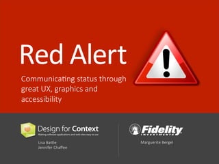
  • 1. Red Alert Communica)ng status through great UX, graphics and accessibility Lisa Ba<le Jennifer Chaffee Marguerite Bergel
  • 2. USER EXPERIENCE & USABILITY Understand user needs and tasks. Design applica)ons that work the way people expect them to. Red Alert! | UXPA Conference July 2 2014 | London USER EXPERIENCE & GRAPHIC DESIGN Unifying graphics and an idea, which is placed in context to solve a problem. Visual and conceptual problem solving. USER EXPERIENCE & ACCESSIBILITY Address accessibility in ways that improve the experience for all users – no ma<er their age, technology or ability. Lisa Ba?le Marguerite Bergel Jennifer Chaffee
  • 3. Red Alert! | UXPA Conference July 3 2014 | London Photo bkg Text in a paragraph format goes here. Smaller text goes below if necessary. This is more detail. WAYFINDING is the art of using landmarks, signage, pathways and other cues to help people navigate and understand where they are.
  • 4. Red Alert! | UXPA Conference July 4 2014 | London Photo bkg Text in a paragraph format goes here. Smaller text goes below if necessary. This is more detail. SIGNPOSTING helps people find their desired path in a complex and unfamiliar space. .
  • 5. LANDMARKS help people orient themselves and create MENTAL MODELS Red Alert! | UXPA Conference July 5 2014 | London Photo bkg Text in a paragraph format goes here. Smaller text goes below if necessary. This is more detail. of a space.
  • 6. Red Alert! | UXPA Conference July 6 2014 | London Photo bkg Text in a paragraph format goes here. Smaller text goes below if necessary. This is more detail. Signage provides important STATUS INFORMATION, lePng people know when there is a problem, and how to get around it.
  • 7. Red Alert! | UXPA Conference July 7 2014 | London Photo bkg Text in a paragraph format goes here. Smaller text goes below if necessary. This is more detail. Some signs provide TIMELY, dynamically changing informaQon to let people know what is happening and what to expect.
  • 8. SignposSng is leWng the user know… Red Alert! | UXPA Conference July 8 2014 | London How do I get back? What’s going on now? What’s most important? What do I need to do? Is there a problem? Where am I?
  • 9. Red Alert! | UXPA Conference July 9 2014 | London GRAPHIC ACCESSIBILITY DESIGN USABILITY / HUMAN FACTORS = great user experience
  • 10. Red Alert! | UXPA Conference July 10 2014 | London USABILITY/ HUMAN FACTORS PRINCIPLES Who is the user? What is their task and context? • Get the user’s a<en)on. • Avoid interrup)ng the task (unless it’s truly urgent). • Convey priority, urgency, next steps. • Provide cues that are appropriate to the user, task and context.
  • 11. CONTRAST The degree of of difference between elements in color, value and size, or shape ALIGNMENT The arrangement of elements in a line that visually connects them Red Alert! | UXPA Conference July 11 2014 | London REPETITION The ac)on of repea)ng, forming a pa<ern or style crea)ng consistency. BALANCE The arrangement of elements crea)ng symmetry or asymmetry PROXIMITY The distance between elements, that connects or disconnects them WHITE SPACE The space between elements that gives them breathing room GRAPHIC DESIGN PRINCIPLES The principles of design suggest how a designer can best arrange the various components of a page layout in connec)on to the overall design and to each other.
  • 12. SHAPES A form or configura)on. Shapes are any type of form or configura)on, abstract or literal such as a bullet or an icon, a box or a circle, etc. Shapes are o[en used to draw a<en)on. Red Alert! | UXPA Conference July 1122 22001144 || LLoonnddoonn GRAPHIC DESIGN ELEMENTS The elements of design are the building blocks for design. These design principles and elements play an important role in communica)ng status to users. LINE A mark between two points. Lines can be used to connect or separate elements, highlight or isolate elements. MASS A grouping of elements within a space. Mass determines amount large or small, can include body copy, or areas of color, grouping of items areas or regions. TEXTURE The surface of an object can have various types of texture crea)ng visual interest to draw a<en)on to an area or create a mood. COLOR Color is used to add appeal and draw a<en)on, to symbolize, evoke a feeling or create a mood.
  • 13. Red Alert! | UXPA Conference July 13 2014 | London ACCESSIBILITY PRINCIPLES Add text equivalents • For all that isn’t text. • Don’t rely on images or styles alone. Support all input methods • Keyboard, touch, speech • Make content order logical. Use proper seman)c structure • Makes naviga)ng easier • Communicates what each item is, and its state. Give users control Don’t: • Override pinch-­‐zoom. • Hard code fonts. • Require )med responses that users can’t extend. Red Alert! | UXPA Conference July 2014 | London
  • 14. Pa_erns for CommunicaSng Status NoQficaQons 1 Red Alert! | UXPA Conference July 14 and Alerts 2014 | London Work Item 2 Lists Progress 3 Indicators Criteria 4 Selected Error 5 Messages Dashboards 6 Maps 7
  • 15. A noQficaQon or alert lets the user know about a potenQal problem, incoming request, status change, or reminder. Red Alert! | UXPA Conference July 15 NoSficaSons and Alerts 2014 | London
  • 16. NoQficaQons and Alerts Red Alert! | UXPA Conference July 16 2014 | London EXAMPLE 1
  • 17. NoQficaQons and Alerts Red Alert! | UXPA Conference July 17 2014 | London EXAMPLE 2 Mobile example
  • 18. NoQficaQons and Alerts Red Alert! | UXPA Conference July 18 2014 | London DESIGN APPROACH Make it easy to drill down to addiQonal informaQon and relevant acQons. Get back to alerts even if you’ve read them before. Dismiss alerts when done. Allow alerts to decay gracefully.
  • 19. NoQficaQons and Alerts Red Alert! | UXPA Conference July 19 2014 | London DESIGN APPROACH Color used for contrast to draw the eye to informaQon Simple shapes and icons draw low key a?enQon
  • 20. NoQficaQons and Alerts Red Alert! | UXPA Conference July 20 2014 | London DESIGN APPROACH How does a user get there? • They’re already at top of page • Placing a (hidden) heading just before • ARIA landmarks • Can Ctrl+F and search alt text (alt=“Alerts”) Need text equivalents? Usually, the number is actually text. So nothing else needed.
  • 21. NoQficaQons and Alerts Red Alert! | UXPA Conference July 21 2014 | London DESIGN APPROACH Ensure adequate contrast via colour contrast analyser For PC & Mac Scores vs WCAG 2.0 Then use Webaim.org’s contrast checker
  • 22. NoQficaQons and Alerts Red Alert! | UXPA Conference July 22 2014 | London DESIGN APPROACH How does a user get there? • Ensure focus shihs into / out of dialogs • When dialog closes, return focus to ‘point of origin' If a Smed response is required, warn users and let them extend.
  • 23. Pa_erns for CommunicaSng Status Red Alert! | UXPA Conference July 23 2014 | London Work Item 2 Lists Progress 3 Indicators Criteria 4 Selected Error 5 Messages Dashboards 6 Maps 7 NoQficaQons 1 and Alerts
  • 24. Knowing which tasks are assigned to you, the type of tasks, when they are due, and which are most important, helps you be producQve. Red Alert! | UXPA Conference July 24 Work Item Lists 2014 | London
  • 25. Red Alert! | UXPA Conference July 25 2014 | London Work Item Lists EXAMPLE 1 Learning management system The user sees a list of their upcoming training when they log in, along with due dates.
  • 26. Red Alert! | UXPA Conference July 26 2014 | London Work Item Lists EXAMPLE 2 Call Center app Stars represent 3 different states: new case (blue), same account (orange), different social security number (green). Are toolQps enough?
  • 27. Red Alert! | UXPA Conference July 27 2014 | London Work Item Lists EXAMPLE 3 Mobile example To do list app The user configures their own color coding and categories; redundant cues are used.
  • 28. Red Alert! | UXPA Conference July 28 2014 | London Work Item Lists DESIGN APPROACH Is it something I really have to do? Or just something I could do? When is it due? (but don’t stress me out!) Type of task Read/unread A change in the item since I last saw it (e.g. new documents have come in, the customer called) AcQons I can take on the item
  • 29. Red Alert! | UXPA Conference July 29 2014 | London Work Item Lists DESIGN APPROACH Color used sparingly, in the icon, draws a?enQon to specific areas. Icons represenQng status use different shape and color.
  • 30. Shape, color and repeQQve pa?ern Red Alert! | UXPA Conference July 30 2014 | London Work Item Lists DESIGN APPROACH Shape and color Shape, color and repeQQve pa?ern The table on the le[ shows what the client was using using to indicate alarms. Varia)ons of colored ellipse shapes with a line inside the ellipse, angled in different posi)ons. The table on the right shows alarms as bells. The level of alarm cri)cality is indicated by the number of bells. Color is used for only the bells that are more important.
  • 31. Red Alert! | UXPA Conference July 31 2014 | London Work Item Lists DESIGN APPROACH Vet colors via color blindness filters • Convert to RGB color mode for accuracy • View > Proof Setup > Color Blindness Deuteronopia trouble seeing green Protaonopia trouble seeing reds Photoshop Proof Colors
  • 32. Pa_erns for CommunicaSng Status NoQficaQons 1 Red Alert! | UXPA Conference July 32 and Alerts 2014 | London Work Item 2 Lists Progress 3 Indicators Criteria 4 Selected Error 5 Messages Dashboards 6 Maps 7
  • 33. In a mulQ-­‐step task, let the users know which steps have been completed and which remain, or how close they are to compleQon. Red Alert! | UXPA Conference July 33 Progress Indicators 2014 | London
  • 34. Progress Indicator Red Alert! | UXPA Conference July 34 EXAMPLE 1 2014 | London A linear process
  • 35. Red Alert! | UXPA Conference July 35 2014 | London A non-­‐linear process Progress Indicator EXAMPLE 2
  • 36. Progress Indicator Red Alert! | UXPA Conference July 36 EXAMPLE 3 2014 | London A user-­‐iniQated process running in the background
  • 37. Progress Indicator In a linear process: Number of steps Current step Whether or not step is done Navigate back to previously visited step CondiQonal steps In a non-­‐linear one: Indicate degree of compleQon Navigate to any available step (skip around) Indicate things that are required, or that have a higher value In an automated process: Indicate degree of compleQon Provide the outcome of each step Show if a problem occurred Red Alert! | UXPA Conference July 37 DESIGN APPROACH 2014 | London
  • 38. Progress Indicator Red Alert! | UXPA Conference July 38 DESIGN APPROACH 2014 | London Contrast: Bold or higher contrasQng font used to draw a?enQon to a specific locaQon RepeSSon: repeaQng of a symbol in a conQnuous sequence suggests a sequence or path. Symbol or shape: The current step has a unique look to draw a?enQon to it.
  • 39. Progress Indicator Red Alert! | UXPA Conference July 39 DESIGN APPROACH 2014 | London OpQons: • Adding inline images for addiQon of alt text. Alt displays for sighted users if images fail to load. • Off-­‐screen text works but doesn’t do the above. Harder to maintain. • Aria-­‐label and aria-­‐labelledby also work, but sQll not as broadly supported. • Re-­‐emphasize context by repeaQng the step name in the <h1>, if possible.
  • 40. Pa_erns for CommunicaSng Status Red Alert! | UXPA Conference July 40 2014 | London Criteria 4 Selected Error 5 Messages NoQficaQons 1 and Alerts Work Item 2 Lists Progress 3 Indicators Dashboards 6 Maps 7
  • 41. When filtering large data sets, let users see the criteria they have chosen and modify their selecQons. Red Alert! | UXPA Conference July 41 Criteria Selected 2014 | London
  • 42. Criteria Selected Red Alert! | UXPA Conference July 42 EXAMPLE 1 2014 | London
  • 43. Criteria Selected Red Alert! | UXPA Conference July 43 EXAMPLE 2 2014 | London
  • 44. Criteria Selected Users choose criteria they want (green) and criteria to Red Alert! | UXPA Conference July 44 EXAMPLE 3 2014 | London exclude (red). Reds + greens are mixed together, possibly making it harder to parse than if they were grouped. Color is the sole differenQator. Adding labels before each grouping may help make this more scannable for all.
  • 45. Criteria Selected Indicate if a list is filtered Provide easy way to turn selecQons on and off Red Alert! | UXPA Conference July 45 DESIGN APPROACH 2014 | London Summarize selected criteria Allow user to reset filters
  • 46. Criteria Selected SemanSc structure ARIA Live Regions (HTML5) causes updates to be read aher user stops their current task. Keyboard/all inputs Links are naQvely focusable. Text equivalents Alt for [x] image tells the user what clicking each link does. Red Alert! | UXPA Conference July 46 DESIGN APPROACH 2014 | London
  • 47. Pa_erns for CommunicaSng Status NoQficaQons 1 Red Alert! | UXPA Conference July 47 and Alerts 2014 | London Work Item 2 Lists Progress 3 Indicators Criteria 4 Selected Error 5 Messages Dashboards 6 Maps 7
  • 48. Systems provide error messages to let the user know when a problem occurs in compleQng a task. Red Alert! | UXPA Conference July 48 Error Messages 2014 | London
  • 49. Red Alert! | UXPA Conference July 49 2014 | London Error Messages EXAMPLE 1 Field level error messages
  • 50. Red Alert! | UXPA Conference July 50 2014 | London Error Messages EXAMPLE 1 Page level error messages. This example has an intrapage link in the page-­‐level error that navigates to the error. Good for everyone.
  • 51. Red Alert! | UXPA Conference July 51 2014 | London Error Messages EXAMPLE 2 System error messages
  • 52. Red Alert! | UXPA Conference July 52 2014 | London Error Messages DESIGN APPROACH Use plain language, clarify what is wrong and what the user can do to fix it (the example below does not).
  • 53. Red Alert! | UXPA Conference July 53 2014 | London Error Messages DESIGN APPROACH Provide immediate feedback for field-­‐level issues when possible
  • 54. Red Alert! | UXPA Conference July 54 2014 | London Error Messages DESIGN APPROACH Use icon and color to convey criQcality & differenQate errors from other types of messages. This ‘error’ doesn’t tell you how to fix things. You can also simply dismiss it.
  • 55. Red Alert! | UXPA Conference July 55 2014 | London Error Messages DESIGN APPROACH RecommendaSons This example uses CSS changes to show/hide checkmarks (class=“icon-­‐ small-­‐Qck-­‐pass”). But screen readers can’t “see” styles. So blind users will only hear the text (‘8 to 32 characters’) with no sense for whether their password has met this criteria or not DON’T use CSS to show/hide errors. Instead, inject errors into page. Reason: users who use their own CSS or disable it, will see all errors at once on screen.
  • 56. Pa_erns for CommunicaSng Status NoQficaQons 1 and Alerts Dashboards 6 Red Alert! | UXPA Conference July 56 2014 | London Work Item 2 Lists Progress 3 Indicators Criteria 4 Selected Maps 7 Error 5 Messages
  • 57. Dashboards & Monitoring Dashboards ohen summarize a great deal of informaQon about status and trends at a glance. Red Alert! | UXPA Conference July 57 2014 | London
  • 58. Red Alert! | UXPA Conference July 58 2014 | London Dashboards EXAMPLE 1 Logo
  • 59. Red Alert! | UXPA Conference July 59 2014 | London Dashboards EXAMPLE 2 Mobile example
  • 60. Red Alert! | UXPA Conference July 60 2014 | London Monitoring EXAMPLE 3
  • 61. Red Alert! | UXPA Conference July 61 2014 | London Monitoring EXAMPLE 4 AnimaQon shows changes in performance of various stocks over a chosen period of Qme.
  • 62. Red Alert! | UXPA Conference July 62 2014 | London Dashboards DESIGN APPROACH Layout and size can emphasize the most important items. Simplify the display, provide overview with drilldown. Let users configure. Communicate trend, volume, and severity.
  • 63. Red Alert! | UXPA Conference July 63 2014 | London Dashboards DESIGN APPROACH Font size conveys importance and makes the numbers a visual element. Color is used to convey meaning.
  • 64. Red Alert! | UXPA Conference July 64 2014 | London Dashboards DESIGN APPROACH Network monitoring dashboard shows connecQvity states and severity of the problem using color and shape of the node.
  • 65. Red Alert! | UXPA Conference July 65 2014 | London Dashboards DESIGN APPROACH SemanSc structure Headings make it easy to jump between secQons. Text equivalents Color is redundant cue. Numbers and locaQon on gauge helps communicate progress. TacSle feedback sent to Flex when thresholds reached.
  • 66. Pa_erns for CommunicaSng Status Red Alert! | UXPA Conference July 66 2014 | London Maps 7 NoQficaQons 1 and Alerts Work Item 2 Lists Progress 3 Indicators Criteria 4 Selected Error 5 Messages Dashboards 6
  • 67. Red Alert! | UXPA Conference July 67 2014 | London Maps Maps convey many facets of informaQon instantly about a geographical space, and the status and features of items within the space.
  • 68. Red Alert! | UXPA Conference July 68 2014 | London Maps EXAMPLE 1
  • 69. Red Alert! | UXPA Conference July 69 2014 | London Maps EXAMPLE 2
  • 70. Red Alert! | UXPA Conference July 70 2014 | London Maps DESIGN APPROACH Simplicity in appearance Granularity of informaQon displayed at each zoom level User control over many different types of informaQon they may want to see
  • 71. Red Alert! | UXPA Conference July 71 2014 | London Maps DESIGN APPROACH Layering of informaQon Get informaQon easily and drill down where you are in context (without having to go somewhere else) RelaQonship between map and list view
  • 72. Red Alert! | UXPA Conference July 72 2014 | London Maps DESIGN APPROACH Pin icons and symbols The pin is a pointer to a very specific area, but needs a symbol to indicate type of property shown Indicate if user saved a property If you have a lot of pins in a small area, what should you do?
  • 73. Red Alert! | UXPA Conference July 73 2014 | London Maps DESIGN APPROACH Provides granularity, but you have to work for it (mouseover). Also requires knowledge of geography. Nice summary data of #ETFs by region using text and graphics that place it in context.
  • 74. Red Alert! | UXPA Conference July 74 2014 | London Maps DESIGN APPROACH Text equivalent for heat maps is a data table, accessible via a ‘View as table’.
  • 75. Red Alert! | UXPA Conference July 75 2014 | London Maps DESIGN APPROACH Visual equivalents for text! Clicking a map locaQon displays a photo of it from the street. In tesQng, users with ‘low vision’ considered this very helpful. ‘On the street, I may not spot the sign. But spo6ng the building is a whole lot easier.’
  • 76. Pa_erns for CommunicaSng Status Red Alert! | UXPA Conference July 76 2014 | London Maps 7 NoQficaQons 1 and Alerts Work Item 2 Lists Progress 3 Indicators Criteria 4 Selected Error 5 Messages Dashboards 6
  • 77. Red Thanks! Alert Communica)ng status through great UX, graphics and accessibility Lisa Ba?le lisa@designforcontext.com Jennifer Chaffee jenniferc@designforcontext.com Marguerite Bergel Marguerite.bergel@fmr.com