8377087607, Door Step Call Girls In Kalkaji (Locanto) 24/7 Available
Detailed analysis of music magazine
1. Ellis Dear
Detailed Analysis of Music Magazine
Front Cover
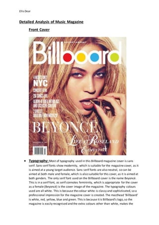
Typography: Most of typography used in this Billboard magazine cover is sans
serif. Sans serif fonts show modernity, which is suitable for the magazine cover, as it
is aimed at a young target audience. Sans serif fonts are also neutral, so can be
aimed at both male and female, which is also suitable for this cover, as it is aimed at
both genders. The only serif font used on the Billboard cover is the name Beyoncé.
This is in a serif font, as serif connotes femininity, which is appropriate for the cover
as a female (Beyoncé) is the cover image of the magazine. The typography colours
used are all white. This is because the colour white is classy and sophisticated, so a
professional impression for the magazine cover is created. The masthead ‘Billboard’
is white, red, yellow, blue and green. This is because it is Billboard’s logo, so the
magazine is easily recognised and the extra colours other than white, makes the
2. Ellis Dear
masthead stand out and it’s seen as a main focus. Billboard and Beyoncé are also in
a bigger font, as they are key features of the cover, so are designed to stand out and
drawn in attention.
Layout: The layout technique used in this Billboard magazine cover is route-of-the-eye.
Route-of-the-eye is used as it’s the way the eye natural reads, so by placing the
magazine features in this route, all important and key parts of the cover will be easily
seen and noticed. Route-of-the-eye is present in this billboard cover because in the
top left had corner the masthead ‘billboard’ starts, finishing in the top right hand
corner. The route then carries on cutting through the main part of the image
(Beyoncé’s face and eyes) and the cover lines on the left side to the bottom left
corner. Here is the headline ‘Beyoncé’ and the barcode and then the route finally
finishes into the bottom right corner, where more cover lines are. Route-of-the-eye
layout keeps the magazine cover looking simple and stops it from being over
cluttered, yet still gives an effective impression. The masthead is placed at the top of
the magazine as it is Billboard’s logo, so is a very important feature that needs to be
placed where it stands out to readers. It’s also placed at the top, as this is where it is
positioned on every magazine edition, so it keeps Billboard’s tradition up, by always
being in the same place, which also makes Billboard magazines very recognisable.
Colour: The colours used on this Billboard magazine cover are very simple and
plain, yet they still look sophisticated and classy, giving the cover a professional look.
The main two colours used are white and a bronzy type of colour theme. The bronzy
theme is present because Beyoncé has an olive skin tone, her hair has a
blonde/bronze summer glow to it and she has a gold necklace in her mouth. The
colours used are very neutral and suitable for both genders, therefore will appeal to
Billboard’s target audience of both males and females in-between the ages of 16-26.
The bronzy colour theme to the cover relates to a ‘lioness’ idea, giving the
impression that Beyoncé is very fierce, dominant and powerful, which will appeal to
Billboard’s young target audience, as people will look up to her. The white
typography used against a background of bronzy colours creates a very sharp and
eye-catching contrast, as it makes the font stand out and look clearer, drawing
attention into the cover. The typography in the white also looks very high-level and
stylish, as it’s a very classy and modern colour. The mast head/Billboard’s logo also
has red, yellow, blue and green colours in it, which helps make the cover look
colourful and interesting. The cover image of Beyoncé has very bright colours that
are more high-key and lit up, so that it stands out and is eye-catching, to draw
attention in to the cover.
Images: The cover image of this Billboard magazine is of Beyoncé. This is suitable
for the cover, as she is an extremely successful music artist, so she fits the music
genre of this magazine. However, Beyoncé is also the image of the front cover, as
she has been interviewed for the magazine and having Beyoncé as the cover’s image
3. Ellis Dear
will help Billboard sell more copies of their magazine. This is because Beyoncé is a
world-renowned performer with millions of fans, with the same target audience as
Billboard. As of this, readers will see Beyoncé’s face and automatically be intrigued
by the magazine and will be persuaded to purchase it. The camera shot used is a
close-up, this is so that Beyoncé’s face is the main attraction to the cover, so it’s
clear she is the main focus and that this Billboard edition is based on her. It also
creates a dramatic and eye-catching look for the magazine. Mise-en-scene has also
used been in the image, as a necklace has been used as a prop. The necklace is in
Beyoncé’s mouth, as she is posing with it. This unusual and quirky pose with the
necklace shows Beyoncé is posing in an arousing manner, which connotes a
seductive and ‘sexy’ look that creates intimacy for the magazine, so that Beyoncé will
appeal to the male gender, as well as the female. The pose is also very fierce as well
as lustful, so it signifies Beyoncé to appear as a very strong and powerful woman,
which helps the magazine target the female gender. Beyoncé is staring right into the
camera, which helps create the fierce look to her pose, as it shows her confidence in
herself. The cover image is made up with bronzy colours. This empathises Beyoncé’s
dominant womanpower even more, as it relates to a ‘lioness’ look, which connotes
Beyoncé to seem extremely influential, important and high-powered.
Language: Billboard is present at the top of the magazine, obviously because it is
the masthead and name of the music magazine. Beyoncé’s name has been used as
the cover line for this Billboard magazine, this is because she’s the main focus of the
Billboard edition. The language is also in short sentences, which signifies the text to
be more dramatic and adds emphasis on this. The language also connotes Beyoncé
to be a very successful and powerful woman in the music industry, as the language
lists many things Beyoncé has done. For example, ‘Live at Roseland’, ‘Concert Film’
and ’26 Songs live’. This will help Billboard sell more copies of their magazine, as
Beyoncé is shown as extremely impressive and victorious, so many people will aspire
to her, persuading them to purchase the magazine copy.
Conventions: This Billboard music magazine cover is very conventional as it
includes many typical features that are expected on a magazine cover. For example,
the cover contains a large masthead and cover story, which are conventionally big,
bold and bright, as they are important magazine features, so need to be easily seen
and clearly stand out to readers’ eye. The magazine cover is also conventional, as the
typography fonts have a strong contrast, as both serif and sans serif fonts are used
against each other, which make the page more appealing and eye-catching. The
Billboard cover is also conventional, as the medium-close of Beyoncé is much
stylised, which signifies her to look very glamourous and very high-powered. This
close-up is also very conventional for a popular music artist on a music magazine
cover, as it focuses on the face, so that it is easy for the audience to recognise
Beyoncé. Finally, this Billboard music cover is again very conventional as of the
4. Ellis Dear
layout. This is because the technique route-of-the-eye is used. This pattern is
conventionally used because it keeps the cover looing simple and uncluttered, but
also effective, as readers view the magazine in a certain way, so that they notice
everything. The layout is also conventional, as part of the typography is placed on
the left third of the magazine. This is conventional for a cover, as when magazines
are placed in magazine stands, only the side of the cover may be seen. So having
most of the text in the left third of the cover, the typography may still be seen, so
that audience’s will still notice it in a magazine stand and be drawn to the writing
which should hopefully persuade them into purchasing the Billboard magazine.
5. Ellis Dear
Contents Page
Typography: There is a high amount of typography on this Billboard contents
page. In the left third of the page, there is a column of typography running down.
This typography is then separated into rows, telling what is on which page in the
magazine. The typography size is relatively small in comparison to the font sizes I
analysed on the previous Beyoncé Billboard front cover. This is because there is a
lot of information to be displayed, and it would not all fit on the contents page in
a large font. Also, the fonts used are smaller than what they would be on a front
cover of a magazine, as the contents page does not need to be as eye-catching as
the front cover, as it is the front cover that sells the magazine to readers and not
the contents page. However, to keep readers interested, the contents page still
6. Ellis Dear
needs to be intriguing and stand out to audiences to a certain extent, so that
they carry on reading. To do this, Billboard has made the titles of articles on each
page in a slightly bigger and bolder typography to the rest. This is because they
are important key features on the contents page and also readers can easily see
what the magazine includes, what part they want to read and yet at the same
time keep them interested, as of the eye-catching parts of typography. On the
list of typography running down the left third on the magazine page, there is a
mix of both serif and sans serif fonts. For example, the titles of articles on the
contents page are in a serif font, whereas then the writing underneath is in a
more sans serif font. This gives the typography used a strong contrast, making
the contents page appear very appealing and engaging. Important and key parts
of the text running down the left hand side of the page are in a different and
brighter colour. They are either in blue or green. This is done so that, instead of
just making them bigger and bolder, still in the black font colour, like other
important parts text have been, it gives the contents page more colour and
makes it more interesting, fun and eye-catching for audiences to read. The
headline ‘Contents’ is the biggest and boldest part of typography on the page.
This is because it is the main key feature as it is the title of the page and with it
being so big and bold, it immediately stands out to readers, and they know
exactly what they are reading. The ‘Contents’ typography is in a sans serif font;
this is because it is a less serious and less traditional font type, which is
associated with younger generations. The use of the sans serif fonts, helps signify
the magazine to be young, fun and modern, which will appeal to its target
audience.
Layout: The layout used on this Billboard contents page is very unconventional.
This is because it does not follow the route-of-the-eye pattern. Instead it is
organised in columns and rows. The layout is very ordered to make the contents
page easy to read and to look sophisticated. There is a higher ratio of typography
to image, however the images are more apparent as they are larger and more
eye-catching. This concept links in with Billboard, as imagery is always a main
focus in their magazines.
Colour: The main colours on this contents page are red and white. This is
because in the main image on the page, the girl is wearing red and white and the
background of the page is white. Red is not the colour most often used on the
page, as black is used a lot, however, it stands the most, as the red and white
outfit is the first thing you’re eyes are drawn to when looking at the page. The
red and white outfit links in with the theme of this magazine edition ‘Xmas in
July’, as red and white are conventional Christmas colours, so they connote the
festival season. The image of the woman also stands out more compared to the
other images on the page, as it has the brightest and eye-catching use colours, so
that reader’s eyes are straight away drawn to the image of the woman. Blue and
7. Ellis Dear
green are also used on the contents page, this is because it helps add colour to
the page to make it look more interesting and eye-catching, but also blue and
green are colours associated with younger people, so they connate fun and
youth, which will help Billboard appeal to its target audience. Also, the colours
used (red, blue, green, white and black) are very neutral colours, which will help
Billboard appeal to both genders of their target audience. Most of the
typography has been printed in black. This is because the writing is the more
serious part of the contents page, and black is a more serious colour, so by using
this colour it helps signify the more traditional part to the page. However, black
is also used over the white background because using black and white together
adds class and a classical element to Billboard’s design of the contents page.
Images: Four images have been used on this Billboard contents page. The main
image is of the girl, in the middle of the page. This image is very dramatic and
extravagant, as of her quirky pose and the bright and alerting outfit. This image is
extremely eye-catching and draws attention in, as soon as you glance at the
page. Mise-en-scene has also been used in the image of the woman. This is
because she is holding a red and white candy cane, as it matches her outfit and
links in with the theme of the magazine ‘Xmas in July’. This is because a candy
cane is associated with the Christmas period. The woman is also wearing a bright
red feather bower, which is very big and fluffy. This makes the woman stand out
even more, and makes seem fun and bubbly, suggesting Billboard is a young,
enjoyable and friendly magazine. Three more images have been used down the
right third of the page. These images are all very different, so the contrast
between them connotes Billboard magazine covers many different news topics,
to appeal to a wide audience. Mise-en-scene has been used in these images, as
one man is holding a trumpet and a cartoon man is holding a guitar, which
signifies Billboard is a music magazine. In the remaining image, there are 5 men,
who look part of a rock/punk band. This shows audiences that Billboard caters
for many genres of music and this is why it appeals to such a large target
audience and is so successful.
Language: The language used is very short and sweet. For example, short
sentences are used so that when readers looking at the page, they can
immediately see what is in the article, by just glancing. The contents page
language also explains in more detail, under the bold cover lines, what the
articles are about. This is done because it’s the contents page’s job to give a
small preview of what readers should expect to read inside the magazine.
Conventions: This contents page is very conventional. This is because the page
has Billboard’s logo and date in top right hand corner. This is conventional, as it is
carrying the masthead on from the front cover and makes the contents page
recognisable as part of a Billboard magazine. Having the date is conventional, as
8. Ellis Dear
it is very traditional to have on a contents page, which signifies Billboard is very
professional. The contents page is also very conventional, as the layout is very
structured and well ordered, so that it is easy to read and follow, which connotes
sophistication. Another convention to this contents page is that it includes
writing listing and explaining the upcoming articles in the magazine. It is also
conventional as there are images which relate to the articles listed on the
contents page, which makes the page more eye-catching, but also makes the
articles seem more interesting to read to the audience, as it gives a more
intriguing preview of them.
9. Ellis Dear
Double Page Spread
Typography: All typography used on this double page spread is sans serif. Sans
serif fonts are very present, contemporary and sleek fonts to use, so they connote
youth, modernity and style to The Vibe magazine. Also, Sans serif is a very neutral
font, so it helps the double page spread appeal to both males and females, which is
suitable for The Vibe, as it is aimed at both genders. The typography of the article is
in a small font, compared the cover lines and quotes that are in a much bigger and
bolder font. This is because the cover lines and quote are important features of the
story, so they must stand out to readers, so that they get a quick preview of what
the articles is about and so that they are persuaded to read on. The bigger and
bolder fonts help emphasise this dramatic and eye-catching typography, against the
smaller font size.
Layout: The layout of this double page spread is very structured and well ordered,
however it does not follow the route-of-the-eye technique. The layout is instead
organised so that the article is written down in columns, so that it is easy to read and
follow for the magazine readers. This neat organisation connotes sophistication. The
layout is also very effective because above the typography layout running
downwards in columns, further up there are images of Solange Knowles running
across sideways. This means the layout is ordered in opposite directions in the top
and bottom half of the double page spread. This makes the pages extremely eye-
10. Ellis Dear
catching and original, letting the reader’s eye easily travels across the page, viewing
the entire article.
Colour: This double page spread has a very plain colour scheme, as it mainly has a
lot of grey, black and white. However, using black and white together creates a
touch of class and adds a classy element to double page spread. For example, at the
top of the pages there are several images of Solange Knowles in black and white.
This put emphasis on how classy and sophisticated she is, as well as connoting a
professional look for the pages. However, next to the black and white images of
Solange, there is a much larger and colourful picture of her. Having just this one
large coloured image of her next to black and white ones, makes the page spread
look very dramatic, but also give the impression to readers that Solange is very
exclusive, chic and glamorous. Her bright red dress, purple heels and other colourful
clothing help to emphasise this further. This way readers will aspire to her and enjoy
what they are reading, persuading them to keep on purchasing The Vibe magazines.
The article typography has been typed in a grey font. This is because the cover lines
and quotes are in blue or blue. Grey is a duller colour compared to black and a bright
blue. So this choice of grey colour helps the quotes and cover lines s tand out to
readers and makes the double page spread more appealing to the eye.
Image: There are several images of Solange Knowles used on The Vibe’s double
page spread. In each one she is posing in a very attractive and seductive way,
connoting a sex appeal to the magazine so that it will interest men, as well as
women. It also shows Solange off to be a youthful, confident and good-looking
female, so many readers will look up to her. There are many small images of Solange,
then a much larger one near the centre of the spread. The one colourful image of
Solange next to smaller ones makes her to seem very fierce, powerful and supreme.
Mise-en-scene has been used in Solange’s costume, as she is wearing trendy bright
red dress, with purple high heels, gold necklaces and a blue/purple jacket. This outfit
makes a very big fashion statement, which signifies Solange to be a popular
trendsetter and fashion icon. This up-to-date and stylish look connotes The Vibe to
be a very current and modern magazine, aimed at a young and image conscious
target audience.
Language: The language used is very informal, so that the article will appeal to The
Vibe’s young target audience. The language also relates to the music genre of the
magazine, as in the quote it says ‘Fall back and enjoy the music’, which shows
readers the article with be music based.
Conventions: This double page spread is conventional for suits its music genre.
This is because it contains several images of a music artist, which are very striking
and eye-catching. It is also conventional because it contains quotes and sub-headings,
so that the reader is intrigued by the preview of the article and is
11. Ellis Dear
persuaded to read on. Finally, the double page spread is conventional because as
the layout is very ordered and structured. For example, the typography is placed in
columns. This makes the pages more readable and look more professional, making
audience interested to read on.