1. Before designing my digipak, I researched the
conventions and found out;
• There must be a barcode and record label
• The artists name is normally bigger than the album
name
• It is common to use more than one font
• A lot of real artists use close ups or mid shots for
the front cover
I looked at Nicole Scherzinger’s Digipak for her album • The song list goes on the back cover
‘killer love’. Nicole follows the conventions for a
• The number code goes on the spine of the cover
DigiPak and inspired me to use a close up shot of
• The inside panels have more pictures of the artist
Ariella on my front cover.
• The artists name and album name is on the CD
• Synergy must be consistent through the outside
and inside panels
I also looked at Rihanna’s DigiPak for her
album ‘Loud’. Rihanna mostly follows the
conventions for a DigiPak; I really like her
use of synergy through the colour red.
However, Rihanna also challenges the
conventions as she has her album name in
a bigger font than her name.
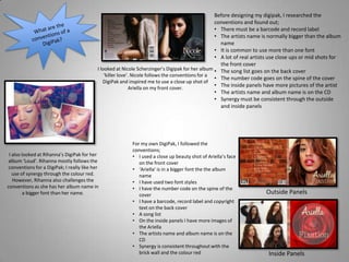
For my own DigiPak, I followed the
conventions;
• I used a close up beauty shot of Ariella’s face
on the front cover
• ‘Ariella’ is in a bigger font the the album
name
• I have used two font styles
• I have the number code on the spine of the
cover
• I have a barcode, record label and copyright
text on the back cover
• A song list
• On the inside panels I have more images of
the Ariella
• The artists name and album name is on the
CD
• Synergy is consistent throughout with the
brick wall and the colour red
Outside Panels
Inside Panels