MULTIDISCIPLINRY NATURE OF THE ENVIRONMENTAL STUDIES.pptx
Evaluation question 2resentation1
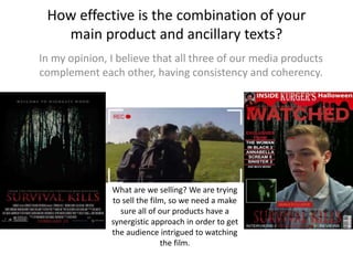
1. How effective is the combination of your
main product and ancillary texts?
In my opinion, I believe that all three of our media products
complement each other, having consistency and coherency.
What are we selling? We are trying
to sell the film, so we need a make
sure all of our products have a
synergistic approach in order to get
the audience intrigued to watching
the film.
2. What did we focus on?
We had to produce a marketing campaign which had consistency
throughout, and I focused on the following:
• Locations
• Characters
• Titles/typography
• Themes
3. Locations
As the location of horror films are a key convention, we wanted to make sure that the
audience knew our film was going to be in the woods. The theme of the woods was shown
through all three of our media products.
Our horror poster tagline was
“Welcome to Highgate wood”
This tagline directly tells the
audience that they are
welcomed to the woods.
The background of the
poster is the woods. This
again emphasizes that the
film will involve the woods.
To keep consistency, we added the
same background of the woods
which was on the poster. This was
done so that the idea of the woods
can be portrayed through both the
horror poster and the magazine
cover.
Showing the woods to the audience through the trailer
was simple; the film is based there. The trailer contains
many shots which reveal the location of the film. As you
can see all three of our media products have revealed
the location of the film, and we showed the synergy.
4. Characters
In terms of the characters styles, we tried to hide the identity the killer of our film, but
wanted to add some suspense and mystery.
The magazine cover we produced contained an image of a
stock character in the film. The same character was
revealed in the trailer. From this the audience can see the
same character in the trailer he film he will feature in, or
the interview of the magazine.
In the trailer, the killer is shown
at glimpses, but his/her face is
not revealed so we left the
audience with question marks,
on who the killer is, what is their
backstory and why are they in
the woods.
In the horror movie poster, we
see a silhouette of the killer
This was done as we wanted
to keep the mystery in the film
consistent. The silhouette
engages with the audience as
they can see someone, but
who is it?
5. Titles/typography
I made sure that the titles I used where the same through all of my media products.
I made sure to use the same style of font as this font will be iconic to the
whole campaign. From doing this, the same title will make the audience
aware as to what they are being brought into. Whether this be the
magazine cover, trailer or movie poster, Survival Kills will be recognised.
I tried to promote my film by using a written code which was
placed above the poster and the magazine cover.
The words “From the producers of” indicates to the audience that
the producers of a previous film are making a new one. This is a
good way of promoting a film, because viewers will want to see a
film made by successful film companies.
Both my magazine cover and my horror poster have this written
code, and I done this to promote the film effectively through more
than one media format.