
Recommended
Recommended
More Related Content
Similar to Engl 396 infographics presentation
Similar to Engl 396 infographics presentation (8)
Recently uploaded
Recently uploaded (20)
Engl 396 infographics presentation
- 2. Information graphics Visual representation of information and data Maximum information in minimum space Complex information simplified via visual aid
- 4. Communicating information quickly and efficiently Text is too complicated or tedious to absorb Audience is unable to read or hear information “A picture is worth a thousand words”
- 5. Text Images and colour graphics Audio and sound effects Animation and 3D effects Interactivity
- 7. Tweet an infographic and briefly explain what makes it efficient and/or appealing.
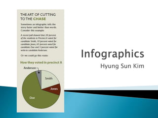
- 8. Text boxes (e.g. profile, comparison) Charts and graphs (e.g. pie chart, bar graph, scatter plot, line graph) Tables (e.g. statistical, numerical) Diagrams (e.g. figures, cutaway illustration) Maps (e.g. geological, statistical) Sequences (e.g. flowchart, timelines, how-tos)
- 10. Factual information from credible sources All sources must be cited Always consider bias of the source in data Present data clearly and objectively
- 11. Make sure it is a stand-alone presentation Do thorough research on the topic Keep in mind elements of a good layout • Structure and cohesion • Colour and white space • Alignment and unity etc.
- 12. http://sdrscreative.com/michaelseiders/wp- content/uploads/Conan-infographic-2-01.jpg https://infographiclist.files.wordpress.com/2011 /09/infographic.png http://33.media.tumblr.com/702f2bc0f31d91ba 9c5b67b7293bd8d8/tumblr_nj3v6zGsxy1rasnq9 o1_540.gif http://www.mun.ca/biology/scarr/timelineHGP_i mage2.jpg http://www- tc.pbs.org/wnet/nature/files/2013/04/How-to- Compost-Poster-New.png