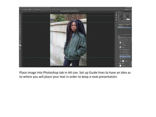
1. Place image into Photoshop tab in A4 size. Set up Guide lines to have an idea as
to where you will place your text in order to keep a neat presentation.
3. Add masthead to the top of the image. Duplicate the text layer making it slightly
less opaque for added effect. Place this transparent text behind the first one.
1.
2.
4. Add issue number and date/ month. I have only added the month since mymagazine is published
monthly, which is also indicated in the slogan below. Also, I have added the magazine’s website .
All of the information have been added discretely below the masthead so that it doesn’t interrupt
the main image.
5. Add the rectangles and circles that will contain your main sell lines
using the shapes tool.
6. Then I begun to add the sell lines into the shapes.
7. I then added the name of the artist in the main image which would draw their
focus to her mainly
8. I continued to be creative with this idea, and make some sort of
logo out of her name. I zoomed in really close to the letters, and
added an extra rectangle onto the letter ‘Y’.
9. I proceeded to extend the rectangle since it was coming across
quite nicely.
10. I then put the name of her new album within the rectangles and added a
quote said by the editors of New Wave magazine so that it sounded more
realistic.
11. I then placed an image of a barcode to make the magazine even more
realistic, and indicate that it is for sale.