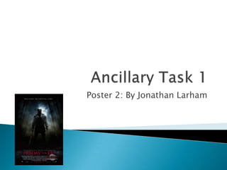
2. This poster for the 2009 remake of Friday the
13th is very to the horror genre as it includes
horror aspects, those being that the poster is
dark and eerie with colours that sit together
well to form a uneasy, conventional feel. The
ways in which the poster is memorable is the
in the writing, the main image and the colour
scheme.
3. •The main image for the poster has a
very dark and eerie colour scheme, that
being predominantly black with the
moonlight creating a white
light, contrasting the picture well.
•The image itself is the main antagonist
of the film, Jason Voorhees, standing in
his trademark pose, machete and hockey
mask equipped. This creates the feel
that we know its a slasher film
already, as the dark antagonist is
standing tall in a low angled shot to
show his dominance.
4. •The design of the main title for Friday The 13th is big, red and it
stands out well against the black background.
•The font is in a serif font style, which makes it appear more
formal.
•The capitalised wording too is conventional to many film posters
and makes it stand out more on the page.
•Having the saw blade adding onto the bottom of the title is
mainly there to be conventional to the slasher sub-genre.
5. Another convention that the poster has it that
of a tagline, though subtle and
leading, “Welcome To Crystal Lake” is both an
eerie tagline to newcomers as well as fan of
the franchise
6. The blocking bill (minus the watermark) is a
conventional feature of all film poster, as well
as the date of release. These both include
important information which the audience
can be interested with.
7. Positives Negatives
Doesn’t give too much away:
actors, scenes, locations etc
If unaware of the franchise, the
poster may just seem strange.
Creates mystery as the only
giveaway is the antagonist and
Crystal Lake
May be seen as simplistic
Colour scheme is very good and
effective.
Not much is known from the
poster