1. -1I found it very difficult to find adverts on the internet for CDs. However these ones I
did find I have found helpful in designing my ancillary.
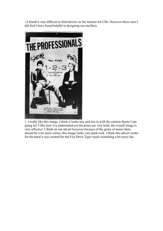
1. I really like this image, I think it looks arty and ties in with the cartoon theme I am
going for. I like how it is understated yet the poses are very bold, the overall image is
very effective. I think on our advert however because of the genre of music there
should be a lot more colour, this image looks very punk rock. I think this advert works
for the band it was created for but Fire Drive Tiger needs something a bit more fun.
2. 2. I like the idea of having this advert at an angle and I think the green logo with the
leaves works well for the name. I think it is important that all aspects of the band tie
together for example the logo the name and the colour scheme and this advert does
that. It is relatively simple which I think works well. It leaves the viewer wanting
more and looks mysterious. I don’t think the colour scheme is right for our band but I
do like the idea of using a logo that ties in with the name.
3. 3. This is a better advert and would work more for Fire Drive Tiger. I like the use of
the orange and the fact it is a really simple layout. I think it is also a very good idea to
include an image of the CD to show the audience what they are looking for when they
go shopping. I also like how the band is on the advert and think this is important for a
new band like Fire Drive Tiger. I also think that Fire Drive Tiger should have more
colour on their advert to go with the upbeat music. I think this advert has been really
helpful and I have gained some good ideas.
4. 4. I looked at this image because I liked how the band were on the bottom of the page
with the name at the top and the date in the middle. This layout is different from the
ones I’ve seen and works well. I also like the use of colour and think here the cartoon
style works well. I think if I could merge this image with the one above I could make
a good advert for Fire Drive Tiger.
5. 5. Although this is not a CD advert it still advertises the band. I chose this image
because I really like the font of the band’s name. I think it looks different and is
memorable which is what Fire Drive Tiger needs. I also really like the idea of using
sepia on an image. Its better than black and white because it makes it look more
contemporary. This band is clearly a rock/punk band and I think if I added a bit of
colour to this page I could make it look pop/rock to suit Fire Drive Tiger.
From looking at these images I have managed to think of some original ideas that uses
some of the features in these adverts. I think the main images I have looked at that I
will focus upon more are the too Paramore Riot adverts I really like the layout of the
second one and how they included an image of the CD in the first.