A small presentation about academic poster making!
•Download as PPTX, PDF•
5 likes•4,865 views

How to make the right academic posters!

Recommended
More Related Content
What's hot
What's hot (20)
Viewers also liked
Viewers also liked (20)
Similar to A small presentation about academic poster making!
Similar to A small presentation about academic poster making! (20)
Recently uploaded
Recently uploaded (20)
A small presentation about academic poster making!
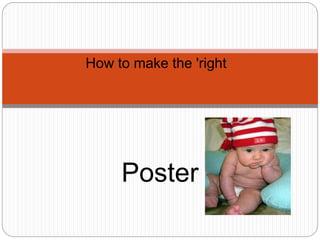
- 1. How to make the 'right’ Poster
- 2. Aims of this lecture To understand the basic concepts and skills that are needed to make high impact posters. A starting point for activity 4 in this assignment.
- 3. What are posters? Printed materials to provide information or spread a message Eg: advertisements, promotion of particular services, message poster, scientific and research posters Should ideally be self explanatory ( American College of Physicians, 2012)
- 4. Example: Poster with a message
- 6. Example: Replica of an artwork, article or a place
- 7. A good poster.... Always SHOWS information!!!!!! Summarizes information in a clear and concise manner Is easy to understand and read Attracts an audience Provides details about important information Acknowledges the source ( Hess et. al, 2006)
- 8. A bad poster... (The evergreen state college, 2008; Hess et al 2006) • Has no or little structure •Is extremely wordy • Repeats information •“ JARGON” •Uses Many font styles!! • has many colours •Different font sizes Includinglittleornoreferences Nosignposting SuddenlyHAS CAPITALLETTERS mixedwithsmall alphabets Isntspelcheckd UNNECESSARY PICTURES
- 9. Posters in education An effective way of presenting information Creatively facilitates adult or pedagogical learning due to its flexibility Attractively describes scientific and research findings ( Hess et al 2006)
- 10. Example: A good scientific poster (MedEdMentoring, 2011)
- 11. Example: A bad scientific poster (Purrington , 2011)
- 12. How to make that impressive poster? http://www.youtube.com/watch?v=wNS2RXqFIrI&fe ature=related (You tube 2009)
- 13. References American college of physicians 2012 http://www.acponline.org/residents_fellows/competitions/ abstract/prepare/pos_pres.htm Hess, G.R., K. Tosney, and L. Liegel. 2006 http://www.nuigalway.ie/remedi/poster/media/Posters_Good_ and_bad.pdf MedEdMentoring. http://www.mededmentoring.org/good_poster.html Purrington 2011 http://colinpurrington.com/wp-content/uploads/2012/02/bad scientific-poster-example.jpg You tube 2009 http://www.youtube.com/watch?v=wNS2RXqFIrI&feature=rel ated
Editor's Notes
- Uses the visual and graphic mode of catching attention. Therefore it is very essential that the poster is ATTRACTIVE!! therefore should include vital information But in conferences or workshops is usually accompanied with a short 3 – 5 minute explanation session. Anything from the poster of leonardo di caprio to the scientific poster that provides information about rock types etc. belong in this continuum.
- Used to spread feel good messages or warning messages or an advice.
- Has to be eye catching and spunky. But should include the right detail.
- This is an expensive artwork. Not everyone can buy it as the artist might make just this one copy. So others are taken to replicate it.
- Does not describe or narrate information!! explicitly explains the theme Is designed to attract Explains every little detail Has a good ability to stand on its own
- People usually get bored if a particular poster is filled with words. Let the poster be soothing to the readers’ eye Words which are abbreviated or has jargon should be done only when absolutely necessary Use the spell check Unnecessary words, quotes or pictures are very difficult to synthesise and can be confusing. Blend of upper case and lower case alphabets is not an easy read.
- Helps organization of vast amounts of knowledge in concise formats. Can be used with adults as well as children by adapting the content. Captures the essence of long, difficult or boring work. Attractive way of presenting research findings. This change is vital to push the boundaries of conventional teaching to increase learner inclusion and participation in the learning process. When done correctly, makes a huge impact.
- Is clear, concise, has a method which can be followed, is signposted, is referenced, has relevant visuals, explains difficult terminologies, is attractive. (MedEdMentoring, 2011)
- Is just wordy, no pictures, very small font size, is not signposted, is in grids, no logical structure evident, references not available (Purrington , 2011)
- Tips to make an impact!! Planning and organization. scholastically satisfying with a full content description. logically structured. adhered to the rules specifically in terms of context, size of the poster, content, audience Following a specific pattern to allow a flow in the poster. e.g. IMRAD (introduction, method, results and discussion). Abstract may or may not be included. Case studies can also be done through posters – introduction, case description and discussion Using relevant pictures and graphs when needed to decrease words. Avoid clutter by keeping the font easy, the size, colour and background visible and soothing Should not be very long