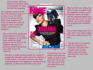
1. Artists name largest part of the cover and in the centre making it the most visible thing on the page. The barcode is an essential part of a magazine it is needed for the sale of the magazine and to track where copies are being sold and how many have been sold. Mid-shot of artists posing towards the camera to engage the potential readers when the magazine is on the shelves. The artist is wearing indie style clothing therefore the magazine is representing the audience, as this is the style they many have. A quote from the main article inside gives the reader an idea of what the article will be like. This may entice them and make them want to read on. This is a list of the artists that will be featured in this issue of the magazine. By showing these artists the target audience may be draw to the magazine because of a particular artists making them more likely to buy the magazine. Issue number and price, these are important pieces of importation for those that sell the magazine. The magazine name is at the top of the left-hand corner, as when it is on the shelf this may be all you can see. NME is now a well known brand so seeing the name of magazine alone could make readers want to buy the magazine. NME April 2010 NME has their own selling line which is there to explain what the magazine is about, giving potential readers so insight into the magazine before they even look twice at it. It is also another way in which people can recognise the magazines brand .
2. The barcode is again shown on the cover to track sales. This is a free CD that you get when you by the magazine. By giving away something free, that features the bands that readers will like people are more likely to by the magazine. This will help to increase sales and therefore popularity of the magazine. Here is some information on the articles inside the magazine. The designer of the magazine has chosen to highlight the artists. This will make the target audience notice the bands that will be in the magazine and are more likely to buy it if they like these particular artists. There is another advertisement for the free CD at the top of the magazine. This is because when the magazines are stacked on a shelf this may be all you can see of the magazine. Therefore potential buyers are still able to know about the offer. The cover bands name id one of the largest pieces of text on the page to show their importance. Beneath this is the article title which tells the potential reader what this interview will be about. Uncut magazine has used the exclusivity of the artist to try to sell the magazine. Readers may be attracted to this as they will feel they are getting something from this magazine that they are not getting from any other. Uncut uses the colours red yellow and white consistently across their front cover, giving them a house style. They also use the same fonts to create the same effect of consistency. Like almost all magazines the magazine masthead is at the top of the cover, so that people are able to know which magazine it is when it is on the shelf. UNCUT July 2009