
Recommended
More Related Content
What's hot
What's hot (20)
Viewers also liked
Viewers also liked (20)
Similar to LU 1 Language of Art
Similar to LU 1 Language of Art (20)
Recently uploaded
Recently uploaded (20)
LU 1 Language of Art
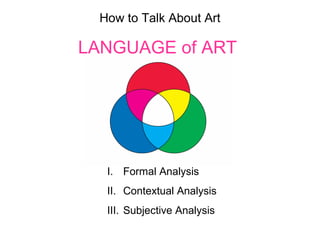
- 1. How to Talk About Art LANGUAGE of ART I. Formal Analysis II. Contextual Analysis III. Subjective Analysis
- 2. I. FORMAL ANALYSIS A. Elements and Principles of Design B. Medium/Media
- 3. A. Elements of Design 1. Line 2. Shape 3. Form 4. Space 5. Color 6. Texture 7. Time
- 4. LINE LINE starts as a POINT. A line is the mark made by a medium between two different points. It is also the edge created when two shapes meet. Lines imply direction, by moving the pen to make a mark or moving the eye to see the lines. Medium refers to the type of material used in an artwork, for example pencil, paint, ink, etc. Classical
- 5. LINE has different qualities It can be expressive, dramatic, romantic, curvy and dynamic or it can be geometric, static, classical, implied, crisp and straight. It can divide and connect, be thick, thin, long or smooth. Autographic Implied Contour
- 6. Eugene Delacroix is known for his expressive line and his work follows the Romantic style. Jacques Louis-David is a founder of the Neo-classical style, thus his line is classical and geometric
- 7. Hung Liu, Three Fujins. 1995 Hung Liu was trained as a painter in Communist China under Chairman Mao’s regime. She relocated to Oakland and continues to develop her painting style with a greater sense of artistic freedom. What do you notice about the different kinds of line in this painting? http://www.youtube.com/watch?v=LV8e43K2zCI
- 8. SHAPE SHAPE is a self-contained, 2- dimensional area of geometric or biomorphic (organic) form. SHAPE is indicated by an OUTLINE. It is flat. FORM FORM is a solid that occupies a 3- dimensional volume. It is measured in width, height, and depth. SHAPE becomes FORM when you add depth: circle to sphere, square to cube, etc. Positive Shape Negative Shape
- 9. Rubin Vase We call the base layer or background of a painting the ground. The ground is known as the negative shape while the figure over the ground is known as a positive shape. The Rubin vase plays with our perception with a reversal of the figure-ground relationship. Kara Walker, Exodus of Confederates from Atlanta, 2005. Lithography and silkscreen on paper.
- 11. SPACE SPACE is what contains FORM. It can be actual and 3-dimensional as it is with sculpture, installation and architecture. On the flat, 2-dimensional surface of a canvas (the picture plane), space is called pictorial depth, or spatial recession. Techniques of conveying a sense of pictorial depth is done through illusion by using various systems of PERSPECTIVE.
- 12. LINEAR PERSPECTIVE is a mathematically accurate system of drawing lines in such a way to represent parallel lines receding to a single point, or two points, on the viewers’ horizon, called the vanishing point. It was developed during the Renaissance. One-point linear perspective Two-point linear perspective
- 13. SPACE can be described as being flat, having depth, having linear perspective, and atmospheric perspective. LIGHT, COLOR, VALUE and PERSPECTIVE are elements used to define the illusion of SPACE.
- 14. FLAT PERSPECTIVE
- 15. COLOR COLOR has several attributes and these are HUE, VALUE and SATURATION. HUE = COLOR: they mean the same thing. COLOR is described in reference to its HUE found on the color wheel. VALUE is the degree of lightness or darkness of the HUE/COLOR. It is created by the amount of light reflected from an object’s surface. SATURATION or intensity is a color’s quality of brightness or dullness. High saturation is vivid and pure, low saturation looks muddy or grayed. Blue in a range of values
- 17. ACHROMATIC = NO COLOR COMPLEMENTARY
- 19. POLYCHROMATIC = MANY COLORS
- 20. COLOR and VALUE are used to give depth for spatial recession. Leonardo da Vinci’s Madonna on the Rocks demonstrates atmospheric perspective with the rocks in the background (higher up on the picture plane) looking hazy and bluish-gray. Through ATMOSPHERIC PERSPECTIVE, objects in the far distance have less clarity than closer objects and the sky becomes paler on the horizon.
- 21. A great range of VALUE adds drama to the artwork. CHIAROSCURO is used by artists of the Renaissance to render the effects of light and dark. In Italian chiaro means light and oscuro means dark.
- 22. TEXTURE TEXTURE is a word used to describe the FORM of an art work’s ability to call forth the tactile, or touch perceived, quality of a surface. It is described by words such as smooth, rough, polished, prickly, grainy, oily, hard, soft.
- 23. ACTUAL TEXTURE
- 24. IMPLIED TEXTURE
- 25. TIME TIME is an element when the art work is telling a story or involves movement. You might view a series of illustrations in an altarpiece that tell the story of the Virgin Mary. By walking through an installation the element of TIME exists in the art work. A figure in an art work who is implied to be in motion also suggests time.
- 26. 1. Balance 2. Emphasis 3. Proportion & Scale 4. Rhythm & Repetition 5. Variety 6. Unity A. Principles of Design
- 27. BALANCE BALANCE refers to the even distribution of weight in a composition. Balance deals with the visual weight of the apparent “lightness” or “heaviness” of the shapes and forms arranged in a composition. BALANCE can be Assymetrical, Symmetrical, Radial, Absolute, and Bilateral. ASSYMETRICAL BALANCE
- 29. RADIAL BALANCE
- 30. EMPHASIS Artists use emphasis in order to bring your attention to one area of the work. This area is also referred to as the FOCAL POINT of the composition. One way to establish emphasis is by creating strong contrasts of LIGHT and COLOR.
- 31. PROPORTION SCALE is the word used to describe the dimensions of an art object in relation to the original object it depicts or in relation to the objects around it. PROPORTION refers to relationship between the parts of an object and the whole, or to the relationship between an object and its surroundings.
- 33. RHYTHM & REPETITION When same or like elements such as shapes and colors are used in REPETITION over and over in a composition, a visual RHYTHM develops. PATTERNS created from RHYTHM and REPETION imply MOVEMENT and TIME.
- 34. VARIETY The visual world is made up various different lines, forms, colors, textures and other elements. All the different factors must work together. UNITY and VARIETY must coexist in a work of art, in other words there is a tension that the artist must balance.
- 35. UNITY UNITY happens when all the various elements and principles of design in an art object come together with a sense of completeness and wholeness. Each of the principles of design working together leads to unity. There is a consistent feeling of completion in the composition.
- 36. Discuss the overall composition in this painting by Raphael, Madonna of the Goldfinch (Madonna del Cardellino), 1506.
- 37. II. CONTEXTUAL ANALYSIS 1. Identifying Subject Matter 2. Style: Regional/Period 3. Historical Context 4. Meaning/Content/Iconography
- 38. IDENTIFYING SUBJECT MATTER STILL LIFE LANDSCAPE MODE of REPRESENTATION
- 39. FIGURATIVE
- 41. PERIOD STYLE STYLE The combination of form and composition that make an art object distinct. Neo-Classical Contemporary Renaissance
- 42. REGIONAL STYLE China, Qing Dynasty Netherlands
- 44. ICONOGRAPHY
- 45. ICONOGRAPHY Iconography in visual culture is the identification of meanings associated with forms and figures. The forms and figures function as holders of symbolic or narrative content, often specific to a particular time and place. Luscious fruits and flowers symbolize the abundance of nature but also it’s inevitable decay Insects also symbolize the vulnerability of material life to decay and death This is a wedding knife with Peeters’ signature on it Clara Peeters, Still Life with Fruit and Flowers, 1612 Branch of art history that studies the interpretation of the content, or meaning, of images. It is the writing (-graphy) of images (icon-).
- 46. Iconography is secular and non-secular. Non-secular means something has to do with religion. Jean Fouquet. Étienne Chevalier and St. Stephen, Virgin and Child. c. 1452–1455 Iconography refers to religious symbolism found in Christian art as well as secular symbolism from Classical mythology, current cultural trends, and the artist’s, and often patron’s, personal life. The face of this Virgin Mary portrait was painted to resemble King Charles VII of France’s favorite mistress, Agnes Sorel. The Virgin Mary is typically seen wearing blue. Colors inform form and figure – this is iconography.
- 47. Secular means something is separate from religion and has ZERO affiliation with it. Common secular themes involve love, death, money, drugs and Mickey Mouse. What are some other symbols and motifs used in contemporary iconography?
- 48. III. SUBJECTIVE ANALYSIS What was your personal response when viewing the art object? An art object is nothing without the viewer. It’s important to observe how the art object made you feel. Go deeper. Did it make you recall a memory, a person or event in your own life?
Editor's Notes
- Pictorial depth is a specializing aspect of composition in which the 3-dimensional world is represented on a flat surface, or picture plane. The area behind the picture plane is called the picture space and contains three zones: the foreground middle ground, and background. The artist’s choice for conveying depth depends on various cultural and personal factors. In European art, the tradition of linear perspective is popular and creates highly convincing illusions of recession into space. In other cultures and at other times, indicating a recession into space is avoided to emphasize the surface rather than the space.
- An artist makes the choice as to how and what he or she wants create. One choice is to render observed reality with photographic precision, and this requires illusion of pictorial depth if you’re working with a 2-dimensional surface. Another choice is to create an abstract work, one that is not based in observed reality but observed imagination. Choosing a perspective is informed by the subject matter and the mode of representing the subject matter; is it a still life or landscape, is it figurative, is it non-objective, is it an abstract expression? Modern art denies the notion of an artwork to even need a “subject matter,” emphasizing the process or idea rather than the final product. [James Abbot McNeill Whistler, Nocturne in Black and Gold , the Falling Rocket , 1875. Oil on panel. Katsushika Hokusai, The Great Wave , c. 1831. Woodblock print on paper. Matisse, Dance , 1910. Oil on canvas.]
- For instance a dark blue has a deeper value than a light blue. In a black and white work you only see value, not hue or saturation. One lowers the saturation of a hue by adding either gray or the hue opposite on the color wheel.
- In the 1660s, British scientist Sir Isaac Newton discovered that color is a direct function of light. Newton found that sunlight passed through a prism breaks into bands of different colors in what is known as the spectrum. We perceive the hues as a result of differing wavelengths of electromagnetic energy. By reorganizing the visible spectrum into a circle, connected through the hue red-violet, the result may be diagrammed as a conventional color wheel, which Newton was the first to do. The primary colors are red, yellow and blue, designated by a 1 on the color wheel. All colors come from mixing these three primary hues. The secondary colors, orange, green and violet, are a mixture of the two primaries it lies between. Intermediate colors designated by number 3 are mixtures of a primary and neighboring secondary. Complementary colors lie opposite from one another on the color wheel (yellow and violet, red and green, blue and orange). Red orange and yellow are regarded as warm colors and appear to advance toward us. Blue, green and violet, which seem to recede, are called cool colors. Black and white are considered neutral and not really colors, but black is understood as the absence of colors and white as the mixture of all colors. What role does color play in your life? Which hues do you choose?
- Local color is the color of objects viewed up close under even lighting conditions. However our perceptions of color can change depending on the light and surrounding atmosphere.
- Hieronymus Bosch Garden of Earthly Delights, c. 1505-1515
- Caravaggio. The Calling of St. Matthew . 1599–1600
- Marble is smooth to touch as it appears. Painters can apply paint thickly onto their canvas through the technique of impasto, and this gives an actual texture.
- Visual texture is another illusion – it looks like there is actual texture but the surface is smooth. Visual texture is a primary tool of any photographer. Textures in a photo are revealed by light.
- Felix Gonzelez-Torres, Untitled (Loverboy). This is a stack of blue paper at 7.5 inches high on the gallery floor. Visitors are instructed to take a sheet as they walk by. As time passed the stack of paper gradually diminished, an allegory for the slowly disappearing body of Gonzalez-Torres’ partner, who died of AIDS.
- The principles of design inform the total organization of forms in a work. The arrangement of the forms create the composition of the piece. These six principles work together to form a sense of harmony in a completed work. The elements are used to follow certain principles and that creates the overall composition. An artist doesn’t consciously separate these principles in his/her work, but we are discussing these qualities one by one so that we can develop a vocabulary to talk about art. For example the Vitruvian Man by Leonardo da Vinci is his famous study of the human figure and its proportions. He includes all of the principles of design here. The figure is perfectly balanced and symmetrical. The navel in the center is the emphasis, also called the focal point. The limbs appear twice, in the circle as well as the square. Different concepts are unified here as a whole, the earthly and the spiritual represented by the square and circle.
- Artists manipulate scale by the way they depict the relative size of objects. One of the ways of depicting pictorial depth or spatial recession to show perspective is to depict a thing closer to us as larger than a thing the same size farther away. This change in scale helps us to measure visually the space in the scene before us. When a mountain fills a small percentage of the space in a painting, we know that it lies somewhere in the distance. We judge its actual size relative to other elements in the painting. Katsushika Hokusai, The Great Wave , c. 1831
- The classical Greeks, in particular the sculptor Polyclitus, believed that beauty itself was a function of proper proportion. In terms of the human body, these perfect proportions were determined by the sculptor Polyclitus who described them in a text called the canon, which is Greek for “rule.” The perfection of the human figure is based on the fact that each part of the body is a common fraction of the figure’s height. According to the canon, the height of the head should be one-eighth of the total height of the body and the width of the shoulders one-fourth of the total height of the body. Mathematics are often involved in determining the scale and proportion of art objects.
- One can see that the possibilities are nearly endless and artistic choice depends both on the time and place where the work was created as well as the objectives of individual artists. This is going to lead us into our next category for discussing art, which is the CONTEXTUAL analysis. When doing a contextual analysis of an art object we are talking about the content, the subject matter, style, historical context. The FORMAL analysis is being discussed as separate to the CONTEXTUAL analysis, but both inform one another as it is the artist’s choice as to how to design the content. The third category is the SUBJECTIVE analysis which is your response to art object. What is the mood, emotion, or idea the work evokes in you and why? When doing a subjective analysis mention the events in your life that led you to feel the way you do, perhaps the work recalls an event from your past.
- Observe what’s going on in the picture plane in regards to symmetry, spatial depth, light, color, and line.
- Subject matter is what the image or object is depicting literally. The content of the work is the meaning of the image or object, which is often deeper and more complex then the surface depiction. We will be talking a lot about the content of an art object through iconography, which includes the identification of symbols. SYMBOLS are images that take on meaning by association, resemblance or cultural convention. For example $
- Not all works of art have a subject matter. Many buildings, paintings, sculptures and other art objects include no recognizable references to things in nature nor to any story or historical situation, focusing instead on lines, colors, masses, volumes, and other formal elements. We classify art objects based on their subject matter in what is referred to as their mode of representation. The modes of representation are: Figurative, Landscape, Still Life, and Abstract: Non-Objective/Non-Representational – term used for art that does not aim to produce recognizable natural imagery, and Expressionism – style where the artist exaggerates forms to draw out the viewer’s subjective response or to project the artist’s own subjective feelings. When discussing the mode of representation, one is also discussing the STYLE of the art object which we will expand on further.
- This brings us to the style portion of contextual analysis. STYLE is the combination of form and composition that makes a work distinct. There is a branch of art history called Stylistic Analysis that recognizes the work of an individual artist or the characteristic manner of groups of artists working in a particular time or place. Some of the common terms used to discuss artistic STYLE are period, region, representation, linear, abstract, and painterly. Period style refers to the common traits detectable in a work of art and architecture from a particular historical era. PERIOD and STYLE are different, when discussing a work of art distinguish between it’s STYLE and the PERIOD of time it’s from.
- Regional Style refers to stylistic traits that persist in a geographic region. An art historian who specializes in Medieval art from Spain can differ between objects created in Medieval Spain from objects created in Medieval Italy. Watercolor from China: Yun Shouping. Amaranth . 1633–1690 and from the Netherlands Anna Maria Sibylla Merian. Plate 9 from the Metamorphosis of the Insects of Surinam . 1719
- Representational styles are those that describe the appearance of recognizable subject matter in ways that make it seem life-life. When identifying the subject matter, one first asks what is the mode of representation. We already talked about a few (Landscape, Figural, Still Life, Abstract), now we will look at Naturalism and Idealization. Realism and Naturalism are used interchangeably to characterize artists’ attempts to represent the observed world in a way that appears accurate. The representation is mimicking nature. Realism is also a specific period style, so when it’s capitalized it’s referring to a style that appeared during the mid to late 19 th century in Europe and North America. Idealization strives to create images of physical perfection according to the dominant trends, tastes and values of a culture. Artists often work in a naturalistic style and then distort the image in a geometric or curvilinear way to make it an idealization, a bit like improving upon perfection. Not necessarily following nature or tradition. Idealization almost always occurs when representing a person of power in the Ancient world.