1. Unit 21 notes
BRIEF:
Develop an idea for a marketing poster for Paul Harts EP ‘Progression’.
The poster must sell Paul as an artist, sell his EP. It should clearly state how
to get his EP, where to get more information on Paul. If photos are used they
should be from the recent photo-shoot.
1.
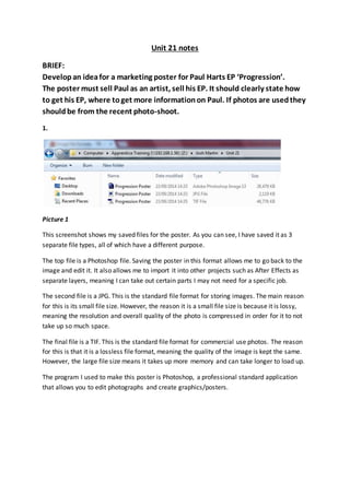
Picture 1
This screenshot shows my saved files for the poster. As you can see, I have saved it as 3
separate file types, all of which have a different purpose.
The top file is a Photoshop file. Saving the poster in this format allows me to go back to the
image and edit it. It also allows me to import it into other projects such as After Effects as
separate layers, meaning I can take out certain parts I may not need for a specific job.
The second file is a JPG. This is the standard file format for storing images. The main reason
for this is its small file size. However, the reason it is a small file size is because it is lossy,
meaning the resolution and overall quality of the photo is compressed in order for it to not
take up so much space.
The final file is a TIF. This is the standard file format for commercial use photos. The reason
for this is that it is a lossless file format, meaning the quality of the image is kept the same.
However, the large file size means it takes up more memory and can take longer to load up.
The program I used to make this poster is Photoshop, a professional standard application
that allows you to edit photographs and create graphics/posters.
2. 2.
Picture 2
Here is the workspace bar in Photoshop. From top to bottom, the tools are:
Move tool – This allows you to simply move the selected layer around the canvas.
Marquee tool – This allows you to select an area, which can then be adjusted. E.g. you
can use the eraser tool to erase things that are only in that area; stopping you from
erasing things you don’t want to. By holding the mouse on the marquee tool you can
select rectangular, elliptical, single row and single column marquees. This allows you to
select areas in different shapes.
Lasso tool – This works similar to the marquee tool except you can draw the selected
shape freely. Holding the mouse over will allow you to select polygonal lasso (which will
allow you to make the selection with straight lines) and the magnetic lasso (which
selection to an already existing object).
Quick selection tool – This also works like the marquee tool except you can select the
area by drawing over an area, which will then automatically select the shape you are
drawing over. Holding the mouse over this will drop down the magic wand tool, which
is very similar but you click the area instead of drawing over, allowing you to quickly
select full shapes.
Crop tool – Allows you to crop out a specific area by resizing the crop grid.
Eyedropper tool – Allows you select a colour that already exists in the project. This
allows you to make sure things match colour exactly.
Healing brush – This allows you to heal/repair and image. So if you do something in
your project that you don’t like, e.g. drawing over an object you didn’t want drawing
over, you can use this tool to repair it. It works by using content-awareness to predict
what should have been there and patches it.
Brush tool – Simply allows you to draw onto the page. Holding over this tool brings up
the pencil tool, which does the same thing but with a pencil texture.
Clone stamp tool – Allows you to stamp an area of your image elsewhere on the page.
It works by using alt-click to select the area you want to stamp. As you then draw over,
the draw point and the stamp point will move along with each other, meaning where
you draw corresponds to where you initially stamped. Holding the mouse over this
brings up the pattern stamp tool, which works similar to the paint tool except it paints a
pattern rather than a solid colour.
History brush - This tool makes a copy of the image as it was in a previous state, then
uses the content of this copy to paint with.
Eraser tool – Simply allows you to rub out a part of the image by drawing over it.
Holding the mouse on this brings up the background eraser (which allows you to erase
parts of a background layer) and the magic eraser (which erases a selected area quickly)
Gradient tool – Allows you to fill an area with a gradient by drawing a live vertically or
horizontally along the page. Holding the mouse over this brings up the paint tool, which
allows you to fill an area with a solid colour.
Blur tool – Allows you to blur an area by drawing over it. Holding the mouse over this
tool also brings up the sharpen tool (allows you to sharpen a drew over area) and the
smudge tool (allows you to smudge out the edge of an object by drawing from inside
the edge to outside).
3. Dodge tool – Brightens the pixels in the selected area. Holding the mouse over this tools also
brings up the burn tool (darkens the pixels) and sponge (de-saturates the colours in selected
area).
Pen tool – Allows you to create a path by creating a starting point, multiple mid points
(which can be bent) and an end point (which is the same as the starting point). After creating
this path you can do multiple things with it such as creating a mask in that area, copying the
selected area or singling out the selected area in its own separate layer.
Text tool – Simply allows you to add text to an image in different fonts and sizes.
Path selection tool – Allows you to select a path point and adjust it even after the path is
finished.
Rectangle tool – Allows you to draw a perfect rectangle, which can be adjusted in several
ways such as adjusting the fill or stroke. Holding the mouse over this tool allows you to draw
different shapes such as circles and lines.
Hand tool – Allows you to move the “camera” in the project, changing your field of view.
Zoom tool – Allows you to zoom in and out of your project.
Select colour tool – Allows you to change the foreground and background colours you will
use when using the tools in Photoshop.
In my poster I didn’t need to use many of these tools as it was only a simple project. However, I feel
that if needed to then I could use them. The tools I did use where the text tool, which I adjusted by
changing the stroke to a green colour. I also made the texts different sizes to each other, making
important text bigger.
I also used the paint bucket tool to give the poster a plai n black background, which doesn’t draw the
attention away from the foreground.
I also used the import option to import images onto the canvas, such as the progression album art,
the Otiss music logo and the logos of the locations the album can be bought on.
I also used the undo option to quickly undo any unwanted changes I made.
3.
The poster was created on an A4 size canvas (standard poster size). Throughout creating this poster I
used grids set at half way down the page both vertically and horizontally to keep everything in the
poster looking tidy and well positioned. Taking up the majority of the canvas is the cover art for the
EP, drawing attention to it. Above that is large text with the name of the musician and below is large
text with the name of the EP. Below this, in slightly smaller text, is a little extra information, which
states that it is a debut EP and is available now. Below that, with a bit of a gap, is small text saying
“available at”, which is then followed by the logos of where it is avai lable. All of the logos are widely
well known so there is no need for text stating what they are. In the bottom left corner is the Otiss
music logo (the record label that released the EP) and in the bottom right corner is information of
where to find more information about Paul Hart. Most of the images used are PSD’s to allow me to
move them around the image better as there is a transparent background.
4. 4.
Effectiveness – During the process of making this poster I believe I learnt a fair amount of new skill s
as I experimented a bit whilst making it. I also believe that this could have been a better poster had I
knew even more about the tools and there use. However, I do believe the poster is of a good quality
considering the skills I had at the time.
Sources of information – A lot of the skills used in this project I self-taught myself, but some extra
information was given to me by John Stockton (trainer), which helped me out a bit. I already knew
the information I needed to put on the poster about the EP and the artist as I have previously made
videos promoting both the EP and artist so there was no need for extra research as I knew all I
needed to know.
Production process – I created a rough mental idea of the poster, which was then quickly drawn out
onto paper using mostly labels of what would go there rather than drawing specifics. I then went
into Photoshop and basically made what I had in mind in there, first by adding the EP cover, then the
info about the EP, then the Otiss logo. It pretty much looked the same as how I had planned it to
look. My boss, who gave me the brief, looked at the poster and gave me some feedback, stating that
some of the text was a bit big, which I then went back to and resized to make it look better and
tidier.
Finished product – The finished product is pretty much how I intended it to be. I believe it fits the
purpose that it was created for and is of a good standard for it to compete with similar products.