Visual Thinking and Practical Design Principles By Dustin Stout
•
2 likes•926 views

From the SMX West Conference in San Jose, California, March 1-3, 2016. SESSION: Getting Images Right In Paid Search. PRESENTATION: Visual Thinking and Practical Design Principles - Given by Dustin W. Stout, @dustinwstout - Weal Media Corporation, CMO. #SMX #31B

Recommended
Recommended
More Related Content
What's hot
What's hot (20)
Viewers also liked
Viewers also liked (8)
Similar to Visual Thinking and Practical Design Principles By Dustin Stout
Similar to Visual Thinking and Practical Design Principles By Dustin Stout (7)
More from Search Marketing Expo - SMX
More from Search Marketing Expo - SMX (20)
Recently uploaded
Recently uploaded (20)
Visual Thinking and Practical Design Principles By Dustin Stout
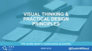
- 1. #SMX #31B @DustinWStout With as little designer mumbo-jumbo as possible. VISUAL THINKING & PRACTICAL DESIGN PRINCIPLES
- 2. #SMX #31B @DustinWStout Just look at any social network. FACT 1: The Internet is becoming more and more visual every day.
- 3. #SMX #31B @DustinWStout The first website ever created. Stunning, isn’t it?
- 6. #SMX #31B @DustinWStout Fogg, B., Soohoo, C., Danielson, D., Marable, L., Standord, J., & Tauber, E. (2003) FACT 2: Human beings have evolved to judge their environment based on visual cues.
- 7. #SMX #31B @DustinWStout Stout, Dustin W. (2015) VISUAL TRUST: When something looks professional, we generally assume that it is professional.
- 8. #SMX #31B @DustinWStout ▪ Balance ▪ Framing ▪ Contrast ▪ Color ▪ Typography ▪ Quality ▪ Consistency Visual Trust Indicators dustn.tv/visual-content-design
- 9. #SMX #31B @DustinWStout Plain and simple. Don’t screw that up. BEFORE ALL ELSE: The purpose of good visual design is to effectively communicate a message.
- 10. #SMX #31B @DustinWStout Very small area in which to communicate a message. WHAT WE’RE WORKING WITH
- 11. #SMX #31B @DustinWStout Four primary components to a good display ad.
- 12. #SMX #31B @DustinWStout Our brains are programmed to see symmetry as beauty. BALANCE: Clearly structured with visual “weight” evenly distributed throughout the canvas.
- 13. #SMX #31B @DustinWStout Maybe animals do too, I don’t know-- let’s try to stay on topic.
- 14. #SMX #31B @DustinWStout Determine the subject and counter balance it.
- 15. #SMX #31B @DustinWStout Position your text in a way that makes sense.
- 16. #SMX #31B @DustinWStout Also known as white space or negative space. FRAMING: Creating even clearance around the edges of your visual piece.
- 17. #SMX #31B @DustinWStout Also known as white space or negative space. FRAMING: This is an example of really bad framing. Please do not subject your audience to text that goes all the way to the edge of the canvas.
- 18. #SMX #31B @DustinWStout Bad contrast on top, good contrast on bottom.
- 19. #SMX #31B @DustinWStout Bad contrast on top, good contrast on bottom.
- 20. #SMX #31B @DustinWStout See what I did there? When you frame your message, it directs people’s eyes better than a thousand tacky-looking arrows ever would.
- 21. #SMX #31B @DustinWStout Probably the hardest thing to explain, so let me show you... CONTRAST: Visual distinction between background and subject matter.
- 22. #SMX #31B @DustinWStout Bad contrast on top, good contrast on bottom.
- 23. #SMX #31B @DustinWStout Witty commentary here. COLOR: Using the right combinations can set an emotional and psychological tone.
- 24. #SMX #31B @DustinWStout Start paying attention to opening credits in movies. COLOR TIP 1: White text on dark (or high contrast background) works best.
- 25. #SMX #31B @DustinWStout Start paying attention to opening credits in movies. COLOR TIP 2: Forget all those “studies” about what color to make your CTA. Just make sure it passes the Squint Test.
- 26. #SMX #31B @DustinWStout Squint test 1: PASS
- 27. #SMX #31B @DustinWStout Squint test 2: FAIL
- 28. #SMX #31B @DustinWStout Squint test 3: PASS
- 29. #SMX #31B @DustinWStout Squint test 3: PASS
- 30. #SMX #31B @DustinWStout Start paying attention to opening credits in movies. COLOR TIP 3: Stick to 3 colors or less, with your CTA being the brightest.
- 31. #SMX #31B @DustinWStout Resist the urge to give a lecture on the difference between “typefaces” and “fonts”. TYPOGRAPHY: Or in other words-- choosing the right “fonts” for the job.
- 32. #SMX #31B @DustinWStout Visual Consistency at play.
- 33. #SMX #31B @DustinWStout Visual Consistency at play.
- 34. #SMX #31B @DustinWStout Visual Consistency at play.
- 35. #SMX #31B @DustinWStout Plain and simple. Don’t screw that up. BEFORE ALL ELSE: The purpose of good visual design is to effectively communicate a message.
- 36. #SMX #31B @DustinWStout SEE YOU AT THE NEXT #SMX THANK YOU!