More Related Content
Similar to 5. film poster analysis x3
Similar to 5. film poster analysis x3 (20)
5. film poster analysis x3
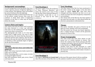
- 1. Background/ surroundings: Text/Headings 2: Text/ Headings:
For the background of the film poster they have The lower tagline ‘From the producers The title/ name of the film has been positioned at
used a vigorous amount of high key lighting to of Texas Chainsaw Massacre’ will the lower central of the poster. It has also been
create tension. This lighting is then surrounded entice the viewers even more if they typed in capital ‘Calisto MT’; ithas then been
by natural darkness (low key lighting). like the film Texas Chainsaw Massacre, enlarged and then colorized red; this is so it can
The background fades to black towards the rear and therefore would like to see it stands out above the dark and gloomy composition
of the poster; simple because they want the because it was mad by the same surrounding it.
audience to think about what is happening producers. The release date of the film has also been typed in
towards on the floor or what may be buried the same font and style; it is then placed below the
below the woods. directors and producers information bar.
Camera Shots and Angles: Theme:
The camera shot that has been used to portray The poster identifies the genre of horror by the
the main character is a close- up/ mid-wide Mise-en-scene, setting/ scene and iconography.
shot; this is so the audiences don’t get dragged The film poster has not got any binary opposites,
away from what is around him. this is simply because it shows all the gruesome
The photograph also looks as if it has been features of a horror film.
taken from a slight worms- eye view or high
angle direction, this shows that the character is
powerful and has more superior. This has been Props/ Iconography:
shown by the way the lower half of the poster is The main props that have been shown on this
in darkness; it then gradually begins to lighten poster are: is a knife/ machete or cleaver. This
by the tip of his weapon. shows the audience how bloody and gory this film
is going to get before they go and see it. This prop
is also known as a ‘Phallic Symbol’.
Colours: Another main prop for this character is a well
The colours that have been used within this known for having is a white mask, this shows that
poster are: the character is unknown; which makes it harder to
Black: This colour represents death, mysterious identify him.
vibes, terror and fear.
White: Revealing what is yet to come, in terms
of seeing the light to heaven. Text/Headings 3:
Red: Red symbolizes death, pain, terror, blood The tagline (’Welcome to Crystal Lake’) at the top of the poster doesn’t tell you anything
and many more. about the narrative of the film; this is so the audience would be more enticed to watch it.
Shanice.S©
- 2. Camera Shots and Angles: Backgrounds/ surroundings: Props/ Iconography:
The main photograph on the poster is an extreme The background of the poster is solid The main prop that has been identified within
close-up of a creepy mythical character with a black; this is so the main feature of it this poster is mobile; this prop is obviously the
mysterious smirk and appears to be full of ideas can stand out above the rest. key feature thought the film.
and intentions. This is shown because he is The outline of the face fades into the The creator of the poster hasn’t revealed any
holding a mobile phone to create suspense of darkness of the darkness/ background. other key features, i.e: setting/ background or
what he is plotting. props because they want the audience to find
The type of lighting that has been used is artificial out how good the film is for themselves.
and the position of the lighting is face- on/
central, the same direction as the character eye
line. Theme:
The creepy character central of the poster has
identified to the theme of horror by the
Colours: suspicious look on there face.
The colours that have been used within this To make the character look even more scary
poster are: they have mad its eye someone’s moth
Black: Black is the main colour on the poster screaming, this reveals a bit more suspense of
simply because they want to show how dark and how scary the film is going to be.
mysterious the film is going to be, also there don’t This poster includes Levi Strauss’s binary
give away any secrets and is very cleverly opposite of good vs. evil and innocence vs.
keeping there audience in suspense. wicked.
White: White has been used to show the title of
the film and the rest of the information in the
footers notes.
Text/ Headings:
Skin colour but ghostly: This colour has been The title of the film has been positioned just
used to show how strange and unusual the main above the directors and producers information
character is in the film. bar in white ‘Lucinda Fax’font; this may have
Red: This colour is used to show tagline at the top been used because they want the title to look as
of the poster and the release date. if it has been created on a mobile phone.
All of the colours that have been used in this film
poster are quite monochrome and minimalistic;
Text/Heading 2:
this is because they have only used a small verity
The tagline for this film ‘What will it sound like when you die?’ is asking the audience a
of colours to make such a large impact on its
personal question, it is also making the audience think about the film as reality.
audience.
Shanice.S©
- 3. Backgrounds/ surroundings: Camera Shots and Angles:
The background of the poster is very simple The main photograph that is incorporated into
and plain; this is because the creators want the film poster is very effective; it is a hand with
the audience to focus on the main key feature splinters impaled into it. This creates tension
instead of what could or may be happening in towards the viewers.
the background. The camera shot that has been taken to show
the key feature of the poster is a low eye level
shot; this does not reveal a main character or
Colours: villain, it just shows the main feature that goes
The colours that have been used on this with the title of the film.
poster are:
Black: Has been used to make the musky Theme:
green colour darker. This film poster doesn’t show any form of Levi
Grey: The light grey has been mainly used for Strauss’s theory, this is simply because the
the background, so the main feature central of creators want the audience to be more terrified
the poster is shown perfectly. of what is yet to be revealed from the film
Green: Green shows the unusual colour of the before watching it.
persons skin whilst the splinters are
corroding out of the skin.
Deep red: The deep red has been used to
Text/ Headings:
make the title stand out above the rest of the
The font that has been used for the title is
background.
‘Cracked’ or it lookslike using another
Props/ Iconography: software to create the blood splat effect around
The prop on the poster to show how spine the title.
chilling the film is and is explanatory of the
title is the splinters coming out of the person’s
Text/ Headings 2:
The tagline that has been put on the film poster
hand.
is ‘It will get under your skin’, this tagline
The lighting that has been used within the set
makes the audience think about what is causing
up of the composition is artificial light, to
such an unusually strange mutated creature
show the main feature in the central of the
come from the surface of your skin.
page.
Shanice.S©