Poster: Image, Design, Language
•Download as ODP, PDF•
0 likes•259 views

A2 short film Escape. EBK

Recommended
More Related Content
What's hot
What's hot (20)
Viewers also liked
Viewers also liked (13)
Similar to Poster: Image, Design, Language
Similar to Poster: Image, Design, Language (20)
More from Shohad Islam
Recently uploaded
Recently uploaded (20)
Poster: Image, Design, Language
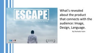
- 1. What’s revealed about the product that connects with the audience: Image, Design, Language. By Shohadul Islam
- 2. Image The image we used in our poster has a very deep meaning to it. It shows emptiness, loneliness as well as a sense of freedom which is represented by the open sky and the man underneath. The audience will be able to connect to this poster as our daily life has become very systematic and we are chained down by responsibilities which take away our freedom. This image shows what freedom would look like in our mind.
- 3. Language The language we used in our poster is simple and easy to understand, but its very meaningful. The tagline ‘’trapped in a life for too long’’ tells the audience the movie is about a person who is tired of the way everything is and his life and he just wants to escape from it. The words ‘Escape’ ‘Trapped’ will draw the audience’s attention as these words are very familiar with people who are tired down by their boring jobs, lifestyles. So I the choice of the language for this poster is very effective on the audience.
- 4. Design The design of this poster is also very simple but shows professionalism of the creator. The colour white and light blue is used for the poster. The white colour represents a sense of peace and calm, comfort and hope, and the colour blue represents peace, serenity, ethereal, spiritual. Moreover, these two colours are also very eye catchy. The square shape for the name of the movie not only works as a design factor to make the poster look good, but also it tells the audience that the man in the movie is circled around by things(such as work) which takes away his freedom, relatable to our target audience.