
Recommended
More Related Content
What's hot
What's hot (20)
Viewers also liked
Viewers also liked (20)
Similar to Album advert analysis
Similar to Album advert analysis (20)
More from Spencermedia
Recently uploaded
Recently uploaded (20)
Album advert analysis
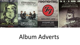
- 2. Kings of Leon • Shots: 4 close ups compiled and overlapped by an eagle graphic. • Text: Uses few words, title of artist and album with a small amount of advertising • Mode of Address: poster? • Language: Formal • Layout: Graphics take up the majority of the advert, titling goes at the top and bottom of the advert • Color: light shades (green, blue, white) for names and graphics. Bold red for 'out now' to highlight it can be bought • Font: Similar to old code text, relates to the picture as the picture appears to need decoding.
- 3. Stereophonics • Shots: Mid shot with added graphics • Text: Both titles at the top, with album details at the bottom • Mode of Address: Poster? • Language: Formal • Layout: Everything centralized • Color: Black and white text with the color focus on the imagery • Font: Black text for titles and white text for details (placed in waves so its visible)
- 4. Foo Fighters • Shots: N/A • Text: Titles above and details below, simplistic • Mode of Address: Poster? • Language: Formal • Layout: All central text and logo, details situated at the bottom • Color: Red and black bold logo, clear white text for details • Font: Graphics in the font to make the advert more creative as it is a simplistic design for 'greatest hits'
- 5. Two Door Cinema Club • Shots: Mid shot of cat with a gradient overlay • Text: Title above with information on deluxe extras, tour information listed below • Mode of Address: Poster? • Language: Formal • Layout: Graphic centralized, details both above and below with album title at the top • Color: White text with little color in the graphics, overall a very plain design • Font: Same font used throughout, except for title which has added graphics to add slight creativity
- 6. Two Door Cinema Club • Shots: Mid shot of cat with a gradient overlay • Text: Title above with information on deluxe extras, tour information listed below • Mode of Address: Poster? • Language: Formal • Layout: Graphic centralized, details both above and below with album title at the top • Color: White text with little color in the graphics, overall a very plain design • Font: Same font used throughout, except for title which has added graphics to add slight creativity
Editor's Notes
- 1
- 2
- 3
- 4
- 5