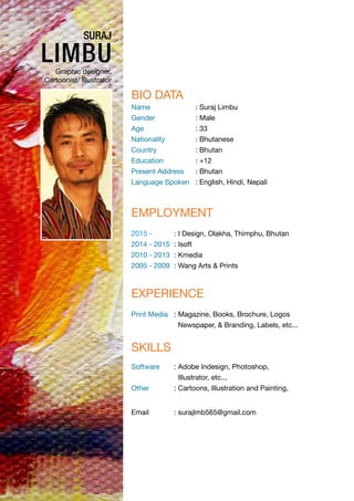
1. suraj
limbuGraphic designer,
Cartoonist/ Illustrator
Bio Data
Name : Suraj Limbu
Gender : Male
Age : 33
Nationality : Bhutanese
Country : Bhutan
Education : +12
Present Address : Bhutan
Language Spoken : English, Hindi, Nepali
Employment
2015 - : I Design, Olakha, Thimphu, Bhutan
2014 - 2015 : Isoft
2010 - 2013 : Kmedia
2005 - 2009 : Wang Arts & Prints
Skills
Software : Adobe Indesign, Photoshop,
Illustrator, etc...
Other : Cartoons, Illustration and Painting,
Experience
Print Media : Magazine, Books, Brochure, Logos
Newspaper, & Branding, Labels, etc...
Email : surajlmb565@gmail.com
2. Work Experience
Designed
1. Tashi Delek Magazine
2. It Magazine
3. DHI Melong
4. Annual Report
5. Corporate Profile
6. Religious Magazine
3.
4. Logo designed
Koufuku
Book Bhutan Tour Sacred Destination Travel
FFCD07 ( C-0, M-18, Y-99, K-0 )
FF0000 ( C-0, M-99, Y-100, K-0 )
000000 ( C-75, M-68, Y-99, K-90 )
Koufuku ( Font ) = Helvetica (56 Rome)
LOGO DESCRIPTION
The logo is designed delving and taking into consideration the origin and significance of
the company.
Red Color
The red color is incorporated keeping with the place of origin of the company, Japan. This
exciting color signifies confidence that the company holds.
Yellow Color
The yellow color is relative to what the company brings and promises. Like the ideal of the
company, Koufuku, the color – yellow shines with optimism, enlightenment, and happiness,
and carries with it the promise of a positive future, instilling optimism and energy, as well as
sparking creative thoughts.
The Image of a Lady
The image of a lady is the portrayal of peaceful, caring and loving nature of a woman. Staying
true to the company, Koufuku, which means happiness, these entire qualities of a woman,
here relative to the ideal of the company, harbor in promoting happiness.
The Face of a Woman
The well structured face of the woman, emerging from the bright red colour, symbolizes
beauty, confidence and strength of the company.