Logopalooza 3 - The Art of Brand & Logos. Digital design magazine.
•
2 likes•994 views

Digital magazine celebrating the art of branding and logo design. Case studies, examples, tech tips logo trivia and more. Volume 3 in a series. A relaunch of an earlier digital magazine. 32 pages of logo goodness.

Recommended
More Related Content
What's hot
What's hot (20)
Similar to Logopalooza 3 - The Art of Brand & Logos. Digital design magazine.
Similar to Logopalooza 3 - The Art of Brand & Logos. Digital design magazine. (20)
Recently uploaded
Recently uploaded (20)
Logopalooza 3 - The Art of Brand & Logos. Digital design magazine.
- 1. G A L L E R Y • C A S E S T U D I E S • T I P S • T R I V I A • N E W S
- 2. The Logo Factory Inc. 6741 Columbus Road, Unit 10, Mississauga, Ontario, Canada. L6T 5G9 Toll-free 1.866.891.9794 (USA & Canada only) International & local 1.905.564.6747 Logopalooza and related art is TM/Copyright 2006 The Logo Factory. The Logo Factory is a registered trademark. Example logos featured in Logopalooza – Volume 3 – are the property of the copyright and/or trademark respective holders. Examples of“in progress”work product are copyright and/or trademark The Logo Factory Inc. All rights reserved. Unauthorized use and/or reproduction prohibited. Logopalooza Volume Three copyright 2017 The Logo Factory Inc. All rights reserved. For further information on The Logo Factory visit us on the web at www.TheLogoFactory.com or contact by e-mail at info@thelogofactory.com 3
- 3. e first coined the name Logopalooza back in 2006 as a downloadable ebook to showcase our work, a bit ahead of its time really - the only place you could find it was on our website and bandwidth concerns being what they were, we had to be judicous in how we made it available. Even then, the first volume of Logopalooza was downloaded a couple of hundred thousand times. It never became as regular as we would have liked - we published another one in 2011 - but the name continued to serve us well. It was the name of our blog. When we launched a few podcasts we called them Logopalooza too. It was always a great name for anything that celebrates logos, branding and the design of same. This notion was always a part in the design aspect of the branded projects. We’ve been kicking around the idea of revisiting Logopalooza as a digital magazine for years now, but as we were celebrating our 20th anniversary, we started work in earnest. We redesigned the logo, while keeping true to the carnival vibe of the original, our dancing Logopalooza man still intact. We’ve recently launched a website - www.Logopalooza.com - but where that’s going to go is anyone’s guess. This is very much an experimental project, but now we’ve many distribution channels open, we may make it into a regular thing. Time will tell. This volume is still a showcase of work by the gang at The Logo Factory, but we’ve expanded the format somewhat, adding some some case studies, tips and a few other bits and pieces. If this turns into a regular gig, we’re planning to open future volumes to other designers so that they can showcase their work too. We’ll add some news, some more in-depth technical and design articles and maybe the occasional surprise. We’ll keep you posted. W AboutLogopalooza
- 4. Studio 247 Interior DesignBela Flor Real Estate ReptoLand Pet Shop 1.866.891.9704 www.Logopalooza.com3
- 5. 1.866.891.9704 www.TheLogoFactory.com Trivia:SoYouThinkYouKnowLogos? The Nike Swoosh logo was created in 1971 by graphic design student Carolyn Davidson, for $35.00, based on a billing rate of $2.00 per hour. Davidson did however, get more of a payday from the athletic company in 1983 when Nike gave Davidson a gold Swoosh gold ring and an envelope filled with an undisclosed amount of Nike stock to express their gratitude. The Rolling Stones lips logo has come to represent the legendary mouth of Mick Jagger but designer John Pasche is on record that the original inspiration came from an image of the Hindu goddess Kali. Pasche was paid £50 for his work at the time, but received the generous supplement of an extra £200 a couple of years later. The group themselves now own the copyright, but in 2006, Pasche sold the original artwork for £400,000. People often mistakenly attribute the design of the Rolling Stones logo to America pop art legend Andy Warhol. While he didn’t design the logo, Warhol worked with Jagger and The Stones on numerous projects including the cover art for Sticky Fingers and Love You Live The Volkswagen logo was the result of a 50 Marks office competition, won by an engineer named Franz Reimspiess (the same man who perfected the engine for the Beetle in the 1930’s). The first Apple logo was designed in 1976 by Ronald Wayne and featured Sir Isaac Newton sitting under a tree, an apple dangling precipitously above his head. According to the Yamaha description of their logo:“The three tuning forks of the Yamaha logo mark represent the cooperative relationship that links the three pillars of our business — technology, production, and sales. They also evoke the robust vitality that has forged a reputation for sound and music the world over, a territory indicated by the enclosing circle. The mark also symbolizes the three essential musical elements: melody, harmony, and rhythm”. For more logo news & trivia check out The Logo Factor design blog.
- 7. 1.866.891.9704 www.TheLogoFactory.com Numbskulls Sour Apple CandyWild Food Plants Reliable Air ConditioningThe Retirement Hour New Leaf LandscapingBulldog Studios
- 8. CaseStudy:Azure Regardless of what some absolutists will say, blends and gradients are perfectly legitimate as long as they’re used judicially, not as a visual crutch to substitute for something“missing.” In this case, we needed to have a flame, it had to be blue (the company name actually means blue in Italian) so not much choice. For what it’s worth, we did create some“flat design”versions anyway. Alas, they didn’t have the same effect at all (truth to tell, logos with gradients have always required a flat version anyway – for applications when blends are either not appropriate or technically unsound.) A lot of designers freak over blends in logos, claiming that they can’t be reproduced using spot-color printing. That simply isn’t true: When it comes to utilizing gradients in logos, we can dial it back when applying that logo to other material. Just because your lead logo is full of blended goodness, that certainly doesn’t mean you have to go to town on collateral material – business cards, letterheads and the like – with wanton abandon. Rather, using flat support graphics can set off a logo with gradients quite nicely.
- 9. CaseStudy:HealthNut Our studio is often brought in the very early stages of startups, to assist with brand development – the‘look and feel’of the company’s corporate image. Such was the case for a Vancouver based health food company who were planning to market heath bars and related products under the name Rawsome! It was under that identity that our designers started working up some rough logo design concepts: Due to some trademark conflicts the company had to change their name in mid-stride and after a few weeks came up with the provocative moniker‘Eat Me Raw.’Naturally, this name required an entirely different approach to the logo, so we worked up some concepts using edgier fonts and a rougher approach to the overall design. (left) Somewhere during the conceptual stages, we developed a graphic character which would stay with us through the entirety of the project, and was eventually selected by the client as part of the final logo. It was only after the packaging was designed, did the client start to worry that the name was a little too provocative. After talking to some of their vendors, they concluded that the name – as humorous as it might be – was likely to narrow the product line’s appeal and marketability. After a great deal of hand-wringing and gnashing of teeth, a new name – Health Nut – was proposed by our team. Luckily, the little graphic character we had developed earlier, fit in perfectly with this new direction and was, in fact, a appropriate depiction of a‘Heath Nut.’A little bit of font jujitsu, and Health Nut had their new logo.
- 10. Big Bark Custom Card PacksBadland Buggy Off-Road Vehicles Protair-X Technologies Inc. 1.866.891.9704 www.Logopalooza.com3
- 11. Timbuktu Studios Thinking Green!Speech Geek 1.866.891.9704 www.TheLogoFactory.com
- 12. Knotty Pine LiquorSal’s Pizza Blue Omega Entertainment 1.866.891.9704 www.Logopalooza.com3
- 13. 1.866.891.9704 www.TheLogoFactory.com Soupy’s Tequila Shack Seaira Air Wave RegulatorsIngena Consulting
- 14. CaseStudy:DiceMan Box manufacturers already have off-the-shelf die lines available (you can see some of the pink die lines in the artwork featured) and the assembly process is set up for particular sizes. The game originally planned to have die-cut characters in the four Dice Man colors. These were scrapped as being too cost prohibitive, so wooden talisman from another game were substituted. We designed this logo & packaging almost 20 years ago, but it still makes an interesting case study in how logos can‘drive’the artwork of design material around it. Dice Man was a Canadian board game produced in the late 90s and was distrbuted through toy stores in the USA and Canada. In this electronic game era, it’s not often you get to design a logo for a board game. It’s even less likely that you’ll get to design an entire game, from the characters to the packaging, to the actual board itself. It’s actually a lot of fun. (Above) The Dice Man logo. (Right) the full design, featuring the character himself. When designing artwork for packaging and boxes, we have to work within already established printing specifications.
- 15. When working on toy and game packaging, there are a host of government and toy council regulations in regards to font sizes, placement, warning labels and the like. The box art has to be submitted for approval before production. Dice Man won the Swedish gaming industry’s Årets Spel (Game of the Year) in the 2001 Children’s category. Toy stores have shelves that are particular sizes, and the box has to fit within their displays.
- 16. Random 55 GTA ExoticsAzure Midstream Company 1.866.891.9704 www.Logopalooza.com3
- 17. 1.866.891.9704 www.TheLogoFactory.com Veteran’s For National SecurityDairyland Printing E2 Optics
- 18. Tweeters Chicken CribKindred Spirits & Wine Tiny Umbrellas children’s charityDizzy Dog pepper sauce Fogazzo Wood Fired Ovens & BBQsGrilled Cheese & Co 1.866.891.9704 www.Logopalooza.com3
- 19. The Logo Mechanics Dante’s Cafe & BistroFutureTech Networks 1.866.891.9704 www.TheLogoFactory.com
- 20. Premium Guard Oil FiltersBrett Firm Legal Putters Wild Extreme Mini Golf 1.866.891.9704 www.Logopalooza.com3
- 21. 1.866.891.9704 www.TheLogoFactory.com Bullfrog Irrigation & Outdoor LightingThomas Allen Coffee Company Monster MediaHosting Sky Cloud Services Texas Heritage Real EstateD4
- 22. Ohio Valley Credit UnionAzurn Networks Health NutLouisville Ladder Oakley Redfish TourAlcana 1.866.891.9704 www.Logopalooza.com3
- 23. Mojo Mamma’s Coffee Hut Bar La Parata RestaurantThe Vital Spot Sports Bar & Grill 1.866.891.9704 www.TheLogoFactory.com
- 24. As much as it would help us in our day-to-day, there’s really no automated solution to turn sketches into usable vector art (auto-tracing results are iffy) and only one way to insure file and art fidelity – vectorizing by hand. CaseStudy:ComicVine While these types of logos are not for every business or venture, we’ve had a lot of requests for this kind of design since we opened our doors and it’s remained a specialty of our shop. Accordingly, we thought it would be fun to show you the stages that go into making a highly illustrative logo – anatomy of an illustrative design if you will – and to do so, we’d use the project for Comic Vine, a client who, as part of their client brief, had requested an identity with a“comic book vixen.” Like all projects requiring illustrative work, the design for Comic Vine began the old-fashioned way – with pencil, pen and paper. Rather than hurriedly jumping into desktop design software, our designers always begin by drawing a series of rough sketches and concepts which are then shown to the client and“tightened up”through an iterative process.
- 25. Here’s the initial vector art as rendered from preliminary sketches. Once we have the baseline to our vector illustration, we can colorize it, add details, shading and turn the image into a final study of our leather-clad hero. Here she is in all her glory: We needed to add some comic book appropriate type so we worked up a skewed version of the client’s name. This also needed to be dynamic enough to stand on its own when use of the full logo wasn’t an option, due to size restrictions or aspect ratio limitations. It was then just a matter of assembling the various components into a full logo. Voila:
- 26. Aviva Capital ManagementPure Soul Coffee Company Fusion Cafe Coffee HouseAnna Lord’s Lingerie Red Door RealtyOra Lee’s Kitchen & Caterin 1.866.891.9704 www.Logopalooza.com3
- 27. 1.866.891.9704 www.TheLogoFactory.com Opinion:TheDesignContestPyramid The risks, rewards & payoffs of hosting (or entering) a logo design contest. Designers submitting quality, original ideas. People who have coped designs from somewhere else or using material from stock image sites. People with a working knowledge of design software but little design skill or experience in logo design or branding. People with little or no skill and limited knowledge of design software.Motivated to enter design contests by the "earn money,anyone can submit" claims of the host site. Most design contest sites do not have vetting procedures in place - anyone can join and participate in contests anonymously. Designers who reuse recycled designs & concepts fromother contests.
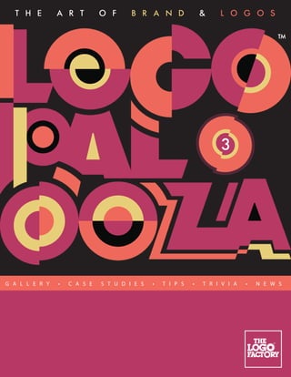
- 28. CaseStudy:Logopalooza From the beginning, we knew we needed – this was supposed to be a‘celebration’of logos, so it had to be funky. Upbeat. Maybe even a little zany. When we first designed the Logopalooza logo back in 2006, we even had a little dancing dude (who was plugged into an iPod for the podcast series.) For what it’s worth, here’s how everything looked back then: Trouble is, we were never happy with it. Sure, it worked with the theme but it just wasn’t there. The longer it hung around, the less “there”it became. The entire concept revolved around the logo being consistent and yet we kept changing it with each outing. The little dancing guy came and went. The font stayed the same, but we changed its configuration. And so on. Logopalooza remained one of “those”internal branding projects – something that we’d get around to redesigning when we had the time. For this design, I knew from the get-go that I wanted something different. I wanted unique, colorful and a logo that spelled out “celebration.”Easy, right? Not quite. This logo is not without some challenges, including the fact that Logopalooza is a very long word. Eleven letters long to be exact. There’s also two‘L’s, which are a pain in the kerning department. Due to its main purpose (book covers like this one) the logo needed to end up with a squarish aspect ratio so we began by stacking the letters. It needed a bold, circular font, so the design was based on Futura Extra Bold, made even rounder and bulbous with absolute circles. We looked for angles that we could mirror throughout the design and how circles could trim letters that were in proximity to make interesting shapes that could be turned into a logo. You can see some of the deconstruction process at left.
- 29. Still unsure of the frequency of publication so for the time being, we added a volume number‘bug’ to the design. Choosing the right colors for a logo is always important, but in this case would be critical – color would not only bind the design together, it would lead the viewer’s eye through the word. With the fractured letters and the word Logopalooza itself, legibility was going to be a big issue so we had to use muted, harmonious color schemes, trying to avoid combinations that would clash and/or vibrate. Most of the schemes were black and three colors (the one we ended up with was black plus four.) Once we had the palettes figured out, it was time to start adding them to various shapes in the logo: While we originally intended to ditch our little Logopalooza dancing man, at some point he found his way back in. He still seemed to fit with the general theme of things and it’s always nice in a re-brand if you can hat-tip the legacy design.
- 30. TechTips:VectorFiles In technical terms, a vector graphics file is your logo artwork, broken down into a series of geometric shapes, consisting of outlines that are curved and joined at X Y coordinates or points. These coordinates and shape outlines are stored as mathematical equations, creating small and portable file sizes that are infinitely editable. This is what a vector file looks like in preview mode (left,) wire-frame mode (right,) and without vectors visible. In the simplest terms, you can imagine a vector shape as a rubber band, wrapped around nails that have been pushed into a pegboard. The vector shapes work pretty well the same way. Move the nail and the‘rubber band’ shape will change. The idea of vector formats also applies to and typography that’s featured in your design. When type has been converted to a vector shape, it is no longer editable as type (but is editable as artwork) and doesn’t require the font used to be installed in the computer that’s opening up the file. These are referred to as outline fonts. Vector formats can generally be identified by the following file extensions – .EPS (Encapsulated Postscript.) .AI (Adobe Illustrator proprietary format.) .PDF (Portable Document Format.) .SVG (Small Vector Graphics.) .CDR (Corel Draw proprietary format.) If you don’t have vector versions of your logo, you’re gonna need to get some.
- 31. Logopalooza Logopalooza is a semi-regular publication devoted to the art of brand & logo design. Each volume features design examples, case studies, tips, news and other interesting tidbits revolving around logos and design. To be notified about future volume releases visit Logopalooza.com TheLogoFactory The Logo Factory Inc. is a web-centric design studio that develops logos and brand identities for clients across the globe, their primary activity since 1996. Clients can visit The Logo Factory web site, view logo examples, submit their job requests to a team of logo designers who can then take these ideas and bring them to visual reality with preliminary, yet finished, preliminary designs. These initial concepts can be previewed on The Factory Floor, a client only area, where logos can be fine-tuned until project finalization. Once the project is completed, clients can download all the relevant logo files and formats, while TLF design staff can guide you through the add-on design and brand-building phase. For more information visit TheLogoFactory.com
- 32. www.Logopalooza.com Logopalooza is a monthly publication of The Logo Factory Inc. www.TheLogoFactory.com