
Recommended
More Related Content
What's hot
Similar to R Programming Unit 3 part-1
Similar to R Programming Unit 3 part-1 (20)
More from Vikram Nandini
More from Vikram Nandini (20)
Recently uploaded
Recently uploaded (20)
R Programming Unit 3 part-1
- 1. GRAPHICAL ANALYSIS 2/20/2021 VIKRAM NEERUGATTI, PROF. & HOD, DEPT. OF CSE, AUDISANKARA INSTITUTE OF TECHNOLOGY, GUDURU. 1
- 2. CREDITS 2/20/2021 VIKRAM NEERUGATTI, PROF. & HOD, DEPT. OF CSE, AUDISANKARA INSTITUTE OF TECHNOLOGY, GUDURU. 2 MRS sir Google
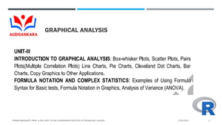
- 3. CONTENT 2/20/2021 VIKRAM NEERUGATTI, PROF. & HOD, DEPT. OF CSE, AUDISANKARA INSTITUTE OF TECHNOLOGY, GUDURU. 3 Introduction Graphical Analysis Box-whisker plots Scatter plots Pairs Plots Line Charts Pie charts Cleveland Dot Charts Bar Charts Copy Graphics to other Applications
- 4. INTRODUCTION-GRAPHICAL ANALYSIS 2/20/2021 VIKRAM NEERUGATTI, PROF. & HOD, DEPT. OF CSE, AUDISANKARA INSTITUTE OF TECHNOLOGY, GUDURU. 4 Graphical Analysis is a tool for science students to collect, graph, and analyze data. The primary advantages of graphical representation of data are: Facilitates and improves learning: graphics make data easy to understand and eliminate language and literacy barriers. Understanding content: visuals are more effective than text in human understanding.
- 5. BOX-WHISKER PLOTS 2/20/2021 VIKRAM NEERUGATTI, PROF. & HOD, DEPT. OF CSE, AUDISANKARA INSTITUTE OF TECHNOLOGY, GUDURU. 5
- 6. BOX-WHISKER PLOTS 2/20/2021 VIKRAM NEERUGATTI, PROF. & HOD, DEPT. OF CSE, AUDISANKARA INSTITUTE OF TECHNOLOGY, GUDURU. 6
- 7. SCATTER PLOTS 2/20/2021 VIKRAM NEERUGATTI, PROF. & HOD, DEPT. OF CSE, AUDISANKARA INSTITUTE OF TECHNOLOGY, GUDURU. 7 Scatterplots show many points plotted in the Cartesian plane. Each point represents the values of two variables. One variable is chosen in the horizontal axis and another in the vertical axis. The simple scatterplot is created using the plot() function.
- 8. SCATTER PLOTS 2/20/2021 VIKRAM NEERUGATTI, PROF. & HOD, DEPT. OF CSE, AUDISANKARA INSTITUTE OF TECHNOLOGY, GUDURU. 8
- 9. SCATTER PLOTS 2/20/2021 VIKRAM NEERUGATTI, PROF. & HOD, DEPT. OF CSE, AUDISANKARA INSTITUTE OF TECHNOLOGY, GUDURU. 9
- 10. PAIRS PLOTS 2/20/2021 VIKRAM NEERUGATTI, PROF. & HOD, DEPT. OF CSE, AUDISANKARA INSTITUTE OF TECHNOLOGY, GUDURU. 10 The pairs plot is a grid of scatterplots. showing the bivariate relationships between all pairs of variables in a multivariate dataset.
- 11. PAIRS PLOTS 2/20/2021 VIKRAM NEERUGATTI, PROF. & HOD, DEPT. OF CSE, AUDISANKARA INSTITUTE OF TECHNOLOGY, GUDURU. 11
- 12. LINE CHARTS 2/20/2021 VIKRAM NEERUGATTI, PROF. & HOD, DEPT. OF CSE, AUDISANKARA INSTITUTE OF TECHNOLOGY, GUDURU. 12 A line chart is a graph that connects a series of points by drawing line segments between them. These points are ordered in one of their coordinate (usually the x-coordinate) value. Line charts are usually used in identifying the trends in data. The plot() function in R is used to create the line graph
- 13. LINE CHARTS 2/20/2021 VIKRAM NEERUGATTI, PROF. & HOD, DEPT. OF CSE, AUDISANKARA INSTITUTE OF TECHNOLOGY, GUDURU. 13
- 14. PIE CHARTS 2/20/2021 VIKRAM NEERUGATTI, PROF. & HOD, DEPT. OF CSE, AUDISANKARA INSTITUTE OF TECHNOLOGY, GUDURU. 14 R Programming language has numerous libraries to create charts and graphs. A pie-chart is a representation of values as slices of a circle with different colors. The slices are labeled and the numbers corresponding to each slice is also represented in the chart. In R the pie chart is created using the pie() function which takes positive numbers as a vector input. The additional parameters are used to control labels, color, title etc
- 15. PIE CHARTS 2/20/2021 VIKRAM NEERUGATTI, PROF. & HOD, DEPT. OF CSE, AUDISANKARA INSTITUTE OF TECHNOLOGY, GUDURU. 15
- 16. PIE CHARTS 2/20/2021 VIKRAM NEERUGATTI, PROF. & HOD, DEPT. OF CSE, AUDISANKARA INSTITUTE OF TECHNOLOGY, GUDURU. 16
- 17. CLEVELAND DOT CHARTS 2/20/2021 VIKRAM NEERUGATTI, PROF. & HOD, DEPT. OF CSE, AUDISANKARA INSTITUTE OF TECHNOLOGY, GUDURU. 17 dotchart() function in R Language is used to create a dot chart of the specified data. A dot chart is defined as a plot which is used to draw a Cleveland dot plot.
- 18. CLEVELAND DOT CHARTS 2/20/2021 VIKRAM NEERUGATTI, PROF. & HOD, DEPT. OF CSE, AUDISANKARA INSTITUTE OF TECHNOLOGY, GUDURU. 18
- 19. CLEVELAND DOT CHARTS 2/20/2021 VIKRAM NEERUGATTI, PROF. & HOD, DEPT. OF CSE, AUDISANKARA INSTITUTE OF TECHNOLOGY, GUDURU. 19
- 20. BAR CHARTS 2/20/2021 VIKRAM NEERUGATTI, PROF. & HOD, DEPT. OF CSE, AUDISANKARA INSTITUTE OF TECHNOLOGY, GUDURU. 20 A bar chart represents data in rectangular bars with length of the bar proportional to the value of the variable. R uses the function barplot() to create bar charts. R can draw both vertical and Horizontal bars in the bar chart. In bar chart each of the bars can be given different colors
- 21. BAR CHARTS 2/20/2021 VIKRAM NEERUGATTI, PROF. & HOD, DEPT. OF CSE, AUDISANKARA INSTITUTE OF TECHNOLOGY, GUDURU. 21
- 22. BAR CHARTS 2/20/2021 VIKRAM NEERUGATTI, PROF. & HOD, DEPT. OF CSE, AUDISANKARA INSTITUTE OF TECHNOLOGY, GUDURU. 22
- 23. COPY GRAPHICS TO OTHER APPLICATIONS 2/20/2021 VIKRAM NEERUGATTI, PROF. & HOD, DEPT. OF CSE, AUDISANKARA INSTITUTE OF TECHNOLOGY, GUDURU. 23 Plots panel –> Export –> Save as Image or Save as PDF
- 24. COPY GRAPHICS TO OTHER APPLICATIONS 2/20/2021 VIKRAM NEERUGATTI, PROF. & HOD, DEPT. OF CSE, AUDISANKARA INSTITUTE OF TECHNOLOGY, GUDURU. 24 It's also possible to save the graph using R codes as follow: Specify files to save your image using a function such as jpeg(), png(), svg() or pdf(). Additional argument indicating the width and the height of the image can be also used. Create the plot.
- 25. COPY GRAPHICS TO OTHER APPLICATIONS 2/20/2021 VIKRAM NEERUGATTI, PROF. & HOD, DEPT. OF CSE, AUDISANKARA INSTITUTE OF TECHNOLOGY, GUDURU. 25
- 26. SUMMARY 2/20/2021 VIKRAM NEERUGATTI, PROF. & HOD, DEPT. OF CSE, AUDISANKARA INSTITUTE OF TECHNOLOGY, GUDURU. 26 Introduction Graphical Analysis Box-whisker plots Scatter plots Pairs Plots Line Charts Pie charts Cleveland Dot Charts Bar Charts Copy Graphics to other Applications
- 27. ANY CLARIFICATIONS? 2/20/2021 VIKRAM NEERUGATTI, PROF. & HOD, DEPT. OF CSE, AUDISANKARA INSTITUTE OF TECHNOLOGY, GUDURU. 27
- 28. THANK YOU 2/20/2021 VIKRAM NEERUGATTI, PROF. & HOD, DEPT. OF CSE, AUDISANKARA INSTITUTE OF TECHNOLOGY, GUDURU. 28