Accessibility patterns testable requirements during early design
•
1 like•702 views

Shift left for accessibility: get a head-start by identifying requirements early in the design/build cycle, with an aim to reducing defects and overall effort.

Recommended
Recommended
More Related Content
What's hot
What's hot (20)
Similar to Accessibility patterns testable requirements during early design
Similar to Accessibility patterns testable requirements during early design (20)
More from Aidan Tierney
More from Aidan Tierney (7)
Recently uploaded
Recently uploaded (20)
Accessibility patterns testable requirements during early design
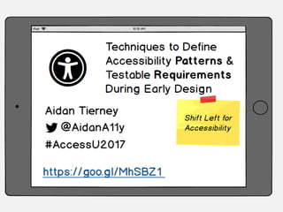
- 1. Techniques to Define Accessibility Patterns and Testable Requirements During Early Design
- 2. 'Shift left' for accessibility Identify user interaction patterns: UX, Design, Content Specify pattern requirements: Dev and QA More on traditional Shift Left: en.wikipedia.org/wiki/Shift_left_testing
- 3. When do projects typically review accessibility? Contract/SOW Business Requirements Mockups & Wireframes Visual Design Copy deck Development QA User testing In Production (audits, complaints)
- 4. We can review accessibility at any stage Contract/SOW Business Requirements Mockups & Wireframes Visual Design Copy deck Development QA User testing In Production (audits, complaints)
- 5. Early development Contract/SOW Business Requirements Mockups & Wireframes Visual Design Copy deck Development QA User testing In Production (audits, complaints)
- 6. Advantages & goals of early reviews • Better user experience – Fewer accessibility gaps – More consistent, discoverable behaviour for keyboard- only and screen reader • Reduce overall project effort – Fewer defects & quicker to resolve – Faster test/fix cycles • Happier teams – Teams prefer clear and specific requirements – Less last-minute panic
- 7. Identify patterns from mockups Identify user interaction patterns: UX, Design, Content Specify pattern requirements: Dev and QA
- 8. RECOGNIZING USER INTERACTION PATTERNS Warm-up exercise
- 9. westjet.com
- 10. aircanada.com (site edition selector)
- 11. Air Canada US homepage https://www.aircanada.com/us/en/aco/home.html
- 13. ACCESSIBILITY ISSUES ARE PREDICTABLE Have you ever noticed?
- 14. Across your accessibility testing, What are the issues you almost always see?
- 15. The usual suspects Alt text missing or inaccurate Headings missing or inaccurate Form labels Error presentment where, when, how Roles tab set, button, toggle States expanded/collapsed selected, disabled Audio, video, animation cannot be stopped Notifications & updating content
- 16. IF WE CAN PREDICT ISSUES, CAN WE PREVENT THEM?
- 17. Before we build it we can… • Identify defects in the interaction design – These will require changes to the interface • Identify requirements to avoid defects • Identify accessibility patterns – Simpler, common – Harder, unique No need to be perfect. Anything you can prevent now is better than later!
- 18. WIREFRAME & MOCKUP ACCESSIBILITY REVIEWS
- 19. What's a wireframe or mockup?
- 20. Before the design or the code
- 21. A blueprint or schematic
- 22. A website wireframe, also known as a page schematicor screen blueprint, is a visual guide that represents the skeletal framework of a website... The wireframe depicts the page layout or arrangement of the website’s content, including interface elements and navigational systems, and how they work together. The wireframe usually lacks typographic style, color, or graphics, since the main focus lies in functionality, behavior, and priority of content. In other words, it focuses on what a screen does, not what it looks like. Wireframes can be pencil drawings or sketches on a whiteboard, or they can be produced by means of a broad array of free or commercial softwareapplications. en.wikipedia.org/wiki/Website_wireframe
- 24. What's an annotation? # Accessibility 1. 2. 2. 3. 4. 5. 6. 7. 8. 9.
- 25. Types of accessibility annotations • 3 relate to predicting & avoiding issues • 1 relates to identifying actual issues that require a change
- 26. Content alt text, labels, instructions (off-screen & onscreen) Development patterns Known or simple Complex development tasks (do-able) Not accessible as-is We need to talk: interface changes needed (or an exemption)
- 27. Content alt text, labels, instructions (off-screen & onscreen) Development patterns Known or simple Complex development tasks (do-able) Not accessible as-is We need to talk: interface changes needed (or an exemption)
- 28. # Accessibility Text 1. Needs alt text (e.g. "back") 2. No alt text needed for any of the icons to the left of inputs on this screen 3. No alt text needed for icon 4. No alt text needed 5. Needs hidden/off-screen label (business to provide) 6. Needs hidden/off-screen label (business to provide) 7. Needs hidden/off-screen label (business to provide) 8. Add/subtract icons need alt text 9. Needs hidden/off-screen label (business to provide)
- 29. Off-screen & onscreen content • Alt text for icons, images, charts • Hidden label text • New or revised onscreen content such as expected data values, instructions or required field messaging • This content will go into the copy deck for translation and approvals • Keep in mind the wireframe is not a copy deck and most of the words are placeholders
- 30. Content alt text, labels, instructions (off-screen & onscreen) Development patterns Known or simple Complex development tasks (do-able) Not accessible as-is We need to talk: interface changes needed (or an exemption)
- 31. # Accessibility Pattern 1. Button 2. No alt text needed for any of the icons to the left of inputs on this screen 3. For screen reader whole row should act as single element. No alt text needed for icon 7. After screen reader user updates value it needs to be announced 8. Buttons. Needs to convey if in disabled state 10. Button 11. Heading 12. Is role a radio or a tab? Must convey selected/checked
- 32. # Accessibility Text Accessibility Pattern Comments 1. Needs alt text (e.g. "back") Button Business to provide text 2. No alt text needed for icons to left of inputs 3. Whole row acts as single element No alt text needed for chevron icon 5. Offscreen label (e.g. departure city) Offscreen label Business to provide text 6. Offscreen label (e.g. arrival city) Offscreen label Business to provide text 7. Update notification (live region) Screenreader announces as number updates 8. Need alt text (e.g. 'add', 'remove') Buttons. Disabled states Business to provide text
- 33. Common accessibility patterns • Headings & levels • Buttons vs. links • Data tables • Disabled elements • Tabs, Radio buttons, checkboxes • Collapsed/expanded content • Live regions (updates w/o screen load) • All the things WCAG says must be 'programmatically determinable'
- 34. Content alt text, labels, instructions (off-screen & onscreen) Development patterns Known or simple Complex development tasks (do-able) Not accessible as-is We need to talk: interface changes needed (or an exemption)
- 35. # Accessibility Comments 1. Calendar will need special attention from development team.
- 36. Complex interactions or elements • Calendars • Maps • Carousel • Audio/video player • Custom camera • Timers
- 38. Content alt text, labels, instructions (off-screen & onscreen) Development patterns Known or simple Complex development tasks (do-able) Not accessible as-is We need to talk: interface changes needed (or an exemption)
- 39. # Accessibility Comments 1. No mechanism for captions 1
- 41. # Accessibility Comments 1. We need to talk 2. No really. If you can make this accessible I will buy you all lunch 1 2
- 42. Not accessible in current state • No expected data format (if triggers error) • Missing instructions, required fields • Media or carousel that cannot be paused (no controls) • Video (synchronized) without "CC" option, unless open captioned • No transcript link • Complex interactive charts, maps or games
- 43. IDENTIFY ISSUES AND OPTIONS, DON'T WRITE SOLUTIONS As you're reviewing
- 44. Annotation tips Useful Avoid Assume readers have some accessibility experience Teaching Accessibility 101 in the annotations Needs alt text. (maybe provide an example) What the alt text should be Needs a hidden label. (maybe provide an example) What the label text should be Needs consistent heading Should be <h1>
- 45. More annotation tips Useful Avoid Ask the interaction designer or team Assume how it will work This is a tabset, a button How to code it Wireframe missing X functionality or content (e.g. pause/play animation control, a way to view transcript) How to design or code it Indicate a pattern is complex & needs discussion with developers Write a mini-tutorial in the wireframe
- 46. What you cannot review in a wireframe A classic wireframe does not include: • Visual design decisions (such as colours, fonts, positioning, images) • Technical decisions • Final "copy" All text is subject to change. Labels, instructions, error messaging or headings cannot be reviewed with much certainty. Checks related to visual designs, code, copy/content should be planned for later in the project.
- 47. LET'S REVIEW A WIREFRAME! Exercise
- 49. Content alt text, labels, instructions (off-screen & onscreen) Development patterns Known or simple Complex development tasks (do-able) Not accessible as-is # Accessibility Text Accessibility Pattern Comments 1. 2. 3.
- 50. Wireframe review exercise • Work in pairs (or a small group) • Decide who will be: – Interaction designer (gets to make stuff up) – Interviewer/Accessibility SME • On your own, spend a moment looking over the wireframe (as your role) • Work together to complete the review – fill in annotations
- 51. # Accessibility Text Accessibility Pattern Comments 1. 2. 3. 4. 5.
- 52. PART 2
- 53. How should the patterns behave? Identify user interaction patterns: UX, Design, Content Specify pattern requirements: Dev and QA
- 54. From patterns to requirements • Specific and testable requirements and expected behaviors • Plain language where possible, not code • Collaboration between accessibility and development (leads)
- 55. Traditional approach: Accessibility & Development '…Oh, and make it accessible' 'Here's a link' Wait, wait Test Surprise!
- 56. COLLABORATION & MORE SPECIFIC ACCESSIBILITY REQUIREMENTS Can we do better?
- 57. Accessibility SME talks to Dev lead • Which technologies, frameworks? • Any reuse of existing code, components? • Timelines, sprints • Will changes to components populate across application? • Complex widgets • 3rd party code (e.g. video players, maps)
- 59. • Description of pattern • Screenshot • Keyboard interactions • WAI-ARIA roles, states, and properties • Code snippets • Examples • Resources - blog posts, tutorials
- 63. Description A button is a widget that enables users to trigger an action or event, such as submitting a form, opening a dialog, canceling an action, or performing a delete operation. Button vs. link: a link navigates away from current context; a button triggers new content in same context. But there will be exceptions. Note: menu button and toggle button are different, unique patterns
- 64. Screenshots
- 65. Keyboard Interactions When the button has focus: • Space activates the button. • Enter: Activates the button. Following button activation: • If activating the button opens a dialog, the focus moves inside the dialog. (see dialog pattern) • If activating the button closes a dialog, focus typically returns to the button that opened the dialog unless the function performed in the dialog context logically leads to a different element. • If activating the button does not dismiss the current context, then focus typically remains on the button after activation, e.g., an Apply or Recalculate button. • If the button action indicates a context change, such as move to next step in a wizard or add another search criteria, then it is often appropriate to move focus to the starting point for that action. You don’t need to read this now!
- 66. WAI-ARIA Roles, States, Properties The button has role of button. The button has an accessible label. By default, the accessible name is computed from any text content inside the button element. However, it can also be provided with aria-labelledby or aria-label. If a description of the button's function is present, the button element has aria-describedby set to the ID of the element containing the description. When the action associated with a button is unavailable, the button has aria-disabled set to true. Also see: See menu button and toggle button You don’t need to read this now!
- 67. Code Snippets <div role="button" id="print"> Print Page </div> <a tabindex="0" role="button" id="alert1"> Show alert </a>
- 69. Links vs. Buttons in Modern Web Applications - Marcy Sutton marcysutton.com/links-vs-buttons-in-modern- web-applications/ Links are not buttons. Neither are DIVs and SPANs - Karl Groves karlgroves.com/2013/05/14/links-are-not- buttons-neither-are-divs-and-spans/ Resources
- 71. A more collaborative approach Identify Accessibility patterns in designs Identify items that need alternative text (and provide) Ask about technology & constraints Identify WAI-ARIA (or iOS/Android) best practices and other behavior Discuss & agree on testable behavior & requirements Dev makes pattern prototypes Dev demonstrates the pattern meets the requirements Build Test
- 72. A more collaborative approach Identify Accessibility patterns in designs Identify items that need alternative text (and provide) Ask about technology & constraints Identify WAI-ARIA (or iOS/Android) best practices and other behavior Discuss & agree on testable behavior & requirements Dev makes pattern prototypes Dev demonstrates the pattern meets the requirements Build Test
- 73. What's different? • Not just sending a link to a best practice • Team agrees (commits) to specific and testable expected behaviors • Takes into account constraints of the platform, framework or legacy code • Yes, it's more work for Accessibility team • More time for Dev preparing to build • Less time fixing defects at the end
- 74. And we're done! Identify user interaction patterns: UX, Design, Content Specify pattern requirements: Dev and QA
- 76. Techniques to Define Accessibility Patterns and Testable Requirements During Early Design