1. DOUBLE PAGE SPREAD
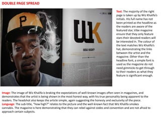
Text: The majority of the right
page is taken up by Wiz Khalifa’s
initials. His full name has not
been printed as the headline as
the readers are aware of the
featured star, Vibe magazine
ensure that they only feature
stars their devoted readers will
be interested in. The colour of
the text matches Wiz Khalifa’s
hat, demonstrating the links
between the artist and the
magazine. Other than the
headline font, a simple font is
used as the magazine do not
need gimmicks to get through
to their readers as what they
feature is significant enough.
Image: The image of Wiz Khalifa is braking the expectations of well-known images often seen in magazines, and
demonstrates that the artist is being shown in the most honest way, with his true personality being apparent to the
readers. The headshot also keeps the article simple, again suggesting the honesty and exclusivity of the piece.
Language: The sub-title, “how high?” relates to the picture and the well-known fact that Wiz Khalifa smokes
cannabis. The magazine is here demonstrating that they can rebel against codes and convention and are not afraid to
approach certain subjects.
2. DOUBLE PAGE SPREAD
Text: The text style
portrays the rebellious and
quirky attitude of the
featured artist, it goes
against the codes and
conventions of the
traditional font for the
magazine and is the main
focus point for the article.
Its an effective way to grab
the attention of the
readers, as the large title
makes the 4 small columns
of simple style font writing
look less than it actually is
as it is taking up such a
large amount of space. The
writing stands out
especially well with the
black thick edging around
Image: The way in which Lily Allen is standing again backs up the rebellious each letter; this makes the
attitude given off in this feature. Her attitude in the image backs up the headline white writing stand out
quote and shows her “not caring what people think” background.
Language: Whilst the headline tells us Lily Allen is not an attention seeker, the
article itself is very attention seeking with eye-catching text and image giving the
article a sense of irony.
3. Text: The heading is outstanding
DOUBLE PAGE SPREAD on the page and grabs the
readers attention. The
subheading of “Madonna” also
stands out as it is bolder than the
rest of the text, which could also
be portraying Madonna’s
persona. The heading is all in
capitals, emphasizing that the
article “has to be read” and also
the status of both Madonna
herself and the magazine. The
ratio of the text to the picture is
balanced because there is a
large image on the one side of
the double page spread and the
text on the other half, which
balances out half text and half
image so that the audience don’t
feel that they have to read a lot of
text, which would increase the
amount of interest in the reader.
Image: The image of Madonna takes up half of the double page spread. She is wearing attention
seeking clothes that portray her unique style. This also emphasizes the uniqueness of the magazine
itself.
Language: The title is persuasive in itself “cash for questions”, giving the reader a motive to read on.
The quote from Madonna “chicks rule the world in many respects” can attract female readers while the
picture of Madonna herself can attract the male readers. Along with the promise of cash for questions,
Vibe magazine can be confident to attract many readers.