Create Graphs & Tables from Experimental Data
•
3 likes•41,179 views

I created this guide for years 4-5 (grades 9-10) MYP science students, but it's equally applicable for MYP years 1,2, and 3.

Recommended
More Related Content
What's hot
What's hot (20)
Viewers also liked
Similar to Create Graphs & Tables from Experimental Data
Similar to Create Graphs & Tables from Experimental Data (20)
More from Brad Kremer
More from Brad Kremer (20)
Recently uploaded
Recently uploaded (20)
Create Graphs & Tables from Experimental Data
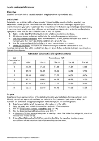
- 1. Objec&ve Students will learn how to create data tables and graphs from experimental data. Data Tables Data tables are just that: tables of your results. Tables should be organized before you start your experiment so that you can concentrate on your method instead of scrambling to organize your informa>on while you work. Trust me on this: you will discover that your experiments go more smoothly if you come to class with your data tables set up, so that all you have to do is write the numbers in the right place. Some rules for data tables included in your lab reports: 1. Tables need a >tle! The >tle should iden>fy what informa>on is in the table. 2. All columns should be labeled and include the units of measurement at the top. 3. Use only numbers in the cells. If you include the units as well, computers won’t read them as numbers, and they won’t be able to plot them on a graph for you. 4. Use the same number of decimal places in every measurement in a column. 5. Center your numbers both ver>cally and horizontally to make the table easier to read. Here is a nice sample data table, created from data my grade 9 class gathered during an experiment on biological membranes: Table 1: Salt Concentra&on and Light Transmi<anceTable 1: Salt Concentra&on and Light Transmi<anceTable 1: Salt Concentra&on and Light Transmi<anceTable 1: Salt Concentra&on and Light Transmi<anceTable 1: Salt Concentra&on and Light Transmi<anceTable 1: Salt Concentra&on and Light Transmi<ance Salt Concentra>on (%) TransmiRance (%T)TransmiRance (%T)TransmiRance (%T)TransmiRance (%T)TransmiRance (%T)Salt Concentra>on (%) Trial #1 Trial #2 Trial #3 Trial #4 Trial #5 0 77.23 74.50 64.88 75.27 54.66 3 85.23 92.82 78.91 60.71 57.96 6 88.39 100.05 73.66 66.51 64.54 9 80.71 100.05 68.29 64.91 52.96 12 82.66 117.18 71.01 56.91 46.95 15 72.55 115.40 65.72 66.03 55.38 Graphs Graphs are visual representa>ons of the data (numbers) in your data table. Some people can easily iden>fy trends from a group of numbers, but most of us find it easier to spot paRerns when the numbers are ploRed on an appropriate graph. Here are my rules for scien>fic graphs: 1. Graphs need a >tle, which shows what informa>on is in the table. 2. Label each axis, and include both numbers and units of measurement. 3. Plot the independent variable across the x-‐axis. (IV = X) 4. Plot the dependent variable along the y-‐axis. (DV = Y) 5. A minimum of 3 data points are required to iden>fy a trend. The more data you gather, the more reliable your results will be. 6. A line of best fit (trendline) is NOT connect-‐the-‐dots! Use the trendline func>on in your spreadsheet sodware to show overall paRerns in your data series. How to create graphs for science 1 Interna>onal School of Tanganyika MYP Science
- 2. These are the guidelines for a finished graph, but how do you create it in the first place? The best thing to do is to use spreadsheet sodware such as Microsod Excel, Mac Pages, or OpenOffice Calc. Personally, I think Excel is the easiest one to use, but you should use whichever one you’re most comfortable with. I’ve summarized the basic steps for the 2011 version of MS Excel for Mac in the steps below. MS Excel (2011 version for Mac) 1. Open a new worksheet and select cell A1. 2. Type the &tle of your data table in A1. You may want to merge several cells together and center the >tle, as shown in Figure 1 below. Figure 1: Data Table Title 3. Type the name of the independent variable and the unit of measurement in cell A2 4. Type the measurements (your results) in the cells below A2, as shown in Figure 2 below. Remember to only write the numbers -‐ not the units -‐ so that the sodware ‘reads’ your informa>on correctly. Figure 2: Independent Variable 5. Type the name of the dependent variable and the units of measurement in cell B2. 6. Type the measurements (your results) in the cells below B2, as shown in the right-‐hand column of Figure 3 below. Figure 3: Dependent Variable How to create graphs for science 2 Interna>onal School of Tanganyika MYP Science
- 3. 7. If you repeated more than one trial of your experiment, add those measurements in the next columns, one column for each trial. This is shown in Figure 4. You now have a completed data table, ready for conversion to a graph! Figure 4: Dependent Variable -‐ Subsequent Trials 8. Select/highlight all the cells in the column heading row and all the data you want to appear in your graph. In Figure 5, we are selec>ng only the first trial in order to keep it simple, like this: Figure 5: Highligh?ng Selected Data in the Data Table 9. Click on the “Charts” tab in the ribbon, shown in Figure 6, and select “Insert Chart”. Figure 6: MS Excel Charts Ribbon How to create graphs for science 3 Interna>onal School of Tanganyika MYP Science
- 4. 10. From the drop-‐down menu, choose “Marked Sca<er,” which should produce a ready-‐made but incomplete chart similar to the one in Figure 7. Figure 7: Basic One-‐Trial Graph 11. The above graph is preRy good, but it’s s>ll missing some key elements: Neither the x-‐axis nor the y-‐ axis is labeled. This is an easy problem to fix! Simply choose the “Chart Layout” tab from the ribbon and select the “Axis Titles” buRon, which produces another drop-‐down menu. Figure 8: MS Excel Chart Layout Ribbon 12.Once you’ve selected the “Horizontal Axis” op>on, simply type the name of your independent variable in the new field in the chart. Select “Ver&cal Axis” and type the dependent variable in the new chart field as well. You should see something similar to Figure 9 below. Figure 9: Labeling the x-‐ and y-‐axis How to create graphs for science 4 Interna>onal School of Tanganyika MYP Science Dependent Variable Independent Variable
- 5. 13.The last step to crea>ng a truly scien>fic graph is to add a trendline, or line-‐of-‐best-‐fit. Excel will do this for you too! Click on one of your data points in the chart so that it looks like Figure 10. Figure 10: Selec?ng a Data Series 14.Click on “Chart” at the menu at the top of the screen, and select “Add Trendline...” from the drop-‐ down menu. This will open a pop-‐up window crea>vely >tled, “Format Trendline,” as illustrated in Figure 11. Figure 11: FormaRng a Trendline How to create graphs for science 5 Interna>onal School of Tanganyika MYP Science
- 6. 15. The linear trendline is the default selec>on, and that’s the one you want. Click “OK.” Now your chart looks like this: Figure 12: Basic Graph with Trendline 16.You can resize the graph by dragging any of the corners where you want them. Click outside the chart area, and voila! Your scien>fic graph is complete! Graphing more than one trial in an experiment 17.The process is iden>cal to crea>ng a chart for a single set of data, except that you should highlight all your results, as shown in Figure 13 below. Figure 13: Selec?ng Mul?ple Trials for a Graph How to create graphs for science 6 Interna>onal School of Tanganyika MYP Science
- 7. 18. Once you’ve selected the “Marked ScaRer” choice from the “Charts” ribbon, Excel will automa>cally generate a chart similar to the one below. Each trial’s data are represented by a different color. Figure 14: Basic Mul?-‐Trial ScaVer Plot 19. While your data are s>ll highlighted in the cells, click “Switch Plot” in the “Chart” tab of the ribbon, as illustrated below. Figure 15: The ‘Switch Plot’ BuVon How to create graphs for science 7 Interna>onal School of Tanganyika MYP Science
- 8. 20. Your chart should change to look more like this one. Then you can add the &tles and label the x-‐ and y-‐axis just like you did in the single-‐trial graph above. Trendlines must be added for each separate data series. Figure 16: Final Mul?-‐Trial Graph 21.Now choose “File” >> “Save As...” and select “PDF” from the drop-‐down menu. Your data table and your graph are converted to a PDF and ready to be uploaded to Turni>n.com! How to create graphs for science 8 Interna>onal School of Tanganyika MYP Science