1. Looking back at your preliminary task, what do you feel
you have learnt in the progression from it to the full
product?
2. Throughout the year, I have felt that there
had been a positive progress present, which
lead to the improvement of the final product.
My understanding of media industry
increased and my main task looks more
professional and completed than my
preliminary task.
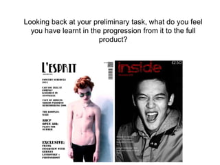
3. As you can see the second front cover looks
more professional and finished. It is very
bright, white is the dominant colour and
therefore it attracts the audience, unlike my
first front cover which seems to be very
dark.
Also the cover lines are much easier to read
on the second front cover, letters are big
and the contrast with the background and it
is not very easy to see and read the cover
lines on the first draft.
I also believe the front cover's photo is more
interesting than the first one.
The front cover of the main task looks real
as it has a barcode and the font size is
rather small for the price and that is what
exensive magazines choose, so people
would not actually see the price, so it
wouldn't push them away.