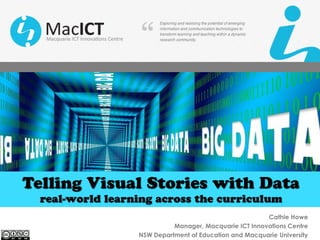
Telling stories with data slideshare
•
3 likes•2,900 views

We live in a data driven world. Our ability to generate and store data is increasing exponentially but, with data comes the need to analyse it and communicate it. Data stories such as infographics can bring facts to life, and is a way to simplify and help make sense and order out of a disparate collection of facts. Learn simple strategies to engage all students in authentic, integrated, inquiry learning which blends computational methods with digital graphics to visualise data in meaningful, interesting and more dynamic ways. See how you can engage your students in building effective stories from the hidden insights locked within the data they are exploring.

Recommended
Recommended
More Related Content
What's hot
What's hot (20)
Similar to Telling stories with data slideshare
Similar to Telling stories with data slideshare (20)
More from Cathie Howe
More from Cathie Howe (11)
Recently uploaded
Recently uploaded (20)
Telling stories with data slideshare
- 1. Cathie Howe Manager, Macquarie ICT Innovations Centre NSW Department of Education and Macquarie University
- 2. Cathie Howe, Macquarie ICT Innovations Centre The Importance of Story The shortest distance between truth and a human being is story Anthony deMello, One Minute Wisdom Stories connect us all, always has, always will Jeff Gomez, Transmedia Storytelling Master Class Stories spark emotion People use stories to make sense of things People learn from stories The Power of Storytelling, http://www.thestorytellers.com/the-power-of-storytelling Storytelling and visual expression are integral parts of human culture … Segel, E & Heer, J. (2010) Narrative Visualisation: Telling Stories with Data
- 3. Cathie Howe, Macquarie ICT Innovations Centre The Importance of Data “The capacity to generate and store data has reached dizzying proportions. What lies within the data represents the chance for this generation to solve its most pressing problems – from disease to climate change to health care and customer understanding.” Gurjeet Singh (2015) Understanding the ‘shape’ of Data to Shape our World
- 4. Cathie Howe, Macquarie ICT Innovations Centre Story + Data “melding the skills of computer science, statistics, artistic design and storytelling” Show me: new ways of visualising data sourced from The Economist http://www.economist.com/node/15557455
- 5. Cathie Howe, Macquarie ICT Innovations Centre Telling Stories with Data • Narrative is the way we simplify and make sense of a complex world • It supplies context, insight, interpretation—all the things that make data meaningful. • You’re attempting to persuade, inspire trust, and lead change. • Stories that incorporate data and analytics are more convincing than those based on anecdotes or personal experience.
- 6. Cathie Howe, Macquarie ICT Innovations Centre The Power of Story + Data: World Vision Example
- 7. The Future of Storytelling Stories are meaningful when they are memorable, impactful and personal. Sourced from You Tube https://www.youtube.com/watch?v=AL-PAzrpqUQ
- 8. Cathie Howe, Macquarie ICT Innovations Centre Data and the NSW Syllabuses Mathematics DesignedbyFreepik
- 9. Cathie Howe, Macquarie ICT Innovations Centre Data and the NSW Syllabuses Science
- 10. Cathie Howe, Macquarie ICT Innovations Centre Data and the NSW Syllabuses History Example Key inquiry questions: What stories do other people tell about the past? How can stories of the past be told and shared? How do we describe the sequence of time? “If history were taught in the form of stories, it would never be forgotten.” - Rudyard Kipling
- 11. Cathie Howe, Macquarie ICT Innovations Centre An Example: First Fleet Data Set on Scootle
- 12. Cathie Howe, Macquarie ICT Innovations Centre Convert First Fleet Data Set to Google Sheets Download spreadsheet, then upload and covert to a Google Doc. Share with Students
- 13. Cathie Howe, Macquarie ICT Innovations Centre Pivot Tables • Pivot tables can be an example of two-way tables. It’s a tool that can extract significance from a large data set. • Data summarisation tool found in data visualization programs such as spreadsheets • Allows you to interpret data in different ways
- 14. Cathie Howe, Macquarie ICT Innovations Centre Pivot Tables and the First Fleet Data Set Working with two variables in this example – gender and ship Examine the relationships between the two variables Can you find a story in this data?
- 15. Cathie Howe, Macquarie ICT Innovations Centre Visual Data Analysis – telling the story of data (Infographic) “Visual data analysis blends highly advanced computational methods with sophisticated graphics engines to tap the extraordinary ability of humans to see patterns and structure in even the most complex visual presentations.” 2015 Interim Horizon Report K-12
- 16. Cathie Howe, Macquarie ICT Innovations Centre Scaffold for Telling Data Stories 1. Define Audience 2. Create Hypotheses 3. Sketch 4. Get Data 5. Explore Data 6. Tell the Story http://online-behavior.com/analytics/stories Daniel Waisberg is an Analytics Advocate at Google and the Founder of Online Behavior “Data analysis isn’t about graphics and visualizations; it’s about telling a story” “Analysis doesn't have to be long and complex.” https://www.thinkwithgoogle.com/articles/tell-meaningful-stories-with-data.html
- 17. Cathie Howe, Macquarie ICT Innovations Centre Practices for telling great stories with data Whitepaper, “5 best practices for telling great stories with data. Tableau Software https://www.tableau.com/sites/default/files/whitepapers/whitepaper_best-practices_telling_great_stories.pdf Sourced from Flickr by US Department of Agriculture: The cost of raising a child Think of Your Analysis as a Story 1. Find the story first – explore the data 2. Determine what you want people to do as a result 3. Write out the “story board” for your audience Be authentic – your story will flow • Make it personal, make it emotional • Start with a metaphor or anecdote • Develop with data - authenticity is rooted in facts and facts are rooted in data • Supplement hard data with qualitative data
- 18. Cathie Howe, Macquarie ICT Innovations Centre Practices for telling great stories with data Be Visual – think of yourself as a film editor • Use pictures and graphs • Design your graphs and charts for instant readability but allow for layers of meaning as the graph is studied Make it easier for your audience and you • Telling a story should be simple and direct. Recall and action will be that much stronger • Stick to 2-3 key issues and how they relate to your audience • No hoop jumping
- 19. Cathie Howe, Macquarie ICT Innovations Centre Stories you can tell with Data Time • A reporting story about the past • An explanatory story about the present • A prediction story about the future Focus • What story • Why story • How to address the issue story Frequency of lightning http://dupress.com/articles/data-driven-storytelling/
- 20. Cathie Howe, Macquarie ICT Innovations Centre Locating Data Collect your own data. Access the vast number of public data sets. • Sea surface information data sets • Weather Observations data sets • Terrestrial protected areas under Australian Government jurisdiction • Frog Atlas for South Australia • The First Fleet • Climate data
- 21. Cathie Howe, Macquarie ICT Innovations Centre Sourcing Data Sets Access the vast number of public data sets. Here just a few examples:
- 22. Cathie Howe, Macquarie ICT Innovations Centre What is an Infographic? Infographics are graphic visual representations of information or data that can present complex information quickly and clearly. Data analysis isn‘t about graphics and visualizations; it‘s about telling a story.
- 23. Cathie Howe, Macquarie ICT Innovations Centre Student Designed Infographic using Piktochart Sourced from: http://catlintucker.com/2013/11/student-designed-infographics- process-products/
- 24. Image sourced from http://magurtis.blogspot.com.au/
- 27. Cathie Howe, Macquarie ICT Innovations Centre Free tools for Creating Infographics & Charts easely Piktochart
- 28. Cathie Howe, Macquarie ICT Innovations Centre Free tools for Creating Infographics & Charts infogr.am VENNGAGE visually
- 29. Cathie Howe, Macquarie ICT Innovations Centre WFP: Country Donors and Recipients http://cdn.wfp.org/data/globe/
- 30. Cathie Howe, Macquarie ICT Innovations Centre CYBERTHREAT REAL – TIME MAP https://cybermap.kaspersky.com/
- 31. Cathie Howe, Macquarie ICT Innovations Centre Hans Rosling’s Yardstick of Wealth Hans Rosling is famous for presenting public data about the world with the most elegant and innovative infographic technology, all to tell a gripping story of the world's past, present and future development.
- 32. catherine.howe@det.nsw.edu.au http://au.linkedin.com/in/cathiehowe @cathie_h @macict www.macict.edu.au Macquarie ICT Innovations Centre Building C5B, Macquarie University NSW, 2109 Ph | 02 9850 4310 | macictsupport@det.nsw.edu.au Contact Details