[UX Series] 3 - User behavior patterns and design principles
•Download as PPTX, PDF•
9 likes•1,666 views

12 user behavior patterns from famous book "Design Interface", and 10 design principles which designer must know. These principles are based on user behavior patterns, so you can use them to design UX efficiently.

Recommended
More Related Content
What's hot
What's hot (20)
Viewers also liked
Viewers also liked (7)
Similar to [UX Series] 3 - User behavior patterns and design principles
Similar to [UX Series] 3 - User behavior patterns and design principles (20)
Recently uploaded
Recently uploaded (20)
[UX Series] 3 - User behavior patterns and design principles
- 1. User behavior patterns & Design principles Vu Phuong Hoang 2015/08
- 2. 1. User behavior patterns Bad news: Everyone is unique!
- 3. 1. User behavior patterns Bad news: Everyone is unique! Good news: Some user’s behaviors are predictable!
- 4. 1. User behavior patterns Bad news: Everyone is unique! Good news: Some user’s behaviors are predictable! Understanding user’s behavior patterns helps improving UX efficiently.
- 5. 1. User behavior patterns 1. Safe exploration 2. Instant gratification 3. Satisficing 4. Changes in midstream 5. Deferred choices 6. Incremental construction 7. Habituation 8. Spatial memory 9. Prospective memory 10. Streamlined repetition 11. Keyboard only 12. Other people’s advice
- 6. 1.1. Safe exploration User wants to know that it’s safe and free to try. So encourage them to try, with a way back. Applications: Back buttons Undo Applying filters in photo processing apps
- 7. 1.1. Safe exploration Back button helps user to jump back. So he can explore freely without getting lost. Breadcrumbs helps user to jump back quickly.
- 11. 1.2. Instant gratification If his first task can be done in a few seconds, he will be confident to continue using your product. So make first tasks stunningly easy. Applications: Prepare for empty state Quick tutorial
- 12. 1.2. Instant gratification Auto-focus to text field
- 13. 1.2. Instant gratification Tell user what to do first Blank page should be designed well User should feel it easy to do
- 17. 1.3. Satisficing User doesn’t need the “best” option, he just needs the “good enough” option. Applications: Simplify the design Use short, meaningful titles Show him the “best” options first
- 18. 1.3. Satisficing Search Engine CTR in 2006
- 19. 1.3. Satisficing Search Engine CTR in 2014
- 20. 1.3. Satisficing
- 21. 1.3. Satisficing
- 22. 1.4. Changes in midstream User usually changes his short term goal Let user do multiple things at once Applications: Multiple instances Save Provide connections
- 23. 1.4. Changes in midstream
- 24. 1.4. Changes in midstream
- 25. 1.5. Deferred choices User wants simple decisions first Leave advanced options later Applications: Reduce choices (hover controls, controls on demands...) Good default values
- 29. 1.6. Incremental construction User wants to try different builds Allow user to change & make it quick to preview Applications: Adjusting fonts Auto calculate based on user’s choice
- 31. 1.6. Incremental construction Auto update item quantity Auto calculate gold cost
- 33. 1.7. Habitutation “That gesture works everywhere else, why not here ?” Keep the consistency Applications: Keep the buttons layout Respect common consistency
- 34. 1.7. Habitutation Microsoft Office keeps the consistency between products
- 35. 1.7. Habitutation Keep primary action on the right side because: It saves time for user User can use it on mobile with right hand only ...
- 36. 1.7. Habitutation Keep primary action on the right side because: It’s on the end of visual path Right side indicates forward, left side indicates backward
- 37. 1.8. Spatial memory “That button was here a minute ago, where is it now ?” Maintain the order Applications: Put buttons in fixed order Let user change the position to suit his needs
- 38. 1.8. Spatial memory Button orders are maintained Color orders are maintained
- 41. 1.9. Prospective memory User can’t remember lot of things Help user to remind himself Applications: Notification Bookmark Recent documents
- 46. 1.10. Streamlined repetition “How many times I need to do this again ?” Help user to repeat action(s) quickly Applications: Macro Copy
- 51. 1.11. Keyboard only “I don’t want to switch between keyboard and mouse” Add keyboard support Applications: Keyboard shortcut Tab key support
- 58. 1.12. Other people’s advice User wants to know feedback from other users Applications: Comments Links from review articles Help
- 59. 1.12. Other people’s advice
- 60. 1.12. Other people’s advice
- 61. 1.12. Other people’s advice
- 62. 1.12. Other people’s advice
- 63. BREAK
- 64. 2. Design principles Psychologists and designers have observed users for hundreds of years
- 65. 2. Design principles Eye tracking is a part of their diffcult work
- 66. 2. Design principles Their works took a lot of time and effort
- 67. Standing on shoulders of giants
- 68. But pick your giant carefully !!!
- 69. 2. Design principles 1. Ockham’s razor 2. Hick’s law 3. Fitts’s law 4. Pareto principle 5. Rule of thirds 6. Mental model 7. Miller’s law 8. Feedback 9. Golden ratio 10. Gestalt principle
- 70. 2.1. Ockham’s Razor First said by William of Ockham in 1300s “Simplicity is the ultimate sophistication” (Leonardo da Vinci) Application: If user doesn’t know where to click, tell him If the background is the distraction, tone it down
- 71. 2.1. Ockham’s Razor Sign up increased by 300%
- 75. 2.2. Hick’s law “The time it takes to make a decision increases as the number of alternatives” First said by William Edmund Hick in 1950s Application: Reduce choices
- 76. 2.2. Hick’s law
- 77. 2.2. Hick’s law
- 78. 2.3. Fitts’s law “Time user needs to move pointer to the target is affected by the target size and the distance to the target” First said by Paul Fitts in 1954 Application: Enlarge the click area Put the button at the end of visual path
- 79. 2.3. Fitts’s law
- 80. 2.3. Fitts’s law • Big buttons are easy to click • But not too big
- 81. 2.3. Fitts’s law • Responsive design
- 83. 2.3. Fitts’s law (Visual flow)
- 84. 2.3. Fitts’s law
- 85. 2.3. Fitts’s law
- 86. 2.3. Fitts’s law
- 87. 2.3. Fitts’s law
- 88. 2.3. Fitts’s law
- 89. 2.4. Pareto principle First said by Vilfredo Pareto in 1896 Application: Find them (20%), fix or utilize them
- 92. 2.4. Pareto principle Know where to put main content
- 93. “The page fold”
- 94. 2.4. Pareto principle Above the fold: 80.3% Below the fold: 19.7%
- 95. Show “best” items first Sofa checking: Rows Fixations / item 1-2 5-10 3-4 2-4 5-8 1 9-13 <=1
- 97. 2.5. Rule of thirds Put key elements at intersection of lines dividing screen into 3x3 matrix. First said by John Thomas Smith in 1797.
- 98. 2.5. Rule of thirds
- 103. 2.6. Mental model It’s significant easier to understand and learn something new if they can model it off of something they already understand. First said by Kenneth Craik in 1943. Application: Make them familiar
- 104. 2.6. Mental model
- 105. 2.6. Mental model
- 106. 2.6. Mental model
- 107. 2.7. Miller’s law The number of objects an average person can hold in short term memory is 7 ± 2. First said by George A. Miller in 1956. Application: Menu should have <= 7 items Make it easy to compare
- 108. 2.7. Miller’s law
- 109. 2.7. Miller’s law
- 110. 2.7. Miller’s law Reduce visible choices to 7 ± 2 Help them to remember
- 111. 2.7. Miller’s law
- 112. 2.8. Feedback User should know about something happened, is happening or will be able to happen. Application: Show interactions
- 113. 2.8. Feedback Help user to fill forms
- 114. 2.8. Feedback
- 115. 2.8. Feedback
- 116. 2.8. Feedback
- 117. 2.9. Golden ratio If height / width ≈ 1.618, then your UI is visual pleasure. Exists for at least 2400 years. First calculated by Michael Maestlin in 1597. It’s mostly artist’s work.
- 118. 2.9. Golden ratio
- 119. 2.9. Golden ratio
- 121. 2.10. Gestalt principle The whole is other than the sum of the parts. First said by Max Wertheimer in 1910. It’s complicated! So leave it for next session.
- 122. Any questions?
Editor's Notes
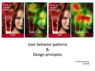
- Application of user behavior pattern: They’re curious about what we’re looking! 1st poster: 6% of the people look at the product 2nd poster: 84% (14X) of the people look at the product. The difference: model looks at the product.
- Example: Search then open link, then back to open another links Booking in Viet Jet Air website Restore defaults button in game settings
- Trying different filters in Litely
- History = unlimited undo level in Lightroom
- Try different formations and settings before saving actually
- If you’re good at something, you will want to do it more (sing, cook...)
- Auto focus to text field in Google Search -> user can start searching immediately
- Blank page in Evernote app tells user what to do intuitively
- Game Cut the rope guides user to play the game. And user will pass this stage with full 3 stars for sure -> “I’m good”
- GoMockingbird allows user to start drawing wireframe immediately, even without signing up. And your design will be kept until next visit.
- HotDeal prevents user from starting using the product by blockers
- satisfice = satisfy + suffice (enough). If the current solution is good enough, he doesn’t want to learn complicated things to make it better.
- Best place to hide a dead body: 2nd page of Google Search.
- Users click on first results much more than last ones -> That’s why you need SEO to improve page ranking
- Search images in high resolution by using “good enough” solution -> still can see low resolution image
- Search high resolution images with advanced tool
- If you’re reading about a movie review, then you might like to find out more about actors, actresses...
- Shopping cart allows you to buy multiple items. Chrome allows you to open multiple tabs (even windows)
- FF8 allows you to save the game. Then you can load it to play again (to try different strategy)
- 500px hide advanced actions (multiple filtering categories) by a help icon
- Pinterest uses Hover Control to simplify the UI
- Facebook requests most basic information to sign up. User can fills advanced information later (profile pics, school..)
- MS PowerPoints change the fonts right after selecting new fonts. The font names are displayed by their own fonts, too. Old blog post: Use mark up, can’t preview the result.
- Torchlight 2 auto calculate gold needed to buy items
- Torchlight 2 auto calculate minor stats, so that user can try different build. They even show the prediction for each increment.
- Are you familiar with Copy/Paste keyboard shortcut ? Do you feel difficult to use other keyboard shortcut to do the same things ?
- Another improvement: Use verb in modal windows
- How many of you put the bike key at the same place, and find it difficult to locate if it’s somewhere else?
- Diablo 3 display equipped item at the place where they’re really equipped in 3D model.
- FF14 allows user to drag HP bar everywhere
- Put keys on the way out Google saves your draft
- Safari saves bookmarks, so you can access them easily later
- iOS displays notification to remind users
- MS Word 2013 shows recent documents so that you don’t have to remember
- Skype allows you to mark conversation as unread, so that you can return to it later
- Repeated actions are boring.
- Starcraft 2 allows user to build multiple unit by holding Shift key.
- The Sims 4 allows you to tile the whole floor by holding Shift key
- Inkscape: Ctrl + drag = duplicate Ctrl + Shift + drag = duplicate + rotate Ctrl + R = redo
- Sublime supports multi-line editting by Ctrl + Shift + L
- Keyboard shortcut increases working speed dramatically
- JIRA supports keyboard shortcuts: / to search i to assign issue to me
- Flash keyboard shortcuts
- Google search keyboard shortcut
- Invoker skill keyboard shortcut map in DOTA
- Starcraft 2 allows user to change keyboard shortcut
- FF14 allows user to use keyboard shortcut for skill activating. They even support 2 rows of shortcuts.
- A lot of us is affected by crowd effect
- Foody provide feedbacks from other users, who really ate in these restaurants
- Amazon display product review from trusted sources
- Google Play show apps that other user installed along with selected app
- 500px has an Editor’s Choice page, so user can know what expertise thinks
- Based on user observation result, they stated famous, useful design principles
- Eye tracking methods: 1st: Contact lens 2nd: Observe skin around eyes 3rd: Wear special glass
- Since we hardly can reproduce their experiments due to knowledge, time, money, devices... We should consider using their results
- Some pattern used to be useful, but not anymore (ex: beauty)
- Occam: Father, philosopher English Less assumption, more robust Instant gratification, sound familiar ?
- Pipe Drive remove 80% content, sign up increases by 300%
- Apple’s website from old days, too many distracted texts
- Apple’s website now: less elements, clearer navigation
- This is used from a long time ago. Who used this: Stephen Hawking, Albert Einstein, Issac Newton.
- Hick: British psychologist Selecting food from menu in a restaurant. 40 fruit jam samples vs 4 samples. 1969, decide a number is in the list or not (2-6 items) -> with added DIGIT, the response time increase 0.38 ms.
- How to turn a man on Vs How to turn a woman on
- Nike’s website shows some kinds of shoes by images and labels, not all of them. So user can pick them easily.
- Fitts: psychologist , USA
- Top: Left: Click area is text, Right: Click area is text + background. Bottom: top-> down: enlarge click area
- But not too big
- Responsive design: Use appropriate design for each screen size.
- Example: Vinaganda has 4 designs for different screen size. 1st: Left most background, Full width image, Big font 2nd: Translated background, Not full width image, Big font 3rd: Smaller font and column width 4th: Smaller menu, no text column 5th: Smallest menu, remove background, no image column
- Visual flow: do you follow the movement direction ?
- Visual flow when sending money in PayPal is zig zag -> your eyes have to change the direction continuously
- Redesigned UI: straight and simple visual flow -> Much easier
- Ubuntu Unity: Search bar is far away from file type filter and content filter.
- Italian, economist Example: + 80% land of Italy was owned by 20% population (observe) + 20% peapods in his garden contained 80% peas (observe) + 80% profits come from 20% customers + 80% traffic occurs during 20% time + 20% code has 80% errors
- User doesn’t want the best option, remember?
- Give good defaults (because they want simple things first, right?)
- User focuses on 20% content only, so find the location and put key content there.
- Web page can be folded multiple times, the first area you see without scrolling is “above the fold” area.
- User pays a lot of attention about “Above the fold” area
- 1st image: Find suitable answer The middle gaze plot shows a category page with 50 sofas: The top 2 rows get about 5–10 fixations per sofa. The next 4 rows get around 2–4 fixations per sofa. The next 8 rows typically get 1 fixation per sofa. The bottom 3 rows get 2 fixations for one sofa and no fixations for the remaining 7 sofas.
- Gutenberg diagram about strong, weak area
- English painter, engraver
- Titatic
- The last supper – Leonardo da Vinci
- Dang Thu Thao, Miss Vietnam 2013
- Final Fantasy XIII
- Prince of Persia
- English, Psychologist Lean your body when playing racing games, Press strongly when playing fighting games
- Trash bin is where we throw objects away
- Folders contain file inside. Folders are labeleled for easy looking up
- Aperture blades in iPhone photo app
- USA, psychologist
- Button at different states
- First used by Phidias, greatest Greece architect, who contributed much in building Parthenon temple