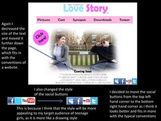
1. I decided to move the social buttons from the top left hand corner to the bottom right hand corner as I think it looks better and fits in more with the typical conventions I also changed the style of the social buttons This is because I think that the style will be more appealing to my target audience of teenage girls, as it is more like a drawing style Again I decreased the size of the text and moved it further down the page, which fits in with the conventions of a website.
2. I decided to keep this page the same, plain and simple as I believe it is effective the way it is, I didn’t want to add too much onto the page. From given feedback I believe that this needed no change.
3. I corrected the spelling of actors name I reduced the size of this text as it attracted too much unnecessary attention I changed the original picture and instead of having a plain and simple white background I decided to keep the mise en scene. This I was told by some feedback looked better than my original choice.