Are Your Icons Responsive?
•
2 likes•785 views

By now, you've probably got this responsive thing mastered. You know all about responsive web design, media queries, and fluid grids. Your websites look great on every screen and you're dang proud of it. But how are your icons doing? Are they responsive? What are responsive icons, you ask? Today we'll dive into that very topic. Full article: http://crtv.mk/bsxK

Recommended
Recommended
More Related Content
Viewers also liked
Viewers also liked (11)
Recently uploaded
Recently uploaded (20)
Are Your Icons Responsive?
- 2. So far you know all about responsive web design, media queries, and fluid grids. Your websites look great on every screen and you're dang proud of it. BUT HOW ARE YOUR ICONS DOING? A presentation by
- 3. A NEW KIND OF ICON
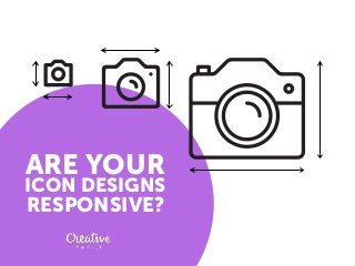
- 4. The idea behind responsive images is fairly simple: you serve up the same images in different sizes to different screens.
- 5. THIS PRACTICE DOESN'T ALWAYS WORK GREAT WITH ICONS
- 6. A given icon might look great at its original size, but terrible once scaled down due to too much detail being squished into such a tight space.
- 7. These shape shifters do more than change size, they actually change their design to accommodate the size at which they're being served. The answer? Responsive icons.
- 8. Otherwise, mobile users will struggle with confusing controls pages requiring scrolling and shrinking and other annoying design elements that will run them off
- 10. DESIGNERS OFTEN CREATE RESPONSIVE ICONS IN PACKS As the user zooms in or out, the icon will change from one model to another. The largest icons have more features and details, where the smaller icons are simply stripped down, diminutive versions. Search for „responsive icons” on creativemarket.com
- 11. Even when the icons are small, they must be recognizable because they are so often the major controls for a site.
- 12. Designers have to design something that the average user will understand intuitively, without a lot of special instructions.
- 13. INTERESTING LINKS FOR MORE ON RESPONSIVE ICONS If you're interested in seeing more, here are a few resources you can check out: Making Iconic Responsive ResponsiveIcons.co.uk ResponsiveLogos.co.uk
- 14. Creative Market is a platform for handcrafted, mousemade design content from independent creatives around the world. www.creativemarket.com facebook.com/crtvmrkt twitter.com/creativemarket This animation is brought to you by