11 Tips for Creating Beautiful Infographics
•
3 likes•2,316 views

11 Infographic Tips from the experts in information design! We rolled up our best tips into this infographic and added hyperlinked examples for each tip for illustration. (The hyperlinks work if you download the file only.) For the original, expanded presentation version, click here: http://www.slideshare.net/edahn/18-tips-for-creating-beautiful-infographics-60233918 inquiries design@hypothesisgroup.com
Recommended

Recommended
More Related Content
Viewers also liked
Viewers also liked (10)
More from Edahn Small
More from Edahn Small (8)
Recently uploaded
Recently uploaded (20)
11 Tips for Creating Beautiful Infographics
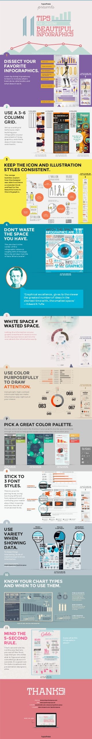
- 1. design@hypothesisgroup.com | www.hypothesisgroup.com DISSECT YOUR FAVORITE INFOGRAPHICS. CLICK TO SEE THE FULL INFOGRAPHIC Great typography Cutouts interacting with elements Variety of graphs Relevant visualization Simple color palette White space 3 column grid Learn by doing! A great way to learn is to study what’s been done, what works, and what doesn’t work. CLICK TO SEE THE FULL INFOGRAPHIC CLICK TO SEE THE FULL INFOGRAPHIC CLICK TO SEE THE FULL INFOGRAPHIC 4 COLUMN3 COLUMN 6 COLUMN USE A 3-6 COLUMN GRID. MIND THE 5-SECOND RULE. The 5-second rule (no, not the one that lets you eat off the floor) says that you should be able to figure out what something’s about in 5 seconds. It’s a good rule for data visualizers and presentation designers alike. CLICK TO SEE THE FULL INFOGRAPHIC Guess what this infographic’s about? USE VARIETY WHEN SHOWING DATA. To keep things interesting, think of creative ways to show information. CLICK TO SEE THE FULL INFOGRAPHIC Check out our Instagram www.instagram.com/hypothesisgroup for some inspiration Spotlighted Key Numbers Varying Graph Styles Simple Visualization STICK TO 3 FONT STYLES. There’s an art to pairing fonts. Using too many different font styles will end up confusing your reader about their meaning and runs the risk of mismatched fonts. CLICK TO SEE THE FULL INFOGRAPHIC SUB HEADINGS Clarendon HV BT BODY COPY Intropol HEADINGS Chaparral Pro Light PICK A GREAT COLOR PALETTE. CLICK TO SEE THE FULL INFOGRAPHIC CLICK TO SEE THE FULL INFOGRAPHIC CLICK TO SEE THE FULL INFOGRAPHIC Sites with great color inspiration RGB: 240, 82, 73 #F05249 RGB: 150, 150, 152 #969698 RGB: 244, 186, 78 #F4BA4E RGB: 48, 76, 98 #304C62 RGB: 36, 120, 120 # 247878 RGB: 0, 204, 153 # 00CC99 RGB: 127, 175, 157 #7FAF9D RGB: 88, 89, 91 #58595B RGB: 171, 193, 76 #ABC14C Choose colors that match the theme of your graphic, but be sure to include enough contrast to help guide readers and make the information pop. USE COLOR PURPOSEFULLY TO DRAW ATTENTION. Using bright, high-contrast colors sparingly can make information pop right out at your viewer. CLICK TO SEE THE FULL INFOGRAPHIC WHITE SPACE ≠ WASTED SPACE. Letting the information on your graphic breathe will create a more soothing experience and lets the user absorb the information easily. CLICK TO SEE THE FULL INFOGRAPHIC DON’T WASTE THE SPACE YOU HAVE. CLICK TO SEE THE FULL INFOGRAPHIC The pie chart in the center of this infographic takes up roughly 20% of the page, but only conveys 4 points of data. What a waste! KEEP THE ICON AND ILLUSTRATION STYLES CONSISTENT. CLICK TO SEE THE FULL INFOGRAPHIC Inquiries: design@hypothesisgroup.com Web: www.hypothesisgroup.com LinkedIn: www.linkedin.com/company/hypothesis-group Instagram: www.Instagram.com/hypothesisgroup MORE TIPS HERE! KNOW YOUR CHART TYPES AND WHEN TO USE THEM. BAR CHARTS Best when comparing differentcategories of things. LINE GRAPHS Used to show change overtime. PIES & DONUTS Best when showing 2 pointsof datathat sum to 100%.Worst when they havemore than3 divisions. CLICK TO SEE THE FULL INFOGRAPHIC 1 2 But don’t be afraid to break the grid! 3 4 5 6 7 8 9 10 11 “Graphical excellence…gives to the viewer the greatest number of ideas in the shortest time with…the smallest space.” ― Edward R. Tufte Set up a solid grid before you start building your infographic so your placement of copy, graphics, and charts doesn’t look messy and chaotic. CONSISTENT TEXTURES LINE WEIGHTS THE SAME MINIMAL COLOR SIMPLE SHAPES SAME PERSPECTIVE THICK OUTLINE STYLE The orange bubbles explain how the designer was able to achieve a consistent look and feel for the beautiful icons in this infographic.