SlideShare a Scribd company logo
1 of 10
New musical express’s masthead doesn’t really follow the full codes and conventions of a magazine because although it is written in bold brightly coloured letters it does not cover the whole top of the page. If they used the whole name it would cover too much of the page so they have abbreviated it. NME always uses the exact same masthead which makes it very easily recognisable. The figure on the front of the cover takes a diagonal line from top right to front left and gives a very English rock chick vibe about her. She is also behind the writing which is different as normally editors put the figure on top of the words to make them more the centre of attention and make the magazine more eye catching. The sideways barcode also challenges convention by being turned on 90 degrees to the left. The name of the figure is written in bigger letters than the masthead so this could really draw a reader in if the name is one you have an interest in.
This magazine is very stereotypical with its masthead as it has a big font that takes up the whole top of the magazine and uses a very bold brightly coloured font. Rolling stone always uses the same font for its mast head but changes the colour so that it fits with the image lower down, this keeps it interesting and makes everything very colour coordinated. The picture on the front of this cover is in sync with the words underneath so it’s almost as if the words are explaining the picture. The same font is used all over the cover it is simply the size that changes this makes it very easy on the eye.
The slits of white through the black masthead and long haired ruff looking men on the front give you a sense straight away that this is a rock and roll magazine. The black, white and red throughout also give a very dark feeling to the cover.  The free poster special wording is there to lure you in and attract more readers as the thought of something free makes the magazine much more interesting. There are lots of pictures and not very many words you so can tell this will be a quite easy going magazine when you open up and look inside.
By having just one letter as the name and masthead for this product it creates a really sense of drama and gives a massive statement that lots of words are not needed to attract your attention. By having a picture of Madonna on the front this edition of the magazine is probably targeting the older generation, but not men or women specifically, as she is in her early fifties so would not be found attractive by younger boys. This cover has quite a lot of writing on it and could possibly put a reader off as they have to search to find out what is inside. The
Very clean, slick looking cover thanks to the fonts and very plain background but a slightly rugged look thrown in as Kanye has a beard growing. Two bold colours will keep the reader interested but are not too over the top. There is no barcode on this cover, this is challenging convention.
The fact that everything is in black and white except for the picture makes it really stand out. There is a lot of writing on the front cover and the way its put together makes it look quite messy which fits in perfectly to the whole rock star look. The masthead is challenging convention as the image of the band covers most of it so you can hardly see the words, this could be risky unless the  magazine is extremely popular as people might not know the name of it.
The cover of this magazine really challenges convention as it has no picture, simply words. Some people may find this more interesting as magazines are meant for reading after all but other may be put of as there is no sneak preview  to entice them in. The colouring is very stereotypical using only black, red and white.
You can tell straight away that this magazine is aimed at a male audience by the sexily dressed woman on the front. She has little clothing on and is showing some flesh so this would really entice younger boys in to reading the magazine as they will probably expect to see more pretty girls with very little clothing on inside. The cover models clothes are the same colour as the background which makes her start to blend into the background as you get further down the page, this is very ironic as the magazine is called blender.
She is dressed in very brightly coloured clothes but has been photographed on a pure white background, this really makes her stand out. The red masthead also stands out from the rest of the cover as it is the only thing red on the whole page. The wording on the front is very minimalistic which is positive towards the  image of a model as she will get more attention.
The background on this front cover is challenging convention as it not just a plain colour like it would normally be. I think it is interesting and more exciting. There are quite a few colours on this cover which makes it very bright and also makes it stand out.

More Related Content

What's hot

Front cover analysis
Front cover analysisFront cover analysis
Front cover analysislarnamccann
 
Analysis of magazine finished
Analysis of magazine finishedAnalysis of magazine finished
Analysis of magazine finishedjessspardoe
 
Music Magazine Evaluation
Music Magazine EvaluationMusic Magazine Evaluation
Music Magazine EvaluationLaurenTaylor8
 
Music Magazine Cover Analysis
Music Magazine Cover AnalysisMusic Magazine Cover Analysis
Music Magazine Cover Analysisfob163
 
Pop music magazine cover annotations
Pop music magazine cover annotationsPop music magazine cover annotations
Pop music magazine cover annotationsxv_Identity
 
Front cover analysis
Front cover analysisFront cover analysis
Front cover analysisML1421
 
Magazine cover analysis
Magazine cover analysisMagazine cover analysis
Magazine cover analysislewis tull
 
Front cover anaylsis 1 robbie .
Front cover anaylsis 1 robbie .Front cover anaylsis 1 robbie .
Front cover anaylsis 1 robbie .JadeOckerby
 
Analysis of cover page
Analysis of cover pageAnalysis of cover page
Analysis of cover pageKlarasa098
 
Magazine cover analysis rolling stones
Magazine cover analysis   rolling stonesMagazine cover analysis   rolling stones
Magazine cover analysis rolling stonesnatrice23
 
Presentation2 (1)
Presentation2 (1)Presentation2 (1)
Presentation2 (1)dankyjosh
 
Unit 14 - LO1
Unit 14 - LO1Unit 14 - LO1
Unit 14 - LO1jbowers96
 

What's hot (20)

Front cover analysis
Front cover analysisFront cover analysis
Front cover analysis
 
Brand identity
Brand identityBrand identity
Brand identity
 
Analysis of magazine finished
Analysis of magazine finishedAnalysis of magazine finished
Analysis of magazine finished
 
Music Magazine Evaluation
Music Magazine EvaluationMusic Magazine Evaluation
Music Magazine Evaluation
 
Music Magazine Cover Analysis
Music Magazine Cover AnalysisMusic Magazine Cover Analysis
Music Magazine Cover Analysis
 
Media deconstructions
Media deconstructionsMedia deconstructions
Media deconstructions
 
Pop music magazine cover annotations
Pop music magazine cover annotationsPop music magazine cover annotations
Pop music magazine cover annotations
 
Front cover analysis
Front cover analysisFront cover analysis
Front cover analysis
 
Magazine cover analysis
Magazine cover analysisMagazine cover analysis
Magazine cover analysis
 
Front cover anaylsis 1 robbie .
Front cover anaylsis 1 robbie .Front cover anaylsis 1 robbie .
Front cover anaylsis 1 robbie .
 
Research
ResearchResearch
Research
 
Research
ResearchResearch
Research
 
Analysis of cover page
Analysis of cover pageAnalysis of cover page
Analysis of cover page
 
Magazine cover analysis rolling stones
Magazine cover analysis   rolling stonesMagazine cover analysis   rolling stones
Magazine cover analysis rolling stones
 
Mojo magazine
Mojo magazineMojo magazine
Mojo magazine
 
Presentation2 (1)
Presentation2 (1)Presentation2 (1)
Presentation2 (1)
 
Unit 14 - LO1
Unit 14 - LO1Unit 14 - LO1
Unit 14 - LO1
 
Analysisi of magaixzne
Analysisi of magaixzneAnalysisi of magaixzne
Analysisi of magaixzne
 
front cover
front coverfront cover
front cover
 
3x cover analysis 2
3x cover analysis 23x cover analysis 2
3x cover analysis 2
 

Viewers also liked

Texas s ta r chart
Texas s ta r chartTexas s ta r chart
Texas s ta r chartsljones212
 
STaR Chart Presentation
STaR Chart PresentationSTaR Chart Presentation
STaR Chart Presentationtpavliska
 
Technlogoy Action Plan
Technlogoy Action PlanTechnlogoy Action Plan
Technlogoy Action PlanRubberman
 
Sun Idee Introduction Presentation
Sun Idee Introduction PresentationSun Idee Introduction Presentation
Sun Idee Introduction Presentationellydoek
 
Musical invaders
Musical invadersMusical invaders
Musical invadersvigarilla
 
DIT EA NOV 2014 Falck
DIT EA NOV 2014 FalckDIT EA NOV 2014 Falck
DIT EA NOV 2014 Falckbjoernam
 
Samruddhi rhythm ppt Save 10L, Hennur Road Banaglore.
Samruddhi rhythm ppt  Save 10L,  Hennur Road Banaglore.Samruddhi rhythm ppt  Save 10L,  Hennur Road Banaglore.
Samruddhi rhythm ppt Save 10L, Hennur Road Banaglore.B"raj Dasmani
 
Media magazine preliminary
Media magazine preliminaryMedia magazine preliminary
Media magazine preliminarychloehiorns
 
Con l'aiuto della madonna di capocolonna, crotone rialzati! (vers.02) s. barr...
Con l'aiuto della madonna di capocolonna, crotone rialzati! (vers.02) s. barr...Con l'aiuto della madonna di capocolonna, crotone rialzati! (vers.02) s. barr...
Con l'aiuto della madonna di capocolonna, crotone rialzati! (vers.02) s. barr...Salvatore [Sasa'] Barresi
 
Guided Outcomes: Overview – exclusively in Canada by Eckler Ltd.
Guided Outcomes: Overview – exclusively in Canada by Eckler Ltd.Guided Outcomes: Overview – exclusively in Canada by Eckler Ltd.
Guided Outcomes: Overview – exclusively in Canada by Eckler Ltd.Landscape
 
食で地元の観光活性化に貢献~学生が企画・運営する大山おからドーナッツ店の取組み~
食で地元の観光活性化に貢献~学生が企画・運営する大山おからドーナッツ店の取組み~食で地元の観光活性化に貢献~学生が企画・運営する大山おからドーナッツ店の取組み~
食で地元の観光活性化に貢献~学生が企画・運営する大山おからドーナッツ店の取組み~Akihiko Koga
 
S ta r presentation
S ta r presentationS ta r presentation
S ta r presentationsunnywren
 
Speak Asia Business Presentation
Speak Asia Business PresentationSpeak Asia Business Presentation
Speak Asia Business Presentationspeak-asia
 
Texas campus s ta r chart summary
Texas campus s ta r chart summaryTexas campus s ta r chart summary
Texas campus s ta r chart summarylctipton
 
(3) lo sviluppo umano nel nostro tempo {s.barresi}
(3) lo sviluppo umano nel nostro tempo {s.barresi}(3) lo sviluppo umano nel nostro tempo {s.barresi}
(3) lo sviluppo umano nel nostro tempo {s.barresi}Salvatore [Sasa'] Barresi
 

Viewers also liked (20)

Texas s ta r chart
Texas s ta r chartTexas s ta r chart
Texas s ta r chart
 
STaR Chart Presentation
STaR Chart PresentationSTaR Chart Presentation
STaR Chart Presentation
 
Technlogoy Action Plan
Technlogoy Action PlanTechnlogoy Action Plan
Technlogoy Action Plan
 
Sun Idee Introduction Presentation
Sun Idee Introduction PresentationSun Idee Introduction Presentation
Sun Idee Introduction Presentation
 
Musical invaders
Musical invadersMusical invaders
Musical invaders
 
DIT EA NOV 2014 Falck
DIT EA NOV 2014 FalckDIT EA NOV 2014 Falck
DIT EA NOV 2014 Falck
 
Final Evaluation
Final Evaluation Final Evaluation
Final Evaluation
 
Samruddhi rhythm ppt Save 10L, Hennur Road Banaglore.
Samruddhi rhythm ppt  Save 10L,  Hennur Road Banaglore.Samruddhi rhythm ppt  Save 10L,  Hennur Road Banaglore.
Samruddhi rhythm ppt Save 10L, Hennur Road Banaglore.
 
Starchart-1
Starchart-1Starchart-1
Starchart-1
 
Media magazine preliminary
Media magazine preliminaryMedia magazine preliminary
Media magazine preliminary
 
Con l'aiuto della madonna di capocolonna, crotone rialzati! (vers.02) s. barr...
Con l'aiuto della madonna di capocolonna, crotone rialzati! (vers.02) s. barr...Con l'aiuto della madonna di capocolonna, crotone rialzati! (vers.02) s. barr...
Con l'aiuto della madonna di capocolonna, crotone rialzati! (vers.02) s. barr...
 
Guided Outcomes: Overview – exclusively in Canada by Eckler Ltd.
Guided Outcomes: Overview – exclusively in Canada by Eckler Ltd.Guided Outcomes: Overview – exclusively in Canada by Eckler Ltd.
Guided Outcomes: Overview – exclusively in Canada by Eckler Ltd.
 
食で地元の観光活性化に貢献~学生が企画・運営する大山おからドーナッツ店の取組み~
食で地元の観光活性化に貢献~学生が企画・運営する大山おからドーナッツ店の取組み~食で地元の観光活性化に貢献~学生が企画・運営する大山おからドーナッツ店の取組み~
食で地元の観光活性化に貢献~学生が企画・運営する大山おからドーナッツ店の取組み~
 
S ta r presentation
S ta r presentationS ta r presentation
S ta r presentation
 
Consciousness: The Brain Is Aware
Consciousness: The Brain Is AwareConsciousness: The Brain Is Aware
Consciousness: The Brain Is Aware
 
Conferenza del partenariato provinciale
Conferenza del partenariato provincialeConferenza del partenariato provinciale
Conferenza del partenariato provinciale
 
Speak Asia Business Presentation
Speak Asia Business PresentationSpeak Asia Business Presentation
Speak Asia Business Presentation
 
Texas campus s ta r chart summary
Texas campus s ta r chart summaryTexas campus s ta r chart summary
Texas campus s ta r chart summary
 
(3) lo sviluppo umano nel nostro tempo {s.barresi}
(3) lo sviluppo umano nel nostro tempo {s.barresi}(3) lo sviluppo umano nel nostro tempo {s.barresi}
(3) lo sviluppo umano nel nostro tempo {s.barresi}
 
Africablackanwhite
AfricablackanwhiteAfricablackanwhite
Africablackanwhite
 

Similar to Analysed front covers

Magazine analysing
Magazine analysingMagazine analysing
Magazine analysingpavithran121
 
Powerpoint on deconstructions
Powerpoint on deconstructionsPowerpoint on deconstructions
Powerpoint on deconstructionsellie_kershaw
 
Powerpoint on deconstructions finnished
Powerpoint on deconstructions finnishedPowerpoint on deconstructions finnished
Powerpoint on deconstructions finnishedellie_kershaw
 
Music Magazines Analysis Jak Tilley
Music Magazines Analysis Jak TilleyMusic Magazines Analysis Jak Tilley
Music Magazines Analysis Jak TilleyJak Tilley
 
Analysis of music magazine covers/contents/doublepage
Analysis of music magazine covers/contents/doublepageAnalysis of music magazine covers/contents/doublepage
Analysis of music magazine covers/contents/doublepagejamsterdj
 
Music magazine Analysis
Music magazine Analysis Music magazine Analysis
Music magazine Analysis izzyrowland
 
Music magazine research
Music magazine researchMusic magazine research
Music magazine researchbroganl4
 
Front cover analysis.
Front cover analysis.Front cover analysis.
Front cover analysis.AmyShields00
 
Media pop mag annotation
Media pop mag annotationMedia pop mag annotation
Media pop mag annotationcassieli
 
Analysing 3 magazine covers
Analysing 3 magazine coversAnalysing 3 magazine covers
Analysing 3 magazine coversblack-bird
 
Research course work
Research course workResearch course work
Research course workmaleneriise
 
Analysis of three magazines (3)
Analysis of three magazines (3)Analysis of three magazines (3)
Analysis of three magazines (3)domingochristal
 
Music Magazine Research
Music Magazine ResearchMusic Magazine Research
Music Magazine Researchbanesybaby
 
Magazine anotation
Magazine anotationMagazine anotation
Magazine anotationsarahwalley
 

Similar to Analysed front covers (20)

Magazine analysing
Magazine analysingMagazine analysing
Magazine analysing
 
Powerpoint on deconstructions
Powerpoint on deconstructionsPowerpoint on deconstructions
Powerpoint on deconstructions
 
Powerpoint on deconstructions finnished
Powerpoint on deconstructions finnishedPowerpoint on deconstructions finnished
Powerpoint on deconstructions finnished
 
Music Magazines Analysis Jak Tilley
Music Magazines Analysis Jak TilleyMusic Magazines Analysis Jak Tilley
Music Magazines Analysis Jak Tilley
 
Analysis of music magazine covers/contents/doublepage
Analysis of music magazine covers/contents/doublepageAnalysis of music magazine covers/contents/doublepage
Analysis of music magazine covers/contents/doublepage
 
Magazine research
Magazine researchMagazine research
Magazine research
 
Music mag analysed
Music mag analysedMusic mag analysed
Music mag analysed
 
Music mag analysed
Music mag analysedMusic mag analysed
Music mag analysed
 
Music magazine Analysis
Music magazine Analysis Music magazine Analysis
Music magazine Analysis
 
Music magazine research
Music magazine researchMusic magazine research
Music magazine research
 
Front cover analysis.
Front cover analysis.Front cover analysis.
Front cover analysis.
 
Media deconstructions
Media deconstructionsMedia deconstructions
Media deconstructions
 
Media pop mag annotation
Media pop mag annotationMedia pop mag annotation
Media pop mag annotation
 
Magazine Cover Analysis
Magazine Cover AnalysisMagazine Cover Analysis
Magazine Cover Analysis
 
Analysing 3 magazine covers
Analysing 3 magazine coversAnalysing 3 magazine covers
Analysing 3 magazine covers
 
Research course work
Research course workResearch course work
Research course work
 
Analysis of three magazines (3)
Analysis of three magazines (3)Analysis of three magazines (3)
Analysis of three magazines (3)
 
Music Magazine Research
Music Magazine ResearchMusic Magazine Research
Music Magazine Research
 
Magazine research
Magazine researchMagazine research
Magazine research
 
Magazine anotation
Magazine anotationMagazine anotation
Magazine anotation
 

More from ellieyoungman

Uses and Gratifications Theory
Uses and Gratifications TheoryUses and Gratifications Theory
Uses and Gratifications Theoryellieyoungman
 
Uses and gratifications Theory
Uses and gratifications TheoryUses and gratifications Theory
Uses and gratifications Theoryellieyoungman
 
Prelim audience research feedback
Prelim audience research feedbackPrelim audience research feedback
Prelim audience research feedbackellieyoungman
 
Prelim audience research feedback
Prelim audience research feedbackPrelim audience research feedback
Prelim audience research feedbackellieyoungman
 
MMade Audience Feedback
MMade Audience FeedbackMMade Audience Feedback
MMade Audience Feedbackellieyoungman
 
MMade audience feedback
MMade  audience feedbackMMade  audience feedback
MMade audience feedbackellieyoungman
 
Prelim front cover+contents
Prelim front cover+contents Prelim front cover+contents
Prelim front cover+contents ellieyoungman
 
Prelim front cover+contents
Prelim front cover+contentsPrelim front cover+contents
Prelim front cover+contentsellieyoungman
 
Photos planning production
 Photos planning production Photos planning production
Photos planning productionellieyoungman
 
Preliminary evaluation
Preliminary evaluationPreliminary evaluation
Preliminary evaluationellieyoungman
 
College magazine cover/contents analysis
College magazine cover/contents analysisCollege magazine cover/contents analysis
College magazine cover/contents analysisellieyoungman
 
Rolling stone Flatplan
Rolling stone FlatplanRolling stone Flatplan
Rolling stone Flatplanellieyoungman
 

More from ellieyoungman (20)

Uses and Gratifications Theory
Uses and Gratifications TheoryUses and Gratifications Theory
Uses and Gratifications Theory
 
Uses and gratifications Theory
Uses and gratifications TheoryUses and gratifications Theory
Uses and gratifications Theory
 
Prelim audience research feedback
Prelim audience research feedbackPrelim audience research feedback
Prelim audience research feedback
 
Prelim audience research feedback
Prelim audience research feedbackPrelim audience research feedback
Prelim audience research feedback
 
MMade Audience Feedback
MMade Audience FeedbackMMade Audience Feedback
MMade Audience Feedback
 
MMade audience feedback
MMade  audience feedbackMMade  audience feedback
MMade audience feedback
 
Prelim front cover+contents
Prelim front cover+contents Prelim front cover+contents
Prelim front cover+contents
 
Prelim front cover+contents
Prelim front cover+contentsPrelim front cover+contents
Prelim front cover+contents
 
Final DPS
Final DPSFinal DPS
Final DPS
 
Draft Layout Ideas
Draft Layout IdeasDraft Layout Ideas
Draft Layout Ideas
 
MMade Flatplan
MMade FlatplanMMade Flatplan
MMade Flatplan
 
Photos planning production
 Photos planning production Photos planning production
Photos planning production
 
Final contents page
Final contents pageFinal contents page
Final contents page
 
Final front cover
Final front coverFinal front cover
Final front cover
 
Preliminary evaluation
Preliminary evaluationPreliminary evaluation
Preliminary evaluation
 
College magazine cover/contents analysis
College magazine cover/contents analysisCollege magazine cover/contents analysis
College magazine cover/contents analysis
 
Personal Learning
Personal Learning Personal Learning
Personal Learning
 
MMade timeline
MMade timelineMMade timeline
MMade timeline
 
Rolling stone Flatplan
Rolling stone FlatplanRolling stone Flatplan
Rolling stone Flatplan
 
Nme Flatplan
Nme FlatplanNme Flatplan
Nme Flatplan
 

Analysed front covers

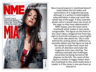
  • 1. New musical express’s masthead doesn’t really follow the full codes and conventions of a magazine because although it is written in bold brightly coloured letters it does not cover the whole top of the page. If they used the whole name it would cover too much of the page so they have abbreviated it. NME always uses the exact same masthead which makes it very easily recognisable. The figure on the front of the cover takes a diagonal line from top right to front left and gives a very English rock chick vibe about her. She is also behind the writing which is different as normally editors put the figure on top of the words to make them more the centre of attention and make the magazine more eye catching. The sideways barcode also challenges convention by being turned on 90 degrees to the left. The name of the figure is written in bigger letters than the masthead so this could really draw a reader in if the name is one you have an interest in.
  • 2. This magazine is very stereotypical with its masthead as it has a big font that takes up the whole top of the magazine and uses a very bold brightly coloured font. Rolling stone always uses the same font for its mast head but changes the colour so that it fits with the image lower down, this keeps it interesting and makes everything very colour coordinated. The picture on the front of this cover is in sync with the words underneath so it’s almost as if the words are explaining the picture. The same font is used all over the cover it is simply the size that changes this makes it very easy on the eye.
  • 3. The slits of white through the black masthead and long haired ruff looking men on the front give you a sense straight away that this is a rock and roll magazine. The black, white and red throughout also give a very dark feeling to the cover. The free poster special wording is there to lure you in and attract more readers as the thought of something free makes the magazine much more interesting. There are lots of pictures and not very many words you so can tell this will be a quite easy going magazine when you open up and look inside.
  • 4. By having just one letter as the name and masthead for this product it creates a really sense of drama and gives a massive statement that lots of words are not needed to attract your attention. By having a picture of Madonna on the front this edition of the magazine is probably targeting the older generation, but not men or women specifically, as she is in her early fifties so would not be found attractive by younger boys. This cover has quite a lot of writing on it and could possibly put a reader off as they have to search to find out what is inside. The
  • 5. Very clean, slick looking cover thanks to the fonts and very plain background but a slightly rugged look thrown in as Kanye has a beard growing. Two bold colours will keep the reader interested but are not too over the top. There is no barcode on this cover, this is challenging convention.
  • 6. The fact that everything is in black and white except for the picture makes it really stand out. There is a lot of writing on the front cover and the way its put together makes it look quite messy which fits in perfectly to the whole rock star look. The masthead is challenging convention as the image of the band covers most of it so you can hardly see the words, this could be risky unless the magazine is extremely popular as people might not know the name of it.
  • 7. The cover of this magazine really challenges convention as it has no picture, simply words. Some people may find this more interesting as magazines are meant for reading after all but other may be put of as there is no sneak preview to entice them in. The colouring is very stereotypical using only black, red and white.
  • 8. You can tell straight away that this magazine is aimed at a male audience by the sexily dressed woman on the front. She has little clothing on and is showing some flesh so this would really entice younger boys in to reading the magazine as they will probably expect to see more pretty girls with very little clothing on inside. The cover models clothes are the same colour as the background which makes her start to blend into the background as you get further down the page, this is very ironic as the magazine is called blender.
  • 9. She is dressed in very brightly coloured clothes but has been photographed on a pure white background, this really makes her stand out. The red masthead also stands out from the rest of the cover as it is the only thing red on the whole page. The wording on the front is very minimalistic which is positive towards the image of a model as she will get more attention.
  • 10. The background on this front cover is challenging convention as it not just a plain colour like it would normally be. I think it is interesting and more exciting. There are quite a few colours on this cover which makes it very bright and also makes it stand out.