Gestalt Principles of Design
•Download as PPT, PDF•
53 likes•34,337 views

The way people see a web page or digital design strongly affects its utility and the meaning that they take away. Gestalt principles tell people how to perceive visual objects, what they mean, and how they relate to one another within the user's experience. Design with these principles in mind to meet users' needs and leave a positive impression.

Recommended
More Related Content
What's hot
What's hot (20)
Viewers also liked
Viewers also liked (20)
Similar to Gestalt Principles of Design
Similar to Gestalt Principles of Design (20)
Recently uploaded
Recently uploaded (20)
Gestalt Principles of Design
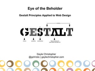
- 1. Eye of the Beholder Gestalt Principles Applied to Web Design Gayle Christopher @gchristo | gaylechristopher.com
- 2. Proximity/Grouping •Things that are close together are perceived to be more related than things that are spaced father apart. •One of the first principles to impact perception •Proximity overpowers similarity •Only uniform connectedness overpowers proximity Proximity overpowers similarity in color/contrast
- 4. Good Continuation •Elements arranged on a line or curve are perceived to be more related than elements not on the line or curve. •All written language employs the principle of good continuation. •Breadcrumbs, words in a paragraph, graphs, and linear arrangement (vertical or horizontal) communicate relatedness.
- 6. Similarity •Visual elements that are similar in shape, size, color and direction are perceived as part of a group. •Different modes of similarity are not created equal. •Color is the strongest way to suggest relationships. •Used in links, icons, page content to suggest similar behavior, relatedness, and reinforce content hierarchies to communicate context. •Consistency in styling and content dimension is important and implies structure.
- 7. Similarity
- 8. Figure-Ground •Elements are perceived as either figures (elements of focus) or background. •Human mind must rapidly decide which elements to focus on in a scene. This ability allows us to determine what we should pay attention to and what we can ignore even if it does provide context. •Use color, shading, highlights to cue the viewer in on what has focus and ground depth: buttons that look like press-able buttons, links that change on rollover, overlays that use shadow.
- 10. Common Fate •We perceive elements moving in the same direction as being more related than stationary objects or those moving in different directions. example •Humans recognize contrasting movement more so than color, contrast, size or any other visual cue. •Very automatic. •Moving objects are perceived as figure. Stationary objects are seen as ground. •Utilized in slide-out menus, tooltips, to create associations between elements on the page. example
- 11. Common Fate Anti-common fate can be used to increase visibility and interaction with visual elements such as call-to-action areas.
- 12. Uniform Connectedness •Uniform visual properties in visual elements cause them to be perceived as more related. Causes us to perceive groups rather than individual things. •Strongest of the Gestalt Principles of relatedness. •All items inside an outline are considered related (as in a file folder). •It is as simple as a bounding box. Other examples are tabbed navigation and thought bubbles.
- 14. Symmetry •Humans prefer symmetry over asymmetry. Symmetric forms tend to be seen as figure rather than ground and are recalled better. •Symmetric objects are associated with stability, consistency, and harmony. •Asymmetric arrangements are more interesting but are associated with negative feelings or impressions.
- 15. Symmetry Asymmetry
- 16. Closure •Humans look for recognizable patterns and visually close gaps in a form. •When the picture is incomplete, we use past experience, understanding, or recognizable patterns to fill in the gaps. •Some images are easier for the human mind to figure out: faces •Closure also applies to movement, as in video production. Th prchas of a hme s lkely th sngl mst mprtant fnancl dsisn y’ll evr mke.
- 17. Experience •Humans will use prior knowledge in understanding visual elements. •Common example: overlooking a misspelling because we know the word •Utilize experience to make UI elements like icons.
- 18. Simplicity (Law of Prägnanz) •Humans tend to interpret ambiguous or complex images as simple and complete. •Simplest: fewer rather than more elements, symmetrical rather than asymmetrical •People are better able to visually process and remember simple figures than complex figures. •Use symmetrical designs when efficiency of use is the priority. Asymmetrical when interestingness is the priority.
- 19. Simplicity (Law of Prägnanz) New twitter Old twitter
- 20. Resources Gestalt Theory in Interactive Media Design Journal of Humanities & Social Sciences, 2008 Vol 2, Issue 1 Top 5 Laws of Perceptual Organization Principles of Design Interaction Design and Gestalt Principles Six Gestalt Principles of Web Design Gestalt Principles of Perceptual Organization Close Relationship Between Gestalt Principles and Design Universal Principles of Design ISBN-13: 978-1-59253-587-3