Diagram Mistakes in Presentation Slide Design
•
30 likes•6,126 views

The document discusses three common mistakes to avoid when designing diagrams for presentations: (1) including too much information on a slide and lacking white space, (2) having an unreadable and chaotic layout with incorrect shapes alignment, and (3) lacking consistency in graphical styles, fonts, and elements. It provides examples of poor diagrams that demonstrate these mistakes and improved diagrams that have more white space, aligned shapes, and consistent formatting. The key to creating readable professional diagrams is to follow these three simple design tricks: having white space, aligned shapes, and consistent graphical style and font use.

Recommended
Recommended
More Related Content
What's hot
What's hot (20)
Viewers also liked
Viewers also liked (7)
Similar to Diagram Mistakes in Presentation Slide Design
Similar to Diagram Mistakes in Presentation Slide Design (20)
More from Peter Zvirinsky
More from Peter Zvirinsky (20)
Recently uploaded
Recently uploaded (20)
Diagram Mistakes in Presentation Slide Design
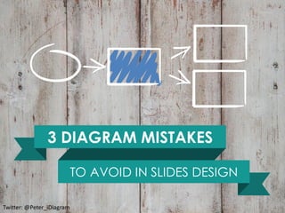
- 1. Visuals by infoDiagram.com 3 DIAGRAM MISTAKES TO AVOID IN SLIDES DESIGN Twitter: @Peter_iDiagram
- 2. Visuals by infoDiagram.com Using diagrams or schema in your presentation?
- 3. Visuals by infoDiagram.com Using diagrams or schema in your presentation? Good for you and your audience :-). Diagrams are great simple visualization tool to show your message clearly
- 4. Visuals by infoDiagram.com Using diagrams or schema in your presentation? Good for you and your audience :-). Diagrams are great simple visualization tool to show your message clearly Remember about three common mistakes to avoid when doing diagrams in a rush.
- 5. Visuals by infoDiagram.com Using diagrams or schema in your presentation? Good for you and your audience :-). Diagrams are great simple visualization tool to show your message clearly Remember about three common mistakes to avoid when doing diagrams in a rush. Make your diagrams looking professional and readable
- 6. Visuals by infoDiagram.com Top reasons of poor diagrams design
- 7. Visuals by infoDiagram.com (1) Too much information on a slide Top reasons of poor diagrams design
- 8. Visuals by infoDiagram.com (1) Too much information on a slide Lack of white space Top reasons of poor diagrams design
- 9. Visuals by infoDiagram.com (2) Unreadable chaotic look (1) Too much information on a slide Lack of white space Top reasons of poor diagrams design
- 10. Visuals by infoDiagram.com (2) Unreadable chaotic look Incorrect layout Lack of white space Top reasons of poor diagrams design (1) Too much information on a slide
- 11. Visuals by infoDiagram.com (2) Unreadable chaotic look Incorrect layout (3) Too many colors, styles, fonts Lack of white space Top reasons of poor diagrams design (1) Too much information on a slide
- 12. Visuals by infoDiagram.com Lack of consistency Incorrect layout (3) Too many colors, styles, fonts Lack of white space Top reasons of poor diagrams design (2) Unreadable chaotic look (1) Too much information on a slide
- 13. Visuals by infoDiagram.com Lack of consistency Incorrect layout (3) Too many colors, styles, fonts (1) Too much information on a slide Lack of white space Top reasons of poor diagrams design (2) Unreadable chaotic look
- 14. Visuals by infoDiagram.com Project Stage ALFA Step 1.2.1 Project Stage BETA Step 2.2.1 Project Stage GAMMA Step 3.2.1 Project Stage ZETA Step 5.2.1 Project Stage OMEGA Step 6.2.1 Project Stage DELTA Step 4.2.1 1 Lack of white space
- 15. Visuals by infoDiagram.com Project Stage ALFA Step 1.2.1 Project Stage BETA Step 2.2.1 Project Stage GAMMA Step 3.2.1 Project Stage ZETA Step 5.2.1 Project Stage OMEGA Step 6.2.1 Project Stage DELTA Step 4.2.1 Too dense, no margins 1 Lack of white space
- 16. Visuals by infoDiagram.com Make texts and shapes smaller to gain a white space. Give your slide a space to “breathe”. Project Stage ALFA Step 1.2.1 Project Stage BETA Step 2.2.1 Project Stage GAMMA Step 3.2.1 Project Stage ZETA Step 5.2.1 Project Stage OMEGA Step 6.2.1 Project Stage DELTA Step 4.2.1 1 Lack of white space - improved
- 17. Visuals by infoDiagram.com Project Stage ALFA Step 1.2.1 Project Stage BETA Step 2.2.1 Project Stage GAMMA Step 3.2.1 Project Stage ZETA Step 5.2.1 Project Stage OMEGA Step 6.2.1 Project Stage DELTA Step 4.2.1 2 Incorrect layout
- 18. Visuals by infoDiagram.com Project Stage ALFA Step 1.2.1 Project Stage BETA Step 2.2.1 Project Stage GAMMA Step 3.2.1 Project Stage ZETA Step 5.2.1 Project Stage OMEGA Step 6.2.1 Project Stage DELTA Step 4.2.1 Even a tiny misalignment makes overall bad impression Decide if it’s a circle or an oval 2 Incorrect layout
- 19. Visuals by infoDiagram.com Use Alignment tools and smart guides for perfect shapes layout 2 Incorrect layout - improved Project Stage ALFA Step 1.2.1 Project Stage BETA Step 2.2.1 Project Stage GAMMA Step 3.2.1 Project Stage ZETA Step 5.2.1 Project Stage OMEGA Step 6.2.1 Project Stage DELTA Step 4.2.1
- 20. Visuals by infoDiagram.com Project Stage Alfa Beta GAMMA Delta Beta 2 GAMMA 2 3 Lack of consistency
- 21. Visuals by infoDiagram.com Project Stage Alfa Beta GAMMA Delta Beta 2 GAMMA 2 Various fonts used Various shape styles applied (with white border and without with flat filling and with gradient, with shadow and without…) 3 Lack of consistency
- 22. Visuals by infoDiagram.com Project Stage Alfa Beta GAMMA Delta Beta 2 GAMMA 2 Unify the shapes style (use Format Painter for copying style quickly), use one font. 3 Lack of consistency - improved
- 23. Visuals by infoDiagram.com (2) Aligned shapes (3) Consistent graphical style and font use (1) Have a white space Three simple design tricks to remember when using diagrams Readable and professional diagrams
- 24. Visuals by infoDiagram.com Questions? What’s your challenge when using diagrams?
- 25. Visuals by infoDiagram.com Comment or contact me. I will gladly talk about using visuals in presentations. Peter Zvirinsky twitter: @Peter_iDiagram blog.infoDiagram.com Questions? What’s your challenge when using diagrams? Visuals by infoDiagram.com Give us a visit, get a free sample
- 26. Visuals by infoDiagram.com Follow me on Slideshare for more presentations, hit FOLLOW on slideshare.net/infodiagramFollow Comment or contact me. I will gladly talk about using visuals in presentations. Peter Zvirinsky twitter: @Peter_iDiagram blog.infoDiagram.com Questions? What’s your challenge when using diagrams? Visuals by infoDiagram.com Give us a visit, get a free sample