How to choose the right chart type or graph for your data
•
9 likes•1,650 views

Learn how to design effective and powerful charts and graphs. Once you have identified the audience for your chart, the metrics they need to see and the data that will power the metrics, it is time to select the right chart type for your data. In this presentation, we show you how to convert your data into powerful information by selecting the right charts for expressing them.

Recommended
More Related Content
Viewers also liked
Viewers also liked (13)
Recently uploaded
Recently uploaded (20)
How to choose the right chart type or graph for your data
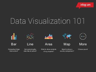
- 1. Bar Comparing things like income? Line Get some lengthy data like oil prices? Area Want to show contents of e.g. exports? Map Need to show a country comparison? More Choose yours! Data Visualization 101
- 2. One dimension Two dimensions Three+ dimensions Bar LineAreaPie Picto Scatterplot Bubble Comparison Tendency/Relations Comparison/ Relationships
- 4. Most often the best choice. Good to show differences in values that don’t add up to 100%. Poor choice for showing time- series data, as the line charts have a smoother representation. Bar Comparing things like income?
- 5. 100°=28% 50°=14% 55° = 15% 55°= 15% 100° = 28% 3,6° = 1%
- 6. Good for showing contrast when two or three components of something differ greatly in size. Bad choice if you have more than three variables or if their values are similar in size. Pie Need to show a country comparison?
- 7. 1 icon = x 7x 4x 6x 16x
- 8. Works well with 2-3 groups of people compared and when differences are significant. A line chart is a better option with more than three groups and when differences are small. Picto Need to show a country comparison?
- 9. Time Value
- 10. Line Get some lengthy data like oil prices? Best choice for time-series data and highlighting trends, with not more than three sets per chart. May be visually misleading when attempting to show data that is not based on time-series. Line Get some lengthy data like oil prices?
- 11. Time Value+value
- 12. Good to show how a certain variable grows/drops relative to others over a period of time. Careful when choosing between basic and stacked layouts, as they give different impressions. Area Want to show contents of e.g. exports?
- 14. Good to find out how much one variable depends on other e.g. how strongly does it correlate. Careful when choosing variables that don’t correlate, as result can be meaningless. Scatter Detect what is more profitable
- 15. Variable1 Variable 2 Volume More 1 More 2 Less 1 More 2 More 1 Less 2 Less 1 Less 2
- 16. The best to understand social, economical, medical, and other scientific relationships. Make sure your audience can read the chart. Bubble Compare values and show relationships
- 17. #InfogramStory Create a chart now