Journalism: Guidelines and Steps in Page Designing
•
141 likes•31,676 views

Guidelines and Steps in Page Designing Designing the Pages Things to be Avoided in page Designing

Recommended
More Related Content
What's hot
What's hot (20)
Similar to Journalism: Guidelines and Steps in Page Designing
Similar to Journalism: Guidelines and Steps in Page Designing (20)
More from Jamaica Olazo
More from Jamaica Olazo (20)
Recently uploaded
Recently uploaded (20)
Journalism: Guidelines and Steps in Page Designing
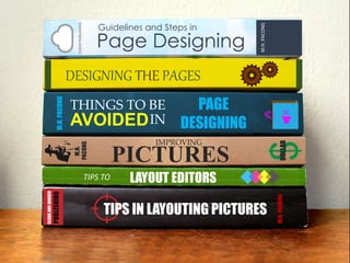
- 1. TIPS IN LAYOUTING PICTURES CLOAKANDDAGGER PUBLISHING M.H.PACONG LAYOUT EDITORSTIPS TO DESIGNING THE PAGES Page Designing CLOUDPUBLISHING M.H.PACONG Guidelines and Steps in THINGS TO BE PAGE DESIGNING M.H.PACONG AVOIDEDIN M.H. PACONG PICTURES DOLLAR IMPROVING
- 2. What is Page Designing? Page designing – refers to the lay outing of the newspaper page, which is also known as page make- up. It is the arrangement of articles, cuts (pictures), headlines, nameplate, folio and other contents on the page. TRAINING… November 16-18, 2014 Page Designing Mrs. Marilyn H. Pacong
- 3. Guidelines and Steps in Design with a purpose. Maintain design using unity and consistency. Design should have contrast and balance. Have a Focal Point. Page Designing Keep it simple.
- 4. Guidelines and Steps in Have a focal point. Page Designing 1 ‘A focal point is the element … that pulls in the viewer’s eye, that is the center of attention or the main subject.’ Mrs. Marilyn H. Pacong
- 5. Guidelines and Steps in Have a focal point. Page Designing 1 You can emphasize a focal point through…
- 6. Guidelines and Steps in Your noble purpose Page Designing 2 Organize large volumes of content into related parcels of information. Craft the typography to make it comfortably readable over many pages, yet lively enough to continually engage the reader.
- 7. Guidelines and Steps in Your noble purpose Page Designing 2 Structure the parts of pages and sections to accommodate a variety of content, whether image- or text-based. Integrate images with typography to achieve a unified form that builds a communication much bigger than its parts. Mrs. Marilyn H. Pacong
- 8. Guidelines and Steps in Keep it simple. Page Designing 3 Crystal clear simplicity is harder to achieve than a crowded, busy design. If you can remove an element without losing the meaning, it is not needed.
- 9. PRINCIPLES OF DESIGN Guidelines and Steps in Page Designing The way layout, design style, typeface and color work together to communicate the same content. UNITY • creates order • organizes page elements • groups items • creates visual connections
- 10. PRINCIPLES OF DESIGN Guidelines and Steps in Page Designing ___UNITY___ Similarity Proximity Continuity Alignment
- 11. PRINCIPLES OF DESIGN Guidelines and Steps in Page Designing Using italicized or bold text to create emphasis is a sample of contrast. Contrast of line, shape, size, tone and texture. CONTRAST Mrs. Marilyn H. Pacong
- 12. PRINCIPLES OF DESIGN Guidelines and Steps in Page Designing An effective design balances the visual weights on a page. BALANCE Symmetrical Asymmetrical
- 14. IN PRINTLOOK GOOD LAYOUT LINGO Speak the same lingo to avoid misunderstanding.
- 15. Layout Lingo When an image or element on a page touches the edge of the page, extending beyond the trim edge, leaving no margin. Bleed allowance: about 1/8” beyond the trim lines. Bleed
- 16. Layout Lingo One or more vertical blocks of text used to break up large bodies of text that cannot fit in a single block of text on a page. Column
- 17. Layout Lingo Crop marks Crossed lines placed at the corners of an image or a page to indicate where to trim it. Center marks Vertical lines used to indicate the center of a two-page spread for folding or cutting. Mrs. Marilyn H. Pacong
- 18. Layout Lingo Orphan A word isolated at the top of a column or page. Widow A syllable, word, or less than one-third of a line isolated at the bottom of a column, paragraph, or page.
- 19. The Dummy’s Guide to a NEWSPAPER DUMMY Don’t plan on the screen. PLAN ON PAPER
- 20. The Dummy’s Guide to a NEWSPAPER DUMMY Every layout begins with a DUMMY Not this dummy… …but this dummy DUMMY – diagram outlining the makeup scheme
- 21. SYMBOLS USED IN DUMMYING
- 23. THE STEPS IN PAGE DESIGNING
- 24. THE STEPS IN PAGE DESIGNING 1. Survey, evaluate, sort out and list down articles according to their kind, value and importance. 2. On the dummy sheets, make a rough plan of a page, assigning the possible needed articles on it. 3. Using your imagination, see how the page looks now. 4. Determine the types to be used and apply art elements. 5. Finalize your make-up. Mrs. Marilyn H. Pacong
- 25. DesigningTHE PAGES A. FRONT PAGE 1. The nameplate of the newspaper, also known as flag, sets the basic image of the publication, draws attention to the page, identifies the publication and sets the tone for the message. It should be clean, distinctive and uncluttered.
- 26. DesigningTHE PAGES A. FRONT PAGE 2. Place the most important or banner story in the right hand corner to get focal attention. 3. If possible, avoid jump stories, because of the inconvenience of turning the pages and locating the continuation. 4. Cover the leading stories substantially.
- 27. DesigningTHE PAGES A. FRONT PAGE 5. Use the ears in calling attention to special features, giving the theme of the campus paper, presenting weather information and others. EARS – small box on one or both sides of the nameplate carrying brief announcements of weather or circulation, etc.
- 28. Designing THE PAGES The X Format Makeup by way of Text and Photo Combination Layout for FRONT PAGE:
- 29. Designing THE PAGES Curve Format Makeup by way of Text and Photo Combination Layout for FRONT PAGE:
- 30. Designing THE PAGES The L Format Makeup by way of Text and Photo Combination Layout for FRONT PAGE:
- 31. Designing THE PAGES The J Format Makeup by way of Text and Photo Combination Layout for FRONT PAGE:
- 32. Designing THE PAGES Makeup by way of Text and Photo Combination Layout for FRONT PAGE: The Umbrella Format
- 33. DesigningTHE PAGES B. INSIDE PAGES 1. Inside news pages should be designed as facing page units rather than as single pages. 2. The principle of contrast and balance should be applied in planning the make-up of facing pages. 3. Inside news pages generally DO NOT use large headline like in the front page.
- 34. INSIDE PAGES
- 35. INSIDE PAGES
- 36. INSIDE PAGES
- 37. DesigningTHE PAGES C. EDITORIAL PAGES 1. These pages should have a distinctive, dignified and formal appearance. 2. Editorials traditionally appear in the first two columns of the left page of the editorial spread. They are larger in types. 3. The editorial box, which should be relatively small, may be anchored in any of the lower corners, or on the upper left hand corner of the editorial page. 4. Titles of editorials, like the headline of news stories, should be of the masculine appearance, not the italic type. 5. Editorial and opinion columns ordinarily appear in the same position of the same page every issue.
- 38. EDITORIAL PAGES
- 39. EDITORIAL PAGES
- 40. DesigningTHE PAGES D. FEATURE/LITERARY PAGES 1. These pages must have a literary and feminine appearance. 2. All of the columns may be wider than the rest of the paper. Often, columns are set in one and one- half columns wide. 3. Roman and italic types are used for text, except for poetry. 4. Different styles of titles in different font types may be used for feature stories. 5. Usually fewer articles appear on these pages than on the news pages. Pictures are used to capture interest and highlight the story.
- 45. DesigningTHE PAGES E. SPORTS PAGES These pages have bolder but livelier appearance than the others. Their makeup should suggest action, speed and color. Large bold heads are used.
- 46. SPORTS PAGES
- 47. SPORTS PAGES
- 48. THINGS TO BE AVOIDED IN PAGE DESIGNING
- 49. 1. Avoid “tombstoning” or “bumping” headlines, which might be read as one headline. THINGS TO BE AVOIDED IN PAGE DESIGNING BUMPER or TOMBSTONE – two elements placed side by side, also called a Tombstone when it refers to headlines.
- 50. 2. Avoid separating related stories and pictures. 3. Avoid a box beside another box or beside photographs or cartoons. THINGS TO BE AVOIDED IN PAGE DESIGNING BREAK OVER or JUMP – story that jumps from one page to another JUMP LINES – continuation lines: continued on page 4
- 51. 4. Avoid gray areas. Break them up with the use of subheads. THINGS TO BE AVOIDED IN PAGE DESIGNING SUBHEAD – one- or two-line head used within the body of a story in type
- 52. 5. Avoid bad breaks. The top of every column should have a headline or a picture. THINGS TO BE AVOIDED IN PAGE DESIGNING BAD BREAK – bad phrasing of a headline; bad wrapping of headline type BREAK – point at which the story turns from one column to another
- 53. 6. Avoid screaming headline or a headline that is too big for a short or unimportant story. 7. Don’t make the top half of the page heavy like too much pictures and big headlines. THINGS TO BE AVOIDED IN PAGE DESIGNING BROKEN HEADS – headlines with lines of different widths
- 54. 8. Avoid many headlines of the same size on a page. 9. Avoid placing small heads on rather long stories. THINGS TO BE AVOIDED IN PAGE DESIGNING
- 55. 10. If possible, avoid jumpheads. 11. Avoid placing jump heads at the upper fold of the page. THINGS TO BE AVOIDED IN PAGE DESIGNING JUMPHEAD – headline over the continued portion of a story RUNOVER, JUMP STORY, or TURN STORY – portion of a story that continues from one page to the next
- 56. 12. Avoid placing the nameplate or flag below the fold. 13. Avoid using many families of types especially on the front page. THINGS TO BE AVOIDED IN PAGE DESIGNING
Editor's Notes
- To catch attention and to encourage a customer to look further into a store you need a strong focal point. Imagine a store is like a film… The window display is the movie poster, static and silent but appealing to the target audience. The entry, the opening credits of the film, it hooks you in to the story. And your walk through the store is the story line, takes you on a journey … supported by a mood enhancing soundtrack! You can emphasize a focal point through … composition, through color, and through the range of tones you use.’ Generally a focal point results when one element differs from the rest. ‘The focal point is best placed just below eye level, just off-centre’ as it assist with guiding the eyes around the rest of a display where the viewer will see other products.
- To catch attention and to encourage a customer to look further into a store you need a strong focal point. Imagine a store is like a film… The window display is the movie poster, static and silent but appealing to the target audience. The entry, the opening credits of the film, it hooks you in to the story. And your walk through the store is the story line, takes you on a journey … supported by a mood enhancing soundtrack! You can emphasize a focal point through … composition, through color... and through the range of tones you use.’ Generally a focal point results when one element differs from the rest. ‘The focal point is best placed just below eye level, just off-centre’ as it assist with guiding the eyes around the rest of a display where the viewer will see other products.
- Successful pages will have vertical and horizontal elements, dominant and secondary elements (heads, boxes, lines, etc).
- Placing two or more headlines on approximately the same level in adjacent columns especially if they are of the same point or types.
- Do not break cut stories to the top of columns.
- Avoid using a banner headline unless the story deserves it. Screaming headlines should also not be used. Screaming headline is one that is too big for a short or unimportant story.