#crosshairs13 - Teaching Data Visualization Through Coffee Prices
•Download as PPTX, PDF•
1 like•1,605 views

Jake Batsell's presentation at the Higher Ed in the Crosshairs symposium at Southern Methodist University, February 22, 2013.

Recommended
Recommended
More Related Content
Viewers also liked
Viewers also liked (20)
Similar to #crosshairs13 - Teaching Data Visualization Through Coffee Prices
Similar to #crosshairs13 - Teaching Data Visualization Through Coffee Prices (20)
More from Jake Batsell
More from Jake Batsell (20)
Recently uploaded
Recently uploaded (20)
#crosshairs13 - Teaching Data Visualization Through Coffee Prices
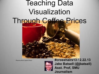
- 1. Teaching Data Visualization Through Coffee Prices Photo by Brian Legate (Flickr) #crosshairs13 / 2.22.13 Jake Batsell (@jbatsell) Asst. Prof, SMU Journalism
- 2. Data is fueling today’s most comprehensive, interactive journalism. The New York Times, February 2012
- 3. But introducing students to data-driven journalism can be Image by Brett Jordan(Flickr) INTIMIDATING
- 4. By easing students into data journalism with a dose of caffeinated competition... STUDENTS CAN MASTER THE BASICS OF DATA VISUALIZATION IN 48 HOURS.
- 5. STEP ONE: Put students in small groups. The mission • Use a combination of reporting skills and data tools to create an interactive map that visualizes local coffee prices.* * 16 oz. drip Photo by codepo8 (Flickr)
- 6. STEP ONE (cont’d): Groups create reporting strategy. • Settle on data elements. • Create Google spreadsheet. • Agree on reporting methods: Shoe-leather, phone calls, Web research, crowdsourcing, etc. Photo by codepo8 (Flickr)
- 7. STEP TWO: Collecting the data. • Finalized spreadsheets due by start of next class. • Standardizing is key. • If crowdsourcing, must vet contributions and decide whether to use them as is, correct them, or exclude.
- 8. STEP THREE: Visualizing the data. • Groups reconvene in class to turn spreadsheets into interactive maps with Google Fusion. • Class time is for polishing and troubleshooting only; no additional reporting.
- 9. STEP FOUR: PRIZES!! More details, links & resources: http://j.mp/teachdataviz @jbatsell jbatsell@smu.edu