1. D O U B L E P A G E S P R E A D F O R N M E M A G A Z IN E
FEATURING ‘THE MACABEES’
2. HOW DOES THE CHOICE OF BAND
FEATURED IN THE ARTICLE SUGGEST
WHO THE TARGET AUDIENCE WILL
BE?
THE MACABEES
Indie/Rock band from London
The choice of band featured in the article suggests that the target audience,
because all the band members are male, definitely suggests that they will have a
strong female following. However, this band also has a huge male fan-base,
meaning the target audience of the article will be pretty vague/general in terms of
gender.
The Macabees are an indie, rock band, so this suggests the target audience will be
interested in that genre of music and generally will be quite young.
They play at many music festivals and do lots of gigging meaning their audience is
predominantly young because of this which will attract a young, teenage target
audience to the magazine.
The Macabees are very creative and artistic in their advertising and promotion and
this will therefore attract a creative audience. Their trendy styling and arty image
again adds to the idea that their target audience is that of a young one.
They have an album called ‘Colour it in’ and songs such as ‘Lego’ and ‘Dinosaurs’,
which again portrays the band as having a childish, playful side which will attract a
younger audience.
3. WHAT TYPE OF LANGUAGE IS USED IN THE
ARTICLE?
‘on the road with...’
This type of language is very ‘rock&roll’ and suggests that the article will
include some backstage info and photographs to the reader which will
attract them to reading it in the first place.
‘the indie kids…’
This language is immediately giving the band a social identity and is
directed to a certain group of people with a certain style etc.
They are also referred to as ‘kids’ which enforces the fact that they are
known to be a fun, childish band at times.
‘up north…’
This language is very informal and casual, which makes it not
only easy for a wide audience and range of people to read,
but is friendly and inviting. It gives the reader an insight into
the style of writing the article has been written in.
4. HOW IS COLOUR
USED?
blues
There is a definite colour scheme on this double
oranges page spread, combining different colours of
orange, brown, blue and white space.
The fact that the majority of the heading text on
both sides of the DPS is orange helps to relate the
pages to one another so that they have something to
browns
with one another and are obviously part of the same
article. The overall colour scheme is quite grungy and,
in my opinion, not very chic or on trend compared to
the designs from other more simplistic and stylish high
end magazines. This however, relates to the band and
how they are quite grungy and rock and roll, and that
they are a fun, young-at-heart kind of band, which
white
relates to the fact that bright colours such as orange
and blue may have been used. It’s a rather
stereotypical, not very unique colour scheme they
have
used to represent the band and the magazine. Though I do
think that the colour scheme fits in with the house style of
the magazine and is recognisably from NME Magazine.
5. FONT
Here there is a contrast in a simpler, San serif font used for
the words ‘The Maccabees’ and a fancier swirly style serif
font for the words ‘On The Road With’. I also like the way
both fonts are merged and overlapping each other slightly
with the ‘R’ overlapping across the ‘C’. In my opinion, I
don’t like the font used for the white text for the title of the
double page spread because I think it looks too fussy and
isn’t a style of font I would personally use on my own
designs and I think it downgrades the magazine in terms of
how high end it looks and is. But, because the font makes
the magazine, overall, look less high end and seem perhaps
I like the font used on the
cheaper than some other magazines on the market I think
subheadings and smaller
this could appeal to customers/audience who are looking
pieces of text as it looks
for a cheap and affordable magazine that is inexpensive but
simpler and less fussy. It
still delivers good quality content.
keeps your attention on the
I do think that the font used for the title of the article is
image used and the actual
fitting for the use on the title because it makes sure it is
article.
clear that it is the title and is completely different to any of
the other text on both pages of the double page spread.
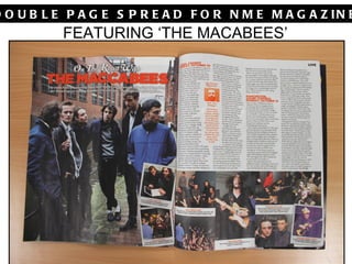
6. THE IMAGES
The images used are very musical,
including guitars which feature in
multiple images, and gig audiences and
The images used in this double page spread are crowds.
very informal and taken from the moment rather than
staged or set up, with multiple images taken
backstage at gigs. The smaller images seem to be
quite playful and fun, with the use of face paint,
which portrays the band as playful and fun which is
what they are generally known to be like. This is
contrasted against the main, full page image used
on the left page, which is more serious and
composed. The band almost look quite uninterested
due to no one having direct eye contact with the
camera, which portrays them in a quite 'rock and
roll' way, especially since one of the band members
is looking away completely. It's as if they've all been
told to stand there and look at the camera but no
one is that bothered.
The small polaroid style images spill out onto the
opposite page which therefore relates both pages
which is important as it is a double page spread and
both pages should have some sort of sign to show
they go together as a double page article.