Customizing the list control - Sencha Touch mobile web application
•Download as DOCX, PDF•
1 like•4,334 views

A tutorial from my blog http://jbkflex.wordpress.com on how to customize the look and feel of the default Sencha Touch List control and give it something of your own.
![Ok now, let’s talk a little about item templates before we move to the actual work in hand. Item templates are created
by using the Ext.XTemplate class and it will define the look and feel along with what fields you will be displaying in
each of your list item. This is how to create basic XTemplate
var tpl = new Ext.XTemplate(
'<p>Kids: ',
'<tpl for=".">', // process the data.kids node
'<p>{name}</p>', //display the name
'</tpl></p>'
);
As you can see in the simple example we have created a basic XTemplate. The tpl tag and the for operator are used
to process the provided data object. It is mainly meant for looping the data objects. Remember that your data is
provided by the Store and this can be a JSON data or an XML which has a hierarchical structure something like this
var data = { //JSON data object
name: 'Tommy Maintz',
title: 'Lead Developer',
company: 'Ext JS, Inc',
email: 'tommy@extjs.com',
address: '5 Cups Drive',
city: 'Palo Alto',
state: 'CA',
zip: '44102',
drinks: ['Coffee', 'Soda', 'Water'],
kids: [{
name: 'Joshua',
age:3](data:image/gif;base64,R0lGODlhAQABAIAAAAAAAP///yH5BAEAAAAALAAAAAABAAEAAAIBRAA7)
Recommended
More Related Content
What's hot
What's hot (17)
Similar to Customizing the list control - Sencha Touch mobile web application
Similar to Customizing the list control - Sencha Touch mobile web application (20)
Recently uploaded
Recently uploaded (20)
Customizing the list control - Sencha Touch mobile web application
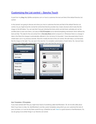
- 1. Customizing the List control – Sencha Touch A post from my blog http://jbkflex.wordpress.com on how to customize the look and feel of the default Sencha List control. In this tutorial I am going to discuss and show you how to customize the look and feel of the default Sencha List control. As you might know the normal list control that Sencha provides has a basic structure which looks like the image on the left below. You can see that it has got individual list items which are laid down vertically and can be scrolled down to see more items. List uses an Ext.XTemplate as its internal templating mechanism which defines the look and feel. The data for the List comes from a Ext.data.Store which is bound to it. Whenever there is a change in data in the Store the change is automatically reflected in the List since it is bounded. I have discussed about how to create basic List in my previous tutorials. Now let’s modify the look of the List control. We will make a List that looks like the image on the right. You can see in the new list, it is complete customization of each items. So, now we have more of a <div> block with custom styles and images. Let’s see how this can be done. Item Templates / XTemplates If you have worked with Flex you might have heard of something called ItemRenderer. Ok, let me tell a little about them if you have no idea. So, ItemRenderer’s are like custom templates using which you can customize the look of your List items, or it can be any Data control for eg. a DataGrid as well. Here is a good tutorial on ItemRenderers. So, we are going to do similar things in our Sencha List control.
- 2. Ok now, let’s talk a little about item templates before we move to the actual work in hand. Item templates are created by using the Ext.XTemplate class and it will define the look and feel along with what fields you will be displaying in each of your list item. This is how to create basic XTemplate var tpl = new Ext.XTemplate( '<p>Kids: ', '<tpl for=".">', // process the data.kids node '<p>{name}</p>', //display the name '</tpl></p>' ); As you can see in the simple example we have created a basic XTemplate. The tpl tag and the for operator are used to process the provided data object. It is mainly meant for looping the data objects. Remember that your data is provided by the Store and this can be a JSON data or an XML which has a hierarchical structure something like this var data = { //JSON data object name: 'Tommy Maintz', title: 'Lead Developer', company: 'Ext JS, Inc', email: 'tommy@extjs.com', address: '5 Cups Drive', city: 'Palo Alto', state: 'CA', zip: '44102', drinks: ['Coffee', 'Soda', 'Water'], kids: [{ name: 'Joshua', age:3
- 3. },{ name: 'Matthew', age:2 },{ name: 'Solomon', age:0 }] }; As you can see the property kids is an array of objects (with properties name and age). So to loop around each kid inside the data object we can write something like this in our XTemplate var tpl = new Ext.XTemplate( '<p>Name: {name}</p>', '<p>Title: {title}</p>', '<p>Company: {company}</p>', '<p>Kids: ', '<tpl for="kids">', // interrogate the kids property within the data '<p>{name}</p>', '</tpl></p>' ); You can see the value assigned to the for operator which is kids, so it will loop through each kid object and print the name. Also you can see the {name} inside the tags, it is kind of a placeholder or rather a replacement of the object property. This {name} field defined here actually comes from the model that the store has declared in it. Example shown below Ext.regModel('kidModel', { fields: ['name'] //fields are declared here });
- 4. var kidStore = new Ext.data.Store({ model: 'kidModel', data: dataObj //that we have defined above }); Ext.data.Storescan store inline data so we have assigned the value of dataObj that we have created earlier in our tutorial to the data property inside our store. You can learn more on Ext.data.Stores, Models and XTemplates from the Sencha Touch API docs. Also I will be posting some more tutorials on these soon. Now to put all these together in a List, it will look something like this var myList = new Ext.List({ id:'myList', layout:'fit', store:kidStore, itemTpl: tpl, emptyText:'Sorry, no data!' }); Ok, we have seen some basic concepts and I will not deviate further away from our real topic on hand that is to customize the List control. Customization To customize the List control, we will have to make changes mainly in our XTemplate where we will create new HTML elements such as <div> for example, and wrap our data fields inside them and then style our <div>’s that we have created using basic CSS. So here we go, this will be the data that we will show in our list var productData = [ {"name": "iPod", "price": "$300", "image_url": "images/ipod.png", "in_stock": "yes"}, {"name": "Toaster", "price": "$200", "image_url": "images/toaster.png", "in_stock": "yes"},
- 5. {"name": "Clock", "price": "$120", "image_url": "images/clock.png", "in_stock": "no"}, ]; Lets define our model with all the fields we need Ext.regModel('productModel', {fields: ['name','price','image_url','in_stock']}); Now lets create our store that will hold the data var productStore = new Ext.data.Store({ model: 'productModel', data: productData }); Now, most important of all of them, lets create our XTemplate. Before writing code the image below shows the basic layout structure of the block that we will design for each List item. As you can see above we have a main <div> block which contains two <div> blocks inside it, the title <div> block and the body <div> block that will hold the product image and other details. Here is the XTemplate for our custom block var productTemplate = new Ext.XTemplate( '<tpl for=".">', '<div class="productBox">', '<div class="productTitle">', '{name}', '<img class="nextIcon" src="images/next.png"/>', '</div>', '<div class="productBody">', '<img class="productImage" src="{image_url}"/>',
- 6. '<ol>', '<li>Price: {price}</li>', '<li>In Stock: {in_stock}</li>', '</ol>', '</div>', '</div>', '</tpl>' ); There are three items in the data so <tpl for=”.”> will loop three times each for one data object. And then it will put the values of the corresponding fields in the placeholders. As you can see in the code block we have a div box ofclassname = ‘productBox’. It holds two <div> blocks inside it, one for the title (class = ‘productTitle’) and the other for the body (class=’productBody’). The styles for them are all defined in the CSS which I will show later. You can also see in the code block the images that have been put together. Overall the code block is pretty simple and self-explanatory. Now lets bind the store, template to our list. This is how to do it var productList = new Ext.List({ styleHtmlContent:true, store: productStore, itemTpl: productTemplate, layout:'fit', height:"100%", emptyText:'Oops! No data' }); And then we can put our List in a Panel for it to display. Lets look at the full code and then I can explain more <!DOCTYPE html> <html> <head> <title>Custom List</title>
- 7. <link href="css/sencha-touch.css" rel="Stylesheet" /> <script type="text/javascript" src="js/sencha-touch.js"></script> <script type="text/javascript"> Ext.setup({ tabletStartupScreen: 'tablet_startup.png', phoneStartupScreen: 'phone_startup.png', icon: 'images/homeblue.png', glossOnIcon: false, onReady: function(){ var productData = [ {"name": "iPod", "price": "$300", "image_url": "images/ipod.png", "in_stock": "yes"}, {"name": "Toaster", "price": "$200", "image_url": "images/toaster.png", "in_stock": "yes"}, {"name": "Clock", "price": "$120", "image_url": "images/clock.png", "in_stock": "no"}, ]; Ext.regModel('productModel', {fields: ['name','price','image_url','in_stock']}); var productTemplate = new Ext.XTemplate( '<tpl for=".">', '<div class="productBox">', '<div class="productTitle">',
- 8. '{name}', '<img class="nextIcon" src="images/next.png"/>', '</div>', '<div class="productBody">', '<img class="productImage" src="{image_url}"/>', '<ol>', '<li>Price: {price}</li>', '<li>In Stock: {in_stock}</li>', '</ol>', '</div>', '</div>', '</tpl>' ); var productStore = new Ext.data.Store({ model: 'productModel', data: productData }); var productList = new Ext.List({ styleHtmlContent:true, styleHtmlCls:'testHtml', overItemCls:'testOver',
- 9. selectedItemCls:'testSelect', pressedCls:'testPress', layout:'fit', height:"100%", emptyText:'Oops! No data', store: productStore, itemTpl: productTemplate }); //main viewport new Ext.Panel({ fullscreen:true, dockedItems:[{xtype:'toolbar', title:'Custom Product List'}], dock:'top', scroll:'vertical', items:[productList] }); } }); </script> </head> <body>
- 10. </body> </html> We have pretty much discussed the things needed to create our custom product list. However, in the productList control above you can notice some CSS class properties that have been bolded. We have provided some CSS class names (for eg. testOver) for specific purpose. Here they are styleHtmlCls:'testHtml', overItemCls:'testOver', selectedItemCls:'testSelect', pressedCls:'testPress', You might ignore this for your custom List, but I will tell you that these are important. These are predefined CSS class names for the List control and by setting custom classes you can further control the look of your custom List. These are the definitions of the properties from the Sencha Touch API docs styleHtmlCls : String The class that is added to the content target when you set styleHtmlContent to true. This means that this CSS class will define the overall look of your list. overItemCls : String A CSS class to apply to each list item on mouseover selectedItemCls : String A CSS class to apply to each selected item in the list pressedCls : String A CSS class to apply to an item in the list while it is being pressed We will set the CSS styles for all these classes in our CSS block. Lets see our CSS block now <style> .productBox { border:1px solid #9a9a9a; }
- 11. .productTitle { border-bottom:1px solid #9a9a9a; padding:5px 10px 0px 10px; background-color:#ccc; font-weight:bold; height:30px; } .nextIcon { float:right; } .productBody { padding:10px; } .productBody ol { float:right; }
- 12. .productBody ol li { list-style:none; } .productImage { width:50px; } .testSelect { background-color:#efefef; } .testPress { /*I want that nothing should happen, so blank*/ } .testHtml { font-family:'Helvetica Neue', HelveticaNeue, Helvetica-Neue, Helvetica, 'BBAlpha Sans', sans-serif;
- 13. font-size:15px; } .testOver { background-color:#aaaaaa; } </style> Simple CSS code, nothing fancy here. Note the custom CSS classes testOver, testHtml, testPress, testSelectdefined in the product List. We have put some CSS rules for them. Now, include this CSS block in your index page and we are ready to go. You should be able to see this at the end
- 14. A Custom Product List Here is the demo application. Open it in your touch phone or test it in http://www.iphonetester.com/ which is an online iPhone simulator. This is it and we are good to go I guess.