2. People pay £10 for new releases
(mainstream magazines such as Empire
cost nearly half that) and some pay even
more to get their hands on past issues.
This is because this unique magazine is
considered a piece of art. It featured
talented illustrators and graphic
designers and photographers and
cutting edge writers. The magazine is a
high quality source of all things film,
music, art politics, op culture and other
topical news. From my previous
research I noted that the cover centres
heavily on a characters face profile, with
little writing only the logo and the title
(the exception older issues where they
displayed the contents). Looking
through the magazines inspired me to
do a similar one to this, as our film is
independent and the style and
cinematography would be interesting for
the indie culture this magazine attracts.
3. After downloading our trailer from YouTube
(easier and faster and smaller file size than
straight from Adobe Premier), I imported
the video into Photoshop. Here I could
choose a frame that would be suitable for a
cover that’s shown to the public
4. Following a few steps of enhancing
colour and exposure, I went
through the filters. This is because
Little White Lies are a very arty
magazine that features talented
artwork. My drawing skills are not
good enough quality so I opted for
this method. There ware some very
extreme effects that were definitely
suitable as you could hardly
recognise Emily.
5. In the end I narrowed it down to
these five. I chose these as they
were close enough to processes
that could be done by paper and
they still kept Emily’s features clear.
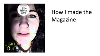
6. After choosing the brush filter, I
set about making it into a
magazine cover. The template
helped for sizing and as a base.
The logo is what makes it a Little
White Lies cover. I cropped the
image then blended all three
layers together to create the
above image.
7. I then proceeded to experimente with
different effects through the blending options
of the layer style, to get a feel of how I wanted
the text to look.
8. Then I browsed dafont, selecting possible styles
that captured my interest and tested them on top
of the magazine. Yellow worked the best as it leapt
out of the dark background and linked the digital
font – of which is a connection to the films plot.