
Recommended
More Related Content
More from khalfyard
More from khalfyard (20)
Recently uploaded
Recently uploaded (20)
80s Pop Magazine Deconstruction
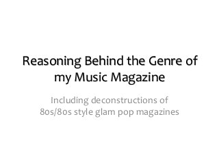
- 1. Reasoning Behind the Genre of my Music Magazine Including deconstructions of 80s/80s style glam pop magazines
- 2. I have decided to create an 80s style glam pop magazine because through my research I have found that generally speaking, music magazines are in decline, particularly pop magazines. Due to this fact, I wanted to target a niche market that might be more interested in a music magazine than the masses seem to be, who a large number of music magazines are aimed at, such as ‘Q’ and ‘NME’. I chose 80s glam pop over any other genre because I felt it would be a fun style of experiment with, and also those who would be most interested in it will be people who were around in the 1980s, especially those who were young at that time because it will be more relatable for them. This is beneficial for me because this age group will probably be more likely to buy a music magazine than the younger generation because they have been more common throughout their lifetime and the purchase is probably something that will be nostalgic for them. Furthermore, generally the older generations are less interested in technology and will therefore be less likely to access content via the Internet, and more likely to want to read about that content in a music magazine. However, I will also target a young audience to try and get them interested in music magazines, in an attempt to save a dying industry. I will do this by using young and up and coming stars as a feature of my magazine who will be more relatable and interesting for a younger audience. Broadening my target audience in terms of age will hopefully make my magazine sell better as I have chosen a niche genre to base my magazine around, so my target audience is already restricted. Before I can create my own music magazine, I need to study the genre in detail. In this PowerPoint I will be deconstructing magazine covers which are similar to the ones I want to create. This will teach me what to include and what not to include when I make my own.
- 3. Bold, colourful masthead in the top left hand corner, layered on top of the photograph. From my wider research I know that this a convention of most magazines, no matter what the genre, although it can vary whether the masthead is layered over the photograph or underneath it. This is a cover from‘Pop’. It is their “80s excess issue” so it is fairly similar to the style of magazine I want to create and can teach me how to style and position my model. However, this is a one-off theme for them, whereas it would be the constant theme in my music magazine. The model is wearing unusual, bold clothing which wouldn’t have been worn by ‘normal’ people in the 80s, and wouldn’t be worn by ‘normal’ people today. Although this type of look is usually associated with fashion magazines, clothing is also important in creating the look of a music magazine. This model is wearing the white bodysuit and headpiece to create a statement look – something that is important for a music magazine because it will stand out on the shelf and capture attention from the audience. Once the outfit has captured the audience’s attention, the audience will then look at the cover properly and see how her outfit fits into the theme of the magazine – it is something that 80s pop stars might have worn during their performances if they were being outgoing. Also, her makeup is bold, particularly her lip colour which is a classic 80s look. The barcode is in the bottom left hand corner, on an angle to save space. This is something that I will use in my music magazine as its positioning saves space but still allows the barcode to serve its purpose – to allow customers to buy the magazine in shops. The taglines are located down the left and right hand side of the magazine as this is a magazine convention. However, these tag lines are somewhat unconventional because some are on angles and the size of each one varies greatly. This is probably a technique to make the magazine stand out and attract attention because it is different. As it is a special edition of the magazine, the unconventional taglines may also have been an attempt at differentiating the special edition from the regular editions that they produce. The cover lines are all written in the same font and the same colour. This is to create a theme in order to make the cover aesthetically pleasing. Above the barcode there is information about this particular issue of the magazine, including the issue number and the price. This is to inform the audience. It is written in small typography because it isn’t part of the aesthetics that the designer of the cover is trying to create, and it isn’t something that they would want to be noticed straight away. It’s not important to most consumers what issue it is, unless they are loyal readers or collectors. However, the price is important to anyone wanting to buy the magazine, but the cover is intended to impress the audience and make them decide they want the magazine before they look at the price. Despite the small typography, the text is placed somewhere that is easy to find for those looking for it, as the barcode is easy to spot. The shot used as the main focus of the cover is a medium shot, which is unusual compared to other 80s glam pop/rock style magazines that I have looked at. However, I suspect that this is because of the outfit the model is wearing – it wouldn’t be represented fully if the shot was close-up, and so a medium shot was used instead. It is still an effective shot, despite it not being the usual bold close-up as the audience can see her outfit and her striking makeup. The model has a traditional modelling facial expression, with her eyes looking directly at the camera and her lips slightly parted. This is a facial expression used quite a lot on music magazines similar to the style I have chosen to create because it makes the model seem as though they’re looking directly at you, as though you can really learn about them, making the cover intriguing. Usually the model will be a celebrity as it will encourage more people to buy the magazine so that they can find out new information about this celebrity (celebrity endorsement).
- 4. This is another cover from ‘Pop’ magazine. Again, it is from their “80s excess issue” so it is fairly similar to the style of magazine I want to create. However, this is a one-off theme for them, whereas it would be the constant theme in my music magazine. Bold, colourful masthead in the top left hand corner, layered on top of the photograph. From my wider research I know that this a convention of most magazines, no matter what the genre, although it can vary whether the masthead is layered over the photograph or underneath it. Although the logo on this cover is the same design as on the previous cover, the colour has been changed so that it fits the new colour scheme being created on cover. Again, the cover lines are located down the left and right hand side of the cover as this is a convention of all magazines, but the taglines of this cover are slightly unusual as some are on an angle and they are all pushed up together and are different sizes. This could be a technique to create interest by mixing up their usual style, or potentially to give the special editions a sense of identity, as they all follow the same format although they use different photographs and colour schemes. There are several different covers under the title of ‘The 80s Excess Issue’. The barcode for this cover is located in the bottom left hand corner so that it doesn’t detract from the main focus of the cover – the striking photograph. Information about the issue number and price is located next to the barcode. The typography is small so that it doesn’t get in the way of the powerful image and ruin the aesthetics of the cover, but it is written in a clear font and in black so that it stand out against the gold of the model’s clothing and is more easily legible to make it easier for the audience. This is information that they need to provide for their audience so it is placed somewhere easy to locate – next to the barcode, but it is discreet so that the cover can ‘wow’ the audience before they look at the price so that the audience is more likely to decide that the price is worth it. The model is wearing very bold makeup, including a dark smoky eye which was a big 80s fashion trend. It is striking and draws the audience into their eyes making the cover appear intimate. The necklace featured in the image is bold and eye-catching which helps to attract attention to the photograph and thus the magazine. Many of the models in 80s-style magazines are wearing bold jewellery and so this is something I will try to replicate in my photographs. The shot used is a close-up and this allows the audience to see in detail the makeup that the model is wearing which plays a big role in creating their 80s look, and also the unusual clothing that the model is wearing, including the lace shirt and the thick white headband. The model’s pose is bold and striking, and they appear to have direct eye contact with the audience. The colour scheme is red, white and black and this appears to be a popular combination of colours in the music magazine industry in general. This could be because it makes the covers clear, yet striking and somewhat exciting with the addition of red. Red can also connote love, which is what the creators of the magazine want their audience to feel towards their magazine, and white, the predominant colour here can symbolise purity, connoting that the audience can obtain honest information from reading this magazine.
- 5. A close up shot is used for the whole of the cover. This is attractive for readers because it’s as though they are getting the opportunity to be close to a celebrity –Grace Jones. Being so close to her face also connotes trust, as we rarely let people so close to our face in real life because it creates an uncomfortable situation which will encourage people to buy the magazine as it will make them feel good about themselves. Bold masthead with clear typography to make it easy to read. A bright blue is used as the font colour to fit in with the neon craze that was around in the 80s and to stand out on the shelf and catch the eyes of potential buyers. The model is wearing bold makeup in bright colours to comply with the style of time – she is fashionable so that she appears ‘cool’ and someone that customers would want to read about. Unusually, this cover doesn’t have a bar code. This could be because this magazine is from the 80s and barcodes weren’t used for transactions as commonly then as they are now, although they did exist. The tagline about Grace Jones is separate from all of the other taglines to make it stand out, as her celebrity endorsement is one of the main selling points of the magazine because many people are interested in her life and want to listen to what she has to say. The typography is clear to help the message stand out when it’s on the shelf and to make it easy for customers to read. The font colour is white so that it is easily visible on top of the photograph as most of the colours in the photograph are quite dark. The font is the same as the majority of the tag lines to create a theme in order to make the cover more aesthetically pleasing. The typography of this tagline is different to the rest of the taglines on the cover – it is a different colour and all in capitals, whereas the rest of the text is in lower case. This is done so that this tagline stands out above any others and this is also helped along by its position on the page – it is the highest tagline on the left so naturally the audience will read this tagline first. Although this is a lifestyle magazine, I can see plenty of similarities between it and other music magazines which I have looked at such as ‘The Rolling Stones’ or ‘NME’, particularly in the photograph used as it is a close-up, intriguing photo. I decided to deconstruct this magazine because Grace Jones is on the cover – and 80s glam star. The model isn’t wearing any clothing that is visible in the shot, however she is wearing big, bold bangles which cover any areas which would be inappropriate to show. These bangles attract the audience’s attention because they are so bold and unusual, but they also work to frame her face, whilst in keeping with the 80s style. Once the audience has been attracted to the bangles initially, they will follow them up to her hands which have been positioned to frame her face at either side. This is something that I want to recreate in my own cover photo because I think it is effective.
- 6. This is a pop magazine which is actually from the 1980s. It isn’t specifically based on glam pop but I feel that by taking influences from a genuine 80s pop magazine, I will be able to reach the older end of my target audience more effectively as it will help my magazine to resemble one that they may have bought in their use, helping to make the experience nostalgic. Bold, colourful masthead in the top left hand corner of the page in logo format to create similarities between each issue Classic colour scheme only involving four main colours – red, black, white and yellow. The black and white make the typography easy to read, whereas the yellow and the red brighten the cover up, making it vibrant and more eye-catching. Large typography to attract attention to the celebrity endorsement Barcode for practicality when selling the magazine. It is at the bottom of the page so that it doesn’t detract from the design of the magazine. It is also a common place for barcodes to be located so it is easy to find when it is needed. Cover lines spread fairly evenly down the left and right hand side of the cover A large image in the centre of the page of a current pop star. This image is a medium shot as the artist featured is actually a group and this is the most effective way to fit them both on the page, whilst still allowing their poses to be serious and their facial expressions to be clearly visible. The photograph coincides with the text that is layered over the photograph above. The typography is actually more a caption, although people buying the magazine are extremely likely to already know what the Petshop Boys look like. Banner created at the top of the page using the masthead and smaller images of other pop stars. It is unusual to use extra small images on the cover, and also unusual to incorporate the masthead into a banner, in comparison to more recent magazines. Badge style text boxes to make the cover more interesting. Pin badges were part of the pop culture at the time as well, so they fit with the theme of the magazine. Text box is the only thing in yellow to draw the audience’s attention to one of their selling points The Petshop boys are wearing fashionable 80s pop clothing to make them appear cool and something boys would aspire to look like. Key summary words in capital letters to draw the attention of the audience to these words in an attempt to capture their attention. Text incorporated into the logo – a more interesting and eye catching way to present text