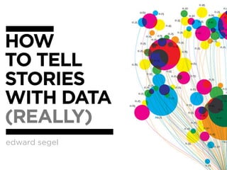
Edward segel interactive_storytelling
•
51 likes•56,379 views

The document provides guidance on principles of visual storytelling with data through informative analysis, personalization, social sharing, and storytelling. It discusses choosing appropriate visualization types, using establishing shots to situate viewers, highlighting important parts of graphics, restricting interactivity, and weaving text and graphics together to tell a story. The principles are aimed at guiding readers through a narrative and engaging them with interactive data visualizations.

Recommended
Recommended
More Related Content
What's hot
What's hot (20)
Viewers also liked
Viewers also liked (20)
Similar to Edward segel interactive_storytelling
Similar to Edward segel interactive_storytelling (20)
Recently uploaded
Recently uploaded (20)
Edward segel interactive_storytelling
- 3. ANALYSIS PERSONALIZATION you SOCIAL STORYTELLING
- 4. ANALYSIS PERSONALIZATION Businessweek Ask. Explore. Find. Top 100 M&A Deals Too much info at once. you BGOV Scenario testing. Federal Spending SOCIAL STORYTELLING
- 5. NYTimes INFORMATIVE ANALYSIS Jobless Rate PERSONALIZATION for People Like You Make relevant. NYTimes Households Increase engagement. like Yours Make emotional. Aaron Koblin Arcade Fire’s Wilderness Downtown SOCIAL STORYTELLING
- 6. INFORMATIVE ANALYSIS PERSONALIZATION you Jeff Heer SOCIAL STORYTELLING Sensus Aaron Koblin Sharing. Sheep, Cash, Bicycle Collaborative. Real-Time sentiment. Stamen Design NYTimes MTV VMA Twitter Reactions to Osama
- 7. ANALYSIS PERSONALIZATION you SOCIAL STORYTELLING
- 8. INFORMATIVE ANALYSIS PERSONALIZATION you SOCIAL STORYTELLING
- 10. STORYTELLING as ancient as mankind
- 11. STORYTELLING Changes with technology PEOPLE TELL STORIES WORDS TELL STORIES IMAGES TELL STORIES COMICS TELL STORIES MOVIES TELL STORIES
- 12. HOW CAN YOU TELL STORIES WITH DATA ?
- 13. VISUALIZATION DESIGNERS ARE MELDING THE SKILLS OF COMPUTER SCIENCE, STATISTICS, ARTISTIC DESIGN AND STORYTELLING. THE ECONOMIST // FEB 2010
- 14. PEOPLE HAVE BEGUN TO FORGET HOW POWERFUL HUMAN STORIES ARE, EXCHANGING THEIR SENSE OF EMPATHY FOR A FETISHISTIC FASCINATION WITH DATA... THE HUMAN STUFF IS THE MAIN STUFF, AND THE DATA SHOULD ENRICH IT. JONATHAN HARRIS // 2008
- 15. small support ght rthou afte boring
- 16. exciting! beautiful! BUT technical! [ what does it mean?
- 17. center st age standalone interactive guided
- 19. VISUAL STRUCTURE MAGAZINE ANNOTATED SCIENCE FAIR STYLE CHART POSTER FLOWCHART COMICSTRIP SLIDESHOW MOVIE Duo- Tacit Selection Captions Specific Tutorial Details on Attached Navigation Demand Annotations Article Timelines Filtering Summaries Interpret Headlines Highlighting INTERACTIVITY MESSAGING O RE M
- 20. Genres + Interactivity + Messaging = DESIGN SPACE STORYTELLING Author Driven Reader Driven ASK QUESTIONS CLARITY strong ordering weak ordering EXPLORE SPEED heavy messaging light messaging FIND limited interactivity free interactivity martini drill-down glass story interactive slideshow
- 21. (more patterns)
- 23. Guide. Highlight. Interpret. VISUAL MESSAGING INTERACTIVITY STRUCTURE tell engage support the story the story the story
- 25. June 27, 2010 Choose your visualization type carefully. Know your options. Even obscure ones. “Cool” and “readability” are at odds. Recognize the trade-off and choose your audience.
- 26. dirty Avoid “chart junk” (Tufte). Extra marks distract from the data. better clean But... chart junk may reflect cool design choices Businessweek... sexy does great with labeling only as much as needed
- 27. Make it clear where to start. Don’t let readers defect. re? whe
- 28. The more linear, the more like a story. Stories have a beginning, middle, and end. Make it clear what to look at and when. Guide readers through the story or they’ll get lost.
- 29. Highlighting Techniques Character Direction Feature Distinction Close-Ups Zooming Framing Motion Audio
- 36. Use staging and animation for complicated transitions. Stage big transitions to avoid confusing readers Transitions Guidance Familiar Objects Viewing Angle Viewer (Camera) Motion Continuity Editing Object Continuity
- 39. (1) Choose your visualization type carefully. Know your options. Even obscure ones. (2) The more linear, the more like a story. Stories have a beginning, middle, and end. (3) Use establishing shots. Situate the viewer before diving in. VISUAL (4) Make it clear what to look at and when—especially where to start. STRUCTURE Guide readers through the story or they’ll get lost. support the story (5) Limit complexity at first. Reveal as needed. Don’t confuse the reader with extraneous information. (6) Consistent visual frameworks. Keep things tidy. (7) Use staging and animation for complicated transitions. Stage big transitions to avoid confusing readers (8) Design Matters. Duh. (9) Avoid “chart junk” (Tufte). Extra marks distract from the data. (10) “Cool” and “readability” are at odds. Recognize the trade-off and choose your audience.
- 40. MESSAGING tells the story
- 41. headline Use headlines, caption captions, & annotations. Quickly draw attention to what’s important. tion annota ing) (noth
- 42. Weave text into the graphic—not just at the beginning. T and graphics work better ext solated together than apart. i integrat ed Aug 16, 2010 June 20, 2011
- 43. CONTINUED... Word-Specific Weave text into the graphic—not just at the beginning. Pictures illustrate the words T and graphics work better together than apart. ext Picture-Specific Words accentuate aspects of the scene Duo-Specific Words and pictures send the same message Intersecting Words and pictures contribute information independently Interdependent Word and pictures combine to convey an idea neither conveys alone Parallel Words and pictures seem to be independent. Montage Words and pictures combine pictorially.
- 44. Start with an editorially interesting view. Default Make data views can be relatable. Put boring. numbers and Curate the facts in context. experience 250 thousand from the square miles beginning. means nothing. It’s the size of T exas! Connect the text to the relevant graphics. Aug 16, 2010 See Fig. 5 Fig. 5
- 45. Mind your precision. Significant digits, tickmarks, and labels suggest what deserves attention. fine precise too thoughtful Good: Lance Armstrong, Popularity issue
- 46. (1) The more text, the more storytelling. Graphs tell stories. But words really tell stories. (2) Say the point you’re making with the graphic. Don’t make the reader figure it out on his own. (3) Use headlines, captions, & annotations. Quickly draw attention to what’s important. MESSAGING tells the story (4) Weave text into the graphic—not just the beginning. T and graphics work better together than apart. ext (5) Start with an editorially interesting view. Default views can be boring. Curate the experience from the beginning. (6) Make data relatable. Put numbers and facts in context. 250 thousand square miles means nothing. It’s the size of Texas! (7) Connect the text to the relevant graphics. See Fig. 5 (8) Don’t ignore summaries & conclusions. Answer the “so what?” or the reader leaves empty handed. (9) Mind your precision. Significant digits, tickmarks, and labels suggest what deserves attention.
- 47. INTERACTIVITY engage the story
- 48. Interactive features should scream Be explicit. interactivity. Click here. Avoid a click-and-seek experience. suggested actions visual cues familiar widgets
- 49. Interactive features should react to the user. Depress buttons, highlight items, animate widgets. Don’t obscure data. Avoid letting pop- ups obscure data.
- 50. Make the visualization “look alive”. Things move even without the user! Demonstrate interactivity. Animate interactive widgets for tacit tutorials.
- 51. Include a progress bar and “back” and “reset” buttons Linear navigation is important— especially with lots of interactivity. Restrict interactivity to key dimensions. The more interactivity, the less story.
- 52. (1) Demonstrate interactivity. Animate interactive widgets for tacit tutorials. (2) Interactive features should scream interactivity. Avoid a click-and-seek experience. INTERACTIVITY (3) Interactive features should react to the user. engage the story Depress buttons, highlight items, animate widgets. (4) Restrict interactivity to key dimensions. The more interactivity, the less story. (5) Make the visualization “look alive”. Things move even without the user! (6) Don’t obscure data. Avoid letting pop-ups obscure data. (7) Include a progress bar and “back” and “reset” buttons Linear navigation is important—especially with lots of interactivity.
- 53. Sound & Video Mobile Linking Fluid INTERACTIVE THE FUTURE ? Mixing DataVis & Infographics
- 54. DATA JOURNALISM IS NOT GRAPHICS AND VISUALISATIONS. IT'S ABOUT TELLING THE STORY IN THE BEST WAY POSSIBLE. SOMETIMES THAT WILL BE A VISUALISATION OR A MAP...BUT SOMETIMES IT'S A NEWS STORY. SOMETIMES, JUST PUBLISHING THE NUMBER IS ENOUGH. IF DATA JOURNALISM IS ABOUT ANYTHING, IT'S THE FLEXIBILITY TO SEARCH FOR NEW WAYS OF STORYTELLING. SIMON ROGERS, THE GUARDIAN // 2011
- 55. New York Times New York Times. The jobless rate for people like you. http://www.nytimes.com/interactive/2009/11/06/business/economy/unemployment-lines.html New York Times. How many households are like yours? LINKS http://www.nytimes.com/interactive/2011/06/19/nyregion/how-many-households-are-like-yours.html New York Times. The Death of a Terrorist: a Turning Point? 1 http://www.nytimes.com/interactive/2011/05/03/us/20110503-osama-response.html New York Times. Paths to the Top of the Home Run Charts. http://www.nytimes.com/ref/sports/20070731_BONDS_GRAPHIC.html New York Times. A Peek Into Netflix Queues. http://www.nytimes.com/interactive/2010/01/10/nyregion/20100110-netflix-map.html New York Times. A Map of Olympic Medals. http://www.nytimes.com/interactive/2008/08/04/sports/olympics/20080804_MEDALCOUNT_MAP.html New York Times. Aerial Photographs of Joplin Before and After the Tornado http://www.nytimes.com/interactive/2011/05/25/us/joplin-aerial.html New York TImes. How different groups spend their day. http://www.nytimes.com/interactive/2009/07/31/business/20080801-metrics-graphic.html New York Times. Taking the Corners. http://www.nytimes.com/interactive/2010/02/20/sports/olympics/20100220-davis-graphic.html New York Times. Alpine Skiing, From Technical Turns to Tucks and Speed http://www.nytimes.com/interactive/2010/02/20/sports/olympics/downhill-overview.html New York Times. Luge Crash at the Olympics. http://www.nytimes.com/interactive/2010/02/12/sports/olympics/LUGEDEATH.html New York Times. Budget forecasts compared to reality. http://www.nytimes.com/interactive/2010/02/02/us/politics/20100201-budget-porcupine-graphic.html New York Times. Fractions of a Second: An Olympic Musical. http://www.nytimes.com/interactive/2010/02/26/sports/olympics/20100226-olysymphony.html New York Times. How the Government Dealt with Past Recessions. http://www.nytimes.com/interactive/2009/01/26/business/economy/20090126-recessions-graphic.html
- 56. The Guardian Guardian. Toyota's sticky accelerator problem. http://www.guardian.co.uk/business/interactive/2010/feb/04/toyota-automotive-industry Guardian. Shaun White's Double McTwist. LINKS http://www.guardian.co.uk/sport/interactive/2010/feb/19/winterolympics2010-vancouver Guardian. Earthquakes: Why they happen. 2 http://www.guardian.co.uk/world/interactive/2008/jan/23/earthquakes Guardian. Oscars 2011: an interactive guide to this year's best picture nominees http://www.guardian.co.uk/film/interactive/2011/feb/21/oscars-2011-best-picture-nominations-interactive-guide Guardian. Inflation in the UK. http://www.guardian.co.uk/business/interactive/2009/mar/24/rpi-inflation?intcmp=239 Guardian. The World’s Economy Turns the Corner. http://www.guardian.co.uk/business/interactive/2010/jan/26/recession-gdp Miscellaneous Aaron Koblin. Personal website with work. http://www.aaronkoblin.com/work.html Jeff Heer. Seneus. http://vis.stanford.edu/papers/senseus Stamen. MTV Video Music Awards. http://stamen.com/clients/mtv Simon Rogers. Data journalism at the Guardian: what is it and how do we do it? http://www.guardian.co.uk/news/datablog/2011/jul/28/data-journalism GapMinder http://www.gapminder.org Gapminder. Human Development Trends 2005. http://www.gapminder.org/downloads/human-development-trends-2005/ People Movin http://peoplemov.in/ Visual Complexity. Football Drawings. http://www.visualcomplexity.com/vc/project_details.cfm?id=452&index=452&domain Dan Archer. Nisoor square shootings of 2007 http://www.cartoonmovement.com/icomic/11
- 57. BGOV BGOV. Federal Programs on Debt-Limit Bubble http://about.bgov.com/2011/07/12/august-invoices-show-u-s-treasury%E2%80%99s-limited-choices/ BGOV. Hospitals Wary of Data Breaches Seek Cyber Insurance From AIG LINKS http://www.bgov.com/news_item/4D53U6teO2rko9nUq8XDoQ BGOV. Medicare-Medicaid Costs $1.5 Trillion by 2020: Chart of the Day. 3 http://www.bgov.com/news_item/XwqMzluxD58Dh0n6lvp8WA BGOV. Kentucky Bourbon’s Seoul Appeal May Rise With Trade Agreement. http://www.bgov.com/news_item/PtRA9_pVGxAHjVVsjZev_g BGOV. Preparing Americans for Death Lets Hospices Neglect End of Life. http://www.bgov.com/news_item/On7zzjnP-22zIl6mQUeigw BGOV. Tea Party Debt Deal Opponents Gain From U.S. Awards. http://www.bgov.com/news_item/JcPzqhvW8bn8LuuhhO8KNA BGOV. August Invoices show Treasury’s Limited Choices. http://about.bgov.com/2011/07/12/august-invoices-show-u-s-treasury%E2%80%99s-limited-choices/ BGOV. Dodd-Frank One Year Later: The Key Players http://www.bgov.com/news_item/WMrg8I6JoxhifG-KDDpytg Businessweek Businessweek. The Credit Boom’s Best and Worst Deals. http://images.businessweek.com/mz/10/34/1034mergers47.pdf?chan=magazine+channel_news+-+markets+%2B+finance Businessweek. Amid doping furer, Lance Armstrong’s reputation heads downhill. http://images.businessweek.com/mz/10/34/1034endorsments22.pdf?chan=magazine+channel_news+-+companies+%2B+industries Bloomberg Interactive Insights. America tied up by debt record. http://www.bloomberg.com/insight/america-tied-up-by-record-debt.html Businessweek. How to save Greece. http://www.businessweek.com/magazine/content/11_27/b4235000567802.htm Businessweek. The Big Apple is Recovering its Shine. http://images.businessweek.com/mz/10/34/1034therecovery11.pdf?chan=magazine+channel_news+-+global+economics Businessweek. Problem? What Problem? http://www.businessweek.com/magazine/content/11_26/b4234013596135.htm Businessweek. Oil on Troubled Waters. http://images.businessweek.com/mz/10/34/1034oilbp53.pdf
- 58. The Washington Post Washington Post. Obama’s Calendar. http://projects.washingtonpost.com/potus-tracker/ Washington Post. Spheres of Influence: The Bush Campaign Pioneers. LINKS http://www.washingtonpost.com/wp-srv/politics/pioneers/pioneers_spheres.html Washington Post. On the Map: On the Map: Five Major North Korean Prison Camps 4 http://www.washingtonpost.com/wp-srv/special/world/north-korean-prison-camps-2009/