SlideShare a Scribd company logo
1 of 7
Download to read offline
Analysis of Magazine Front Covers Unit G321
Cover 1.NME Sept 2009  Dizzee Rascal Edition
FRONT COVER ANALYSIS THE MASTHEAD…  The masthead is a recognisable logo. It is bold, big and red, so it stands out and grabs the audiences attention. It shows the colour scheme (red, white and black) and is easily identifiable.  THE HEADER… The   header reveals a special feature included in the magazine. This is at the top so the audience see it straight away and it grabs their interest. Also revels what bands are featured in the magazine (Kasabian, Muse). It also enforces the colour scheme.  THE SELL LINES/COVER LINES...  There are a limited number of sell and cover lines, suggesting that the magazine- in a way- sells itself. However, the ones that are on the magazine reveal to the audeince what bands are in the magazine and what genre of music the magazine covers.   THE MAIN IMAGE...  The image straight away grabs your attention. It’s a lively  and fun shot of Dizzee Rascal, suggesting that the magazine is fun and lively. The use of a mid shot creates a relationship between the subject and the reader. However, it is not a typical mid shot as it includes his whole body, suggesting the magazine is different and doesn’t follow the rules.  THE MAIN COVER LINE...  This is big, bold and stands out. The fact it only says ‘Dizzee Rascal’ suggests that he stands out and is bold. It also reveals the main interview in the magazine and because it stands out so much it tells the reader it’s an important interview with and important person.  BARCODE/DATE/ISSUE/PRICE...  This is useful to the buyer as it tells us the date, the price and issue number of the magazine. It also makes finding these things out easy as they’re all in a convenient place. The barcode is also used to let the producers know how popular the magazine is and tells them if the person featured on the front is popular or not.  THE FOOTER...  This reveals to the audience even more bands featured in the magazine. It also reveals the genres that NME covers. Putting these in the footer makes them seem less important that the bands on the rest of the page but they still are significant. Using a footer again makes the reader feel there is more in the magazine and that there is a selection.  USE OF A PULL QUOTE...  Again, the pull-quote adds the importance of Dizzee Rascal  and reinforces the fact he’s the main focus. The use of this particular quote gives us more ideas of what the interview is like and also tells the reader that this perhaps what NME are doing; spreading joy.  BACKGROUND...  There is a lot going on in the background: it’s fun, busy and different. This reflects the bands in the magazine and give us an idea what the interview with   Dizzee is like. It also makes the cover look more busy and makes us feel like there is more than there actually is.  USE OF A FLASHER…  This acts as a way of making elements look more exciting, thus making the magazine look more full and exciting. It stands out to grab your attention and makes the audience more interested in the contents.  RULE OF THIRDS/THE LEFT THIRD...  The magazine follows the conventional rule of thirds; main focuses (Dizzee’s face, the cover lines, ect) are all in the areas where your eye’s drawn too. This makes the magazine more appealing to the reader as the most important areas are the ones we see first. The left third makes us feel there’s more in magazine as it creates a balance between text/images.
Cover 2. Rolling Stone 2007 Amy Winehouse Edition
FRONT COVER ANALYSIS THE MASTHEAD...  This is a recognisable masthead. It’s bold, big and stands out, making it attention grabbing and easy to recognise. The font used looks quite old, fitting in with the title (a ‘old’ band, ‘old’ saying, references to old songs). However this doesn’t reflect the audience as they would be modern and the magazine features modern bands/music.  THE COVER/SELL LINES...  These inform the reader about the bands involved in their ‘Summer Tours’ section. The main cover lines are in a different colour than the sell lines, suggesting they are more important but also this means they stand out and you are told quickly and easily who’s featured. They also inform us of the genre of the magazine. The bands featured are ‘old’ which fits with the theme of the title/magazine.  THE MAIN COVER LINE...  This is the same colour and size as the title, telling the audience of the importance. This also suggests that Amy is as recognisable and important as the magazine itself.  BARCODE/DATE/ISSUE/ PRICE...  Here only the barcode is featured. It is in the opposite corner to the product information (date, issue, price)  suggesting they are equally important.  THE FLASHER...  This stands out as it doesn’t fit the colour scheme. It adds excitement to   the cover  and your eyes are automatically drawn to this area because it doesn’t fit the colour scheme. It also makes the information seem more exciting than it probably is. It also makes it look like there is more on the cover than there is, again making the reader more interested so they buy the magazine.  THE MAIN IMAGE...  This is automatically the main focus of the magazine. It takes up at least half of the cover and the fact its a mid close up makes the magazine look more approachable and friendly. The image covering up the title suggests her importance and emphasises how good this article about Amy must be. Her eyes are looking directly at you which creates a relationship between the reader and magazine.  RULE OF THIRDS/THE LEFT THIRD...  This magazine follows the rule of thirds as the main focus points are in the cross-sections. For example, her eyes are on one of the focus points and your eyes are automatically drawn to them. The cover lines are also on the cross-sections. The left third appears to be at right side of Amy, creating balance and giving the magazine and fuller feeling and it also makes it look even more professional.
Cover 3. XXL 2010 Dr. Dre  Edition
FRONT COVER ANALYSIS THE MASTHEAD...  This stands out the most as it is big and bold. The colours- white on red- automatically grab your attention and make you realise that this magazine is different to others and stands out by itself. The title of the magazine, ‘XXL’, reflects the contents and suggests that this magazine is bigger and better than others. It’s  recognisable and acts as a devise to quickly see what magazine it is.  THE MAIN COVER LINE...  The cover line is the same size as the masthead, suggesting the importance of Dr. Dre. It’s in-line with the masthead and directly underneath it so you automatically read it after you’ve seen the title. ‘Exclusive Interview’ tells the reader that it’s a one off and only in this magazine; it gives the impression the magazine is proud to have this interview.  THE BACKGROUND...  It’s a plain background so that everything else stands out. However, the colour is a serious colour which perhaps reflects the seriousness of the magazine and of Dre. The fact it’s plain could also suggest that the magazine identity, and the identity of the musicians featured, stands out by itself against all other magazines.  RULE OF THIRDS/THE LEFT THIRD...  XXL appears to follow the rule of thirds, with all the important, eye catching areas in the cross-sections. However, there isn’t a definite left third. It is spaced out around the top of the magazine, making the middle/bottom look more full and appealing  THE COVER/SELL LINES...  These reveal to the audience who else is included in the magazine. ‘Plus’ in a different colour makes it seem like there is more and they’re important. Despite this, they’re in a small font compared to the main cover line, suggesting these artists are less important than Dre.  BARCODE/DATE/ISSUE/ PRICE...  This is all in one place, so it easy , for the reader, to find out what they want. This is important information for the reader  but it’s clear the magazine feels it’s secondary as it’s small and in the bottom corner of the page. The barcode is important so that the producers know how many people buy the magazine and what they’re interested in.  THE MAIN IMAGE...  The image is a mid close up shot, creating a relationship between the reader and magazine. However, it seems to be a serious tone as the image is of Dre playing chess- a serious game- and he’s staring directly at you with a serious expression. This again can reflect the seriousness of the magazine/Dre. The chess pieces are larger than usual, reinforcing the XXL idea and therefore fitting in witch the magazine.

More Related Content

What's hot

Magazine Analysis
Magazine AnalysisMagazine Analysis
Magazine Analysissarahbonita
 
Existing magazine names
Existing magazine namesExisting magazine names
Existing magazine namesloisevz
 
Task 2,3
Task 2,3Task 2,3
Task 2,3akii786
 
KERRANG! - Front Cover
KERRANG! - Front CoverKERRANG! - Front Cover
KERRANG! - Front Coverasmediac15
 
Rad analysis
Rad analysisRad analysis
Rad analysiscpile05
 
School Magazine Annotations
School Magazine AnnotationsSchool Magazine Annotations
School Magazine Annotationslucyvh
 
Analaysius of front cover
Analaysius of front coverAnalaysius of front cover
Analaysius of front coverbeth_media
 
Analysing 3 magazine covers
Analysing 3 magazine coversAnalysing 3 magazine covers
Analysing 3 magazine coversblack-bird
 
Semiotic analysis of a magazine cover
Semiotic analysis of a magazine coverSemiotic analysis of a magazine cover
Semiotic analysis of a magazine coveremjcampbell
 
Contents Page 'Top Of The Pops'.
Contents Page 'Top Of The Pops'.Contents Page 'Top Of The Pops'.
Contents Page 'Top Of The Pops'.Antonia-Montefusco
 
Contents Page Analysis- We Love Pop
Contents Page Analysis- We Love PopContents Page Analysis- We Love Pop
Contents Page Analysis- We Love PopAntonia-Montefusco
 

What's hot (17)

Magazine Analysis
Magazine AnalysisMagazine Analysis
Magazine Analysis
 
Cover
CoverCover
Cover
 
Existing magazine names
Existing magazine namesExisting magazine names
Existing magazine names
 
Task 2,3
Task 2,3Task 2,3
Task 2,3
 
KERRANG! - Front Cover
KERRANG! - Front CoverKERRANG! - Front Cover
KERRANG! - Front Cover
 
Rad analysis
Rad analysisRad analysis
Rad analysis
 
Magazine analysis
Magazine analysisMagazine analysis
Magazine analysis
 
School Magazine Annotations
School Magazine AnnotationsSchool Magazine Annotations
School Magazine Annotations
 
Planning and textual analysis
Planning and textual analysisPlanning and textual analysis
Planning and textual analysis
 
Analaysius of front cover
Analaysius of front coverAnalaysius of front cover
Analaysius of front cover
 
Analysing 3 magazine covers
Analysing 3 magazine coversAnalysing 3 magazine covers
Analysing 3 magazine covers
 
NME ANALYSIS
NME ANALYSISNME ANALYSIS
NME ANALYSIS
 
Semiotic analysis of a magazine cover
Semiotic analysis of a magazine coverSemiotic analysis of a magazine cover
Semiotic analysis of a magazine cover
 
Research.
Research.Research.
Research.
 
Contents Page 'Top Of The Pops'.
Contents Page 'Top Of The Pops'.Contents Page 'Top Of The Pops'.
Contents Page 'Top Of The Pops'.
 
Front cover
Front coverFront cover
Front cover
 
Contents Page Analysis- We Love Pop
Contents Page Analysis- We Love PopContents Page Analysis- We Love Pop
Contents Page Analysis- We Love Pop
 

Viewers also liked

Handelsbeleid in steden en gemeenten (UNIZO Burgemeestersonbijt 16/01/14)
Handelsbeleid in steden en gemeenten (UNIZO Burgemeestersonbijt 16/01/14)Handelsbeleid in steden en gemeenten (UNIZO Burgemeestersonbijt 16/01/14)
Handelsbeleid in steden en gemeenten (UNIZO Burgemeestersonbijt 16/01/14)Bert Serneels
 
Lclh slideshow2
Lclh slideshow2Lclh slideshow2
Lclh slideshow2joefroese
 
Customer Value In Relatie Tot E Overheid (Definitief)
Customer Value In Relatie Tot E Overheid (Definitief)Customer Value In Relatie Tot E Overheid (Definitief)
Customer Value In Relatie Tot E Overheid (Definitief)DCQHavermans
 
Analysing NME Dizzee Rascal cover
Analysing NME Dizzee Rascal coverAnalysing NME Dizzee Rascal cover
Analysing NME Dizzee Rascal coverchaggarg1
 
Corporate Presentation - PDAC 2015
Corporate Presentation - PDAC 2015Corporate Presentation - PDAC 2015
Corporate Presentation - PDAC 2015primero_mining
 
Primero Mining 2013 Q1 Results
Primero Mining 2013 Q1 ResultsPrimero Mining 2013 Q1 Results
Primero Mining 2013 Q1 Resultsprimero_mining
 
36kr no.94
36kr no.9436kr no.94
36kr no.94Gina Gu
 
Europan barrena
Europan barrenaEuropan barrena
Europan barrenaiktklik
 
Eidn 2-mobilizacao nacional
Eidn 2-mobilizacao nacionalEidn 2-mobilizacao nacional
Eidn 2-mobilizacao nacionalliviacalmeida
 

Viewers also liked (20)

Handelsbeleid in steden en gemeenten (UNIZO Burgemeestersonbijt 16/01/14)
Handelsbeleid in steden en gemeenten (UNIZO Burgemeestersonbijt 16/01/14)Handelsbeleid in steden en gemeenten (UNIZO Burgemeestersonbijt 16/01/14)
Handelsbeleid in steden en gemeenten (UNIZO Burgemeestersonbijt 16/01/14)
 
Lclh slideshow2
Lclh slideshow2Lclh slideshow2
Lclh slideshow2
 
Customer Value In Relatie Tot E Overheid (Definitief)
Customer Value In Relatie Tot E Overheid (Definitief)Customer Value In Relatie Tot E Overheid (Definitief)
Customer Value In Relatie Tot E Overheid (Definitief)
 
86.03.end malaria
86.03.end malaria86.03.end malaria
86.03.end malaria
 
Analysing NME Dizzee Rascal cover
Analysing NME Dizzee Rascal coverAnalysing NME Dizzee Rascal cover
Analysing NME Dizzee Rascal cover
 
C.i. precios
C.i. preciosC.i. precios
C.i. precios
 
Psi
PsiPsi
Psi
 
Corporate Presentation - PDAC 2015
Corporate Presentation - PDAC 2015Corporate Presentation - PDAC 2015
Corporate Presentation - PDAC 2015
 
Hypertext system
Hypertext systemHypertext system
Hypertext system
 
Bab i KALOIN
Bab i KALOINBab i KALOIN
Bab i KALOIN
 
Primero Mining 2013 Q1 Results
Primero Mining 2013 Q1 ResultsPrimero Mining 2013 Q1 Results
Primero Mining 2013 Q1 Results
 
Indo uniline
Indo unilineIndo uniline
Indo uniline
 
Asteroide
AsteroideAsteroide
Asteroide
 
36kr no.94
36kr no.9436kr no.94
36kr no.94
 
Europan barrena
Europan barrenaEuropan barrena
Europan barrena
 
SKPD 1033 DST Project
SKPD 1033 DST ProjectSKPD 1033 DST Project
SKPD 1033 DST Project
 
Eidn 2-mobilizacao nacional
Eidn 2-mobilizacao nacionalEidn 2-mobilizacao nacional
Eidn 2-mobilizacao nacional
 
Status update 1
Status update 1Status update 1
Status update 1
 
How to use photoshop
How to use photoshopHow to use photoshop
How to use photoshop
 
Kamus istilah tambang
Kamus istilah tambangKamus istilah tambang
Kamus istilah tambang
 

Similar to Cover analysis

Analysing contents pages
Analysing contents pagesAnalysing contents pages
Analysing contents pageslauramas0n
 
Front Cover Analysis
Front Cover AnalysisFront Cover Analysis
Front Cover AnalysisPhil_Harrison
 
Analysing cover pages
Analysing cover pagesAnalysing cover pages
Analysing cover pagesKyle150
 
Music Magazine Research
Music Magazine ResearchMusic Magazine Research
Music Magazine Researchkiggundm2613
 
Nme front cover analysis
Nme front cover analysisNme front cover analysis
Nme front cover analysisasmediaf13
 
Analysing magazines
Analysing magazinesAnalysing magazines
Analysing magazineslaura-illing
 
Analysis of 3 magazine front covers
Analysis of 3 magazine front coversAnalysis of 3 magazine front covers
Analysis of 3 magazine front coversolivermitchell
 
Nme front cover analysis word
Nme front cover analysis   wordNme front cover analysis   word
Nme front cover analysis wordasmediad14
 
Market research
Market researchMarket research
Market researchKaris Hays
 
Textual Analysis - Media Studies
Textual Analysis - Media StudiesTextual Analysis - Media Studies
Textual Analysis - Media StudiesNorah Fields
 
Mojo magazine analysis
Mojo magazine analysis Mojo magazine analysis
Mojo magazine analysis Najat Hachem
 
Analyising music magazines
Analyising music magazinesAnalyising music magazines
Analyising music magazinesjessasmedia4
 
Magazine analysis
Magazine analysisMagazine analysis
Magazine analysismillerjess
 
Magazine analysis
Magazine analysisMagazine analysis
Magazine analysismillerjess
 
Nme Music Magazine Analysis 2
Nme Music Magazine Analysis 2Nme Music Magazine Analysis 2
Nme Music Magazine Analysis 2ritapro98
 
Analyising music magazines
Analyising music magazinesAnalyising music magazines
Analyising music magazinesjessasmedia4
 

Similar to Cover analysis (20)

Analysing contents pages
Analysing contents pagesAnalysing contents pages
Analysing contents pages
 
Front Cover Analysis
Front Cover AnalysisFront Cover Analysis
Front Cover Analysis
 
Analysing cover pages
Analysing cover pagesAnalysing cover pages
Analysing cover pages
 
Mastheads
MastheadsMastheads
Mastheads
 
Music Magazine Research
Music Magazine ResearchMusic Magazine Research
Music Magazine Research
 
Nme front cover analysis
Nme front cover analysisNme front cover analysis
Nme front cover analysis
 
Analysing magazines
Analysing magazinesAnalysing magazines
Analysing magazines
 
FCD 2
FCD 2FCD 2
FCD 2
 
Front cover analysis
Front cover analysisFront cover analysis
Front cover analysis
 
Analysis of 3 magazine front covers
Analysis of 3 magazine front coversAnalysis of 3 magazine front covers
Analysis of 3 magazine front covers
 
Nme front cover analysis word
Nme front cover analysis   wordNme front cover analysis   word
Nme front cover analysis word
 
Market research
Market researchMarket research
Market research
 
Textual Analysis - Media Studies
Textual Analysis - Media StudiesTextual Analysis - Media Studies
Textual Analysis - Media Studies
 
Mojo magazine analysis
Mojo magazine analysis Mojo magazine analysis
Mojo magazine analysis
 
Analyising music magazines
Analyising music magazinesAnalyising music magazines
Analyising music magazines
 
Magazine analysis
Magazine analysisMagazine analysis
Magazine analysis
 
Magazine analysis
Magazine analysisMagazine analysis
Magazine analysis
 
Nme Music Magazine Analysis 2
Nme Music Magazine Analysis 2Nme Music Magazine Analysis 2
Nme Music Magazine Analysis 2
 
Cover analysis
Cover analysisCover analysis
Cover analysis
 
Analyising music magazines
Analyising music magazinesAnalyising music magazines
Analyising music magazines
 

Recently uploaded

15042024_First India Newspaper Jaipur.pdf
15042024_First India Newspaper Jaipur.pdf15042024_First India Newspaper Jaipur.pdf
15042024_First India Newspaper Jaipur.pdfFIRST INDIA
 
Power in International Relations (Pol 5)
Power in International Relations (Pol 5)Power in International Relations (Pol 5)
Power in International Relations (Pol 5)ssuser583c35
 
lok sabha Elections in india- 2024 .pptx
lok sabha Elections in india- 2024 .pptxlok sabha Elections in india- 2024 .pptx
lok sabha Elections in india- 2024 .pptxdigiyvbmrkt
 
Emerging issues in migration policies.ppt
Emerging issues in migration policies.pptEmerging issues in migration policies.ppt
Emerging issues in migration policies.pptNandinituteja1
 
Political-Ideologies-and-The-Movements.pptx
Political-Ideologies-and-The-Movements.pptxPolitical-Ideologies-and-The-Movements.pptx
Political-Ideologies-and-The-Movements.pptxSasikiranMarri
 
Mitochondrial Fusion Vital for Adult Brain Function and Disease Understanding...
Mitochondrial Fusion Vital for Adult Brain Function and Disease Understanding...Mitochondrial Fusion Vital for Adult Brain Function and Disease Understanding...
Mitochondrial Fusion Vital for Adult Brain Function and Disease Understanding...The Lifesciences Magazine
 
11042024_First India Newspaper Jaipur.pdf
11042024_First India Newspaper Jaipur.pdf11042024_First India Newspaper Jaipur.pdf
11042024_First India Newspaper Jaipur.pdfFIRST INDIA
 
12042024_First India Newspaper Jaipur.pdf
12042024_First India Newspaper Jaipur.pdf12042024_First India Newspaper Jaipur.pdf
12042024_First India Newspaper Jaipur.pdfFIRST INDIA
 
13042024_First India Newspaper Jaipur.pdf
13042024_First India Newspaper Jaipur.pdf13042024_First India Newspaper Jaipur.pdf
13042024_First India Newspaper Jaipur.pdfFIRST INDIA
 
Geostrategic significance of South Asian countries.ppt
Geostrategic significance of South Asian countries.pptGeostrategic significance of South Asian countries.ppt
Geostrategic significance of South Asian countries.pptUsmanKaran
 

Recently uploaded (10)

15042024_First India Newspaper Jaipur.pdf
15042024_First India Newspaper Jaipur.pdf15042024_First India Newspaper Jaipur.pdf
15042024_First India Newspaper Jaipur.pdf
 
Power in International Relations (Pol 5)
Power in International Relations (Pol 5)Power in International Relations (Pol 5)
Power in International Relations (Pol 5)
 
lok sabha Elections in india- 2024 .pptx
lok sabha Elections in india- 2024 .pptxlok sabha Elections in india- 2024 .pptx
lok sabha Elections in india- 2024 .pptx
 
Emerging issues in migration policies.ppt
Emerging issues in migration policies.pptEmerging issues in migration policies.ppt
Emerging issues in migration policies.ppt
 
Political-Ideologies-and-The-Movements.pptx
Political-Ideologies-and-The-Movements.pptxPolitical-Ideologies-and-The-Movements.pptx
Political-Ideologies-and-The-Movements.pptx
 
Mitochondrial Fusion Vital for Adult Brain Function and Disease Understanding...
Mitochondrial Fusion Vital for Adult Brain Function and Disease Understanding...Mitochondrial Fusion Vital for Adult Brain Function and Disease Understanding...
Mitochondrial Fusion Vital for Adult Brain Function and Disease Understanding...
 
11042024_First India Newspaper Jaipur.pdf
11042024_First India Newspaper Jaipur.pdf11042024_First India Newspaper Jaipur.pdf
11042024_First India Newspaper Jaipur.pdf
 
12042024_First India Newspaper Jaipur.pdf
12042024_First India Newspaper Jaipur.pdf12042024_First India Newspaper Jaipur.pdf
12042024_First India Newspaper Jaipur.pdf
 
13042024_First India Newspaper Jaipur.pdf
13042024_First India Newspaper Jaipur.pdf13042024_First India Newspaper Jaipur.pdf
13042024_First India Newspaper Jaipur.pdf
 
Geostrategic significance of South Asian countries.ppt
Geostrategic significance of South Asian countries.pptGeostrategic significance of South Asian countries.ppt
Geostrategic significance of South Asian countries.ppt
 

Cover analysis

  • 1. Analysis of Magazine Front Covers Unit G321
  • 2. Cover 1.NME Sept 2009 Dizzee Rascal Edition
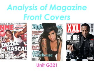
  • 3. FRONT COVER ANALYSIS THE MASTHEAD… The masthead is a recognisable logo. It is bold, big and red, so it stands out and grabs the audiences attention. It shows the colour scheme (red, white and black) and is easily identifiable. THE HEADER… The header reveals a special feature included in the magazine. This is at the top so the audience see it straight away and it grabs their interest. Also revels what bands are featured in the magazine (Kasabian, Muse). It also enforces the colour scheme. THE SELL LINES/COVER LINES... There are a limited number of sell and cover lines, suggesting that the magazine- in a way- sells itself. However, the ones that are on the magazine reveal to the audeince what bands are in the magazine and what genre of music the magazine covers. THE MAIN IMAGE... The image straight away grabs your attention. It’s a lively and fun shot of Dizzee Rascal, suggesting that the magazine is fun and lively. The use of a mid shot creates a relationship between the subject and the reader. However, it is not a typical mid shot as it includes his whole body, suggesting the magazine is different and doesn’t follow the rules. THE MAIN COVER LINE... This is big, bold and stands out. The fact it only says ‘Dizzee Rascal’ suggests that he stands out and is bold. It also reveals the main interview in the magazine and because it stands out so much it tells the reader it’s an important interview with and important person. BARCODE/DATE/ISSUE/PRICE... This is useful to the buyer as it tells us the date, the price and issue number of the magazine. It also makes finding these things out easy as they’re all in a convenient place. The barcode is also used to let the producers know how popular the magazine is and tells them if the person featured on the front is popular or not. THE FOOTER... This reveals to the audience even more bands featured in the magazine. It also reveals the genres that NME covers. Putting these in the footer makes them seem less important that the bands on the rest of the page but they still are significant. Using a footer again makes the reader feel there is more in the magazine and that there is a selection. USE OF A PULL QUOTE... Again, the pull-quote adds the importance of Dizzee Rascal and reinforces the fact he’s the main focus. The use of this particular quote gives us more ideas of what the interview is like and also tells the reader that this perhaps what NME are doing; spreading joy. BACKGROUND... There is a lot going on in the background: it’s fun, busy and different. This reflects the bands in the magazine and give us an idea what the interview with Dizzee is like. It also makes the cover look more busy and makes us feel like there is more than there actually is. USE OF A FLASHER… This acts as a way of making elements look more exciting, thus making the magazine look more full and exciting. It stands out to grab your attention and makes the audience more interested in the contents. RULE OF THIRDS/THE LEFT THIRD... The magazine follows the conventional rule of thirds; main focuses (Dizzee’s face, the cover lines, ect) are all in the areas where your eye’s drawn too. This makes the magazine more appealing to the reader as the most important areas are the ones we see first. The left third makes us feel there’s more in magazine as it creates a balance between text/images.
  • 4. Cover 2. Rolling Stone 2007 Amy Winehouse Edition
  • 5. FRONT COVER ANALYSIS THE MASTHEAD... This is a recognisable masthead. It’s bold, big and stands out, making it attention grabbing and easy to recognise. The font used looks quite old, fitting in with the title (a ‘old’ band, ‘old’ saying, references to old songs). However this doesn’t reflect the audience as they would be modern and the magazine features modern bands/music. THE COVER/SELL LINES... These inform the reader about the bands involved in their ‘Summer Tours’ section. The main cover lines are in a different colour than the sell lines, suggesting they are more important but also this means they stand out and you are told quickly and easily who’s featured. They also inform us of the genre of the magazine. The bands featured are ‘old’ which fits with the theme of the title/magazine. THE MAIN COVER LINE... This is the same colour and size as the title, telling the audience of the importance. This also suggests that Amy is as recognisable and important as the magazine itself. BARCODE/DATE/ISSUE/ PRICE... Here only the barcode is featured. It is in the opposite corner to the product information (date, issue, price) suggesting they are equally important. THE FLASHER... This stands out as it doesn’t fit the colour scheme. It adds excitement to the cover and your eyes are automatically drawn to this area because it doesn’t fit the colour scheme. It also makes the information seem more exciting than it probably is. It also makes it look like there is more on the cover than there is, again making the reader more interested so they buy the magazine. THE MAIN IMAGE... This is automatically the main focus of the magazine. It takes up at least half of the cover and the fact its a mid close up makes the magazine look more approachable and friendly. The image covering up the title suggests her importance and emphasises how good this article about Amy must be. Her eyes are looking directly at you which creates a relationship between the reader and magazine. RULE OF THIRDS/THE LEFT THIRD... This magazine follows the rule of thirds as the main focus points are in the cross-sections. For example, her eyes are on one of the focus points and your eyes are automatically drawn to them. The cover lines are also on the cross-sections. The left third appears to be at right side of Amy, creating balance and giving the magazine and fuller feeling and it also makes it look even more professional.
  • 6. Cover 3. XXL 2010 Dr. Dre Edition
  • 7. FRONT COVER ANALYSIS THE MASTHEAD... This stands out the most as it is big and bold. The colours- white on red- automatically grab your attention and make you realise that this magazine is different to others and stands out by itself. The title of the magazine, ‘XXL’, reflects the contents and suggests that this magazine is bigger and better than others. It’s recognisable and acts as a devise to quickly see what magazine it is. THE MAIN COVER LINE... The cover line is the same size as the masthead, suggesting the importance of Dr. Dre. It’s in-line with the masthead and directly underneath it so you automatically read it after you’ve seen the title. ‘Exclusive Interview’ tells the reader that it’s a one off and only in this magazine; it gives the impression the magazine is proud to have this interview. THE BACKGROUND... It’s a plain background so that everything else stands out. However, the colour is a serious colour which perhaps reflects the seriousness of the magazine and of Dre. The fact it’s plain could also suggest that the magazine identity, and the identity of the musicians featured, stands out by itself against all other magazines. RULE OF THIRDS/THE LEFT THIRD... XXL appears to follow the rule of thirds, with all the important, eye catching areas in the cross-sections. However, there isn’t a definite left third. It is spaced out around the top of the magazine, making the middle/bottom look more full and appealing THE COVER/SELL LINES... These reveal to the audience who else is included in the magazine. ‘Plus’ in a different colour makes it seem like there is more and they’re important. Despite this, they’re in a small font compared to the main cover line, suggesting these artists are less important than Dre. BARCODE/DATE/ISSUE/ PRICE... This is all in one place, so it easy , for the reader, to find out what they want. This is important information for the reader but it’s clear the magazine feels it’s secondary as it’s small and in the bottom corner of the page. The barcode is important so that the producers know how many people buy the magazine and what they’re interested in. THE MAIN IMAGE... The image is a mid close up shot, creating a relationship between the reader and magazine. However, it seems to be a serious tone as the image is of Dre playing chess- a serious game- and he’s staring directly at you with a serious expression. This again can reflect the seriousness of the magazine/Dre. The chess pieces are larger than usual, reinforcing the XXL idea and therefore fitting in witch the magazine.