
Recommended
Recommended
More Related Content
Recently uploaded
Recently uploaded (20)
Featured
Featured (20)
I'm Not a Designer
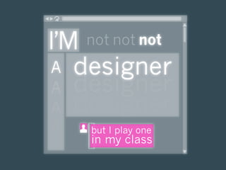
- 1. I’M not not not A designer A designer A designer A but I play one in my class
- 3. today Ba l ance
- 4. today spac i n g
- 5. today up here heads up hey you precedence lookmadehere look over you down here
- 6. today Navigation W E S
- 7. today a lign ment
- 8. today olorcolorcolorcolo etype typetype typ image
- 9. today usability accessibility © copyright
- 10. today meh.
- 11. today not bad
- 12. today oh no, you didn’t.
- 13. today (please forgive me!)
- 14. today WHAT makes T H E shh! very secrets Y O U R basics visitor O F good web O F A tick design designer
- 15. WHAT makes Y O U R visitor tick how they read what they need what they choose
- 16. WHAT makes Y O U R visitor 0:00:04.40 tick 4.4 seconds of time how they read for each 100 words what they need what they choose on a website. http://www.useit.com/alertbox/percent-text-read.html
- 17. WHAT makes Y O U R 18 4.4 visitor words seconds tick Assume a reading speed of 250 words per minute (study how they read included the highly literate). what they need what they choose At that speed, users can read 18 words in 4.4 seconds. http://www.useit.com/alertbox/percent-text-read.html
- 18. WHAT makes Y O U R 18% visitor Thus, when you add verbiage tick to a page, you can assume that readers will read just 18% of it. how they read what they need what they choose Ouch. http://www.useit.com/alertbox/percent-text-read.html
- 19. WHAT makes Y O U R visitor How do they tick choose which 18 how they read percent to read? what they need what they choose http://www.useit.com/alertbox/percent-text-read.html
- 20. Eye-tracking visualizations show that users read WHAT Web pages in an F-shaped pattern: two makes horizontal stripes, followed by a vertical stripe. Y O U R visitor tick how they read what they need what they choose Translation? http://www.useit.com/alertbox/reading_pattern.html
- 21. Eye-tracking visualizations show that users read WHAT Web pages in an F-shaped pattern: two makes horizontal stripes, followed by a vertical stripe. Y O U R visitor tick how they read what they need what they choose Translation? http://www.useit.com/alertbox/reading_pattern.html
- 22. Eye-tracking visualizations show that users read WHAT Web pages in an F-shaped pattern: two makes horizontal stripes, followed by a vertical stripe. Y O U R visitor tick how they read what they need what they choose Translation? http://www.useit.com/alertbox/reading_pattern.html
- 23. WHAT makes Users won't read your text thoroughly. Y O U R visitor The first two paragraphs must tick state the most important information. how they read Start subheads, paragraphs, what they need and bullet points with what they choose information-carrying words. http://www.useit.com/alertbox/reading_pattern.html
- 24. WHAT makes What else can we learn from Y O U R eye-tracking studies? 1 visitor DUH Readers ignore banners. tick HUH? Readers ignore decorative fonts. DUH Organizing important info in the how they read top left is key. what they need HUH? Lengthy lines of text what they choose promote eye fatigue. 2 1 http://www.virtualhosting.com/blog/2007/scientific-web- design-23-actionable-lessons-from-eye-tracking-studies/ 2 http://www.slate.com/id/2193552/
- 25. WHAT makes What else can we learn from Y O U R eye-tracking studies? visitor DUH Large images beat small images. tick HUH? Text beats images. DUH Shorter paragraphs perform how they read better than long ones. what they need HUH? Smaller type encourages what they choose more focused reading, and large type, more scanning. http://www.virtualhosting.com/blog/2007/scientific-web-design-23-actionable- lessons-from-eye-tracking-studies/
- 26. blah-blah text WHAT a block of words that users typically makes skip when they arrive at a page. The worst kind has no function, like Y O U R visitor ‘Welcome to our site, we hope you will find our new and improved tick design helpful.’ how they read what they need what they choose http://www.useit.com/alertbox/intro-text.html
- 27. blah-blah text WHAT a block of words that users typically makes skip when they arrive at a page. The worst kind has no function, like Y O U R visitor ‘Welcome to our site, we hope you will find our new and improved tick design helpful.’ “Kill the welcome mat and cut to the chase!” Jakob Neilsen how they read what they need what they choose http://www.useit.com/alertbox/intro-text.html
- 28. WHAT makes Y O U R visitor ENTER: tick The Tagline how they read what they need what they choose http://www.useit.com/alertbox/intro-text.html
- 29. WHAT makes Accessibility Y O U R visitor accessibility tick “It’s not just about disabled users being able to access your website — it’s about everyone being able to access your website.” Trenton Moss how they read what they need what they choose http://www.alistapart.com/articles/wiwa/
- 30. WHAT alt attributes makes presented to the user when the image is not available; a concise description of the Y O U R picture, which would make sense in the visitor text when the image is not present. tick Rules to alt by: • If an image contains text, use that text for the alternate text. • If an image is merely decorative, how they read leave the alternate text blank. what they need Joe Dolson what they choose http://www.improvetheweb.com/5-basic-steps-towards-website-accessibility
- 31. WHAT considering color It is estimated that one in 12 makes men and one in 200 women Y O U R have some form of color visitor blindness. tick how they read what they need what they choose http://www.alistapart.com/articles/wiwa/
- 32. WHAT considering color Are you requiring that someone makes see in color to tell the difference Y O U R between options? visitor tick Red asterisks (*) are required fields. Green how they read asterisks (*) are optional. what they need what they choose http://www.improvetheweb.com/5-basic-steps-towards-website-accessibility
- 33. WHAT makes Are your Y O U R contrasts visitor too low? tick T R Y : The Color- how they read Contrast Analyzer what they need http://blackwidows.co.uk/resources/color- contrast-analyser.php what they choose http://www.improvetheweb.com/5-basic-steps-towards-website-accessibility http://art4cast.wikispaces.com/
- 34. WHAT makes meaningful link text Y O U R visitor tick Click here to read more about my life as an astronaut! vs. how they read Read more about my life as an what they need astronaut. what they choose http://www.improvetheweb.com/5-basic-steps-towards-website-accessibility
- 35. WHAT makes flashing or blinking Y O U R that’s not optional visitor tick Epileptic users must be careful to avoid seeing flickering between 2 and 55 Hz . Videos or flashing elements should how they read only begin when users click “play”, what they need and warnings should accompany anything with epileptic triggers. what they choose http://www.improvetheweb.com/5-basic-steps-towards-website-accessibility
- 36. WHAT makes Y O U R Software visitor tick Adobe Acrobat, Flash, PowerPoint, Java, how they read Cookies, Pop-Ups what they need what they choose
- 37. WHAT makes font characteristics Y O U R visitor • Size, Typeface (font), and tick • • even Arrangement! how they read what they need L O O K : Readability http://lab.arc90.com/experiments/readability/ what they choose
- 38. WHAT screen size makes Y O U R visitor tick how they read what they need what they choose Headers should be somewhere between 600px and 800px wide. http://tech2.in.com/media/images/2007/May/img_6218_img_2158_apple30inch.jpg http://magsol.files.wordpress.com/2009/05/macbook1white20061108.jpg
- 39. WHAT screen size makes Y O U R visitor tick how they read what they need what they choose Be sure to test repeating background images on a smaller screen, too! http://tech2.in.com/media/images/2007/May/img_6218_img_2158_apple30inch.jpg http://magsol.files.wordpress.com/2009/05/macbook1white20061108.jpg
- 40. very T H E basics O F good design precedence spacing navigation alignment usability consistency typography image
- 41. very T H E basics O F Color good Contrast design Size precedence spacing Design Element navigation alignment Position usability consistency typography image http://dryicons.com
- 42. very T H E basics O F good design precedence spacing navigation alignment usability consistency typography image http://www.mediapost.com/directories/index.cfm?/fa/mpDir.MPRDDetail/cat/3/subcat/13/catName/Newspapers/subcatName/National/National.html
- 43. Line Spacing very T H E Padding basics White Space O F good design precedence spacing navigation alignment usability consistency typography image
- 44. Line Spacing very T H E Padding basics O F White Space good design precedence spacing navigation alignment usability consistency typography image
- 45. very T H E basics Line Spacing O F good Padding design White Space precedence spacing navigation alignment usability consistency typography image
- 46. very T H E basics Line Spacing O F good Padding design White Space precedence spacing navigation alignment usability consistency typography image
- 47. very T H E basics O F good Navigation design vs. precedence spacing Orientation navigation alignment usability consistency typography image
- 48. very T H E basics O F where you can go good Navigation design vs. precedence spacing Orientation where you are navigation alignment usability consistency typography image
- 49. very The Breadcrumb Trail T H E basics O F where you can go good Navigation design vs. precedence spacing Orientation where you are navigation alignment usability consistency typography image http://teachercenter.cciu.org
- 50. very The Breadcrumbuse T H E teach them to basics Trail O F where you can go good Navigation design vs. precedence spacing Orientation where you are navigation alignment build usability consistency typography image http://bookworms.cciu.org
- 51. very The Breadcrumb Trail T H E bypass basics O F where you can go good Navigation design vs. precedence spacing Orientation where you are navigation alignment build usability consistency typography image http://bookworms.cciu.org
- 52. very T H E Rules to go by: basics Navigation to everywhere O F good doesn’t need to be on every page. design Navigation to related or precedence following activities spacing navigation should be. alignment usability consistency typography Orientation (you are here) image must be.
- 53. very T H E alignment Keeping things lined up; that's not to say basics that everything should be in a straight line, but keep things consistently placed. O F Aligning makes your design more ordered good and digestible, as well as making it seem more polished. design Collis Ta’eed precedence spacing navigation alignment usability consistency typography image http://psd.tutsplus.com/tutorials/designing-tutorials/9-essential-principles-for-good-web-design/
- 54. very T H E basics O F good ENTER: design The Grid precedence spacing navigation alignment usability consistency typography image
- 55. very T H E basics The Grid O F good design precedence spacing navigation alignment usability consistency typography image
- 56. very T H E basics O F good ENTER: design The Table precedence spacing navigation alignment usability consistency typography image
- 57. very T H E basics O F good ENTER: design The Table precedence spacing navigation alignment usability consistency typography image
- 58. very T H E usability The user should be able to intuitively relate basics the actions he needs to perform on the web page, with other interactions he sees O F in the general domain of life good (e.g., a press-of-a-button action leads to some result). design precedence spacing navigation alignment usability consistency typography image http://en.wikipedia.org/wiki/Web_usability
- 59. very T H E basics THE EASIEST EXAMPLE: O F good The design Underline precedence spacing navigation alignment usability consistency typography image
- 60. very T H E Contact Mrs. Jones Contact Mrs. Jones 555-1212 555-1212 basics Click me! Click me! O F good design But they’ll figure it out! Run—don’t walk—to remove all precedence spacing underlining from any text in your navigation webpage that is not a link, or a alignment usability book title. consistency typography image
- 61. very T H E Use Verbose Phrasing Don't try to name features or web links with a single basics word. Use several words if that's what it takes. O F Grouping good Put related things together. Use Images as an Additional Option—Not an design Alternative—to Words Graphics are good for coming back to a feature, not for figuring things out in the first place. precedence Use Descriptive Values, Not Internal Codes spacing Use words that any competent Windows user will navigation alignment understand, not industry jargon, computerese, or usability even special business language. Translate things consistency into what users are trying to do. typography image http://www.usabilityinstitute.com/resources/userInYourFace/userInYourFace.htm
- 62. very T H E basics THE ONLY WAY TO KNOW: O F good The design Guest precedence spacing navigation alignment usability consistency typography image
- 63. very T H E basics O F good design precedence spacing navigation alignment usability consistency typography image
- 64. very T H E do don’t Sit next to them. Say anything. basics do don’t O F watch where they go, help them get back good and where they don’t go. if they get lost. do don’t design give them a task, such as “find my latest post.” explain why you made certain design choices. precedence spacing navigation If you have to alignment usability explain it, consistency typography you need to image revise it.
- 65. very T H E get it basics Free, online Guide to Usability and Usable Interfaces O F good http://www.usabilityinstitute.com/ resources/userInYourFace/ design userInYourFace.htm precedence spacing navigation alignment usability consistency typography image
- 66. very T H E consistency design the website in such a way that basics makes it easier, not harder, for the mind to see the pattern. It must be clear to a visitor O F he is still at the same site. good Bernard Peh design precedence spacing navigation alignment usability consistency typography image http://ezinearticles.com/?expert=Bernard_Peh
- 67. very T H E typography the arrangement of type and the design of basics type O F good Think it design doesn’t matter? precedence spacing navigation alignment usability consistency typography image
- 68. very “ T H E A couple of months ago, I was lucky enough to see basics Erik Spiekermann give a lecture. Part of his talk addressed his redesign of The Economist newspaper, which was partly motivated by the client’s realization O F that their design was too heavy and the content too good difficult to read. In newspaper design, infor mation is dense. Newspapers often... [set] their body content in a light design typeface with plenty of whitespace within and around the characters. This was part of Spiekermann’s solution for the redesign of The Economist. Whilst retaining the quirkiness of the original Economist typeface, Spiekermann redesigned it slightly, adding more whitespace to the individual precedence characters. He then set the type slightly smaller and spacing with more [distance between lines]. All these changes navigation added micro whitespace to the design. The overall alignment result was subtle: the content was more legible and the overall feeling of the newspaper was lighter, yet usability the amount of content remained the same. consistency ” typography Mark Boulton image http://www.alistapart.com/articles/whitespace/
- 69. very T H E basics O F good design precedence spacing navigation alignment usability consistency typography image http://www.daidala.com/economist101ecotype.html
- 70. very size T H E size basics O F good design February 1-7 For this week’s podcast, we welcomed the precedence Principal, Mr. Brackbill into the studio for an spacing interview. He was very funny. navigation alignment usability January 24-31 consistency This week’s episode includes a recording of typography the song we wrote about the days of the image week. Ms. Judy is playing guitar.
- 71. very size T H E size basics O F good design February 1-7 For this week’s podcast, we welcomed the precedence Principal, Mr. Brackbill into the studio for an spacing interview. He was very funny. navigation alignment usability January 24-31 consistency This week’s episode includes a recording of typography image the song we wrote about the days of the week. Ms. Judy is playing guitar.
- 72. very T H E face, or classification basics O F serif / sans serif good design February 1-7 For this week’s podcast, we welcomed the precedence Principal, Mr. Brackbill into the studio for an spacing interview. He was very funny. navigation alignment usability January 24-31 consistency This week’s episode includes a recording of typography image the song we wrote about the days of the week. Ms. Judy is playing guitar.
- 73. very T H E face, or classification basics O F serif / sans serif good design February 1-7 For this week’s podcast, we welcomed the precedence Principal, Mr. Brackbill into the studio for an spacing interview. He was very funny. navigation alignment usability January 24-31 consistency This week’s episode includes a recording of typography the song we wrote about the days of the image week. Ms. Judy is playing guitar.
- 74. very T H E face, or classification basics Web-Safe Fonts O F good or design precedence spacing navigation alignment usability consistency typography image
- 75. very T H E color basics O F good design February 1-7 For this week’s podcast, we welcomed the precedence Principal, Mr. Brackbill into the studio for an spacing interview. He was very funny. navigation alignment usability January 24-31 consistency This week’s episode includes a recording of typography the song we wrote about the days of the image week. Ms. Judy is playing guitar.
- 76. very T H E color basics O F good design February 1-7 For this week’s podcast, we welcomed the precedence Principal, Mr. Brackbill into the studio for an spacing interview. He was very funny. navigation alignment usability January 24-31 consistency This week’s episode includes a recording of typography the song we wrote about the days of the image week. Ms. Judy is playing guitar.
- 77. very T H E color basics February 1-7 For this week’s podcast, we welcomed the O F good Principal, Mr. Brackbill into the studio for an interview. He was very funny. design Check out the full interview here. The podcast may take a while to download. precedence spacing The podcast is copyright Smithfield School navigation District. For more information, contact us. alignment usability consistency typography image
- 78. very T H E case basics Lower: Less room, and O F easier to read. Don’t believe good me? How long is it taking you to get through this? design UPPER: MORE ROOM, AND precedence HARDER TO READ. DON’T spacing navigation BELIEVE ME? HOW LONG IS alignment IT TAKING YOU TO GET usability consistency THROUGH THIS? typography image
- 79. very T H E case basics O F good design February 1-7 For this week’s podcast, we welcomed the precedence Principal, Mr. Brackbill into the studio for an spacing interview. He was very funny. navigation alignment usability January 24-31 consistency This week’s episode includes a recording of typography the song we wrote about the days of the image week. Ms. Judy is playing guitar.
- 80. very T H E case basics O F good design FEBRUARY 1-7 For this week’s podcast, we welcomed the precedence Principal, Mr. Brackbill into the studio for an spacing interview. He was very funny. navigation alignment usability JANUARY 24-31 consistency This week’s episode includes a recording of typography the song we wrote about the days of the image week. Ms. Judy is playing guitar.
- 81. very T H E case basics HINT: Uppercase should always be smaller than the lowercase text around it, and O F good always requires more space between letters (tracking). design F E B R UA RY 1 - 7 For this week’s podcast, we welcomed the precedence Principal, Mr. Brackbill into the studio for an spacing interview. He was very funny. navigation alignment usability J A N UA RY 2 4 - 3 1 consistency This week’s episode includes a recording of typography the song we wrote about the days of the image week. Ms. Judy is playing guitar.
- 82. very T H E style/decoration/weight basics Contact Mrs. Jones O F 555-1212 good design F E B R UA RY 1 - 7 For this week’s podcast, we got the precedence Principal, Mr. Brackbill to visit the studio spacing for an interview. He was very funny. navigation alignment usability consistency typography image
- 83. very T H E image & design element basics O F good STEP ONE: Decide on a look, and find design images that support it. Mixing styles, are you? precedence You wouldn’t wear sneakers spacing navigation with a suit and tie, would you? alignment usability consistency typography image http://classroomgoogleearth.wikispaces.com/
- 84. very T H E image & design element basics STEP TWO: O F good Decide what to symbolize. TRY PHOTOS FOR design Special projects Student work precedence Events or fundraisers spacing navigation TRY ICONS FOR alignment usability Navigation to common areas consistency typography Highlight the important image http://classroomgoogleearth.wikispaces.com/
- 85. very T H E image & design element basics O F good Rules to symbolize by: be relevant. design be consistent. be legal. be creative. precedence spacing navigation be small! alignment usability consistency typography image http://classroomgoogleearth.wikispaces.com/
- 86. shh! secrets O F A web designer make your own art navigation
- 87. shh! secrets O F web A type designer vector make your own art navigation photo
- 88. shh! secrets O F web A type kind designer CAN BE ITS OWN art make your own OF art navigation
- 89. shh! livebrush DOWN LOAD secrets http://livebrush.com O F A web designer make your own art navigation Download Icon (arrow only) by http://dryicons.com/
- 90. shh! GIMP DOWN LOAD secrets http://gimp.org O F A web designer make your own art navigation Download Icon (arrow only) by http://dryicons.com/
- 91. shh! Pixlr ON THE WEB secrets http://www.pixlr.com O F A web designer make your own art navigation Web Icon (globe only) by http://dryicons.com/
- 92. shh! Dry Icons ON THE WEB secrets http://dryicons.com O F A web designer make your own art navigation Web Icon (globe only) by http://dryicons.com/
- 93. shh! ON THE WEB Pics4Learning secrets http://pics4learning.com O F A web designer make your own art navigation Web Icon (globe only) by http://dryicons.com/
- 94. shh! secrets O F A web designer The Link make your own art navigation
- 95. shh! secrets O F A web designer The Link make your own art navigation http://newworlds.cciu.org/
- 96. shh! secrets O F A web designer The Link make your own art navigation http://moodle.ojrsd.com/
- 97. shh! secrets potential traps • Linking to pages they O F A web designer • • don’t have access to Moving pages around Linking to pages that are blocked make your own art navigation
- 98. ? ? ?? ? Questions? ? ? Pick my brain!
- 99. wrapping up WHAT makes T H E shh! very secrets Y O U R basics visitor O F good web O F A tick design designer