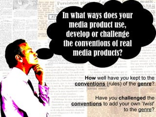
1. How well have you kept to the conventions (rules) of the genre ? Have you challenged the conventions to add your own ‘ twist ’ to the genre ? In what ways does your media product use, develop or challenge the conventions of real media products?
2. “ Show swearwords - as are aimed at an older generation. Be non-gender specific. Feature upcoming artists OR previously iconic artists. Not just whoever's topping the charts” In the early stages of research I noted that alternative music magazines are more likely to..
3.
4. THE COVER The conventions of Alternative music magazine COVERS I followed in my own magazine cover include… Cover art: The pixellation of a small area of my image reflects the subjects concern about losing identity etc. Colloquial language. For example “12Watch” which links to “text speak” and draws in the digital aspect. A colour scheme of black red and white is androgynous and can be appreciated by both genders A list of rhetorical questions are used as sell lines.
5. THE COVER I chose to follow the conventions of alternative music magazines entirely whilst creating my magazine cover as I wished to clearly convey the content of my magazine to the audience. Had I chosen to break numerous conventions cover-wise, I feel that would’ve detracted massively from the brand identity and the content of the magazine.
6.
7. THE CONTENTS PAGE The conventions of Alternative music magazine CONTENTS PAGE I followed in my own magazine contents page include… The largest image is the one which relates to my key story Page numbers overlap the related image Pages divided into features and regulars for easy reading Intriguing statements used – for example – “everything from hitting the library to love interests” A large, clear and classic block title Clear links to cover – ie-masthead font used for “features” and “regulars”
8. THE CONTENTS PAGE I chose to follow some of the conventions of alternative music magazines as I wished to clearly convey the content of my magazine to the audience. However there were a few features I chose not to include – such as a self promoting advertisment. I chose to avoid this as I wanted to give the reader the impression that my magazine was all about the music! In having to push for people to subscribe etc I feel it would suggest my magazine is lacking something. It would also imply a focus on profit etc, and capitalism is notorious as something which is corrupting the music & preint media industry – I wanted my magazine to be the polar opposite of that!
9.
10. THE DOUBLE PAGE SPREAD The conventions of Alternative music magazine DOUBLE PAGE SPREAD I followed in my own magazine contents page include… Text revolves mostly around the music – much of the tales of personal lives are reflected/have been reflected by the music All images are entirely and immediately related to the text Colours are still red/black/white to remain androgynous and appealing to the audience Key quotes are in larger font/varied colours The occasional swear word, along with colloquial language has been used
11. THE DOUBLE PAGE SPREAD Once again I primarily chose to follow the conventions of alternative music magazines. However I found that as I had done no textual analysis on double page spreads, I relied on audience research and personal knowledge to assist me in my judgements. I feel that the conventions of music magazine covers/contents pages which I’d clearly outlined helped me in this too, as many aspects such as types of photos, colour schemes and composition etc could be drawn from the rest of the magazine.
12. MY MAGAZINE I feel confident that through my choices, my magazine remains clearly based around the alternative music genre. Nevertheless I feel certain attributes within it (such as an extremely abstract cover image, lack of desperate advertising etc) prevent it from blending in with other magazines of the genre - such as NME and MOJO - too much, thus creating a strong, interesting and intriguing identity.