
Recommended
More Related Content
What's hot
What's hot (20)
Viewers also liked
Viewers also liked (20)
Similar to Poster analysis
Similar to Poster analysis (20)
More from nBrownie
More from nBrownie (15)
Recently uploaded
Recently uploaded (20)
Poster analysis
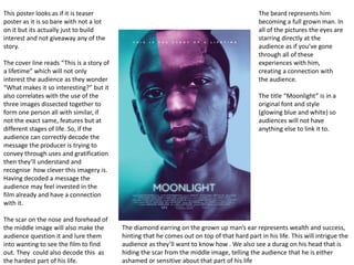
- 1. This poster looks as if it is teaser poster as it is so bare with not a lot on it but its actually just to build interest and not giveaway any of the story. The cover line reads “This is a story of a lifetime” which will not only interest the audience as they wonder “What makes it so interesting?” but it also correlates with the use of the three images dissected together to form one person all with similar, if not the exact same, features but at different stages of life. So, if the audience can correctly decode the message the producer is trying to convey through uses and gratification then they’ll understand and recognise how clever this imagery is. Having decoded a message the audience may feel invested in the film already and have a connection with it. The scar on the nose and forehead of the middle image will also make the audience question it and lure them into wanting to see the film to find out. They could also decode this as the hardest part of his life. The diamond earring on the grown up man’s ear represents wealth and success, hinting that he comes out on top of that hard part in his life. This will intrigue the audience as they’ll want to know how . We also see a durag on his head that is hiding the scar from the middle image, telling the audience that he is either ashamed or sensitive about that part of his life The beard represents him becoming a full grown man. In all of the pictures the eyes are starring directly at the audience as if you’ve gone through all of these experiences with him, creating a connection with the audience. The title “Moonlight” is in a original font and style (glowing blue and white) so audiences will not have anything else to link it to.
- 2. Using the marvel logo above the Avengers title is a clever way of branding the film so fans know who its being made by and therefore is expected to be of high quality and a big budget movie. The characters all have their own fan bases with individual movies and comics, so having them all appear on the poster using a wide angled shot targets a whole range of super hero fans instead of just focusing on one or two. The use of the actors names at the top helps promote the film to fans outside of the super hero genre. The poster is conventional for an action film poster as it shows all the protagonist characters in action rather than standing around. This is conventional as the image is expected to show a scene from the film rather than it being a photo shot outside of the film itself. Conventions of form and genre. This magazine poster uses the rule of thirds to ensure that no character is directly in the middle of the poster. Iron Man and Thor are on the left and right vertical line to ensure the poster is creative and not boring. This is conventional of action film posters as the characters are never directly in the middle of the poster but they are to the right or left of the centre. This helps to draw the attention to these characters and then allow the audience to see the background behind them. The poster uses the route of the eye to show the character Hulk, in the primary optical area, directly opposite that horizontally is an explosion that draws the eye, this then diagonally goes down the centre of the poster through the main characters to the terminal area where the title of the film is placed as well as the small printed information that is not relevant to the audience.
- 3. The main image is of Simon pegg on the London underground surrounded by zombies. This is to represent how people get stuck in the same old routine and mindlessly do things which if the audience correctly decode the producers message they’ll find it funny and clever. Also, it creates an effect with the audience as “zombie” is a term often used to describe people addicted to electronics such as phones, iPods, MP3s and games consoles which is also played upon as Shaun works within an electronic store. “A ROMANTIC COMEDY.” – shown through Pegg wearing a suit with a red tie and also carrying yellow flowers. There is also a pause within the sentence as there is a full stop after comedy, and then it says “WITH ZOMBIES” that are also portrayed within the poster not as dull commuters all going to work to do the same thing they’ve been doing for 25 years but actual zombies. Colour – Most of the poster is bright vibrant colours whereas there are other parts that are dull and lack in real colour. However, it is not a coincidence that its partially vibrant and partially dull, as the bright colours represent the living, as Simon Pegg, the flowers and the train doors are solid, vibrant colours compared to the zombies who are dull and grey as they are “dead” and this creates a juxtaposition of putting bright and dull together but also living and dead to create a clear contrast and emphasise the threats and plot for the film. The brightness of colours also picks out the most important sections of the image for the audience as it makes it “pop” against the dullness, also with the character Shaun “stciking out like a saw thumb” but with the yellow flowers he’s carrying shows that the zombie element of the film isn’t the only plot point, but also a romantic twist that no zombie film has done as “Shaun of the Dead” is the one to create the new genre of ZomRomCom.Language – The language used is directly speaking to the audience through the text, as in the slogan it uses “YOU” instead of using first or second person it using third. It is getting the audiences involved and like the magazine cover the text is blunt and to the point, as too much text on a poster can be disheartening and less interesting to an audience for instance “A ROMANTIC COMEDY. WITH ZOMBIES” it says the whole plot of the film within five given words so the audiences know what to expect but not completely as it was the first within the genre.